Pediatrician Testimonial Landing Page Template
Checkup is a single-column testimonial landing page built for pediatric practices. It layers 20-plus parent review cards into a scrolling mosaic, grouped by emotional chapter, and guides visitors toward booking an appointment. The Arctic White color system and warm peach accents create a calm, trustworthy feel that resonates with first-time parents searching for the right pediatrician.
by Rocket studio
Quick summary
Checkup is a single-column testimonial landing page designed to help pediatric practices earn parent trust through the sheer weight of real family voices. The page opens with a bold headline, flows through three emotionally grouped clusters of parent review cards, and closes with a clear call to action. It is built for mobile-first browsing and optimized for click-through to a scheduling portal.
Who this template is for
This template fits pediatric practices that want to convert anxious first-time parents into booked appointments. It works equally well for practices serving adoptive families or those who want a trusted referral source for daycare directors.
- First-time parents who research pediatricians late at night on a phone
- Adoptive families navigating new immunization schedules and seeking a warm, knowledgeable practice
- Daycare directors looking for a reliable referral they can confidently pass on to enrolling households
What problem this template solves
Parents choosing a pediatrician face a trust gap. A practice website rarely communicates warmth, competence, or community confidence on its own. Checkup solves this by replacing generic marketing copy with accumulated social proof organized to mirror the emotional arc parents actually experience.
- Skepticism about an unfamiliar practice is addressed through 20-plus real-voice testimonial cards
- Anxiety about first visits, sick calls, and developmental milestones is met with stories that reflect those exact moments
- Decision hesitation is reduced by placing a clear booking call to action at three strategic points on the page
What you get with this template
The template delivers a complete, ready-to-customize testimonial landing page with every section pre-structured and pre-styled. No form is included by design; the booking button links directly to the practice's scheduling portal, keeping the path to conversion short.
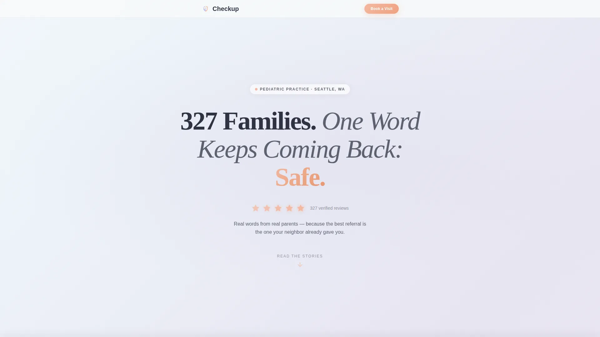
- A hero section with a centered giant headline, five peach star ratings, and a pulsing scroll arrow
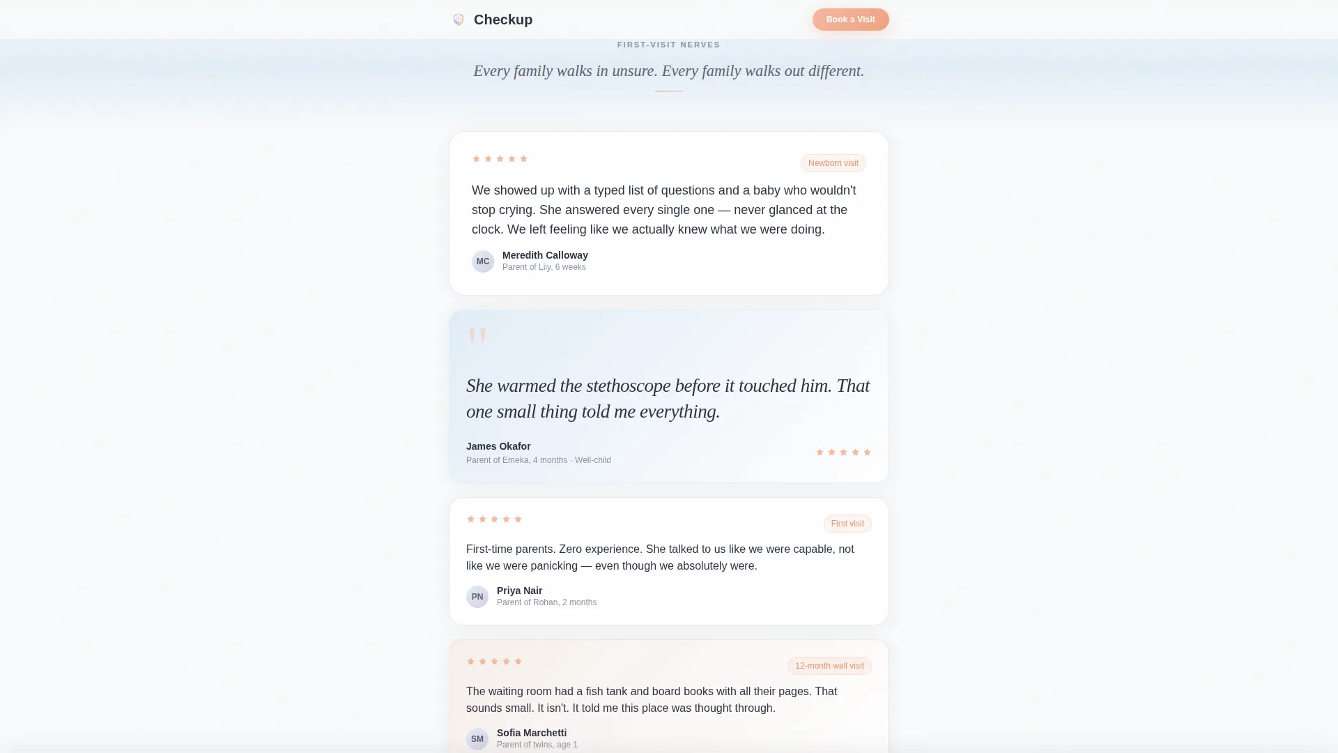
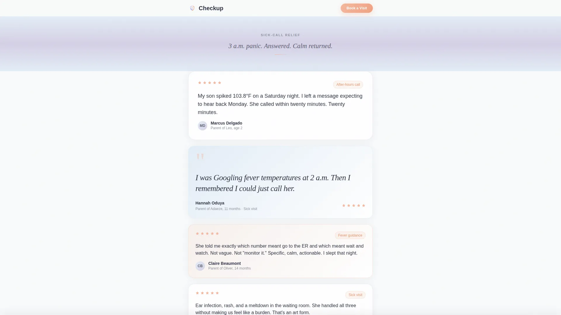
- Three emotionally themed testimonial mosaics with staggered card layouts and smooth gradient band transitions
- Three strategically placed "Book Your First Visit" call-to-action buttons, including a sticky bottom bar that activates at the 50 percent scroll point
Feature list
This section outlines the key built-in capabilities of the Checkup template.
Giant Centered Hero Headline
The hero opens with a bold, typographically generous statement: "327 Families. One Word Keeps Coming Back: Safe." Five peach-colored star ratings sit directly beneath it. A soft pulsing arrow invites the visitor to scroll. There are no stock photos or medical imagery, just the weight of a number and a single word.
Testimonial Mosaic Layout
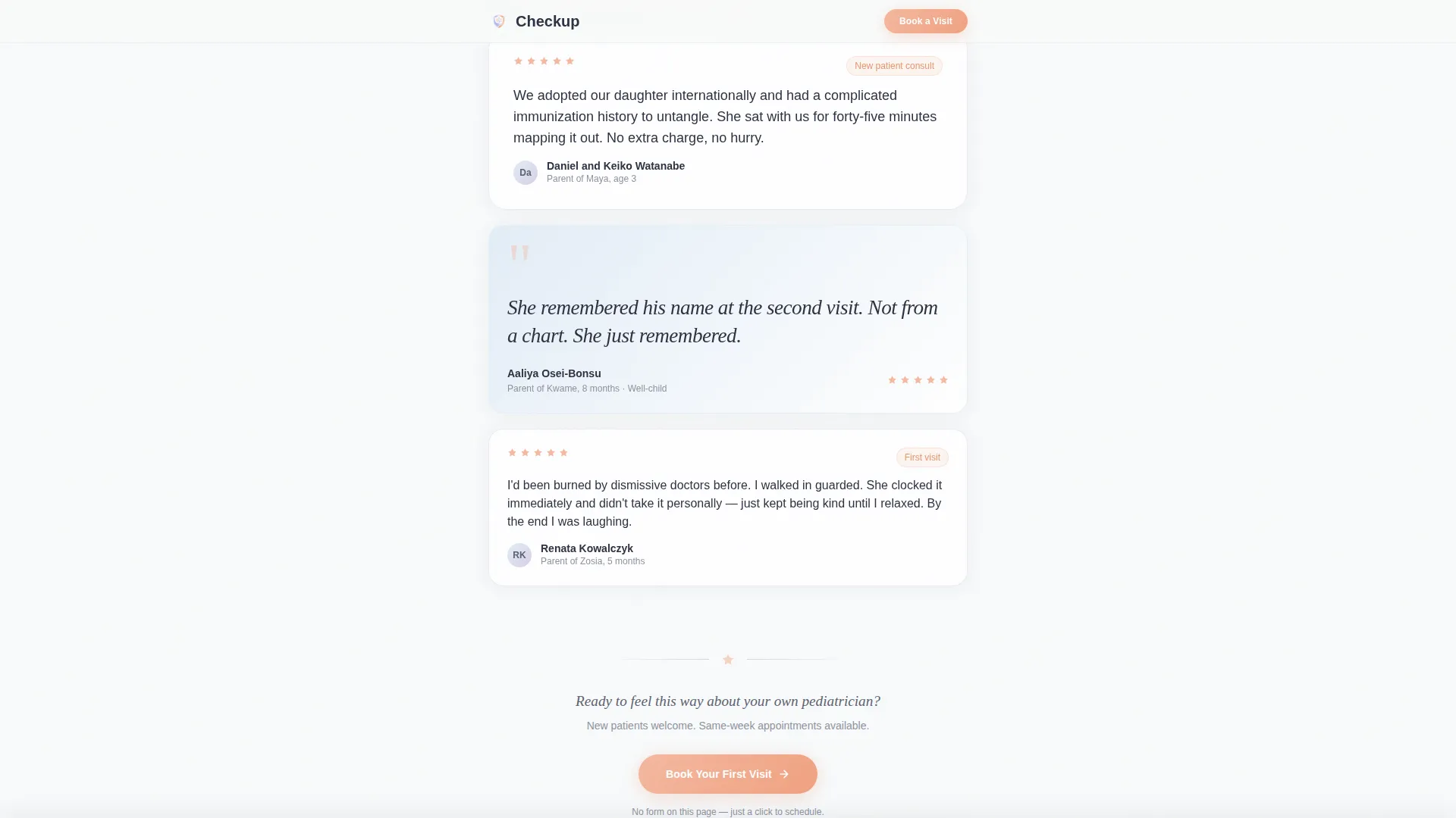
Parent review cards are arranged in a staggered, single-column mosaic. Cards vary in width and content length. Some carry a single italic sentence in large type; others hold a short paragraph noting the child's age and visit reason. GSAP scroll reveals animate the cards into view as the visitor scrolls.
Emotional Chapter Gradient Bands
The page is divided into three testimonial clusters: first-visit nerves, sick-call relief, and milestone celebrations. Between each cluster, a subtle gradient band shifts the background hue from arctic white to pale sky to quiet lavender, then back. Each shift signals a new emotional chapter without using headings or labels.
Three-Point Call-to-Action System
The primary "Book Your First Visit" button appears after the seventh testimonial card, again in a persistent sticky bar that activates once the visitor passes the halfway point of the page, and once more at the page close. All three instances link to the practice's scheduling portal rather than an on-page form.
Sticky Bottom Booking Bar
After the visitor scrolls past the 50 percent mark, a soft peach sticky bar anchors to the bottom of the screen. It carries the booking call to action without covering key content. This keeps the conversion path visible at all times without interrupting the reading experience.
Minimal Footer Design
The footer follows a Superhuman Extreme Minimal pattern. It holds only the essential details needed to close the page cleanly, keeping the visual focus on trust signals and the booking action rather than navigation or secondary links.
Page sections overview
| Section | Purpose |
|---|---|
| Hero Headline | Establish immediate trust with a bold family-count statement and star ratings |
| Testimonial Mosaic One | Present first-visit nerve stories through staggered parent review cards |
| Mid-Page Call to Action | Prompt early converters with a peach booking button after the seventh card |
| Testimonial Mosaic Two | Continue trust-building with sick-call relief stories on a sky-to-lavender band |
| Testimonial Mosaic Three | Close the emotional arc with milestone celebration stories and a gradient return |
| Closing Call to Action | Deliver the final booking prompt at page end |
| Minimal Footer | Provide essential practice details with no visual clutter |
Design & branding system
The visual identity uses a Soft Gradient theme built on an Arctic White color system. Every color choice is intentional. The palette references the first light of a nursery morning: cool enough to feel calm, warm enough to feel human, never clinical.
- Color palette: fresh snowdrift white (#F8FAFB), pale sky inhale (#E3EDF7), quiet lavender mist (#D5D0E5), and warm peach accent (#F4B9A0) used on buttons, star ratings, and highlighted quotes
- Typography: Fraunces serif for headlines to convey warmth and authority; DM Sans for body text to keep reading easy and unhurried
- Animations: GSAP scroll-triggered card entrances, a single pulsing hero arrow, and staggered mosaic reveals that unfold naturally as the visitor reads
Mobile & speed optimization
The template is built mobile-first because its primary audience browses on a phone, often late at night. The single-column layout translates directly to any screen width without requiring a layout shift.
- Server Components power the static testimonial cards, keeping JavaScript load minimal and rendering fast
- The sticky booking bar is designed for thumb reach on a phone screen, staying anchored at the bottom edge without obscuring content
- Staggered GSAP animations are medium-weight and trigger on scroll, so early content loads and displays before later animations fire
How this template helps you convert
Checkup is built around a single conversion goal: turning a skeptical parent visitor into a scheduled appointment click. Every structural decision supports that goal.
- Trust is built incrementally through 20-plus testimonial cards organized by emotional chapter, so confidence accumulates naturally before any booking prompt appears
- The three-point call-to-action system ensures the booking button is always within reach, whether the visitor is an early decision-maker after the seventh card or a careful reader who finishes the full page
- The sticky bottom bar keeps the conversion path visible throughout the scroll without forcing a choice, reducing friction while maintaining a calm and unhurried tone
Other information about this template
The Checkup template sits within the Health and Medical category, specifically in the Pediatrician Website subcategory. It is designed for the Pediatrician Testimonial and Review Page niche and carries a high intersection match for that use case. The template is localized for English-language use in the United States and does not include any currency or pricing elements.
- Template style: Single Column Flow with a Testimonial Mosaic creative direction
- Theme: Soft Gradient with an Arctic White color system and a Click-Through landing page direction
- Header concept: Giant Headline Centered, using Fraunces serif type on a whisper-soft white-to-lavender gradient
- The page contains no on-page form; the booking call to action links directly to an external scheduling portal, keeping the visitor flow simple
Theme
Soft Gradient
Creative direction
Testimonial Mosaic
Color system
Arctic White
Style
Single Column Flow
Direction
Click-Through
Page Sections
Giant Centered Hero Headline
Staggered Testimonial Mosaic
Emotional Chapter Gradient Bands
Three-point Call-to-action System
Sticky Bottom Booking Bar
Minimal Footer Pattern
Related questions
Does this template include a contact form or booking form?
How many testimonial cards does the template include?
Can I update the testimonial content and headline numbers?
Who is the primary audience for this landing page?
Does the sticky booking bar appear on mobile as well?



