Baby Shower Event Photography Landing Page
Cherish is a single-column landing page template built for baby shower event photographers. It follows a Heritage & Story theme with a warm Parchment & Rust color system. The page moves visitors through the emotional arc of a shower day, from quiet morning preparations to golden-hour farewells, and guides them toward booking with two clear calls to action.
by Rocket studio
Quick summary
Cherish is a single-column, scroll-driven landing page for baby shower event photographers. It uses a Heritage & Story theme with a Parchment & Rust palette to create a warm, intimate tone. The page walks visitors through the full emotional story of a shower day and earns the click to a full portfolio with two strategically placed calls to action.
Who this template is for
This template is designed for photographers who specialize in baby shower events and want a landing page that reflects their storytelling approach. It suits those whose clients are expectant mothers, close friends organizing surprise celebrations, and multi-generational families gathering for a final quiet milestone before a new arrival.
- Baby shower event photographers offering full-day narrative coverage
- Photographers targeting intimate gatherings such as garden showers and living room brunches
- Wedding and events photographers expanding into the baby shower niche
What problem this template solves
Most photography landing pages show a grid of highlight images but fail to communicate the emotional continuity that separates a skilled storyteller from a simple shooter. Cherish solves that gap by guiding visitors through the arc of an entire event day, so they understand exactly what kind of photographer they are hiring.
- Visitors leave generic portfolio sites without feeling the depth of the work
- A grid layout cannot communicate the story between the moments
- Without that emotional proof, prospective clients hesitate to reach out
What you get with this template
You get a fully structured, single-column landing page laid out to move a visitor from first impression to click in one smooth scroll. Every section is intentional, from the full-width lifestyle header to the quiet closing moment, with copy placeholders and visual slots that follow the brief's creative direction.
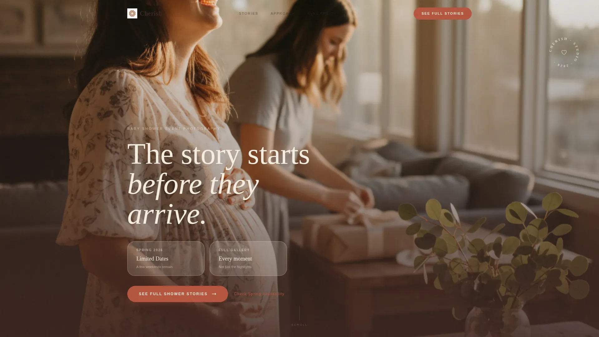
- A full-width lifestyle header featuring warm late-afternoon window light and a serif headline fade-in
- A seasonal scroll arc that shifts palette temperature from cool morning tones to warm amber as the page descends
- Two click-through calls to action linking to a portfolio page, each paired with a secondary availability text link
Feature list
This template delivers a focused set of design and layout features rooted in its Heritage & Story creative direction.
Full-Width Lifestyle Header
The header opens with an off-center, shoulder-height lifestyle composition. A mother-to-be mid-laugh anchors the shot while late-afternoon window light spills across eucalyptus sprigs and handwritten name cards. A single serif headline fades in beneath the image with the line "The story starts before they arrive."
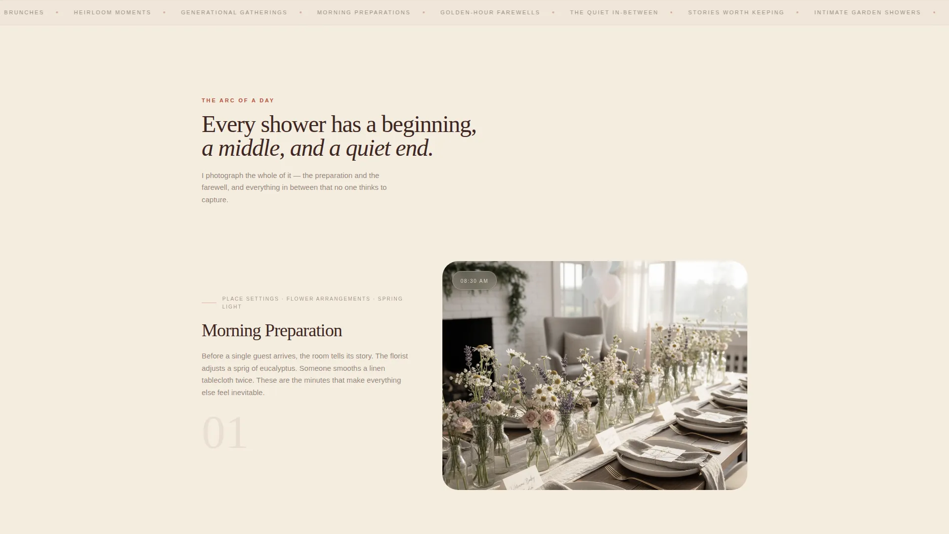
Seasonal Scroll Arc
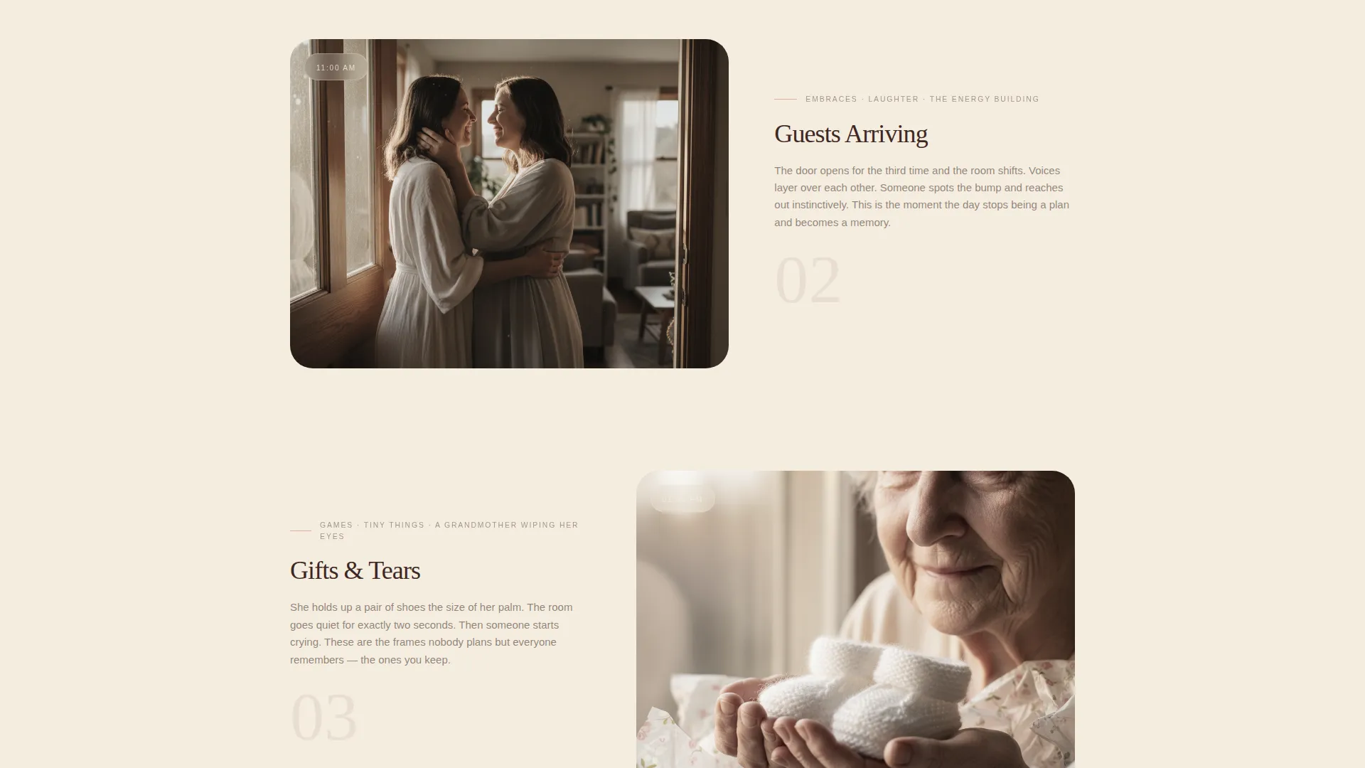
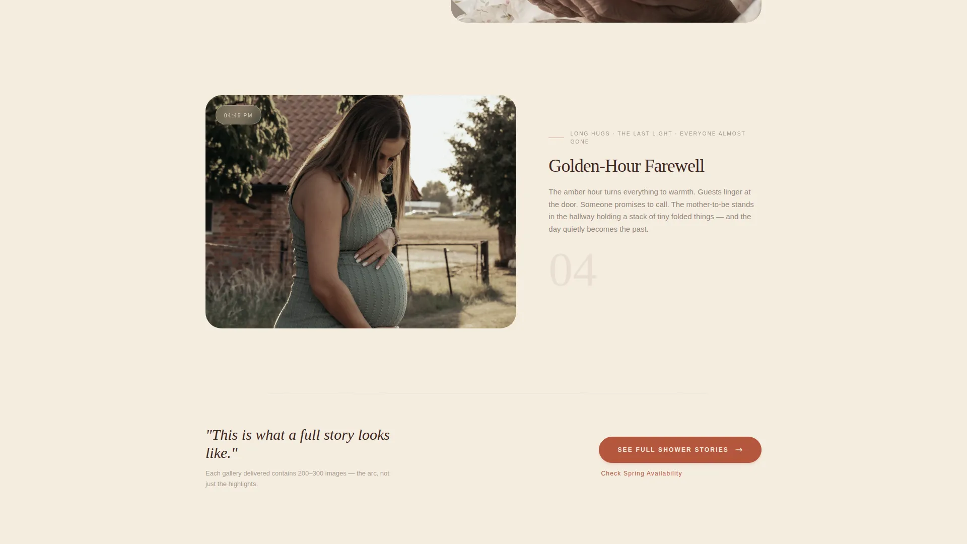
The page is built around a Seasonal/Moment creative direction. Visual sections move through a shower day chronologically, from cool morning detail shots through the warm energy of guests arriving, on to the emotional peak of the grandmother moment, and finally to the quiet, intimate close as the mother sits with a stack of folded things.
Dual Call-to-Action Placement
Two primary calls to action reading "See Full Shower Stories" are placed at deliberate narrative moments: once after the opening header sequence and once after the final intimate section. A secondary text link reading "Check Spring Availability" sits beneath each, serving visitors who are already ready to book.
Heritage Color Palette Integration
The Parchment & Rust color system is applied structurally throughout the layout. Sun-faded parchment washes the full background, warm linen creates soft section dividers, heirloom rust appears on accent lines and hover states, and deep walnut anchors headlines and captions.
Narrative Section Flow
The page is organized as an emotional arc, not a static gallery. Sections are ordered to reflect the lived sequence of a shower day: quiet preparations, arrivals and embraces, games and gifts, and the intimate closing moment. This structure proves the photographer captures continuity rather than highlights alone.
Serif Typography Treatment
Headlines and captions use a serif typeface that reinforces the analog, heirloom tone of the Heritage & Story theme. The typographic choices feel deliberately handcrafted, consistent with the linen-wrapped album quality described throughout the brief.
Page sections overview
| Section | Purpose |
|---|---|
| Full-Width Header | Opens with lifestyle image and serif headline fade-in |
| Morning Detail Shots | Cool-toned spring detail photography of place settings and flowers |
| Guests Arriving | Mid-energy section showing embraces and gathering atmosphere |
| Games and Gifts | Emotional peak featuring candid and documentary moments |
| Intimate Closing Moment | Quiet final scene with mother and folded gifts alone |
| Primary call to action Block (first) | Directs visitor to full portfolio after header sequence |
| Primary call to action Block (second) | Repeats portfolio link after the closing intimate moment |
Design & branding system
The visual identity uses a four-color Parchment & Rust system that feels deliberately analog, like a hand-written letter found inside a cedar chest. Every color has a structural role, and the palette shifts subtly in warmth as the visitor scrolls downward.
- Parchment (#F5EDE0) washes the full background; linen (#E8DDD1) marks section transitions
- Rust (#B5563E) appears on accent lines and hover states; walnut (#3E2723) anchors all headlines and captions
- The Heritage & Story theme is reinforced through serif type, restrained spacing, and a single-column layout that reads like turning pages in a physical album
Mobile & speed optimization
The single-column layout is a natural fit for mobile viewing. The vertical scroll flow translates directly to how people read on a phone, and the section order remains intact without requiring horizontal navigation or grid reshuffling.
- Single-column structure adapts to narrow viewports without layout breakage
- Large lifestyle images are placed in dedicated full-width slots that maintain proportional display on smaller screens
- Text hierarchy using walnut headlines and linen dividers stays legible across device sizes
How this template helps you convert
This landing page earns the click by demonstrating narrative depth before the visitor reaches the call to action. It builds trust through story, not just imagery.
- The emotional scroll arc moves visitors through a complete shower day, which communicates the photographer's ability to capture a full, coherent story rather than a collection of isolated highlights.
- Two calls to action are placed at the moments of highest emotional engagement, once when the narrative builds and again when it resolves, so the invitation to view more arrives exactly when the visitor is most ready.
Other information about this template
This template sits within the Wedding & Events category and is built specifically for the Baby Shower Event Photography niche. It is designed as a Click-Through landing page, meaning its primary conversion goal is directing visitors to a separate portfolio page with complete event galleries rather than capturing leads directly on the page.
- The template style is Single Column Flow, which keeps the visitor's attention on one narrative thread without distraction
- The creative direction is Seasonal/Moment, a visual strategy that uses time-of-day color temperature to create a sense of real lived experience
- The header concept is a Lifestyle Shot, which sets an intimate documentary tone from the first scroll position
- This template is well suited to photographers building a brand around intimate, heritage-style baby shower event photography
Theme
Heritage & Story
Creative direction
Seasonal/Moment
Color system
Parchment & Rust
Style
Single Column Flow
Direction
Click-Through
Page Sections
Full-width Lifestyle Header
Seasonal Scroll Arc
Dual Call-to-action Placement
Heritage Parchment & Rust Palette
Narrative Section Structure
Serif Typography System
Related questions
Who is the Cherish template designed for?
What does the single-column layout mean for my page?
Can I adapt the calls to action for my own portfolio links?
Does the color palette need to match my existing brand?
Is this template suitable for photographers who cover other event types too?


