Sculptor Gallery Portfolio Landing Page Template
Chisel is a bento grid landing page template built for sculptor gallery portfolios. It blends a collage-style header, interactive hover and lightbox effects, and a deep Obsidian and Gold color system to create a portfolio space that feels like a private studio visit. The layout guides collectors, curators, and interior architects toward a catalogue download or a studio visit request.
by Rocket studio
Quick summary
Chisel is a single-page sculptor gallery portfolio template. It uses a bento grid layout, a collage header, and an Interactive Explorer approach to put each artwork in the spotlight. The page builds trust through process documentation and high-resolution imagery before presenting two clear conversion paths: a catalogue download and a studio visit request.
Who this template is for
This template is built for sculptors who want their portfolio to feel like a curated gallery experience, not a standard grid of images. It suits artists who work across multiple materials and need a page that communicates craft, context, and collector-readiness at once.
- Fine art sculptors presenting bronze, marble, ceramic, or mixed-media work to buyers and institutions
- Curators and gallery representatives assembling a focused online presence for a represented artist
- Interior architects and art advisors who want a sourcing-ready reference page for statement pieces
What problem this template solves
Most portfolio pages show finished work without telling the story behind it. Collectors and curators need more than images. They need to understand medium, scale, process, and intent before they commit to an acquisition or a studio visit. This template closes that gap.
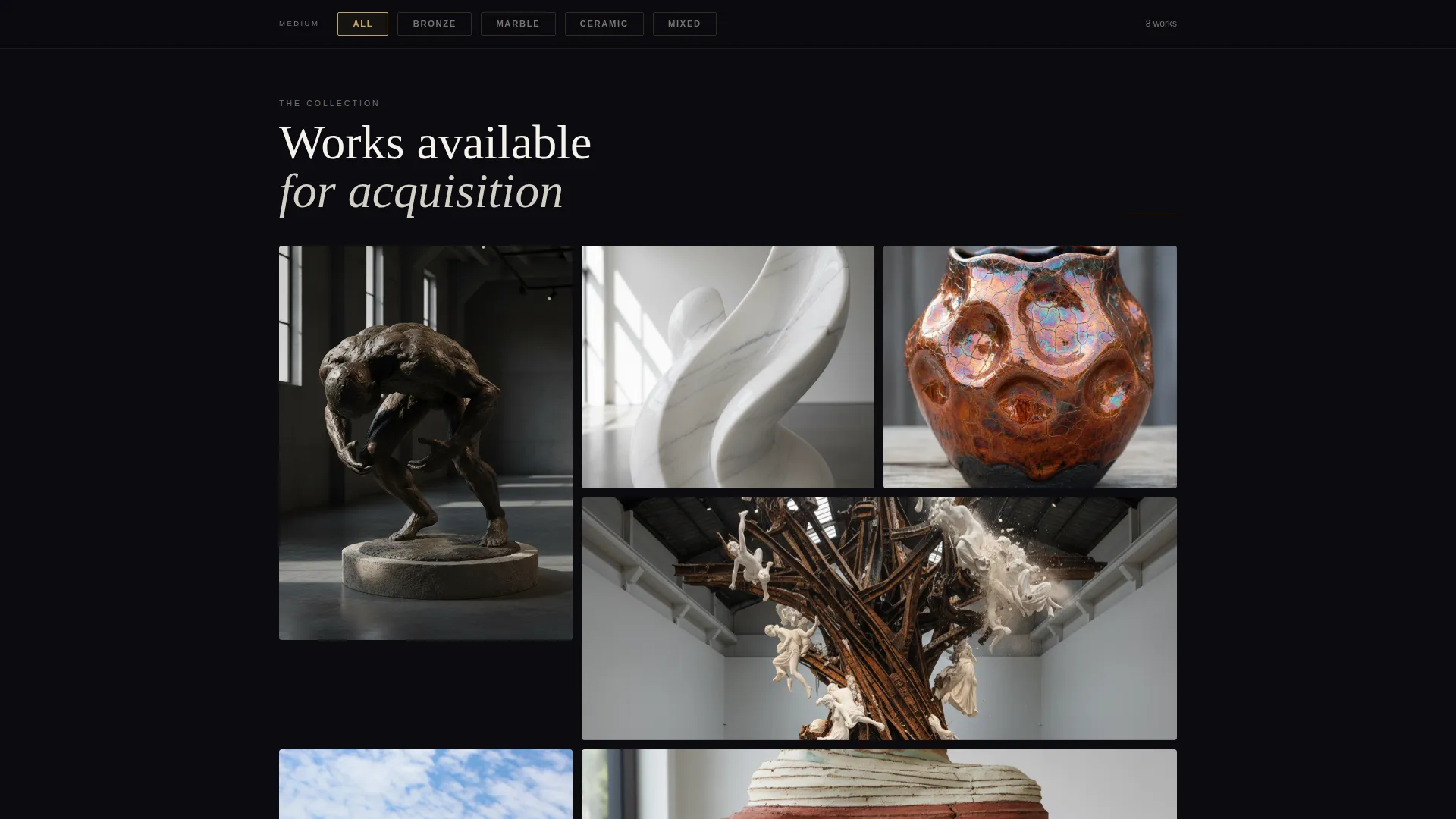
- It presents work by medium using filterable grid sections, so buyers can focus on what they actually collect
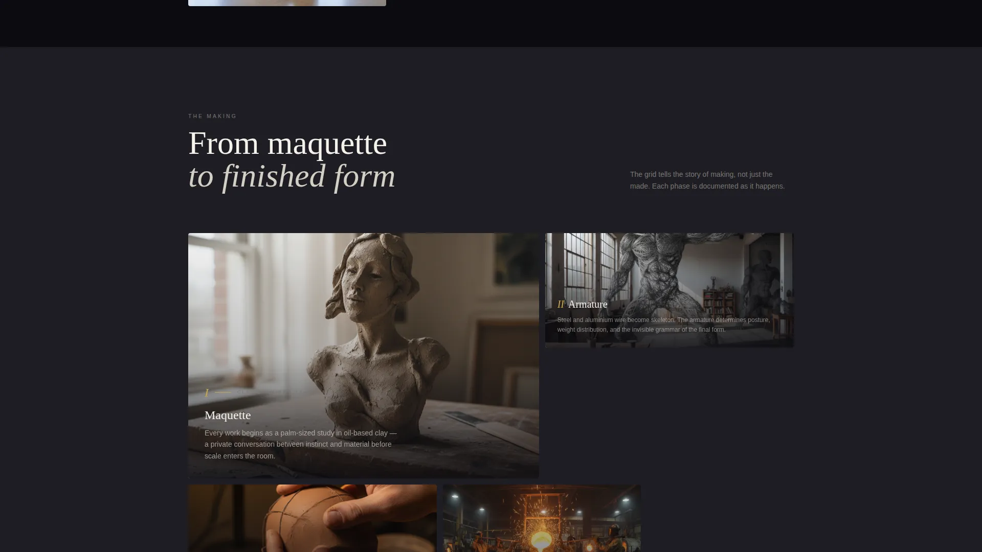
- It documents the making process from maquette to finished form, giving institutional buyers the context they need
- It gates the full catalogue behind a single email field, turning passive browsers into qualified leads
What you get with this template
Chisel delivers a complete, ready-to-customise landing page structured around the full arc of a sculptor's practice. Every section earns its place by contributing either to the viewer's understanding of the work or to the page's conversion flow.
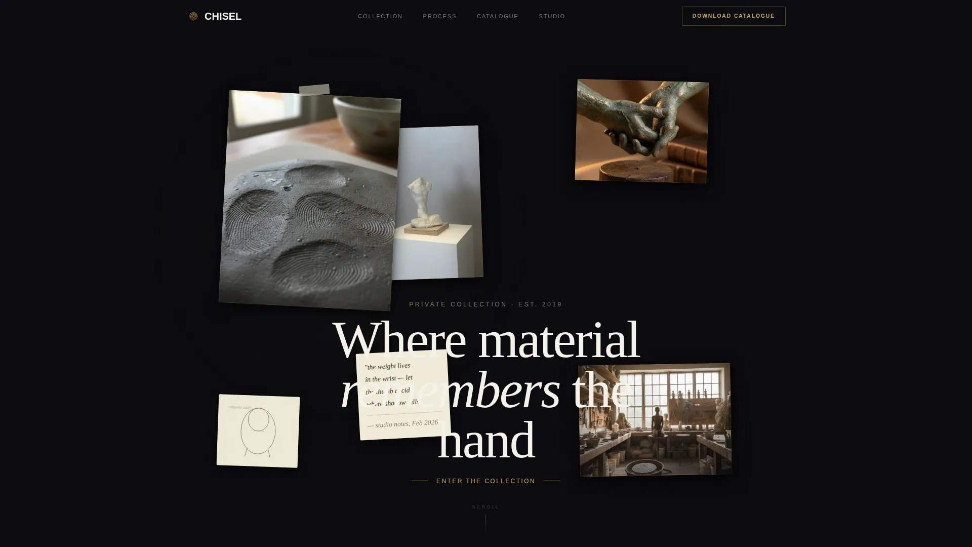
- A collage-style header with overlapping photographs, studio sketches, and handwritten notes layered across the viewport
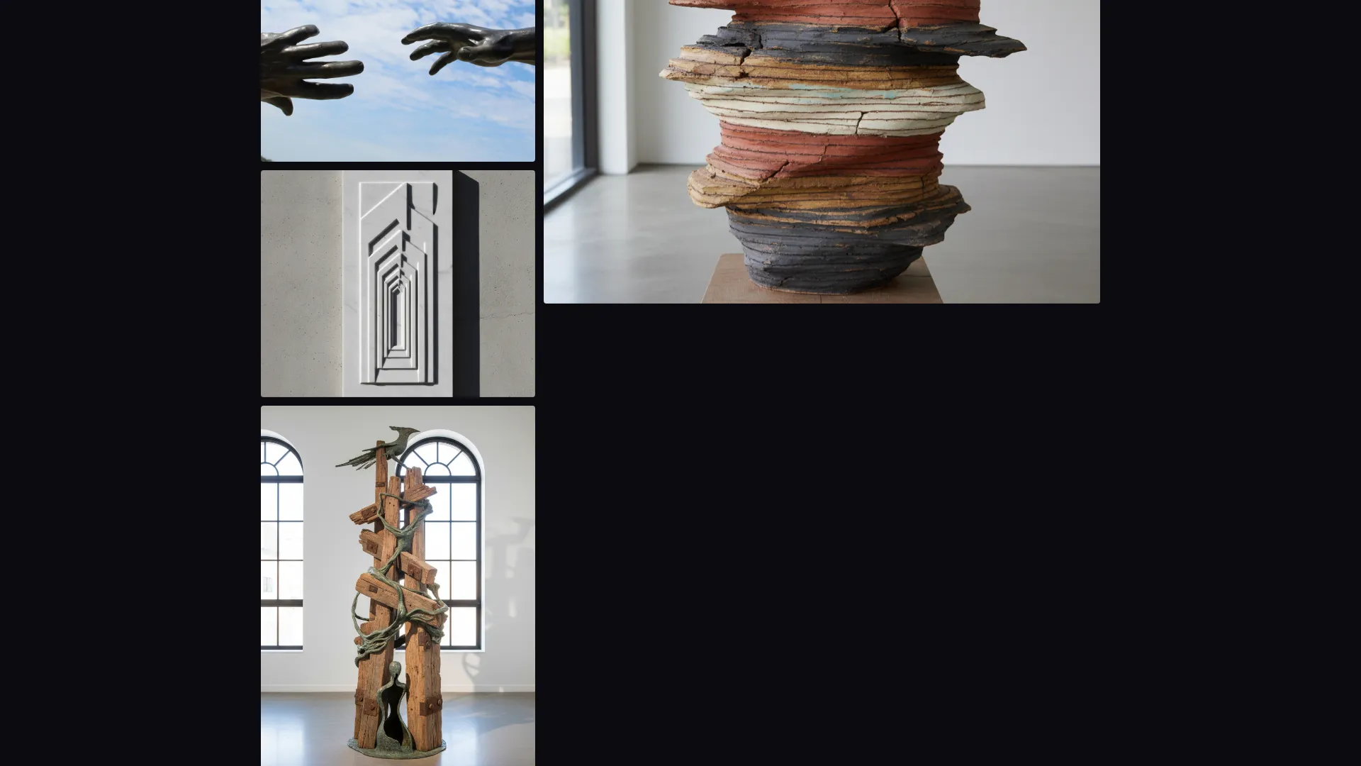
- A bento grid body with hover parallax, lightbox expansion, material detail shots, dimensions, and artist statements
- Two conversion paths: a catalogue download gated behind an email field and a floating studio visit request button
Feature list
This template packs a focused set of interactive and visual capabilities, each grounded in the brief's design and content direction.
Collage and Scrapbook Header
The header layers overlapping sculpture photographs, torn-edge studio snapshots, pencil sketches on yellowed paper, and a fragment of handwritten notes across the full viewport. One image tilts three degrees and shows a close-up of finger grooves pressed into wet clay. The arrangement feels like a private archive just opened for the first time.
Interactive Bento Grid with Hover Parallax
Each cell in the bento grid acts as a portal into a single work. Hovering triggers a subtle parallax shift that makes the sculpture appear to rotate five degrees, as if responding to the viewer's gaze. The effect is immediate and tactile without distracting from the art itself.
Lightbox with Orbital Camera Loop
Clicking any grid cell expands it into a full lightbox view. Inside, a slow orbital camera loop cycles around the piece alongside material detail shots, physical dimensions, and a brief artist's statement. Buyers get enough context to make informed decisions without leaving the page.
Medium Filter on Sticky Rail
A sticky filter rail sits above the bento grid and lets visitors toggle between bronze, marble, ceramic, and mixed-media sections. The grid reshuffles on selection, keeping the browsing experience focused and relevant for collectors who specialise in a particular material.
Process Documentation Grid
Deeper scroll sections shift from finished work to the making process. The grid tells the story from maquette to armature to completed form, giving curators and institutional buyers the provenance narrative they often require before committing to an acquisition.
Dual Conversion Architecture
The primary call to action, a catalogue download gated behind a single email field with an optional checkbox for exhibition invitations, appears after the third grid section. A secondary floating button outlined in gold for studio visit requests stays visible throughout the scroll without competing with the artwork.
Page sections overview
| Section | Purpose |
|---|---|
| Collage Header | Establishes atmosphere and introduces the artist's practice through layered studio imagery |
| Medium Filter Rail | Lets visitors toggle the grid by material type for focused browsing |
| Bronze Works Grid | Showcases cast bronze pieces with hover parallax and lightbox access |
| Marble Works Grid | Presents carved marble work with material detail shots and dimensions |
| Ceramic and Mixed Grid | Displays ceramic and mixed-media pieces in the same interactive format |
| Process Documentation | Traces the journey from maquette to finished sculpture through sequential grid cells |
| Catalogue Download | Captures visitor email in exchange for the full high-resolution catalogue |
| Floating Visit Button | Persistent studio visit request button, gold-outlined, anchored to the bottom corner |
Design & branding system
The visual identity follows a Lens and Frame theme built on the Obsidian and Gold color system. The palette references a private viewing room after hours, with velvet-dark walls and a single brass picture light casting warm focus on each piece.
- Core colors are deep volcanic black (#0B0B0F), polished graphite (#1E1E24), antiqued gold leaf (#C9A84C), and gallery-white (#F5F2EB), with gold reserved for hover states, frame borders, and navigational accents only
- Typography uses refined serif typefaces that echo the language of exhibition catalogs, with text set in gallery-white or muted bone against the obsidian ground
- The gallery-white tone creates breathing space between bento cells, preventing the dark palette from feeling compressed or heavy
Mobile & speed optimization
The bento grid and collage header are designed to adapt across screen sizes without losing the atmospheric quality that defines the template's character. The layout prioritises the reading experience on smaller viewports by maintaining visual hierarchy and legibility.
- The sticky filter rail collapses cleanly on mobile, keeping the medium toggle accessible without consuming screen space
- Lightbox views retain material detail shots and artist statements on smaller screens, preserving the full buyer information flow
- The floating studio visit button remains anchored and visible across all viewport sizes
How this template helps you convert
Chisel earns the conversion by giving generously before asking for anything. The page is structured so that trust builds progressively through the scroll.
- The first three grid sections let the work speak entirely for itself, with no calls to action interrupting the viewing experience, so that when the catalogue offer appears it feels like a natural next step rather than a toll gate
- The dual conversion architecture separates passive interest from active intent: the email-gated catalogue captures buyers who want to go deeper, while the floating studio visit button stays available for collectors and curators who are ready to engage directly
Other information about this template
Chisel is part of the Portfolio and Agency category and sits within the Sculptor Portfolio subcategory, making it a focused solution for fine art practitioners rather than a general creative portfolio template. The template is well suited to gallery websites, solo exhibition microsites, or artist representation pages where the quality of presentation directly influences acquisition decisions.
- The template style is Bento Grid, the header concept is Collage and Scrapbook, and the creative direction is Interactive Explorer
- The landing page direction is Content and Resource, meaning the page is built to inform and earn trust before converting
- The Lens and Frame theme and the Obsidian and Gold color system are core to the visual identity and are designed to complement sculptural photography rather than compete with it
Theme
Lens & Frame
Creative direction
Interactive Explorer
Color system
Obsidian & Gold
Style
Bento Grid
Direction
Content/Resource
Page Sections
Collage and Scrapbook Header
Interactive Bento Grid with Hover Parallax
Lightbox with Orbital Camera Loop
Medium Filter on Sticky Rail
Process Documentation Grid
Dual Conversion Architecture
Related questions
Who is the primary audience for this landing page template?
Can the bento grid be filtered by material type?
How does the catalogue download conversion work?
Does the template include a way for collectors to request direct contact?
Is this template suitable for a group show or a multi-artist gallery?



