Uruguayan Food Truck Landing Page Template
The Chivito landing page template brings Uruguay's most beloved sandwich to life online. Built for wood-fired food trucks serving construction crews, weekend feria wanderers, and office catering orders, this hero-dominant single-page design combines a full-bleed grill photo, sensory scroll sections, an inline order form, and a weekly truck schedule to move visitors from curious to committed fast.
by Rocket studio
Quick summary
This template is a hero-dominant landing page purpose-built for a wood-fired Uruguayan food truck. It pairs a scorched-industrial visual identity with a high-converting inline order form, a sensory scroll experience, and a weekly route schedule. Every section is designed to make visitors feel the heat, smell the quebracho smoke, and place an order before they reach the bottom of the page.
Who this template is for
This template is a good fit for food truck operators who want to sell directly from their website without a third-party platform. It works equally well for solo operators running a single truck and for small teams managing multiple pickup spots across the city.
- Wood-fired food truck owners who want direct online orders for lunch service at construction sites and weekend ferias
- Operators looking for a catering-ready page that handles bulk orders of twenty or more units for office asado events
- Street food vendors in Uruguay or similar markets who want a mobile-first page that loads fast on a phone at a worksite
What problem this template solves
Most food truck pages struggle to close a sale. They show a photo, list a phone number, and ask the visitor to figure out the rest. That approach loses the lunchtime crew who has twelve minutes to order and get back to the site. It loses the office manager who needs to order forty milanesa rolls for a Friday and wants a clear process, not a phone call. This template solves that problem by putting the order form front and center and making the food do the persuasion.
- Visitors have no clear way to order quickly, especially on mobile, so orders are lost before they happen
- Catering inquiries arrive with no structure, making it hard to manage bulk requests and pickup times efficiently
- The truck's weekly location changes are never communicated clearly, so regulars stop showing up
What you get with this template
You get a complete, single-page layout with six named sections, a sticky call-to-action button, and an inline order form that handles sandwich selection, quantity, pickup location, and time-slot booking in fifteen-minute windows. The design system is fully specified with a Citrus Burst color palette and Agrarian Root styling. Typography is set in Fraunces for headlines and DM Sans for body copy, giving every section a confident, warm, readable feel that works at any screen size.
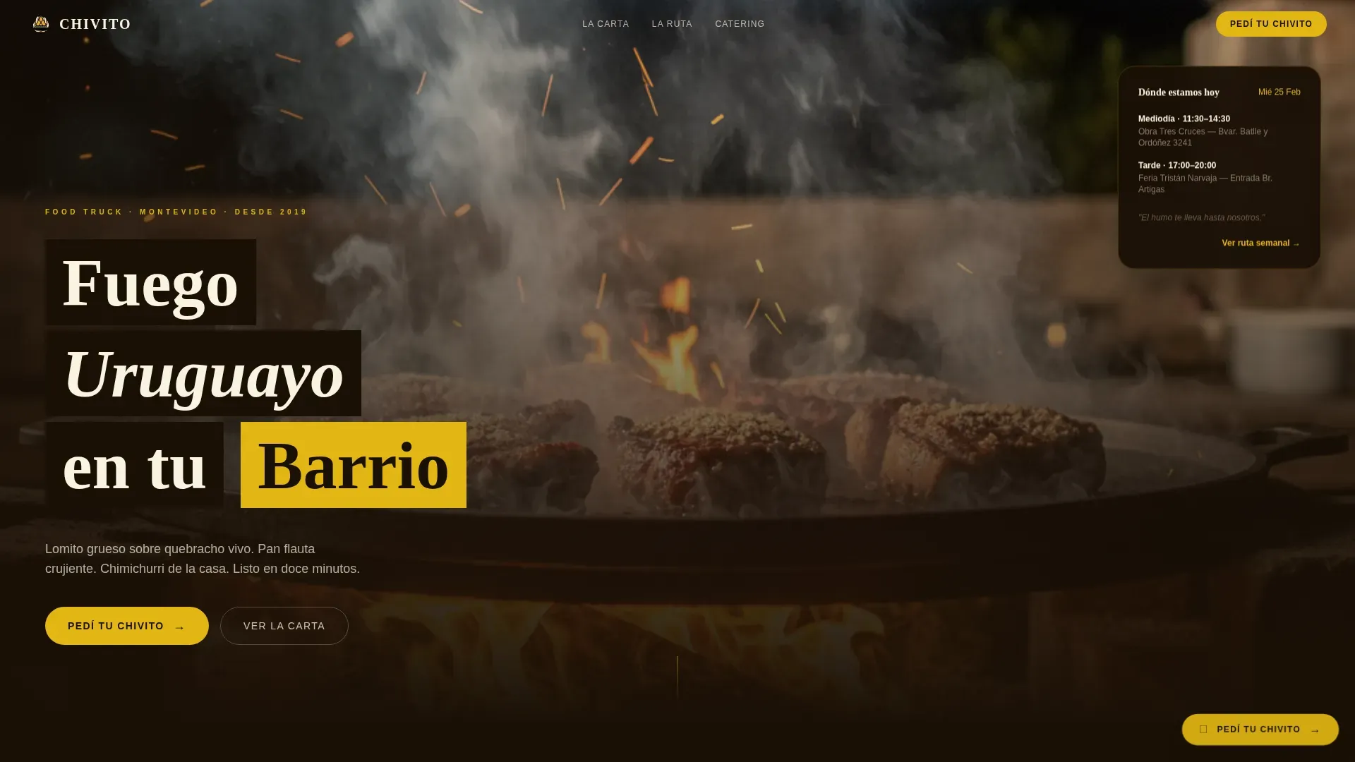
- A full hero section with a full-bleed grill photo, a floating truck schedule card, and a fade-in headline in hand-painted chalk lettering
- A six-section scroll layout covering the grill story, menu grid, order form, catering banner, and weekly route
- A compact inline order form with a sandwich selector, quantity stepper, location dropdown, and time-slot picker
Feature list
A brief paragraph introduces what this feature set delivers as a whole. Every capability listed below comes directly from the template brief, so you know exactly what is built in and ready to customize. Nothing here is speculative.
Full-Bleed Hero with Floating Schedule Card
The hero section opens with a grill-level photograph: lomito steaks mid-sear, fat rendering into flame, a hand reaching in with tongs, and smoke catching golden-hour light. Shallow depth of field keeps the meat razor-sharp while the chalkboard menu blurs behind it. A floating card over the photo shows the truck's weekly schedule, so visitors can find the nearest stop without scrolling.
Sensory Scroll Sections
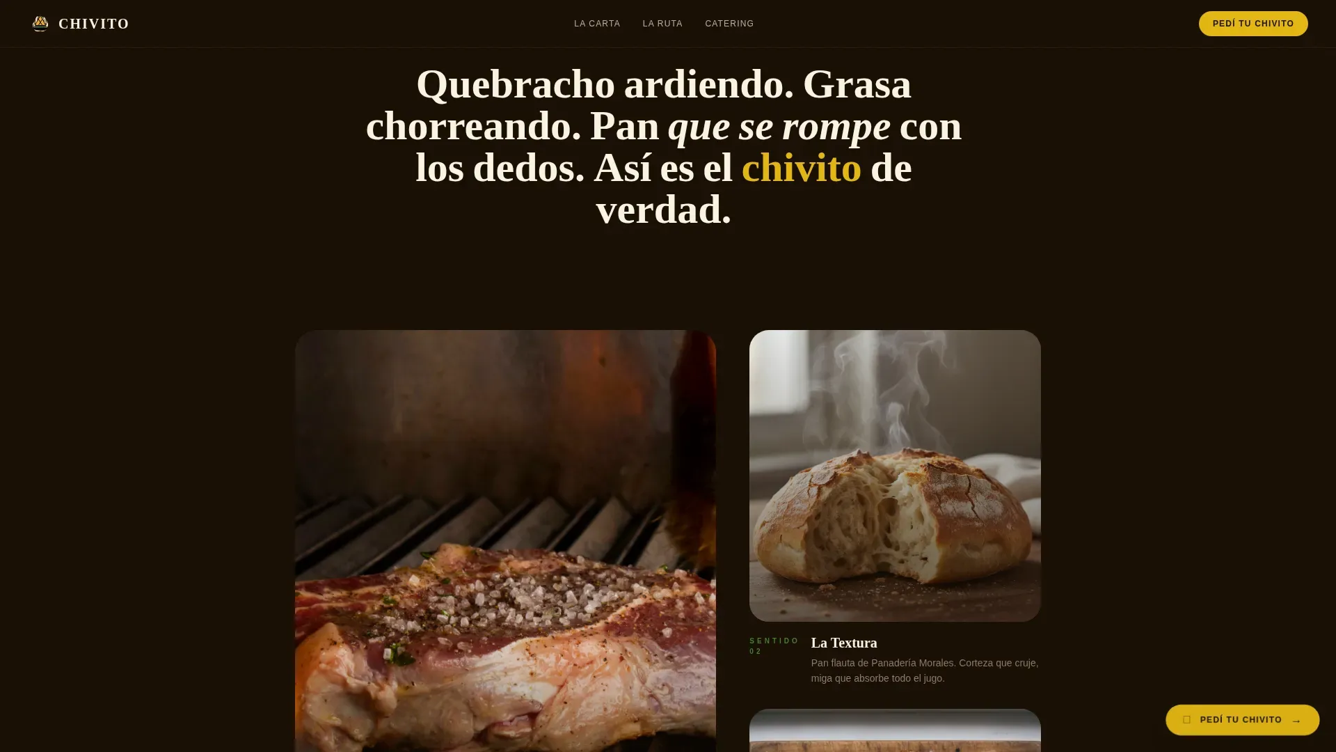
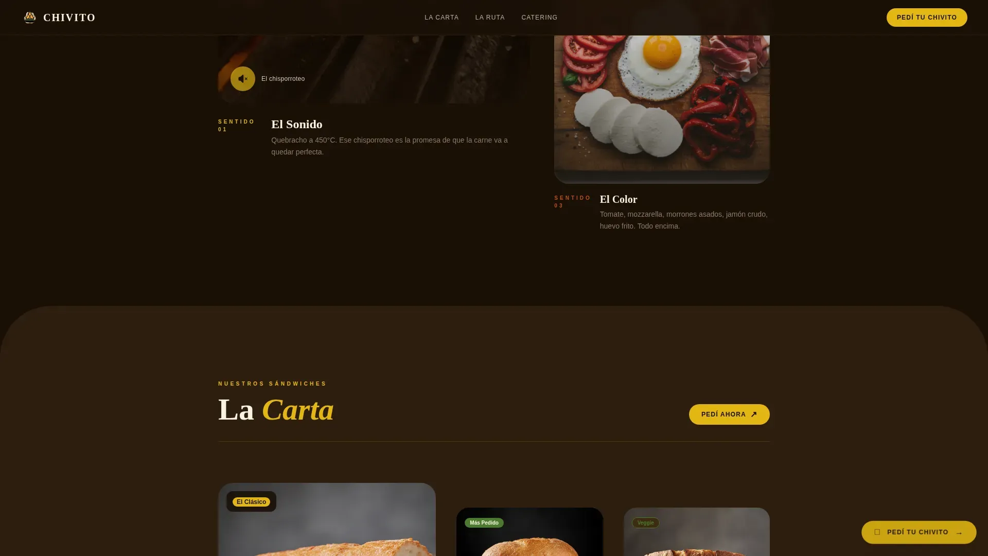
Each content section below the hero triggers a different sense. An audio-clip icon sits beside a macro close-up of meat hitting the plancha. A texture section shows bread crust shattering under thumb pressure. A flat-lay overhead view displays fresh toppings: sliced tomato, jamón crudo, mozzarella cheese, roasted morrones, and a fried egg with a trembling yolk. Sections are taller than wide, pulling the visitor deeper with every scroll like courses arriving at a good table.
Inline Order Form with Time-Slot Picker
The "Pedí Ahora" section holds a compact order form that keeps the decision fast and simple. Visitors choose their sandwich from photo thumbnails, set a quantity with a stepper, select a pickup location from a dropdown synced to the truck's weekly route, and pick a fifteen-minute time window. The form is built to handle a construction crew ordering at speed on a phone, not a desktop user with ten minutes to spare.
Catering Call-to-Action Banner
A dedicated dark-background banner section targets office managers and event organizers. The "Asado de Oficina" block uses a fading photo with a clear call-to-action link for bulk orders over twenty units. This separates catering intent from individual orders, making it easy for the buyer to self-identify and move forward without confusion.
Weekly Truck Route Grid
The "La Ruta" section presents the weekly location schedule in a clean grid layout. Visitors can see exactly where the truck will be on any given day, at what time, and in which neighborhood. This keeps regulars informed and removes the most common barrier to a repeat order: not knowing where the truck is today.
Sticky Order Button
A scorched-lemon (#E2B714) call-to-action button stays anchored on screen as visitors scroll. It reads "Pedí tu Chivito" and opens the inline order form without leaving the page. This persistent prompt means the path to placing an order is never more than one tap away, regardless of which section the visitor is currently viewing.
Page sections overview
| Section | Purpose |
|---|---|
| Hero: Grill Photo | Opens with full-bleed grill image, floating schedule card, and fade-in headline |
| El Fuego | Sensory scroll with macro food photography, audio icon, and ingredient callouts |
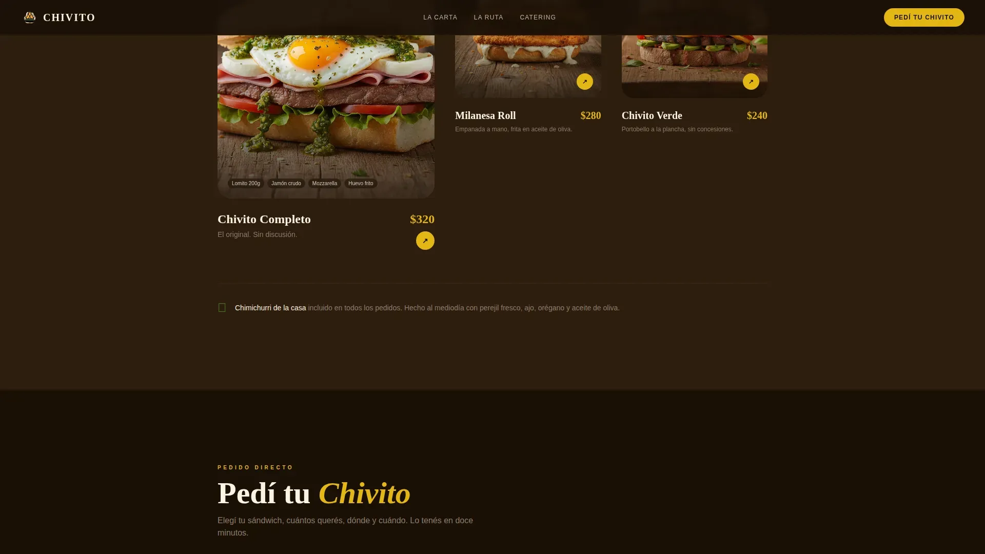
| La Carta | Asymmetric menu grid with photo cards for three sandwich variants |
| Pedí Ahora | Inline order form with sandwich picker, quantity, location dropdown, and time-slot picker |
| Asado de Oficina | Dark catering banner for bulk orders over twenty units |
| La Ruta | Weekly truck schedule grid showing daily locations |
| Footer | Minimal horizontal flow with social media link |
Design & branding system
The visual identity follows an Agrarian Root theme expressed through the Citrus Burst color system. The palette feels like a halved lemon squeezed over blackened iron: bright acid hitting dark, seasoned metal. Every color decision references the physical truck itself, from the scorched exterior to the vivid produce piled on the prep counter. Fraunces serif headlines carry the weight of hand-lettered signage, while DM Sans body copy keeps reading easy and fast.
- Color palette: scorched lemon (#E2B714) as primary, sun-dried campo gold (#C9A227) as secondary, deep quebracho char (#1A1006) as the dark background, cream (#FAF3E0) for text fields, and fresh chimichurri green (#4A7C2E) for accent buttons and garnish details
- Typography: Fraunces for all headlines to evoke hand-painted truck signage; DM Sans for body text to keep menus, order labels, and form fields easy to read at small sizes
- Scroll animation style: high animation with scroll-reveal words, image zoom on entry, fade-in section transitions, and a sticky call-to-action button that persists throughout the scroll
Mobile & speed optimization
Construction crews order on phones while standing at a worksite. Office managers tap through a bulk order during a ten-minute break. The template is built mobile-first so every tap target, form field, and photo card works at thumb-reach without pinching or zooming. Images are lazy-loaded to keep the initial view fast, even on a slower connection in the field.
- Mobile-first layout where every section, form, and button is sized and spaced for single-hand phone use
- Lazy-loaded photography so the hero image and sensory scroll photos do not block the page from becoming interactive
- Quantity steppers, location dropdowns, and time-slot pickers are all touch-optimized with generous tap targets for outdoor use
How this template helps you convert
This template treats the food itself as the primary sales argument. The design gets out of the way and lets the photography, the sensory scroll, and the frictionless order form do the work. Visitors who arrive curious leave with a confirmed order because every section moves them one step closer to the checkout moment.
- The full-bleed hero and sensory scroll sections create immediate appetite and establish the grill's authenticity, so visitors arrive at the order form already wanting the food rather than needing to be persuaded by text
- The sticky "Pedí tu Chivito" button and the compact inline order form reduce the number of steps between decision and confirmation, making it easy to complete an order in under two minutes on a mobile device
- The catering banner separates bulk-order intent from individual orders, allowing office managers to find their own path forward without disrupting the single-order flow for lunchtime customers
Other information about this template
This template was designed specifically around the cultural weight of the chivito, Uruguay's national dish. The origin of the chivito is traced back to 1944 in Punta del Este, and since then it has become the most recognized sandwich in the country. The classic chivito completo is served with churrasco steak, ham, bacon, mozzarella cheese, lettuce, fresh tomato, and a fried egg on top. Hand-cut fries, known as papas fritas, are the natural companion. The chivito al plato is a low-carb variation served on a dish instead of bread, and the template's menu grid can display this variant alongside the standard sandwich options.
Uruguayan cuisine carries strong Italian and Spanish culinary roots, and that heritage shows up in the way the food is built: layered, generous, and unapologetically good. Uruguay is known for its high-quality beef, a fact that anchors the entire truck concept. Every similar food truck in the market that tries to compete needs to justify its beef quality, and this template gives you the visual and structural tools to show yours without a single line of persuasion copy.
Beyond the plate, the template supports a complete social media strategy. Social media is a powerful tool for food trucks to engage with customers and promote their offerings, and the footer's Instagram link is the starting point. Food trucks can use social media platforms to announce their locations and daily specials, which pairs naturally with the "La Ruta" weekly schedule section. Visual content such as photos and videos of food can significantly enhance engagement on social media for food trucks, and the sensory scroll sections give you ready-made content moments to share. Engaging with customers through comments and messages on social media can help build a loyal community around a food truck. Using hashtags related to food and local events can increase visibility for food trucks on social media, and the template's photography-first layout makes it easy to pull frames for those posts. Collaborating with local influencers can help food trucks reach a wider audience on social media. Food trucks should regularly update their social media profiles to keep followers informed about menu changes and special events. Running social media contests or giveaways can encourage customer interaction and increase brand awareness for food trucks, and the template's structure makes it simple to reference those campaigns from the page.
The template page is localized for Uruguay: prices display in UYU currency, dates follow the DD/MM/YYYY format, and all interface labels are written in Uruguayan Spanish. This matters for lunchtime crews who are scanning a phone screen quickly and need to read everything at a glance without translating in their heads.
Successful food trucks often focus on specific cultural cuisines to attract a dedicated customer base, and this template is built around exactly that logic. Food trucks that present their offerings online effectively can enhance their visibility and customer engagement. Trust and social proof can be established through customer reviews that highlight descriptives like "juicy," "flavorful," and "best sandwich." The template's structure allows you to add review callouts without disrupting the visual flow. Food trucks that offer a diverse menu often attract a wider audience and can cater to various dietary preferences, and the three-card menu grid in "La Carta" gives you space to show that range clearly. Successful food trucks often participate in local events and festivals to increase their exposure and customer base, and the catering banner section is the right place to promote your presence at those events.
The design aesthetic is rustic, warm, and inviting, incorporating the visual weight of wood textures and warm colors that feel at home in a market or a construction-site lunch break. A compelling hero section built around a full-bleed view of beef being grilled over an open, wood-fired flame communicates the truck's core value proposition in the first breath. High-quality images of the food significantly enhance the visual appeal of the landing page, and the template's layout is structured to make those images the dominant element on every screen. A well-structured layout that guides the user through the content can improve user experience and increase conversion rates on the landing page, and this template's six-section flow is built with that logic at every step.
The template handles all the practical information a curious visitor needs before placing an order:
- The hero's floating schedule card and the "La Ruta" grid both display daily location, hours, and neighborhood so regulars and new visitors alike can find the truck
- The order form's location dropdown is synced to the weekly route, removing the chance of a customer selecting a pickup spot the truck will not visit that day
- The "Asado de Oficina" catering section covers bulk-order details for groups of twenty or more, giving office managers a clear path forward without a phone call
- The footer includes a "Seguinos en Instagram" link so visitors can follow along for real-time location updates, daily specials, and any weather-related schedule changes
- The page is written in Uruguayan Spanish with UYU pricing, DD/MM/YYYY date format, and culturally specific copy that speaks directly to the local audience
Whether the buyer is a market wanderer who happened to catch the smoke trail on a cool morning near the feria, a worksite foreman placing a bulk order before the day shift ends, or an event organizer looking for something more interesting than pizza and empanadas at the next team lunch, this template gives them a clear, fast, and trustworthy path to placing that order.
Theme
Agrarian Root
Creative direction
Sensory Appeal
Color system
Citrus Burst
Style
Hero-Dominant (90/10)
Direction
Direct Sales
Page Sections
Full-bleed Hero with Schedule Card
Sensory Scroll Experience
Inline Order Form with Time Slots
Sticky Call-to-action Button
Catering Banner for Bulk Orders
Weekly Truck Route Grid
Related questions
What sections are included in this template?
Is this template built for mobile users?
Can this template handle catering and bulk orders?
What order form fields are included?
What makes this template specific to Uruguayan food culture?



