Pool Builder Local SEO Landing Page Template
Chlorine is a local SEO landing page template built specifically for pool construction companies targeting B2B partners. It leads with a live-stats dashboard, walks skeptical buyers through objection-driven comparison tables, and ends with a focused territory audit request form. The design uses a contractor-spec color palette to keep every element purposeful and conversion-ready.
by Rocket studio
Quick summary
Chlorine is a single-page local SEO landing page template designed for pool builders selling to B2B partners. It opens with a metrics dashboard, moves through FAQ-led comparison sections, and closes with a qualified lead capture form. The layout feels like a laminated spec sheet: precise, utilitarian, and built to close deals.
Who this template is for
This template is built for pool construction businesses that need to demonstrate their local search authority to commercial partners, not just homeowners. If your growth depends on signing general contractors, real estate developers, or property management firms, this page is structured for that conversation.
- Pool builders targeting general contractor partnerships on new residential developments
- Real estate developers and property managers evaluating SEO partners for Sun Belt HOA communities
- Pool construction companies operating across multiple metro markets who need to qualify B2B leads at scale
What problem this template solves
Most pool builder websites are built for end consumers. They show portfolios, feature lifestyle photography, and invite homeowners to request a quote. That approach leaves commercial partners cold. A skeptical operations manager wants data, comparisons, and answers to specific objections before they pick up the phone.
- No clear way to communicate local search performance to a business-minded audience
- Generic SEO landing pages that fail to address contractor-specific objections around off-season rankings or multi-location profiles
- No structured path for warm B2B leads who are comparing providers but not yet ready to call
What you get with this template
You get a fully structured, objection-driven landing page that leads with proof and earns trust before asking for anything. Every section is built around the questions a real operations manager would ask when evaluating a local SEO service.
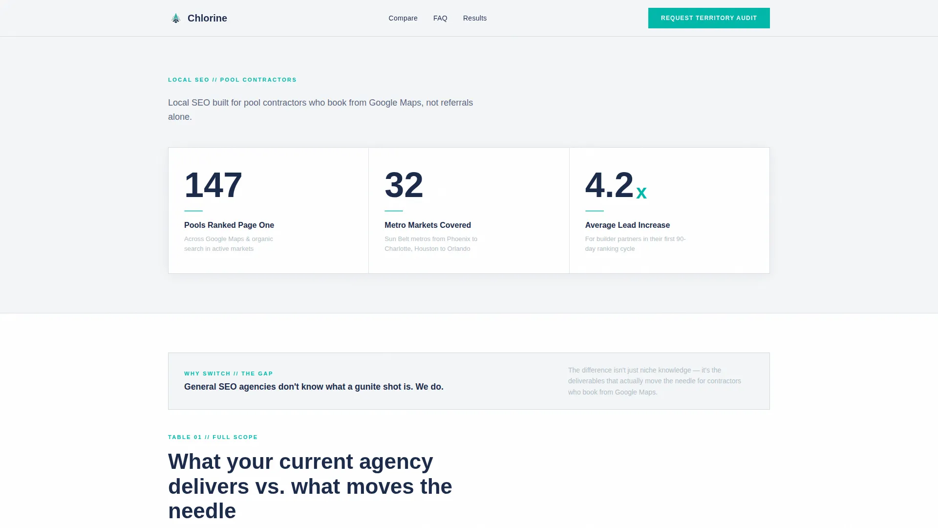
- A live-stats header dashboard showing three key performance metrics to anchor credibility immediately
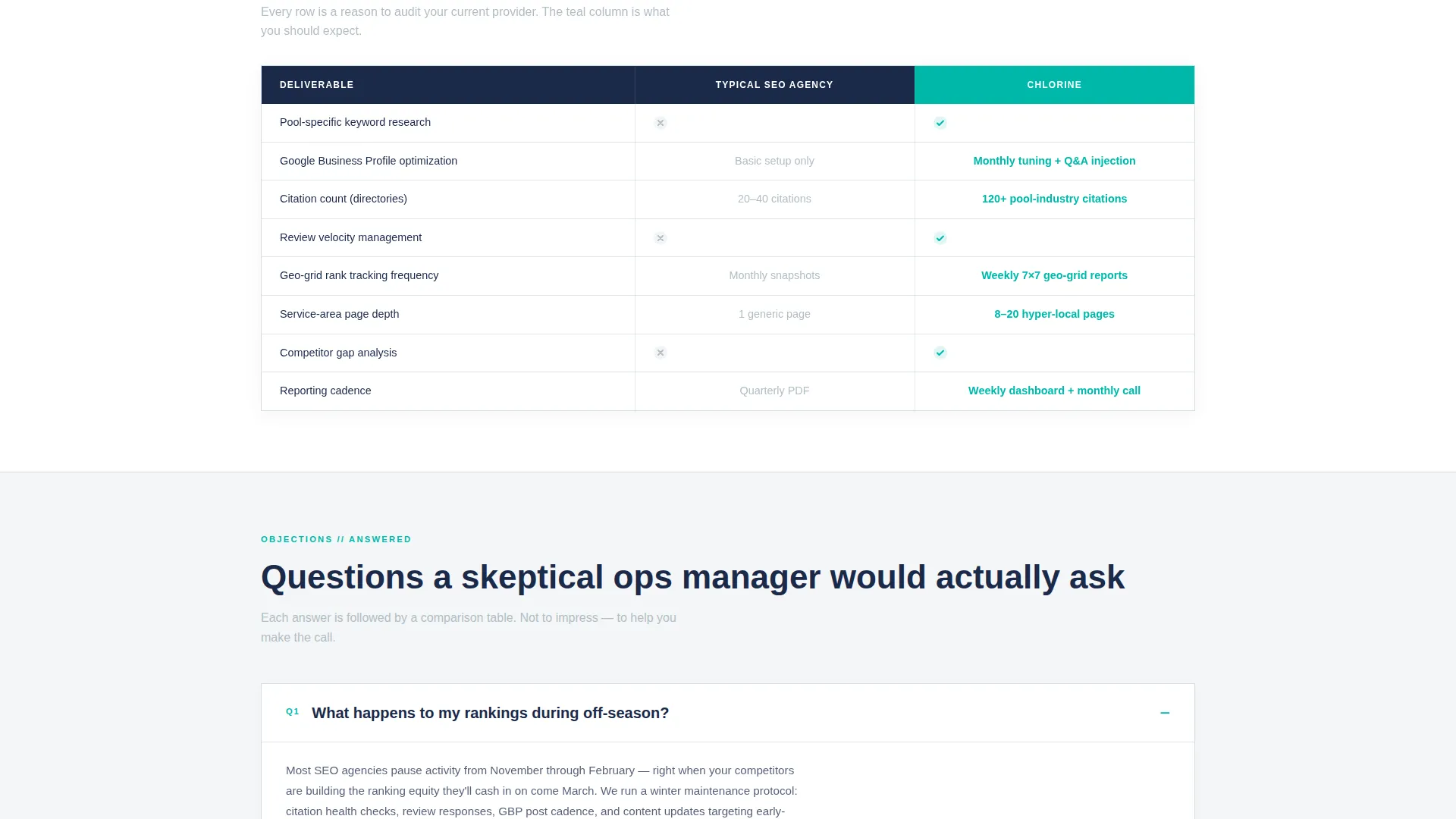
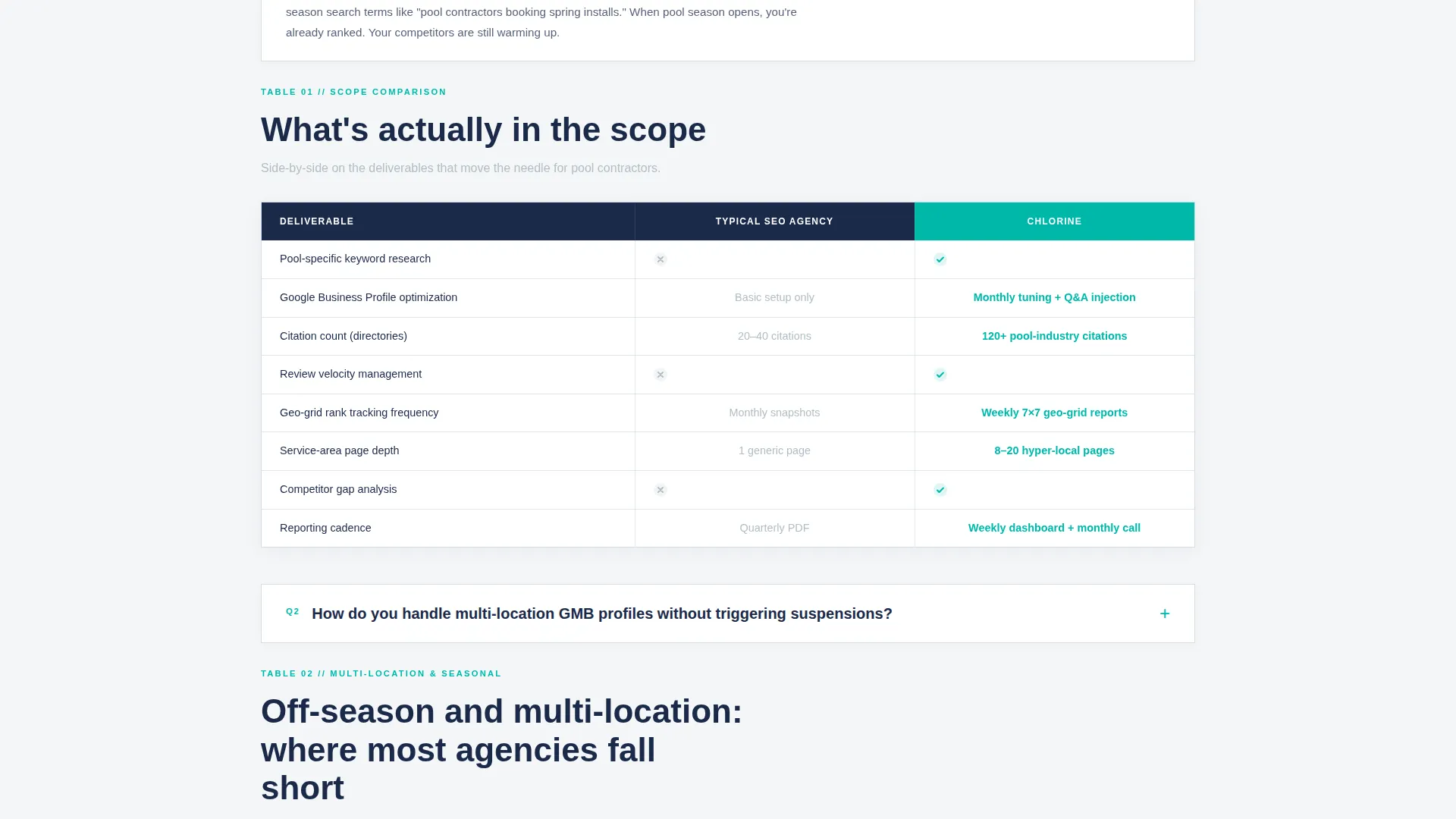
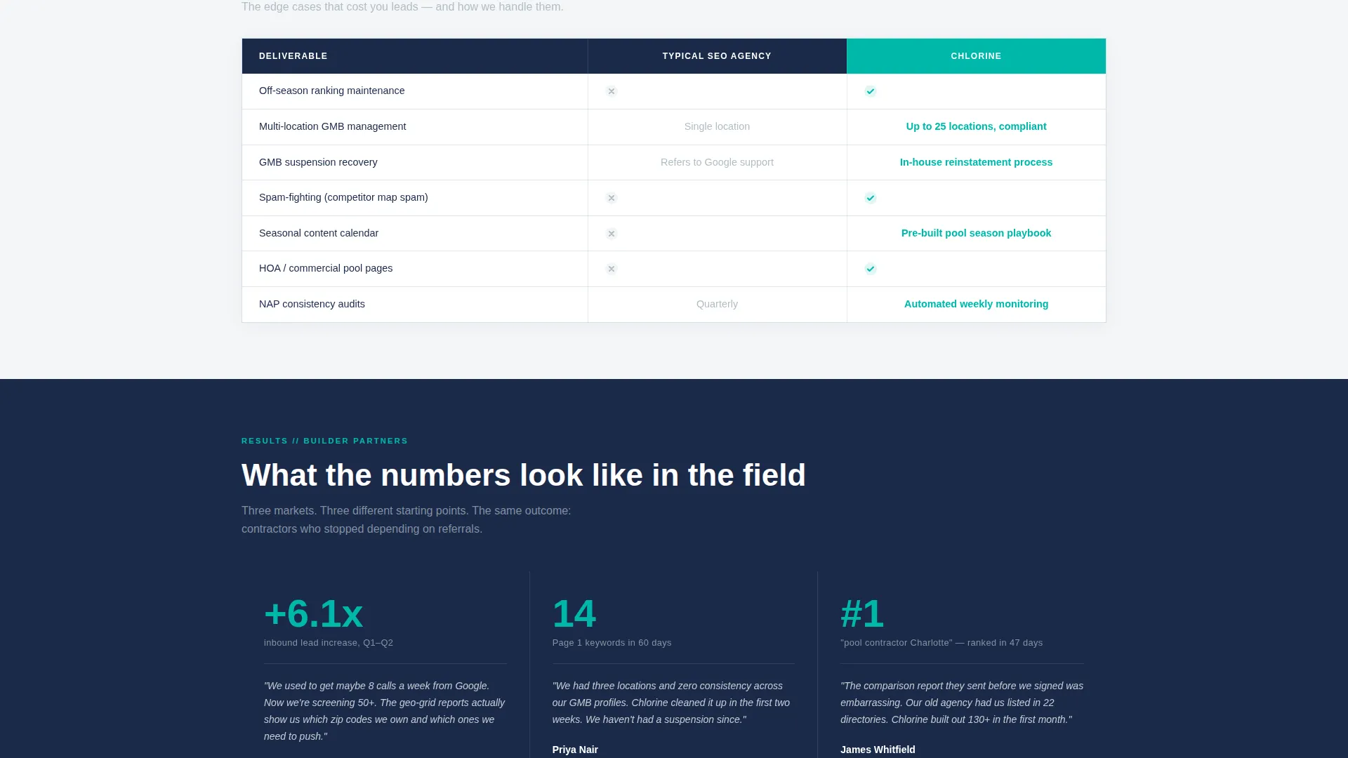
- Multiple comparison tables formatted as decision tools, with teal checkmarks that build visual momentum as visitors scroll
- A dual conversion path: a territory audit request form for ready buyers and a gated case study PDF for warm leads still comparing options
Feature list
This template includes prompt-backed components designed specifically for pool builder local SEO positioning.
Live Metrics Dashboard Header
Three large counters display performance figures against a soft overcast white background. Numbers are typeset in deep equipment-shed navy, with a subtle teal pulse beneath each figure. There is no hero image. The numbers do the selling on their own.
FAQ-Driven Objection Sections
Each scroll section opens with a real contractor question, such as how rankings hold during off-season or how multi-location profiles are managed without triggering issues. The question is answered in plain language before a comparison table reinforces the point.
Side-by-Side Comparison Tables
Each comparison table contrasts a typical SEO provider's deliverables against this service's scope. Rows cover citation counts, review velocity management, geo-grid tracking frequency, and service-area page depth. Teal checkmarks stack downward to build visual decision momentum.
Dual-Path Lead Capture
The primary path collects company name, number of service locations, current monthly lead volume via dropdown, and a free-text field for the visitor's biggest ranking frustration. The secondary path offers a gated case study PDF for leads who are comparing but not ready to call.
Floating call to action Bar
After a visitor reaches sixty percent scroll depth, a pinned floating bar appears with the primary call to action: "Request a Territory Audit." This keeps the conversion trigger visible without interrupting the reading flow earlier in the page.
Service Utility Visual System
The Cloud Canvas color system uses four purposeful values: soft overcast white for the field, permit-office gray for secondary elements, deep equipment-shed navy for typographic weight, and chlorine-indicator teal reserved for active states, toggles, and all call-to-action surfaces.
Page sections overview
| Section | Purpose |
|---|---|
| Stats Dashboard Header | Opens with three live performance counters to establish immediate credibility |
| Subhead Positioning Line | Single line anchoring the local SEO value proposition for pool contractors |
| Objection Section One | FAQ-led section dissolving the first key contractor objection with plain language |
| Comparison Table One | Side-by-side deliverable breakdown following objection section one |
| Objection Section Two | FAQ-led section addressing a second contractor objection around multi-location management |
| Comparison Table Two | Second decision-tool table reinforcing reasons to switch providers |
| Territory Audit Form | Primary B2B lead capture form with four structured fields |
| Gated Case Study Path | Secondary email-gated PDF download for warm leads still in evaluation mode |
| Floating call to action Bar | Pinned conversion bar that activates at sixty percent scroll depth |
Design & branding system
The visual identity follows a Service Utility theme. Every color choice is functional. The palette reads like a laminated spec sheet clipped to a contractor's clipboard: no decoration, no lifestyle photography, every element earning its space.
- Cloud Canvas color system: soft overcast white (#F4F6F8) as the background field, permit-office gray (#B0BEC5) for secondary user interface elements, deep equipment-shed navy (#1B2A4A) for all primary typographic weight
- Chlorine-indicator teal (#00B8A9) used exclusively for active states, toggle highlights, checkmarks in comparison tables, and all call-to-action surfaces
- No hero images or lifestyle photography; the header relies entirely on large-format counters and a single focused subhead
Mobile & speed optimization
The single-column flow layout is a natural fit for mobile viewing. The template is structured so that comparison tables, FAQ sections, and the floating call to action bar stack cleanly on smaller screens without losing their function as decision tools.
- Single column flow keeps the scroll linear and readable on any screen width
- The floating call to action bar is designed to remain visible and usable at mobile viewport sizes
- Comparison table rows are built to remain legible and decision-ready on narrower displays
How this template helps you convert
Chlorine is built around a specific conversion architecture. It qualifies visitors before asking them for anything, then offers two paths based on where they are in their decision process.
- The live metrics dashboard earns trust in the first three seconds, replacing the need for a portfolio or a testimonial carousel with hard numbers that a contractor audience respects immediately.
- The FAQ-to-comparison-table structure resolves objections in sequence, so by the time a visitor reaches the territory audit form, the primary hesitations have already been addressed on the page.
- The dual-path lead capture separates ready buyers from warm evaluators, ensuring that leads who download the case study PDF are also qualified by email and market area for follow-up.
Other information about this template
This template is well suited to pool construction companies operating in Sun Belt metro markets where seasonal demand and multi-location Google Business Profile management create specific local SEO challenges. The comparison table format is particularly effective for B2B audiences who are already evaluating multiple service providers. The gated PDF path adds a secondary qualification layer without requiring a sales call.
- The template style follows a single column flow, keeping the content hierarchy clear and the scroll experience linear
- The creative direction is Stats-First Impact, meaning the most credible numbers appear before any explanatory copy
- The header concept is built around a dark, high-contrast dashboard rather than imagery, which suits the contractor audience's preference for data over lifestyle presentation
- The landing page direction is oriented toward booking and scheduling conversions, with the territory audit form as the primary action and the case study PDF as the secondary path
Theme
Editorial Magazine
Creative direction
Stats-First Impact
Color system
Arctic White
Style
Single Column Flow
Direction
Booking/Scheduling
Page Sections
Live Metrics Dashboard Header
Faq-driven Objection Sections
Side-by-side Comparison Tables
Dual-path Lead Capture Form
Floating Territory Audit Call to Action Bar
Service Utility Color System
Related questions
What type of business is this landing page template built for?
Can the comparison tables be edited to reflect my own service scope?
What information does the territory audit form collect from leads?
How does the gated case study download qualify warm leads?
Is this template a good fit for a single-location pool builder?



