Local Brick & Mortar Business Professional Website Template
Chord is a curated music store landing page template built for instrument retailers who want their online presence to feel as considered as their floor. A scroll-reveal layout guides visitors from hero search to category reveals, warming up intent before every click. The Citrus Burst palette and progressive photography create the atmosphere of stepping into a boutique showroom.
by Rocket studio
Quick summary
Chord is a single-page, scroll-reveal landing page template designed for boutique music retailers. It leads with an oversized search experience, then walks visitors through instrument categories using progressive photo reveals. Each section deepens the store's atmosphere, from acoustics to vintage studio gear, before routing buyers to a filtered catalog or an in-store booking link.
Who this template is for
This template suits independent music retailers who want their online presence to reflect the quality and curation of their physical store. It works equally well for established shops and newer boutique spaces building credibility fast.
- Boutique instrument shops stocking curated, hard-to-find, or vintage gear
- Local music stores offering in-store play sessions alongside their retail inventory
- Retailers selling across categories such as acoustic, electric, and studio production gear
What problem this template solves
Most retail music store pages look like warehouse listings. They overwhelm visitors with filters and grids before those visitors have any emotional connection to the inventory. Chord solves this by letting the scroll do the qualification work.
- Visitors arrive at a warm, searchable hero instead of a cluttered product grid
- Progressive category reveals pre-qualify buyer intent before anyone reaches the catalog
- Secondary calls to action like the session booking link reduce friction for high-consideration purchases
What you get with this template
You get a fully structured, single-page layout that combines atmosphere with function. Every section is purposefully sequenced to move visitors from curiosity to confident clicks.
- A scroll-reveal page with progressive section loading tied to visitor scroll depth
- An oversized, centered search box hero with animated placeholder text cycling through instrument examples
- Category reveal sections that transition from close-up detail shots to full lifestyle photography
- Primary and secondary call-to-action blocks placed after each category reveal
- A click-through architecture where every call to action routes to a filtered catalog page or booking scheduler
Feature list
This template delivers a focused set of design and layout features drawn directly from its brief. Each feature supports the store's curated identity.
Scroll-Reveal Progressive Layout
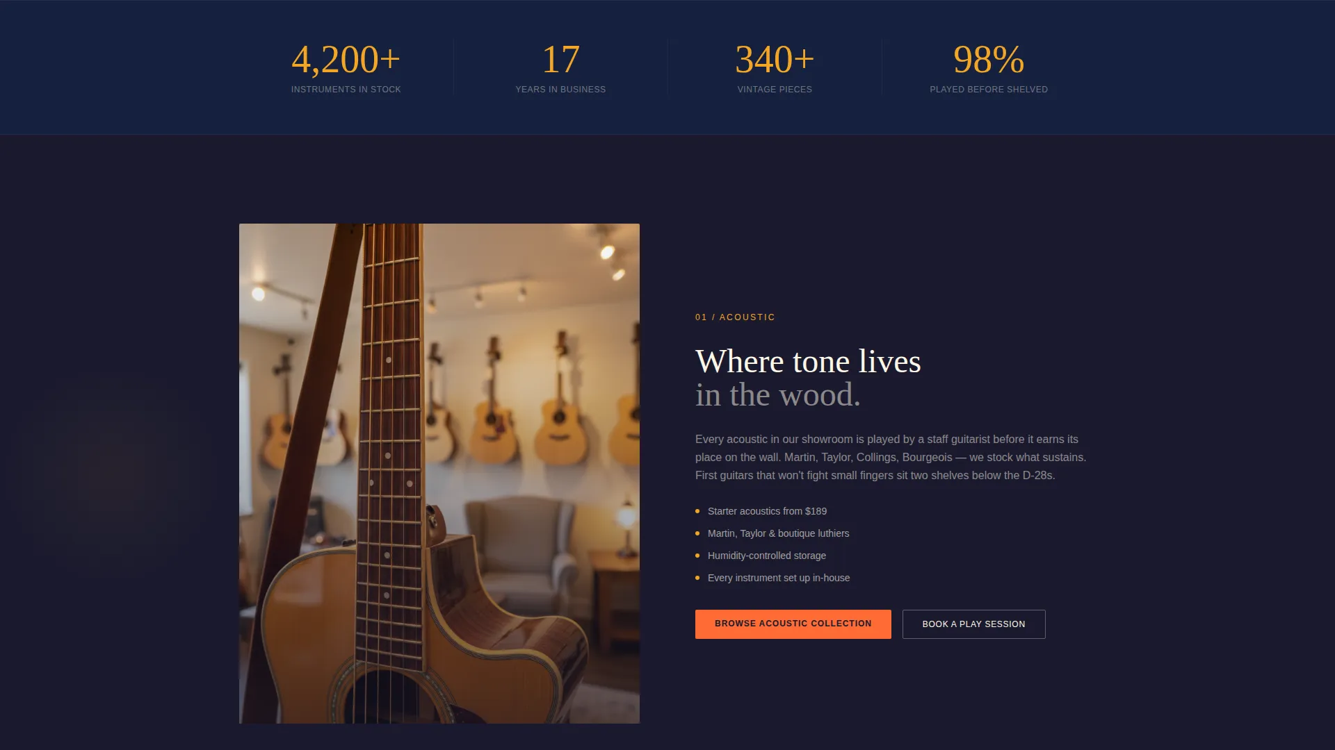
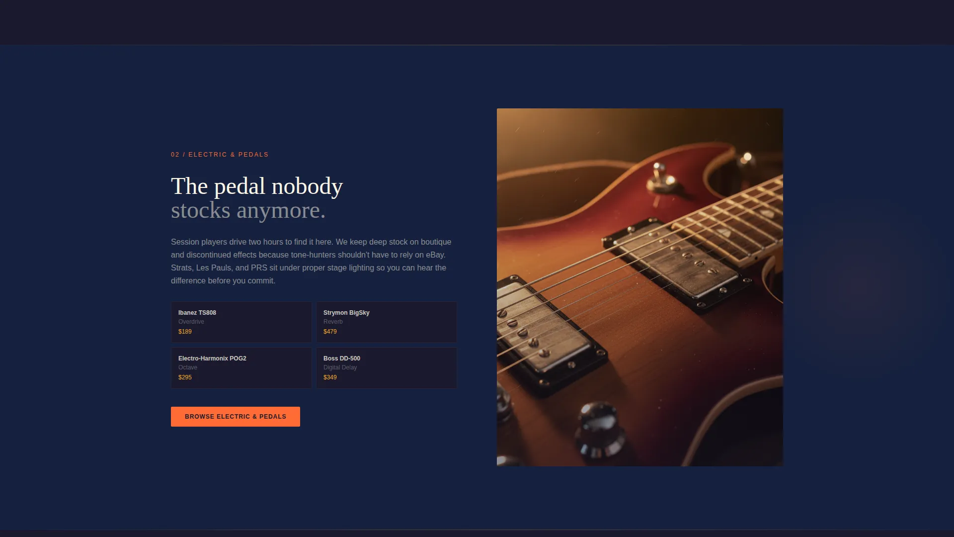
Each section loads as the visitor scrolls, rewarding attention with increasingly covetable inventory reveals. The layout escalates from acoustic to electric to studio to vintage, mimicking the experience of walking deeper into a well-stocked shop.
Animated Search Box Hero
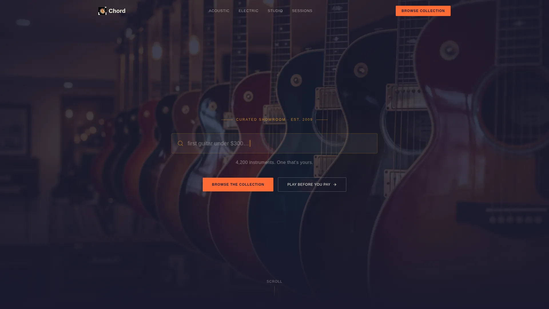
The header centers an oversized search field on a deep charcoal background. A slow-pulsing tangerine cursor and cycling placeholder text ("1964 Stratocaster...", "Moog Grandmother...", "first guitar under $300...") invite interaction before any other element competes for attention.
Before-and-After Photo Reveal Sections
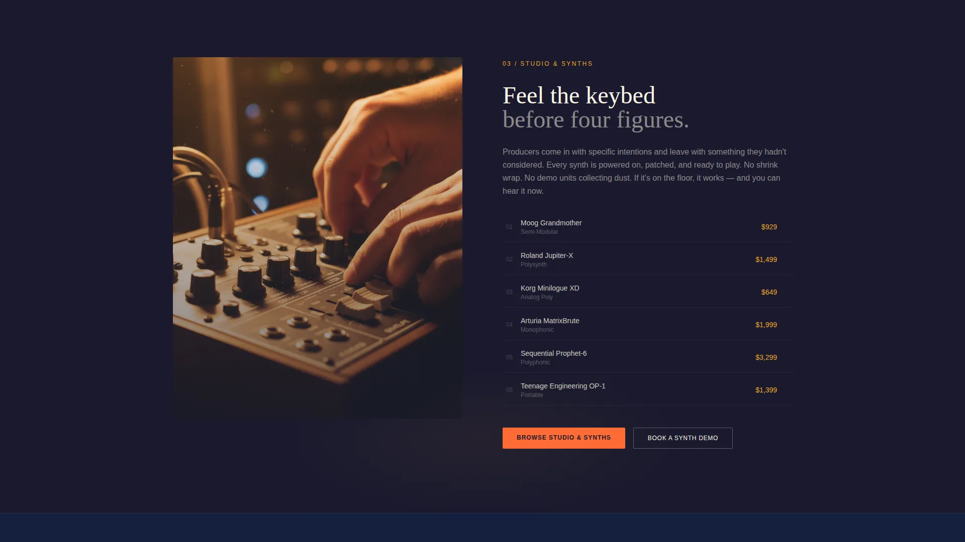
Each category section opens with an isolated close-up detail, such as a tuning peg or a fader knob, then progressively reveals the full instrument in a lifestyle context. Player hands appear on strings or keys as the image completes, adding warmth and credibility.
Citrus Burst Color System
The palette pairs deep charcoal showroom walls with warm amber, tangerine, and bleached cream. Accent colors are used sparingly so they land with impact, guiding the eye to calls to action and key moments without distracting from the photography.
Click-Through call to action Architecture
There is no cart on this page. Every call-to-action either routes to a filtered catalog section or to a session booking link. This keeps the page focused on pre-qualifying intent and reducing decision fatigue before the visitor reaches the full shop.
In-Store Session Booking Link
A secondary call to action labeled "Play Before You Pay - Book a Session" appears alongside category reveals. It connects to an in-store appointment scheduler, supporting high-consideration purchases where feel and playability matter most.
Page sections overview
| Section | Purpose |
|---|---|
| Search Box Hero | Invites instrument discovery through an animated, oversized search field |
| Subheadline Strip | Anchors the hero with a single reassuring inventory line in cream text |
| Acoustic Category Reveal | Opens the scroll journey with close-up acoustic details progressing to lifestyle shots |
| Electric Category Reveal | Deepens the narrative with electric instrument photography and a filtered catalog call to action |
| Studio Gear Reveal | Transitions the mood toward production gear with detail-to-environment photography |
| Vintage Collection Reveal | Surfaces rare and hard-to-find stock as the reward for scrolling to the back of the store |
| Primary call to action Block | Recurs after each reveal with "Browse the Collection" in tangerine |
| Session Booking call to action | Offers the "Play Before You Pay" appointment link for high-consideration buyers |
Design & branding system
The visual identity follows a Luxe Minimal direction, where restraint is the default and the accent palette does heavy lifting only where attention should land. The result feels like a single overhead bulb casting honey light across a quiet showroom.
- Color system: deep charcoal (#1A1A2E) as the base, warm amber (#F5A623) and tangerine (#FF6B35) as focal accents, and bleached cream (#FFF8E7) for open breathing space
- Typography and spacing lean minimal, letting the photography carry emotional weight while text stays clean and purposeful
- Photography direction uses shallow depth-of-field images with amber-lit lacquer finishes, transitioning from isolated product close-ups to hands-on lifestyle contexts
Mobile & speed optimization
The template is designed to maintain its atmospheric quality across screen sizes. The scroll-reveal behavior and photo transitions are structured to feel intentional on both desktop and mobile viewports.
- Scroll-triggered section reveals are sequenced so that each category loads progressively, keeping the page light in the initial view
- The search hero and call to action blocks are centered and stacked cleanly for touch-first navigation on smaller screens
- Photography sections are structured to maintain focus and composition at reduced widths without losing the depth-of-field mood
How this template helps you convert
The page earns clicks by building desire before presenting a choice. Every layout decision reduces hesitation and guides visitors toward confident action.
- The animated search box opens with an invitation rather than a category menu, so visitors arrive curious rather than overwhelmed
- Progressive scroll reveals pre-qualify buyer intent by category, meaning visitors who reach the vintage section already know what they are looking for
- Every call to action appears after a moment of visual payoff, placing "Browse the Collection" and the session booking link exactly when visitor interest peaks
Other information about this template
Chord was built with the intersection of curated retail and boutique local commerce in mind. It suits any music retailer who wants their landing page to feel less like a storefront and more like an experience.
- The template's Marketplace and Multi layout direction means it can support a range of inventory categories within a single scroll journey
- The Masonry and Pinterest-inspired visual flow organizes imagery in a way that feels editorial rather than transactional
- The Neo-Retro theme gives the design a timeless quality, referencing the warmth of analog instrument culture without looking dated
- The Unboxing Experience creative direction informs how each category reveal is staged, building anticipation before the full instrument is shown
- The Full-Bleed Photo header concept is realized through the shallow depth-of-field guitar row background behind the search field
Theme
Neo-Retro
Creative direction
Unboxing Experience
Color system
Citrus Burst
Style
Masonry/Pinterest
Direction
Marketplace/Multi
Page Sections
Scroll-reveal Progressive Layout
Animated Search Box Hero
Before-and-after Photo Reveal
Click-through Call to Action Architecture
Citrus Burst Color System
In-store Session Booking Call to Action
Related questions
Does this template include a shopping cart or checkout flow?
Can I adapt this template for a store selling only one instrument category?
How does the animated search box work?
Can the session booking call to action be used for lessons or repair services?
What makes this landing page different from a standard product grid layout?



