Fashion E-Commerce Pricing & Packages Website Template
Closet is a scroll-reveal landing page template built for fashion rental platforms. It opens with a full-viewport UGC photo wall, then guides visitors through a horizontal rack browse, a live rental ticker, a style quiz, and a progressive plan comparison module. Every section is designed to convert free-tier members into paid unlimited subscribers.
by Rocket studio
Quick summary
Closet is a single-page, scroll-reveal template for fashion rental platforms. It combines a masonry UGC photo wall, a swipeable rack carousel, a live rental ticker, a three-step style quiz, and a progressive plan comparison into one high-energy, mobile-first flow. The goal is to turn free-tier members into paying subscribers by making the upgraded experience feel irresistible.
Who this template is for
This template is built for fashion rental platforms that already have a free-tier member base and want to move those members to a paid subscription. It suits teams who want editorial impact without building custom interactions from scratch.
- Fashion rental businesses running a freemium-to-paid upgrade funnel
- Platform teams targeting wedding-season marathoners, style-obsessed twenty-somethings, and fashion editors as their core audience
- Designers and developers who need a dark, dopamine-pop editorial aesthetic ready to customise
What problem this template solves
Free-tier members often stall. They browse, they like the idea, but they do not feel the pull strongly enough to upgrade. A static pricing page does nothing to solve that. This template replaces a flat comparison table with a living, scrollable experience that builds desire section by section.
- It removes the "I'll think about it" hesitation by showing real members wearing real pieces right now
- It surfaces the financial case for upgrading through concrete member value data, not abstract promises
- It structures the entire page around a single conversion goal, so no section pulls attention in the wrong direction
What you get with this template
You get a fully structured, single-page scroll-reveal layout with five distinct content sections and a footer. Every section is purpose-built and ready for your content. The interactions are defined and the visual hierarchy is set.
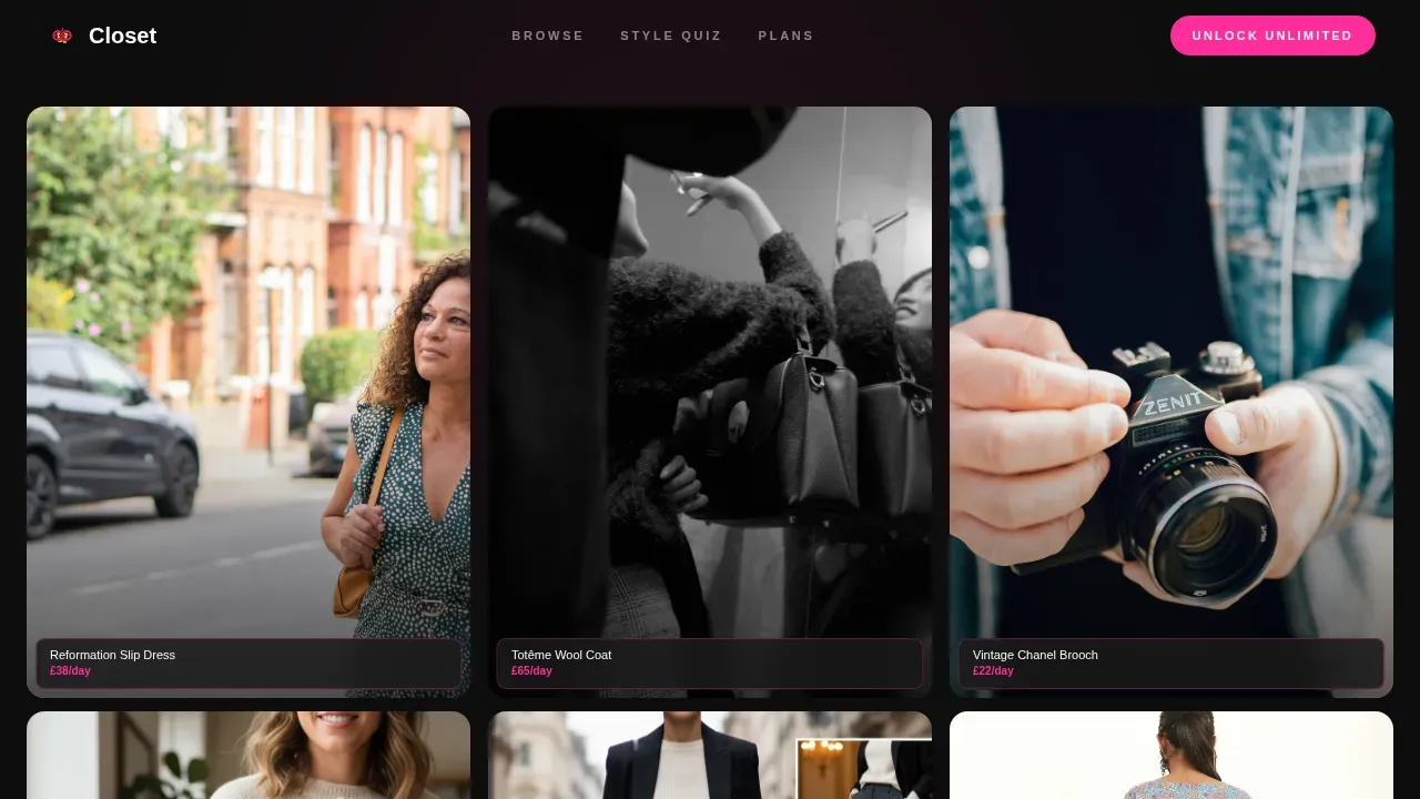
- A full-viewport UGC masonry hero with staggered bounce animations and floating item tags
- A horizontal swipe rack carousel, a live rental ticker stream, a three-tap style quiz with capsule reveal, and a progressive plan comparison with member ROI math
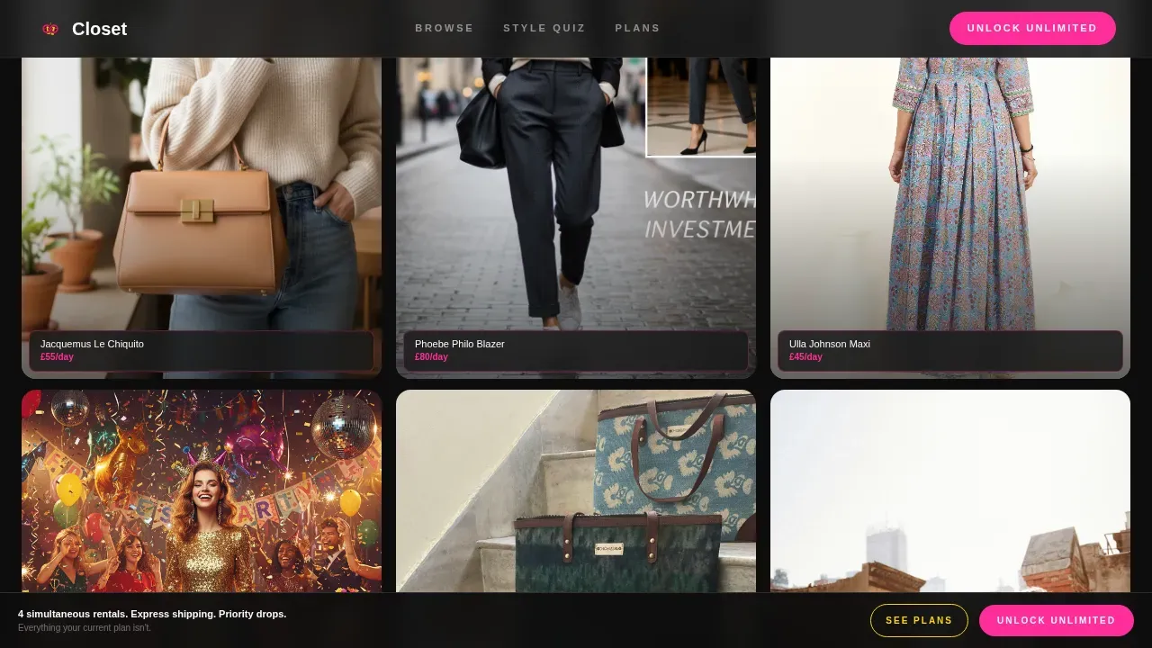
- A sticky fuchsia "Unlock Unlimited" call-to-action button that pins to the viewport after the first scroll, plus a secondary yellow-outline soft-commitment call to action
Feature list
This section walks through the core built-in features that make Closet work as a conversion-focused fashion rental landing page.
Full-Viewport UGC Masonry Hero
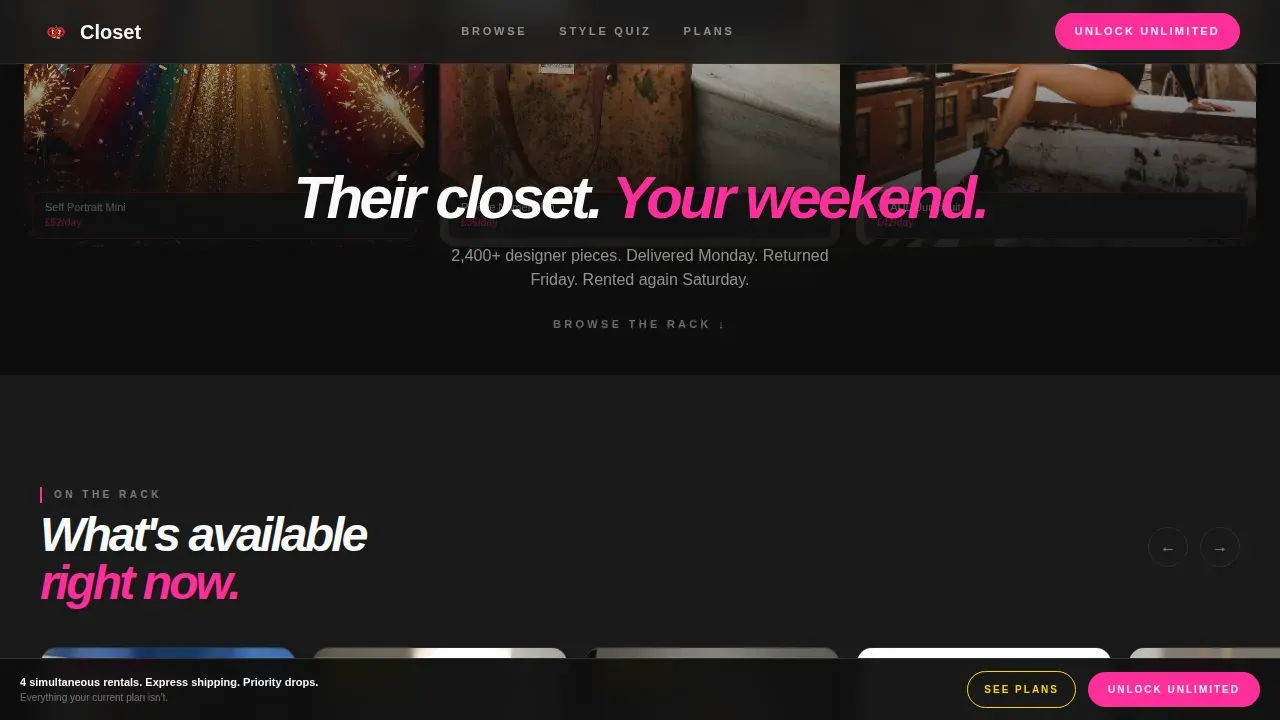
The page opens with a masonry grid of real-life member photos. Each tile enters with a micro-bounce animation using staggered timing. Every image carries a small floating tag showing the item name and rental price. A single tagline fades up from below once the grid settles: "Their closet. Your weekend."
Horizontal Rack Swipe Carousel
After the hero collapses, the template reveals a curated horizontal "rack" that visitors swipe through. The gesture mimics physically browsing hangers, making the catalog feel tactile and explorable rather than flat and digital.
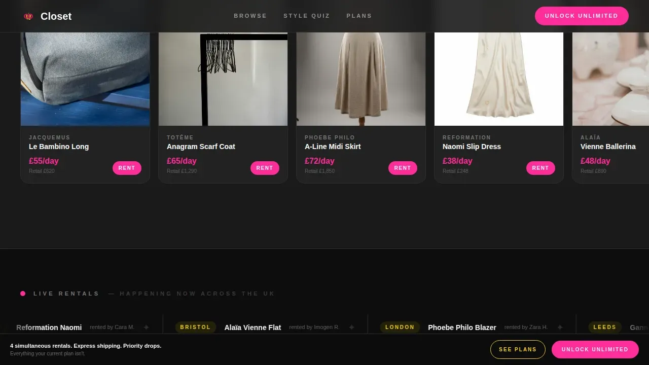
Live Rental Ticker Stream
A real-time ticker streams city names and item names in an airport-departures style. This section creates a sense of live activity and scarcity, showing visitors that pieces are moving right now across the platform.
Three-Step Style Quiz Micro-Interaction
Three either/or image taps instantly surface a personalised capsule wardrobe suggestion. The interaction alternates the page rhythm between voyeuristic discovery and personal activation, building a compounding sense of craving as the visitor scrolls.
Progressive Plan Comparison Module
Instead of a static comparison table, each benefit of the upgraded tier is revealed one at a time as the visitor scrolls. The current plan's limits appear first, then the upgraded plan's unlock follows. The section closes with a real member's twelve-month rental history: forty-seven pieces worn, £31,400 in retail value, £588 in membership cost.
Sticky Dual Call-to-Action Bar
A fuchsia "Unlock Unlimited" button pins to the bottom of the viewport after the first scroll. A secondary yellow-outline button, "Try One Month, Cancel Anytime," captures hesitant visitors without adding friction to the primary conversion path.
Page sections overview
| Section | Purpose |
|---|---|
| UGC Photo Wall Hero | Opens with a full-viewport masonry grid of member photos; floating item tags and a single tagline set the tone |
| Rack Browse Carousel | Horizontal swipe interaction mimics physical browsing; transitions the visitor from observer to shopper |
| Live Rental Ticker | Airport-style stream of current rentals by city and item; builds urgency and social proof simultaneously |
| Style Quiz Interaction | Three-tap either/or image quiz reveals a personalised capsule; shifts the page from discovery to personal desire |
| Plan Comparison Module | Progressive scroll-reveal unlocks each upgraded benefit one at a time; closes with member ROI math |
| Footer | Horizontal flow footer pattern for navigation and platform links |
Design & branding system
The visual identity follows a Directory and Discovery theme expressed through a Dopamine Pop colour palette. Black dominates the background so garments appear spotlit. Fuchsia fires on hover states and primary call-to-action buttons. Yellow punctuates badges, member tier labels, and notification pings. White holds typography and negative space so the eye can recover between high-energy moments.
- Colour palette: electric fuchsia (#FF2D9B), serotonin yellow (#FFD600), deep wardrobe black (#1A1A1A), and cloud white (#FAFAFA)
- Typography: Plus Jakarta Sans at 800/900 italic weight for headlines and 500 weight for body copy
- Visual tone: dark editorial, flash-of-a-party-camera immediacy, walk-in closet fantasy
Mobile & speed optimization
This template is built mobile-first, reflecting the Instagram-native behaviour of its target fashion audience. Desktop is treated as an enhancement layer rather than the primary canvas. Interactions are designed for thumb-driven browsing.
- Images are lazy-loaded to avoid blocking the initial render on mobile connections
- The Swiper library powers the horizontal rack carousel with smooth touch-swipe support
- IntersectionObserver drives the scroll-reveal animations so they fire at the right moment on any screen size
How this template helps you convert
Every section in this template is sequenced deliberately to move a free-tier visitor toward an upgrade decision. The page does not present a static offer; it builds a feeling across multiple scroll moments before the ask arrives.
- The UGC hero establishes desire immediately by showing real people wearing real rented pieces, with visible item names and prices right on screen, so the value feels tangible before a single word of copy is read.
- The live ticker and style quiz compound that desire by making the experience feel personal and alive, shifting the visitor's mindset from "browsing a platform" to "this is my wardrobe."
- The progressive comparison module closes the loop by revealing upgraded benefits one at a time and ending with the member ROI calculation, forty-seven pieces worn for £588, so the financial argument lands without feeling like a hard sell.
Other information about this template
This template is localised for a United Kingdom audience. Pricing is displayed in British pounds (GBP), dates follow the DD/MM/YYYY format, and city references lean London-centric. The footer uses a horizontal flow layout pattern suited to platform-style navigation.
- Animation intensity is high throughout: staggered bounce entry on the hero, IntersectionObserver-triggered reveals on each section, ticker scroll on the live stream, and transition effects on the style quiz
- The template is built as a single scroll-reveal landing page, not a multi-page site, so all conversion logic lives within one continuous flow
- The style quiz interaction is a three-tap micro-interaction designed to surface a personalised capsule result; it is a front-end interaction pattern included in the template structure
Theme
Directory & Discovery
Creative direction
Surprise & Delight
Color system
Dopamine Pop
Style
Scroll Reveal (Progressive)
Direction
Upsell/Upgrade
Page Sections
UGC Masonry Hero with Floating Tags
Horizontal Rack Swipe Carousel
Live Rental Ticker Stream
Three-tap Style Quiz with Capsule Reveal
Progressive Scroll-reveal Plan Comparison
Sticky Dual Call-to-action Bar
Related questions
Who is this landing page template designed for?
Can I customise the colours and typography?
Does the template include the style quiz interaction?
Is this template suitable for mobile users?
How does the plan comparison section work?



