Trendy Direct Sales Community Landing Page Template
The Familyvlog Futuristic Neon Masonry Direct Sales Landing Page Template is built for family vlog channels ready to turn audience love into real revenue. It combines a glitch-flicker spotlight hero, an unevenly tiled masonry grid of merch and digital products, hover video previews, and a floating cart into one high-energy, mobile-first direct sales experience powered by personality and neon-on-chrome visual identity.
by Rocket studio
Quick summary
This template gives a family vlog channel everything it needs to sell merch, digital downloads, and exclusive content bundles from a single, personality-driven landing page. The visual system pulls from a Futuristic Neon theme: deep chrome black backgrounds, electric ruby accents, and hot neon pink calls to action that read instantly on any screen. It is designed so fans can browse, add to cart, and buy without friction, and so midnight-scrolling parents and teen superfans both feel at home.
Who this template is for
Family vlog creators do not always have the time or budget to design and build a custom storefront from scratch. This template gives them a ready-made foundation that matches the energy of their video content and converts fans into buyers without requiring development experience.
- Family vlog channels with an existing audience looking to launch merch or digital products
- Creator economy builders who want to sell exclusive bundles, bloopers, and live-event access directly to fans
- Brand managers and creator partnerships teams scouting for channels with a polished, commerce-ready presence
What problem this template solves
Most creator storefronts feel generic. They look like every other e-commerce page, which means fans scroll past without feeling the pull of the channel's personality. A family vlog lives and dies on emotional connection, and a flat product grid kills that connection before a purchase can happen.
- The template replaces a lifeless product list with a masonry grid of tiles that move, preview video clips on hover, and escalate in value as the visitor scrolls
- It removes the email gate entirely, earning the purchase through sheer volume of personality, social proof, and a countdown timer that creates real urgency
- It gives fans multiple entry points: low-price stickers and phone wallpapers in the first row, mid-tier hoodies and signed prints in the second, and premium bundles with unreleased bloopers and live Zoom hangouts in the third
What you get with this template
The template ships as a complete, single-page layout with every section pre-built and visually connected. Customizable landing page templates like this one allow for personalization to match the channel's unique theme, so swapping in real content feels like filling in a mood board rather than building from zero. Using this template saves significant time when creating a landing page for a family vlog, because the structure, hierarchy, and visual logic are already solved.
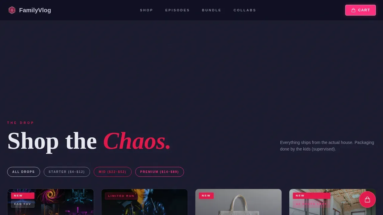
- A spotlight hero section with glitch-flicker typography, breathing spotlight animation, subscriber milestone text, and a hero call-to-action button
- A full masonry product grid with hover video simulation, "Grab It" buttons on every card, a floating persistent cart, and a tiered pricing structure
- A social proof strip, a featured bundle section with a countdown timer, a brand partners strip, and a Vercel Horizontal Flow footer
Feature list
This section breaks down the core capabilities built into the template. Each feature is drawn directly from the design brief and reflects what the finished page actually delivers.
Spotlight Hero with Glitch Typography
The hero opens on a single family freeze-frame caught under a concentrated ruby-pink spotlight. The channel name renders in oversized chrome type with a glitch-flicker animation that feels like a CRT screen waking up. A sub-line like "140 episodes. 2.6M subscribers. One ridiculous family." punches in below. The spotlight itself breathes on scroll, narrowing and expanding like a heartbeat, so the hero section stays alive as the visitor moves down the page. This kind of interactive video-adjacent motion keeps views climbing by holding attention at the very top.
Masonry Grid with Hover Video Simulation
The product grid tiles unevenly like a mood board exploding outward, which is exactly why masonry layouts are popular for displaying content in a visually appealing way. Each card auto-plays a two-second clip on hover: a kid dancing, a dad failing at a trend, a mom's deadpan reaction. The grid escalates deliberately across three rows, from entry-level digital products to mid-tier physical merch to premium bundles. Every tile moves, so momentum never dips and views on lower-priced items continue to feed interest in higher-value ones.
Floating Persistent Cart with Neon Pink call to action
A floating cart pulses gently in the corner of the screen at all times. Every "Grab It" button on every product card adds directly to this cart without a page reload or redirect. The cart's neon pink color is reserved specifically for purchase actions, which creates a visual language that trains the visitor's eye toward conversion. This persistent presence makes it easy to accumulate items across the grid before checking out.
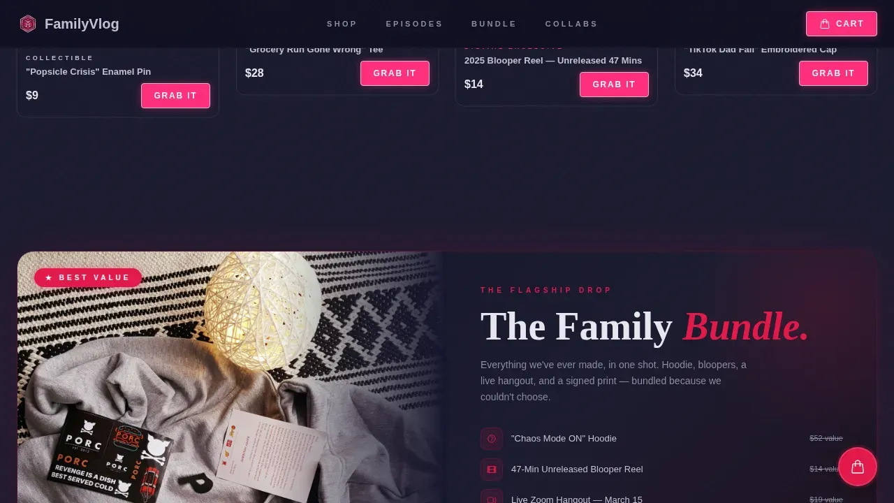
Featured Bundle Section with Countdown Timer
Below the masonry grid, a hero-level featured bundle section presents the flagship merch-plus-digital package. A countdown timer reading "Drop ends Sunday" creates urgency without feeling hollow, because the offer is specific and tied to a real window. The section uses a premium layout distinct from the card grid, signaling higher value before the visitor even reads the price. The primary call to action here reads "Get the Family Bundle."
Social Proof Strip with Animated Counters
A dedicated strip surfaces the channel's credibility in motion. Subscriber milestones, episode counts, and brand partner logos animate into view as the visitor scrolls to that section. A fan quote strip runs alongside these numbers. Social proof at this scale, 2.6M subscribers and 140 episodes, does the persuasion work that static text cannot, because it lets the audience read the community's validation before deciding to buy.
Brand Partners Strip with Authentic Positioning
The brand partners section displays collaboration logos alongside copy that frames each partnership as a "collab, not ad." This positioning matters for brand managers reviewing the channel as a potential partner. It signals that the channel takes authentic storytelling seriously, which is the same quality that makes direct sales in family vlogs work. Collaborating with brands for sponsored content is one of the clearest direct sales strategies available to family vloggers, and this section presents it transparently.
Page sections overview
| Section | Purpose |
|---|---|
| Spotlight Hero | Freeze-frame intro with glitch typography, breathing spotlight, and subscriber milestone sub-line |
| Masonry Product Grid | Tiered product cards with hover video clips, "Grab It" call to action buttons, and floating cart |
| Social Proof Strip | Animated subscriber counters, episode archive teaser, and fan quote highlights |
| Featured Bundle | Hero bundle layout with countdown timer and "Get the Family Bundle" call to action |
| Brand Partners Strip | Collaboration logos with "collab, not ad" positioning copy |
| Page Footer | Vercel Horizontal Flow footer pattern with channel links and legal text |
Design & branding system
The Ruby and Chrome color system is the visual engine of this template. It reads like a retro arcade cabinet rebuilt with spacecraft internals: reflective, pulsing, and magnetically playful against the darkness. Modern design elements like neon aesthetics make landing pages more engaging, and this palette commits fully to that principle without losing legibility. Bold colors and dynamic layouts are increasingly popular in the design of family vlogs to attract viewers' attention, and this system delivers both.
- Color palette: deep chrome black (#1A1A2E) for the background, polished metallic silver (#C0C0D0) for body text and chrome type, electric ruby (#E3174A) for primary accents, and hot neon pink (#FF2D7B) reserved exclusively for hover states and purchase buttons
- Typography: Fraunces serif for display headings and channel name treatments, DM Sans for body copy, product descriptions, and interface labels, giving the page both personality and clarity
Mobile & speed optimization
The template is built mobile-first, because the primary audience is millennial parents scrolling at midnight on their phones. Every layout decision, from card sizing to button placement to the floating cart position, prioritizes the thumb-scroll experience before scaling up to desktop. Interactive elements in video content can significantly improve viewer engagement, and the template is structured to deliver those elements without slowing the experience down.
- Animation strategy: CSS transforms only for card hover glows, spotlight breathing, and masonry reveal effects, keeping motion smooth without heavy scripting
- Reveal approach: Intersection Observer triggers section animations as they enter the viewport, so off-screen content does not run unnecessarily and the page continues to feel fast as the visitor scrolls
How this template helps you convert
Landing page templates can enhance the visibility of family vlogs by giving the channel a professional storefront that matches the quality of its video content. This template goes further by building the conversion logic directly into the layout. Engaging with the audience through authentic storytelling enhances direct sales, and every section of this page is arranged to create that effect in sequence.
- The spotlight hero hooks the visitor emotionally before any product appears, using the family's energy, subscriber count, and glitch-flicker personality to establish trust in the first three seconds
- The masonry grid converts that trust into browsing momentum, with hover video previews acting as three-second proof points on every tile and a tiered price structure that guides visitors from low-cost entry items up to the premium bundle
- The countdown timer on the featured bundle closes the loop with urgency, turning a warm browser into a buyer by making the decision feel time-sensitive and specific
Other information about this template
This template is part of the broader creator economy movement where family vlog channels are building direct-to-fan commerce experiences that stand apart from generic platform monetization. Several additional context points are worth knowing before you begin customizing.
- AI tools can assist in video editing for family vlogs, and the hover video simulation slots built into each product card are designed to accept short clips that AI-powered applications help creators produce quickly
- AI-powered applications help streamline the content creation process for family vlogs, so the channel behind this page can continue publishing at pace while the storefront runs independently
- Using AI tools can enhance the overall quality of family vlogs by automating repetitive tasks in video editing, freeing up time to focus on the storytelling that drives subscriber growth and views
- AI can help generate ideas for content in family vlogs, turning everyday life moments into episode concepts that feed both the channel and the merch narrative
- Vibe coding enhances the visual and functional aspects of digital content, and this template's animation layer is a practical application of that principle: glitch text, spotlight breathe, card hover glow, countdown timer, and floating cart pulse all work together to create a page that feels alive
- Vibe coding can be applied to create engaging family vlogs and to build the digital environments around them; using it, creators can express their family's unique personality through every scroll interaction
- Vibe coding allows for the integration of various multimedia elements in vlogs and in the pages that support them, including video previews, animated counters, and interactive cart states
- Futuristic design trends often incorporate minimalistic aesthetics to enhance user experience, and while this template leans into bold neon, the layout itself stays clean: one column of intent per section, clear hierarchy, and no clutter
- The use of 3D graphics and animations is a growing trend in the design of family vlogs to enhance storytelling; the glitch-flicker and spotlight breathing effects in this template position the channel inside that trend without requiring 3D assets
- Augmented reality features are being integrated into family vlogs to create immersive experiences; this template is designed to accommodate that direction as a channel grows
- Utilizing social media platforms like Facebook to promote products can increase direct sales for family vlogs; the page structure makes it easy to drive traffic from Facebook posts and video posts directly to specific product cards or the featured bundle
- Sharing highlights from the channel through Facebook posts continues to be one of the most effective ways to drive views back to the storefront page
- The page is localized for English-language audiences, priced in USD, and uses MM/DD/YYYY date formatting for the countdown timer and any time-sensitive copy
- The template is categorized under Media and Entertainment, specifically the Content Creator Niches subcategory, with a Family Vlog Channel niche focus
- The familyvlog futuristic neon masonry direct sales landing page template is the complete product name for this asset in the marketplace, covering all design, layout, and interaction components described above


Theme
Futuristic Neon
Creative direction
Launch Energy
Color system
Ruby & Chrome
Style
Masonry/Pinterest
Direction
Direct Sales
Page Sections
Spotlight Hero with Glitch Animation
Masonry Grid with Hover Video Previews
Floating Persistent Cart
Featured Bundle with Countdown Timer
Social Proof Strip with Animated Counters
Brand Partners Strip
Related questions
Can I swap the product cards for my own merch and digital products?
Does the countdown timer work on a real deadline?
Is the floating cart connected to a payment processor?
Can this landing page support Facebook and social media traffic effectively?
How much can I personalize the neon color system?


