Small-Batch Creamery Butter Producer Landing Page Template
The Churn landing page template is built for small-batch creameries and artisan butter producers who want to sell direct. It combines a sensory-driven card grid, a cinematic lifestyle hero, and a persistent "Add to Box" side drawer to create a warm, market-stall browsing experience that moves visitors from desire to order without friction.
by Rocket studio
Quick summary
Churn is a modular card-grid landing page template for small-batch creameries and farm dairy producers. It layers lifestyle photography, tasting-note cards, and provenance storytelling across a warm Agrarian Root design to bring the feeling of a Saturday farmers market into a direct-to-consumer buying flow. Every section earns the click before it asks for one.
Who this template is for
This template suits any small-scale dairy business that sells fresh, hand-crafted products direct to the people who love them most. It is especially well-matched for producers who care about telling the story behind every batch.
- Artisan butter and cultured dairy producers selling by the quarter-round or pint
- Farm-to-table chefs and market vendors who want to move customers from browse to buy today
- Family creamery owners expanding their direct-to-consumer business online
What problem this template solves
Most generic food landing pages strip out the sensory detail that makes artisan dairy worth the wait. Visitors land on a flat product list with no flavor story, no farm context, and no emotional reason to order. That gap costs the creamery real sales.
- No way to convey the texture, aroma, and fresh quality of hand-churned butter through copy alone
- No clear path to purchase that feels as unhurried and joyful as shopping a market stall
- No subscription option to bring recurring customers back each season
What you get with this template
You get a fully designed, section-led landing page ready to present your dairy range with confidence. Every component supports a Marketplace and Multi conversion goal, giving visitors two clear paths: build a custom box or subscribe monthly.
- A cinematic hero section with a lifestyle shot, market-style headline, and floating call-to-action card
- A modular card grid that lets each product card carry its own "Add to Box" button in tangerine zest
- A provenance strip, tasting-notes row, looping video card, and a seasonal subscription section with household-size dropdown
Feature list
This template's features are drawn directly from the source brief. Each one serves a specific role in the buying journey.
Sensory-Driven Card Grid
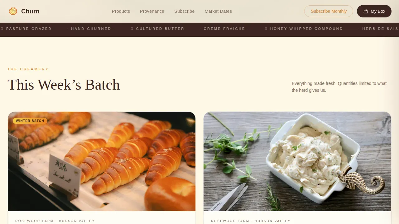
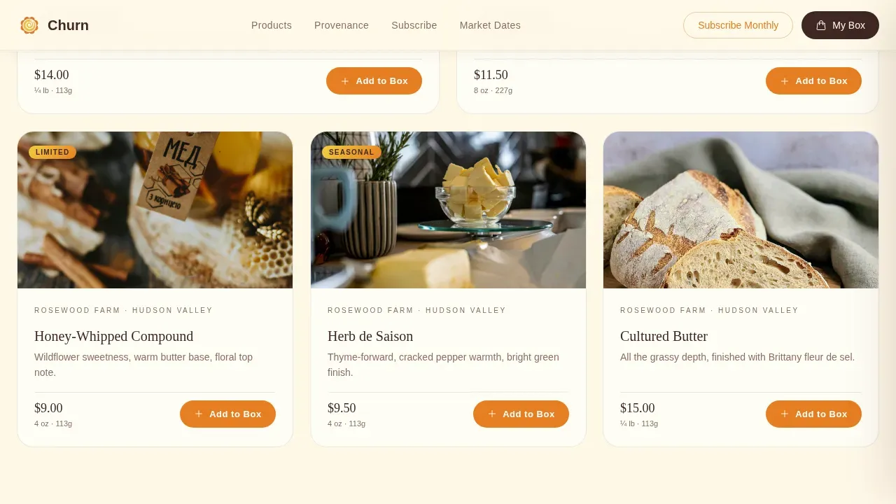
The asymmetric bento-style product grid organizes cards by sense: first you see golden butter photography, then you read tasting notes written like wine descriptors, then you watch a fifteen-second looping video of cream breaking in the churn. This approach makes each scroll feel like a fresh take on browsing a farm stall rather than reading a catalog. The grid makes it easy to showcase the full dairy range across one smooth, continuous page.
Persistent "Add to Box" Side Drawer
Every product card carries its own "Add to Box" button. Clicking it opens a slide-in side drawer that holds the customer's growing order without navigating away. This keeps the browsing flow intact and means customers can add a pint of cultured butter, a jar of crème fraîche, and a seasonal spread before committing to checkout.
Subscribe Monthly Section
A dedicated subscription section lets visitors choose a curated seasonal shipment using a single household-size dropdown. Flexible subscription models allow customers to adjust their plan rather than cancel, which supports steady recurring revenue for the creamery business.
Provenance Strip with Herd and Pasture Details
A bold stat-driven strip names the herd, the pasture, and the farm story behind the milk. This kind of trust-building storytelling differentiates artisan producers from mass-market dairy and gives customers a provenance line they can repeat with pride when they serve your butter at the table.
Tasting Notes Cards
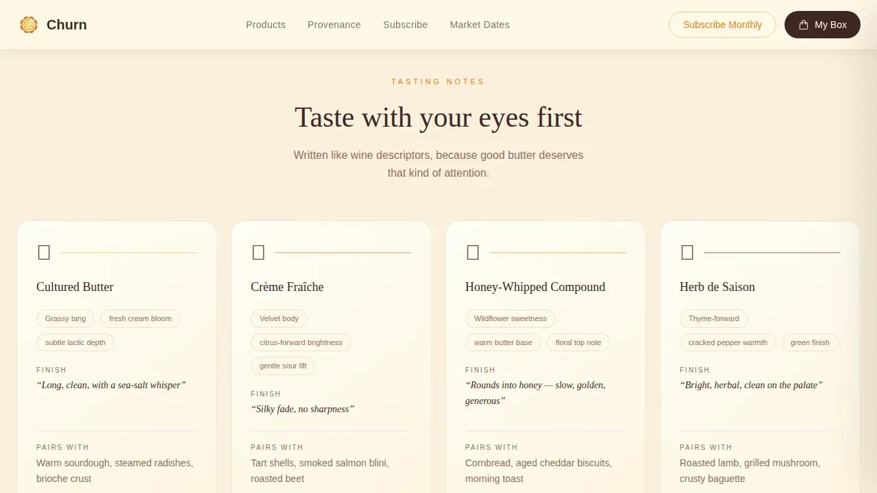
Dedicated READ-row cards present each flavor with wine-style descriptors: grassy tang, clean finish, sea-salt bloom. Crafting a flavor story this way connects emotionally with customers and makes the decision to buy feel natural and considered.
Lifestyle Hero Section
The header uses a sun-drenched overhead lifestyle photograph of butter rounds, crème fraîche, citrus rinds, and bread-tearing hands. A bold market-chalkboard headline sits top-left in loam brown. High-quality sensory hero content like this is one of the most effective trust signals a small-batch dairy brand can deploy on a landing page.
Page sections overview
| Section | Purpose |
|---|---|
| Hero Lifestyle Shot | Opens with cinematic overhead photo, market headline, and floating call-to-action card |
| Product Bento Grid | SEE row: photography cards with individual "Add to Box" buttons in asymmetric 2+3 layout |
| Tasting Notes Row | READ row: wine-descriptor cards presenting flavor, texture, and finish for each dairy product |
| Provenance Strip | Names the herd, pasture, and farm with large stat numbers to build trust |
| Subscribe Monthly | Curated seasonal box with household-size dropdown and subscription call to action |
| Page Footer | Horizontal flow footer with navigation, contact, and brand details |
Design & branding system
The visual identity follows an Agrarian Root theme expressed through the Citrus Burst color system. The palette feels like a wooden crate of citrus sitting on a farmhouse table at golden hour: warm, unhurried, and nothing sterile.
- Colors: Meyer lemon (#F4D03F) for primary accents, tangerine zest (#E67E22) for buttons and hover states, raw cream (#FFF8E7) for card backgrounds, and deep loam brown (#3E2723) for all typography and borders
- Typography: Fraunces serif for display headlines, DM Sans for body copy, with wide letterspacing on the hero headline to echo a hand-stamped market sign
- Interactions: scroll-linked card reveals, butter-softening CSS hover transitions, and a slide-in side drawer for the custom order builder
Mobile & speed optimization
The template is built desktop-first to deliver the full market-browsing experience on wide screens, and it scales responsively to mobile so customers who discover the creamery through social media can still shop with ease.
- Hero image is priority-loaded for fast above-the-fold rendering; product grid images use lazy loading to keep the page feeling quick on slower connections
- The card grid reflows into a single-column layout on smaller screens without losing the sensory sequence of see, read, and watch
- The side drawer and subscription dropdown remain fully functional on touch devices
How this template helps you convert
Good dairy landing pages earn the click before they ask for one. This template is structured to do exactly that by delivering desire ahead of every purchase prompt.
- Each product card leads with a photograph and a tasting note before showing a price or a button, so customers feel ready to buy rather than sold to
- The persistent side drawer means visitors can build a full order across multiple card rows without losing their place, reducing drop-off between browse and checkout
- The subscription section offers a low-commitment entry point with a single dropdown, which means customers who are not ready to build a custom box today can still join the recurring shipment program
Other information about this template
This template draws on the same principles that make successful artisan dairy brands resonate with a wider community. The following context is useful for any creamery owner or food business team considering this design.
- Small-batch production naturally supports a creativity-forward flavor story. Independent shops that blend nostalgic comfort flavors with a fresh take tend to earn stronger loyalty and word-of-mouth support.
- Flavors built around local farms and single-origin milk reflect sustainable values that resonate with today's conscious buyers. Highlighting these stories on the landing page means customers understand your commitment before they place an order.
- The growing interest in novelties like poppable bites, portioned rounds, and mix-ins shows that innovation in small-scale dairy is expanding well beyond tradition. This template gives you the visual space to present seasonal flavors and new batch experiments with the same care as your core range.
- Creameries like Bold Batch Creamery, Stepladder Creamery, and Wright's Dairy Farm and Bakery demonstrate how family-rooted stories, community engagement, and a heart-first brand voice create loyal customer bases. This template is structured to bring that same warmth to your online presence.
- Social proof elements such as chef sourcing quotes, named herds, and pasture provenance function like testimonials and star ratings. They give new customers the confidence to check out without hesitation.
- The template's modular card structure means you can simply swap in new product photography and tasting notes each season without rebuilding the page layout from scratch.

Theme
Agrarian Root
Creative direction
Sensory Appeal
Color system
Citrus Burst
Style
Card Grid (Modular)
Direction
Marketplace/Multi
Page Sections
Sensory-driven Modular Card Grid
Persistent Add to Box Side Drawer
Subscribe Monthly Subscription Section
Provenance Strip with Farm and Herd Data
Tasting Notes Cards with Wine-style Descriptors
Cinematic Lifestyle Hero Section
Related questions
Can I use this template for a creamery that sells cheese and other dairy products beyond butter?
Does the template support a monthly subscription offer alongside individual product sales?
How does the card grid handle seasonal or limited-batch products?
Is this template suitable for a small farm dairy that is just starting out direct-to-consumer?
Can tasting notes and provenance content be updated each season without redesigning the page?



