Bold Women-Owned Tech Landing Page Template
Cipher is a bold, Neo-Retro landing page template built for women-owned tech ventures. It pairs a deep ink-and-paper color system with a seasonal scroll structure, layered card components, and a smart upsell flow. The result feels like a beautifully printed broadsheet, tactile, authoritative, and designed to move early-adopter founders from curiosity to commitment.
by Rocket studio
Quick summary
Cipher is a single-page landing page template designed for women-owned tech startups and lean SaaS ventures. It uses an Ink and Paper color palette, a seasonal content structure, and overlapping card layouts to create a browsing experience that feels as tactile and considered as a hand-pulled print. The upgrade path is built directly into the scroll.
Who this template is for
This template was built for founders and creative professionals who want their page to feel as sharp as their product. It suits teams that value craft, editorial confidence, and a visual identity that stands out from generic tech templates.
- Early-adopter women founders launching lean SaaS tools who want a page that reflects their voice
- Freelance developers selling curated dev kits who need a focused, conversion-ready layout
- Creative directors inside agencies who want a landing page that doubles as a statement
What problem this template solves
Most tech landing pages either look like a corporate slide deck or a startup-kit clone. Neither feels right for a women-owned studio that ships with intention. Cipher removes that tension by giving you a layout that is both technically credible and visually distinctive.
- Generic templates flatten your brand into a safe, forgettable pattern
- Feature-first page structures bury your strongest selling point under navigation and noise
- Standard upgrade flows feel transactional and break the experience you worked hard to build
What you get with this template
Cipher delivers a fully structured single-page layout with every major section pre-built and ready to adapt. The design system, interactive moments, and upsell components are all included in the template.
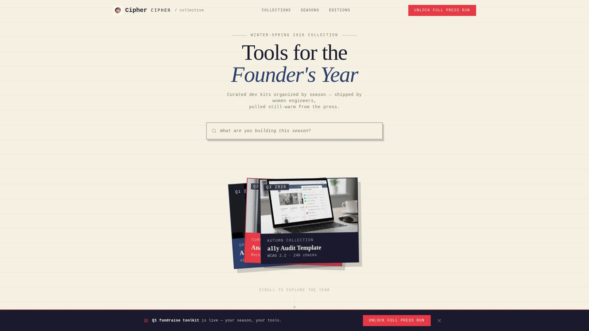
- A Search Box header with layered seasonal product cards and a halftone treatment
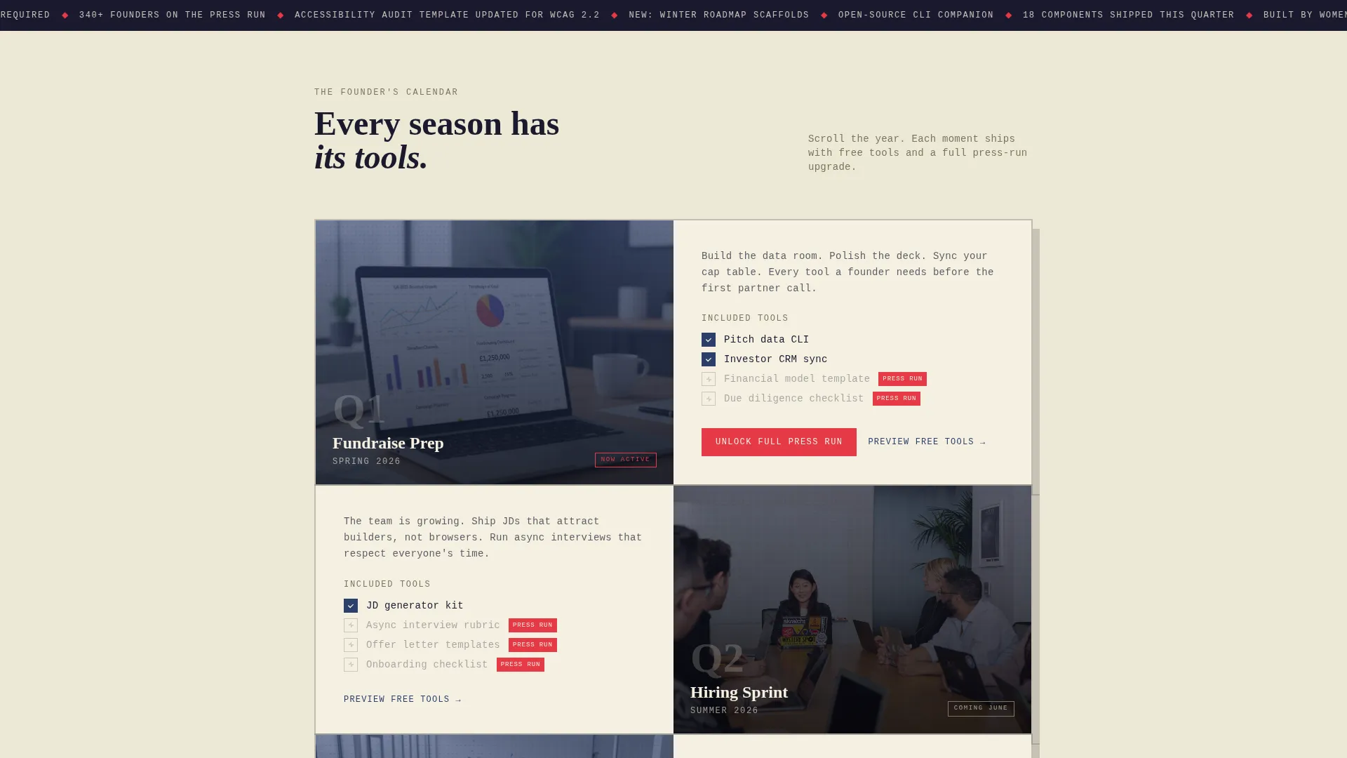
- A calendar-driven scroll structure organized into four founder moment sections
- A persistent upgrade bar, a plan toggle, a team-size stepper, and a coupon field styled as a torn ticket stub
Feature list
Cipher ships with a focused set of components, each tied directly to the page brief and the seasonal upsell strategy.
Centered Search Box Header
The header places a monospaced serif search input on a wide cream field. Three ink-dark product cards fan behind it at slight rotational offsets, previewing the seasonal collection. When a visitor types, results slide up from beneath the card stack, preserving the physical-paper illusion throughout.
Seasonal Scroll Structure
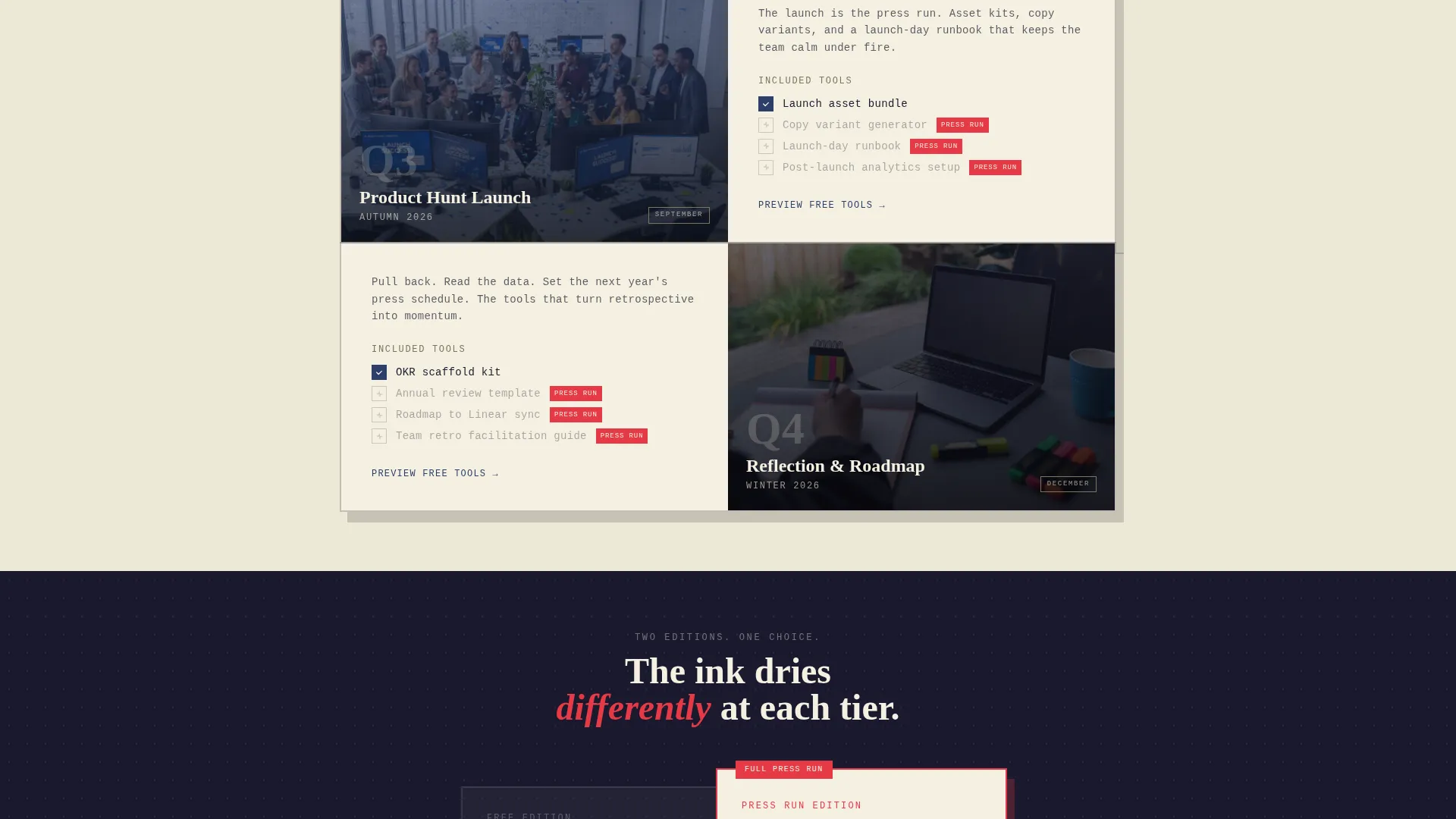
The page scroll is organized by a founder's calendar year rather than a traditional feature hierarchy. Each of the four sections represents a business moment: fundraise prep, hiring sprint, product-hunt launch, and roadmap reflection. This structure keeps content relevant and emotionally resonant at every point in the year.
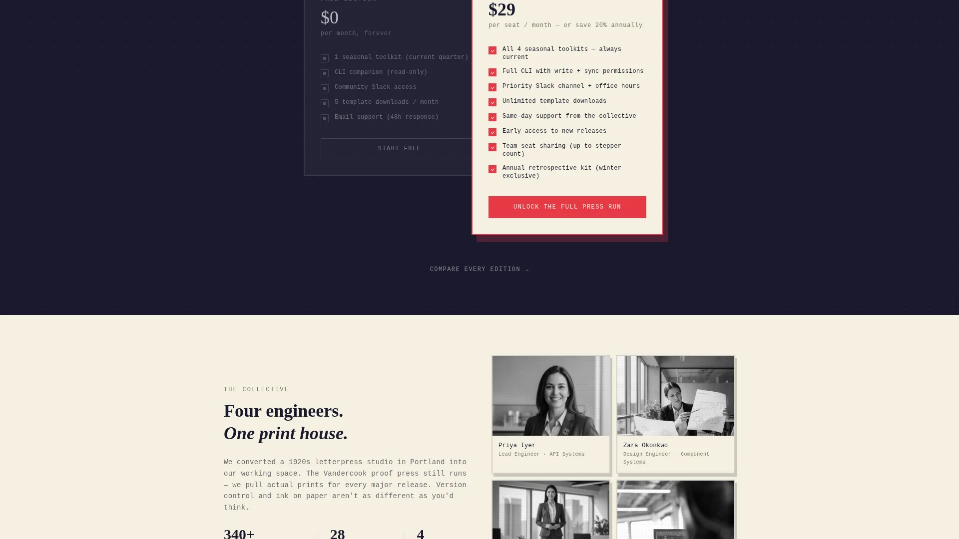
Layered Plan Comparison Cards
Inside each seasonal moment, the current plan tier sits alongside the upgraded tier in overlapping cards. The free version renders in grayscale ink. The upgraded version blooms into full vermillion and navy detail. Shadows deepen and panels stack higher as the visitor scrolls, reinforcing accumulating value.
Upsell Upgrade Form
The primary call to action, "Unlock the Full Press Run," appears first inside the most calendar-relevant seasonal section. It then reappears as a persistent bottom bar after the visitor scrolls past two sections. The upgrade form includes a monthly-to-annual toggle, a team-size stepper, and a coupon field styled as a torn ticket stub.
Layered Comparison Sheet
A secondary path labeled "Compare Every Edition" opens a full comparison sheet that slides over the page like a transparency overlay. It shows exactly which seasonal tools unlock at each plan tier without pulling the visitor away from the page.
Halftone Product Card Treatment
Each seasonal product card uses a halftone dot overlay applied to a cropped product screenshot. The treatment gives digital content a printed, textural quality that is consistent with the broader Ink and Paper design language.
Page sections overview
| Section | Purpose |
|---|---|
| Search Box Header | Introduces the seasonal collection via layered cards and a live search input |
| Q1 Fundraise Moment | Shows fundraise-prep tools with free-versus-upgraded plan card layering |
| Summer Hiring Sprint | Presents hiring-sprint resources with deepening shadow and stacked panel effect |
| Autumn Product Launch | Features product-hunt launch tools and the first "Unlock the Full Press Run" call to action |
| Winter Roadmap Reflection | Closes the seasonal scroll with reflection and roadmap planning resources |
| Persistent Upgrade Bar | Reappears after two-section scroll and anchors the upsell path throughout |
| Comparison Overlay Sheet | Slides over the page to display full tier-by-tier tool comparison |
Design & branding system
The visual identity follows a Neo-Retro theme built entirely around an Ink and Paper color system. The palette references the look and feel of a first-edition technical manual found in a used bookshop: authoritative, textural, and deliberately analog.
- Deep manuscript black (#1A1A2E), unbleached stock cream (#F5F0E1), typewriter-ribbon navy (#2C3E6B), and feminist vermillion (#E63946) form the complete four-color system
- Cream dominates background fields; navy and black layer in offset panels with subtle drop shadows that mimic stacked broadsheets
- Vermillion appears only on interactive elements, upgrade badges, and urgent calls to action, keeping its visual weight intentional and high-impact
Mobile & speed optimization
The layered, offset panel structure is designed to translate cleanly across screen sizes. The stacking and shadow effects that define the desktop experience are structured to remain readable and functional on smaller viewports.
- Rotational card offsets and drop shadows are kept subtle enough to render well on mobile screens without overwhelming the layout
- The persistent upgrade bar is built to stay accessible at the bottom of the viewport across device sizes
- The comparison overlay is structured as a slide-over layer, which keeps it contained and navigable on touch devices
How this template helps you convert
Cipher is built around a deliberate upsell architecture. Every design and structural decision serves the goal of moving visitors toward the upgraded plan tier.
- The seasonal scroll structure creates emotional relevance by matching page content to the visitor's current business moment, making the upgrade feel timely rather than generic.
- The overlapping grayscale-versus-color plan cards create a direct, visual contrast between tiers, showing the upgrade benefit without requiring the visitor to read a feature table.
- The persistent bottom bar and the "Compare Every Edition" overlay give the visitor two low-friction paths to commit, one for decisive buyers and one for those who need to compare first.
Other information about this template
Cipher was designed with the intersection of women-owned business identity and tech editorial confidence in mind. It fits naturally within the Retail and E-Commerce category, specifically the Women-Owned Business subcategory, while serving digital product and SaaS use cases.
- The template style follows a Gallery and Detail pattern, giving products visual prominence while keeping the upgrade path clear
- The Neo-Retro theme and Ink and Paper color system make the design feel distinctly non-generic, which supports brand recall for studios that compete on taste and craft
- The page is built as a single landing page, not a multi-page site, so all content lives in one focused, scrollable experience
Theme
Neo-Retro
Creative direction
Surprise & Delight
Color system
Citrus Burst
Style
Gallery + Detail
Direction
Marketplace/Multi
Page Sections
Centered Search Box Header
Seasonal Scroll Structure
Layered Plan Comparison Cards
Persistent Upgrade Bar and Form
Comparison Overlay Sheet
Halftone Product Card Treatment
Related questions
Who is this landing page template built for?
Can I adapt the seasonal sections to match my own product calendar?
How does the upsell path work inside this template?
Does this template include the comparison overlay component?
Is this template suitable for a digital product or SaaS business?



