AI Builders Community Professional Website Template
Grove is a hero-dominant landing page template built for solo AI builders running accountability-first communities. It combines a moody half-page photo header, warm serif typography, an origin-story scroll flow, and a dual call-to-action layout built around an application form and a secondary email newsletter capture. The Forest Trust color system gives every section a grounded, campfire-ready feel.
by Rocket studio
Quick summary
Grove is a single-page landing page template designed for AI builders accountability groups and indie maker communities. The layout is hero-dominant with a 90/10 content split, built to tell a founder's origin story, establish community trust, and drive application submissions. It uses a Nature-Inspired Forest Trust palette with warm serif headings and a sticky conversion bar that appears at fifty percent scroll depth.
Who this template is for
This template is built for a specific kind of community organizer: someone running a tight, accountable circle of builders who ship things, not just talk about them. It is not a generic community template. Every section is written and structured around the solo builder experience.
- Solo AI builders, indie hackers, and freelance developers who run or want to launch a weekly accountability circle for makers
- No-code founders and non-technical creators who are wiring together AI pipelines and need a community landing page that matches their seriousness
- Community organizers in the AI agents, automation, and GPT-builder niche who want a landing page that feels lived-in and trustworthy, not corporate
What problem this template solves
Building alone is the number one reason AI projects stall. Most landing pages for communities rely on stock imagery, generic copy, and a simple sign-up form. They do not communicate warmth, credibility, or a reason to trust the circle behind the door.
- Generic community landing pages fail to show the human story behind the group, leaving visitors unsure whether the community is real or just another newsletter
- Solo builders searching for accountability groups need to feel the culture of a community before applying, and most landing pages skip that entirely
- Static, one-size-fits-all landing pages cannot carry the weight of an origin story, social proof artifacts, and a two-path conversion flow at the same time
What you get with this template
This template delivers a complete, single-page layout structured around trust-building scroll depth. Every section has a defined job, and the visual system carries that job from top to bottom without contradiction.
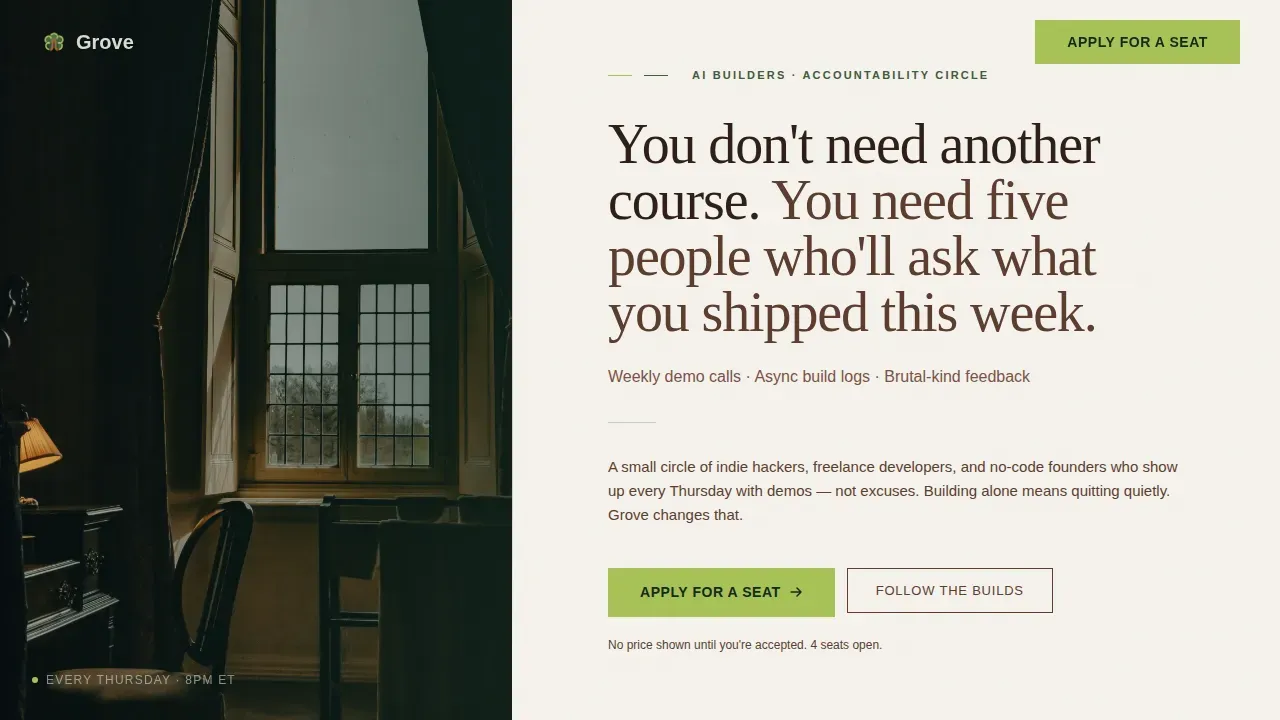
- A hero section with a half-page grain-textured photo composition on the left and a warm serif headline block on the right, plus a subline naming the format: weekly demo calls, async build logs, and brutally kind feedback
- A three-paragraph origin story block with a candid founder photo, followed by a growth narrative section featuring real social-proof artifacts including blurred Slack thread screenshots, a member commit graph, and demo recording previews
- A dual-path conversion layout: a primary application form asking for first name, what you are building, and a build-stage dropdown, plus a secondary low-commitment email capture for the free weekly newsletter called The Build Log
Feature list
This template includes a focused set of purpose-built components that work together to move a visitor from curious to committed. Each feature was designed specifically for the accountability community niche.
Half-Page Hero with Grain-Textured Photo
The hero occupies the dominant portion of the page with a 40/60 split composition. The left side holds a moody, grain-textured photograph shot from inside a dim room looking out through a rain-dotted window toward a tree line at dawn, with a laptop glowing faintly on the desk. The right side carries a warm Fraunces serif headline and a single subline naming the group's format. This layout creates immediate emotional resonance before a single word of copy is read, making it one of the most conversion-aware elements in the template for communities where trust is the primary barrier to application.
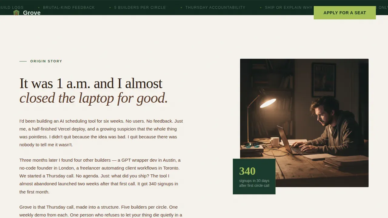
Origin Story Scroll Section
Three short narrative paragraphs describe the founder's own experience of building alone and almost stopping. A single candid photograph accompanies the text. This section is the emotional anchor of the page. It builds the kind of credibility that most landing pages for communities skip entirely: the honest, specific story of why the circle exists at all. It shifts the visitor's mindset from skeptic to someone who feels they have already been understood.
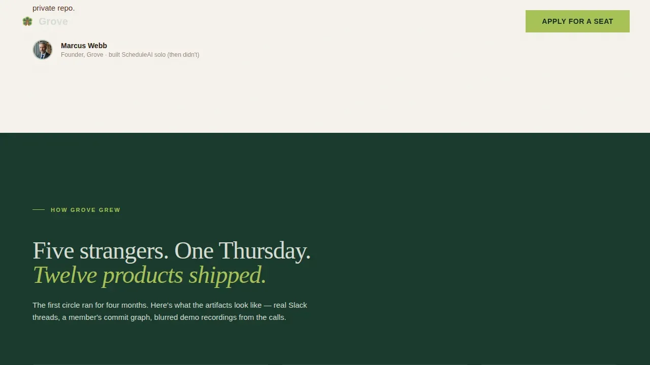
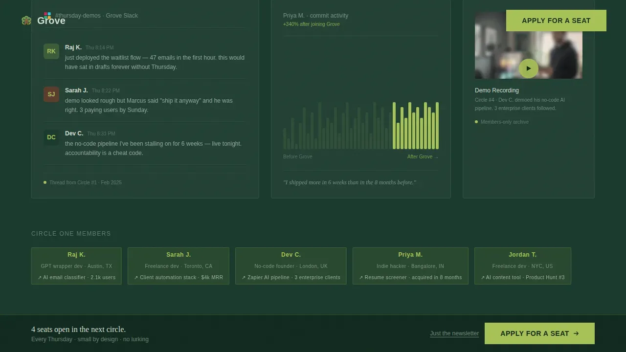
Social Proof Artifact Block
Following the origin story, the page opens into a wider section showing how Grove grew. This includes blurred Slack thread screenshots, a member commit graph showing shipping velocity over time, and previews of blurred demo recordings. Member names appear alongside what each person shipped. These artifacts do the work that testimonials alone cannot: they show a living, active community rather than claiming one.
Dual-Path Application and Newsletter Capture
The primary conversion path uses an application form with three fields: first name, a two-line open text field for what the visitor is building, and a dropdown for build stage covering idea stage, early prototype, live but stuck, and scaling. No price is shown on the page. Accepted applicants receive a personal invite with details. The secondary path captures email addresses for The Build Log, a free weekly newsletter, requiring only an email field and a single button. This two-path structure respects the visitor's readiness level without losing them.
Sticky Bottom Conversion Bar
A sticky bar emerges from the bottom of the viewport after the visitor has scrolled fifty percent of the page depth. It carries the primary call to action, "Apply for a Seat," and stays visible as the visitor continues reading. This is a proven pattern for landing pages that tell longer stories: it keeps the action available without interrupting the narrative. The bar uses the chartreuse accent color to draw the eye without clashing with the rest of the design.
Forest Trust Color and Typography System
The visual identity uses a four-color system: deep canopy green for dark backgrounds, morning fog gray for light backgrounds, heartwood brown for body text on light sections, and new-growth chartreuse reserved strictly for calls to action and active states. Typography pairs Fraunces, a warm optical-size serif, for all headlines with DM Sans for body text. This pairing creates a campfire-story aesthetic that feels personal and grounded, not polished or corporate.
Page sections overview
| Section | Purpose |
|---|---|
| Hero Photo+Text | Opens the page with emotional presence and states the community format clearly |
| Founder Origin Story | Builds credibility through a real narrative of building alone and almost quitting |
| How Grove Grew | Shows the community's growth through real artifacts and shipped outcomes |
| Apply for a Seat | Primary conversion section with a three-field application form |
| The Build Log | Secondary email capture for visitors not ready to apply |
| Sticky Bottom Bar | Keeps the primary call to action accessible across the full scroll depth |
| Footer | Minimal horizontal flow footer with essential links |
Design & branding system
The visual direction follows an Origin Story creative framework: every design decision reinforces the sense that you are being told something true, not sold something polished. The grain texture, the muted photography, and the restrained use of the chartreuse accent all contribute to a page that feels like a clearing in the woods rather than a conference hall.
- Color system: deep canopy green (#1B3A2D) for dark section backgrounds, morning fog gray (#D6DDD3) for light section backgrounds, heartwood brown (#5C3D2E) for body text on light sections, new-growth chartreuse (#A8C256) exclusively for calls to action and active interface states
- Typography: Fraunces warm serif for all H1, H2, and H3 headings; DM Sans for body paragraphs, labels, and form elements; both typefaces reinforce the organic, unhurried tone of the Forest Trust visual identity
- Texture and motion: grain texture overlays on the hero photograph, GSAP scroll-reveal animations for section transitions, subtle parallax on the hero photo, and alternating dark and light background sections that create a campfire-like rhythm as the visitor scrolls
Mobile & speed optimization
The template is built desktop-first, reflecting the reality that most AI builders and indie hackers work from laptops. That said, the layout includes a solid mobile fallback to ensure the page functions cleanly on smaller screens when visitors arrive from shared links or social posts.
- Mobile responsive designs are handled through a responsive layout system that stacks the half-page hero into a full-width photo above the headline block on smaller viewports, preserving the visual hierarchy without requiring the visitor to pinch or scroll sideways
- The sticky bottom bar and application form are both client-side components, keeping static sections lean while isolating interactivity to only the elements that require it; a mobile preview of the form collapses the dropdown and open text field into a single clean column
- GSAP scroll animations are scoped to respect reduced-motion preferences on mobile, so the page never feels broken or laggy on devices where animation is turned off
How this template helps you convert
This template was designed with a single conversion goal in mind: getting qualified solo AI builders to submit an application for a seat in the circle. Every layout decision flows toward that goal, and the dual-path structure ensures that visitors who are not ready to apply still leave a signal.
- The hero section states the community's format in one subline, doing the filtering work immediately so that unqualified visitors self-select out early and qualified ones feel instantly recognized; this directness improves application quality and keeps conversion rates meaningful rather than inflated
- The origin story and social proof artifact sections build the trust required for a commitment-level action like submitting an application; most landing pages skip this work, but communities that show real artifacts and founder honesty consistently see stronger conversion rates from warm traffic
- The sticky bottom bar and dual-path form layout ensure that the call to action is always one tap away, while the secondary Build Log newsletter path captures visitors who need more time, extending the customer journey beyond a single visit and supporting longer-term lead generation
Other information about this template
This section covers additional practical context that will help you decide whether Grove is the right tool for your project, including how it compares to broader landing page creation options and what you should know before customizing it.
The Grove template was built as a complete landing page layout, not a drag and drop editor product. If you are used to working inside traditional landing page builders with a drag and drop editor interface, the structure here is intentionally opinionated. The sections are fixed in scroll order to preserve the Origin Story narrative flow. You can adjust copy, swap images, and change colors, but the section sequence is designed to be used as delivered.
Free AI landing page builders and free ai builders tools often produce landing pages that feel generated rather than felt. This template was hand-crafted around a specific niche and specific conversion goal, which is why the copy direction, visual hierarchy, and section structure all feel cohesive. It is an alternative to spending hours inside a landing page builder trying to recreate this kind of specificity from scratch.
Most landing pages built in traditional landing page builders start from a blank canvas or a generic pre built templates library. The Grove template skips that friction. The layout, tone, and scroll story are already in place. You bring the community details, the founder photo, and the member artifacts.
- This is a single landing page template, not a multi-page website. It is purpose-built for one conversion goal: application submissions, with a secondary email capture path.
- The template does not include backend form handling, email marketing platform connections, or payment processing out of the box. You will need to connect your preferred email marketing tools and form submission handler separately.
- The free tier on most platforms that host this kind of template may limit traffic or remove platform branding. Check the plan details of your hosting platform before publishing. A paid plan typically unlocks custom domain support and removes branding restrictions.
- The Forest Trust color system was designed to work as a complete set. Changing individual colors without adjusting the full palette may reduce the visual coherence of the page. The chartreuse accent is particularly important: it should appear only on calls to action, not on decorative elements.
- For teams wanting to use analytics tools to track visitor behavior and form completion rates, the template supports standard script-tag integrations. You can add tracking via a head tag or through your hosting platform's built-in options.
- The sticky bottom bar component requires JavaScript to function. On platforms or browsers with scripting disabled, the bar will not appear. The primary call to action is also embedded in the body of the page, so conversion is not dependent on the sticky bar alone.
- Small business owners and solo entrepreneurs launching a community product for the first time may find the application-gated model unfamiliar. This template makes that model feel natural by framing the gate as selectivity, not scarcity tactics.
- If you are running advertising campaigns to drive traffic to this page, the hero's specificity works in your favor. Visitors who arrive from a targeted ad about AI builder communities will find the headline and subline immediately confirming that they are in the right place. This alignment between ad copy and landing page message is one of the strongest drivers of improved conversion rates.
- E-commerce businesses looking for a community-led growth strategy can use this template as a standalone community landing page that connects an audience before a product launch. It is not an e-commerce checkout page, but it works well as a pre-launch or waitlist-style page for e-commerce brands building a builder-adjacent audience.
- The template quality reflects a specific craft decision: every element exists for a reason tied to the conversion goal or the trust-building narrative. Nothing is decorative for its own sake.
Theme
Nature-Inspired
Creative direction
Origin Story
Color system
Forest Trust
Style
Hero-Dominant (90/10)
Direction
Lead Generation
Page Sections
Half-page Hero with Grain-textured Photo
Founder Origin Story Section
Social Proof Artifact Block
Dual-path Application and Newsletter Capture
Sticky Bottom Conversion Bar
Forest Trust Color and Typography System
Related questions
Can I use this template without any coding expertise?
Does the template include the application form backend?
Is this template suitable for e-commerce businesses or product launches?
How does the two-path conversion structure work?
Can I adapt the color system or typography for my own brand?


