Editorial Electronics Store Design Landing Page
Circuit is an editorial masonry landing page built for electronics store design studios. It pairs a full-bleed mezzanine hero with a Pinterest-style origin story grid, guiding visitors through project photography, pull-quotes, and narrative blocks. Two clear calls to action drive clicks to a portfolio page and a consultation booking page. No forms. Just proof of taste and track record.
by Rocket studio
Quick summary
Circuit is a single-page editorial landing page for a retail spatial design studio specializing in electronics store environments. The layout uses a masonry grid to tell a founder's origin story through project photography, pull-quote cards, and narrative blocks. Two calls to action push visitors toward a portfolio and a consultation booking page without any on-page forms.
Who this template is for
This template is built for design studios and spatial consultancies that work in the electronics retail sector. It suits practices that lead with visual credibility and prefer to close deals through a portfolio page rather than an on-page inquiry form.
- Independent electronics retailers and franchise owners looking to refresh tired store layouts
- Consumer tech brands preparing flagship pop-up experiences who need a design partner with a strong track record
- B2B spatial design studios that want to demonstrate taste and project history before asking for a meeting
What problem this template solves
Most design studio pages either bury the work behind a wall of text or jump straight to a contact form before earning trust. Circuit solves that by letting the project history do the selling first.
- Visitors leave before reaching a call to action because the layout lacks a compelling story arc
- Generic portfolio grids fail to convey the studio's personality, process, or commercial credibility
- A single unmotivated call to action placed too early pushes unqualified clicks and cold leads
What you get with this template
Circuit delivers a complete single-page layout with a structured narrative flow and two strategic calls to action. Every section is built to move a visitor from first impression to a motivated portfolio click.
- A full-bleed mezzanine hero with a floating headline and a violet pill call-to-action button
- A masonry origin story grid combining project photography tiles, oversized pull-quote cards, and short narrative column blocks
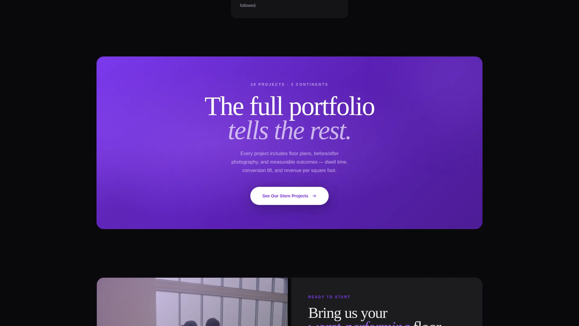
- A full-width breakout card interrupt after the origin story peaks, followed by a final-row secondary call to action anchoring the close
Feature list
This section covers the core built-in capabilities that define Circuit's editorial experience.
Full-Bleed Mezzanine Hero
The header fills the entire viewport with a mezzanine-angle store photograph. A single sans-serif headline lands in phosphor white on generous negative space. A violet pill button floats at the bottom of the frame. No navigation is visible until scroll begins.
Masonry Origin Story Grid
The masonry grid lays out the founder's journey as a sequence of visual chapters. Tiles alternate between full-bleed project photography, pull-quote cards in oversized violet type, and short narrative blocks styled like magazine columns. Each row reads like a new editorial spread, with the story building commercial credibility as the scroll deepens.
Scroll-Linked Animation System
The template includes high-intensity scroll-linked reveals, staggered masonry entry animations, magnetic hover effects on cards, and a parallax header. A cursor-reactive effect activates on the hero, and scroll-velocity influences card depth transitions throughout the grid.
Strategic Two-Call-to-Action Architecture
"See Our Store Projects" appears first as a pill button in the hero, then resurfaces as a full-width breakout card after the origin story. "Book a Walkthrough Call" anchors the final row. The sequencing is intentional: proof of work earns the click before any meeting is requested.
Editorial Typography Pairing
Headlines use DM Sans for clean authority. Editorial accent text uses Fraunces, a serif that references print magazine layouts. The combination keeps the page feeling contemporary while grounding it in a recognizable high-design visual language.
Void and Violet Color System
The palette is built around absolute void black (#09090B) as the dominant background, electric violet (#7C3AED) for headlines and hover states, muted graphite (#1C1C1E) for card surfaces, and cool phosphor white (#EAEAEF) for body text. The result reads like a flagship store after closing time, with violet-lit screens glowing against dark surfaces.
Page sections overview
| Section | Purpose |
|---|---|
| Full-Bleed Hero | Establish editorial tone and present primary call to action |
| Origin Story Masonry | Build credibility through founder narrative and project photography |
| Breakout Call-to-Action Card | Interrupt the scroll and redirect to portfolio page |
| Final Row Close | Anchor the page with secondary "Book a Walkthrough Call" button |
| Footer | Horizontal flow footer pattern for studio information and links |
Design & branding system
Circuit's visual identity is rooted in an editorial magazine aesthetic adapted for a premium retail design context. Every color, typeface, and layout decision references the experience of a high-end store environment after hours.
- Color palette: void black (#09090B) background, electric violet (#7C3AED) accents, graphite (#1C1C1E) card surfaces, and phosphor white (#EAEAEF) body text
- Typography: DM Sans for bold sans-serif headlines, Fraunces for editorial serif accent moments across pull-quotes and narrative blocks
- Visual tone: high-contrast luxury with deep shadows, violet pulse states on interactive elements, and generous negative space that lets photography breathe
Mobile & speed optimization
Circuit is designed desktop-first to honor the architecture magazine aesthetic at full width. The masonry grid is built to collapse responsively for smaller screens without losing its editorial rhythm.
- Staggered masonry columns collapse cleanly on tablet and mobile, preserving the chapter-by-chapter narrative flow
- Scroll-linked animations use IntersectionObserver for staggered reveals and CSS scroll-behavior for smooth progression without layout thrash
- Parallax and cursor-reactive effects are handled at the presentation layer, keeping the visual experience performant across modern browsers
How this template helps you convert
Circuit earns click-throughs by sequencing proof before any ask. The layout is built around a click-through goal, not form capture.
- The hero establishes authority immediately with a full-bleed editorial photograph and a single, confident headline before presenting the first call to action.
- The masonry origin story builds progressive trust through project photography and personal narrative, so by the time the breakout card appears, the visitor is already invested in the studio's track record.
- The secondary call to action at the page's close targets visitors who scrolled the full story and are ready to book a conversation, capturing high-intent leads at the right moment.
Other information about this template
Circuit sits inside the Architecture and Design category under the Retail and Commercial Space Design subcategory, targeting the electronics store design niche. It is built for English-language, United States-based studios operating in United States Dollar markets.
- Template style: Masonry and Pinterest-style grid layout
- Creative direction: Origin Story narrative arc built through a tile-based chapter structure
- Header concept: Full-Bleed Photo taken from a mezzanine vantage point
- Landing page direction: Click-Through optimized, with no on-page forms
- Footer: Vercel Horizontal Flow pattern (Pattern 3) for studio links and contact information
- Localization: English language, United States market, United States Dollar pricing context


Theme
Editorial Magazine
Creative direction
Origin Story
Color system
Void & Violet
Style
Masonry/Pinterest
Direction
Click-Through
Page Sections
Full-bleed Mezzanine Hero Section
Masonry Origin Story Grid
Scroll-linked Animation System
Two-stage Call-to-action Architecture
Editorial Typography Pairing
Void and Violet Color System
Related questions
Does Circuit include an on-page contact form?
Can I adapt Circuit for a design studio outside electronics retail?
What typography does Circuit use?
How does the masonry grid build the origin story?
Is Circuit designed for desktop or mobile first?


