Trusted Beverage Container Landing Page Template
Hydrate is a bento grid landing page built for wholesale drinkware operations. It targets promotional distributors, corporate gifting managers, and gym franchise buyers with a bold Neo-Retro visual identity. The layout organizes product comparisons, volume pricing, and sample request flows into self-contained bento cards that guide procurement decisions without lengthy copy.
by Rocket studio
Quick summary
Hydrate is a single-page bento grid template built for custom-printed drinkware wholesalers. It presents material comparisons, volume price breaks, and decoration options inside scannable cards. The design pairs chunky retro-modern typography with a Dopamine Pop color palette. Qualified buyers are routed toward the catalog or a sample kit request before they leave the page.
Who this template is for
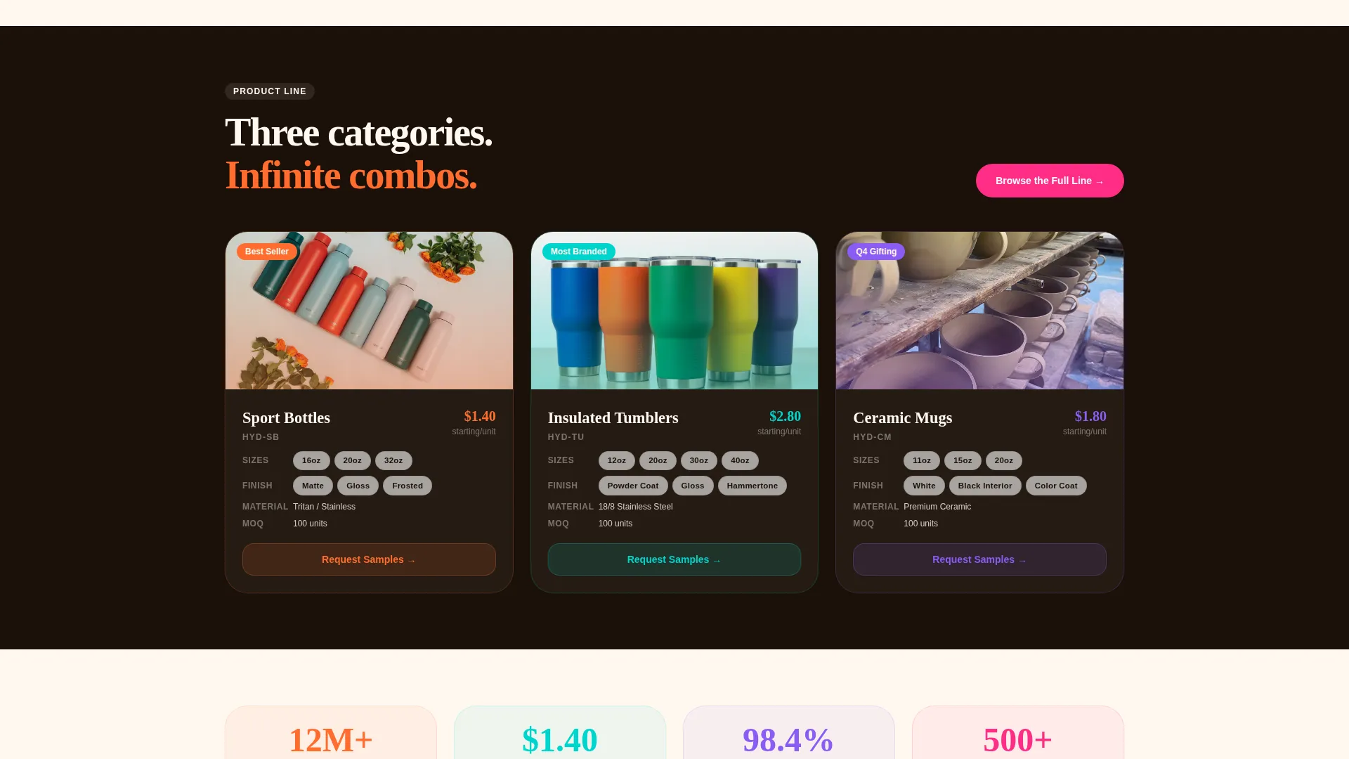
This template is built for businesses that sell drinkware in bulk to other businesses. If your operation ships pallets of tumblers, sport bottles, or ceramic mugs to buyers who brand them, this layout speaks your audience's language.
- Promotional product distributors who need margin clarity and fast product comparisons
- Corporate gifting managers sourcing multi-hundred-piece runs for seasonal campaigns
- Gym franchise owners and similar brand-first buyers ordering logoed drinkware at volume
What problem this template solves
Wholesale drinkware buyers arrive with a mental checklist. They want to know material specs, unit cost at different quantities, decoration methods, turnaround times, and minimum order requirements before they commit to browsing a catalog. A generic product page forces them to dig. This template puts every objection in front of them in the order their procurement brain asks it.
- Buyers leave pages that bury pricing or require a sales call before showing numbers
- Comparison data scattered across multiple pages slows down the decision to request a sample
- A single-column layout lectures; the bento grid lets the eye scan, compare, and circle back
What you get with this template
You get a fully structured bento grid landing page designed to move wholesale drinkware buyers from curiosity to catalog click or sample request. Every section is purpose-built around the questions bulk buyers ask before committing.
- A full-bleed overhead photo header with typographic headline and a primary call-to-action button
- An interactive bento grid carrying material comparisons, volume pricing bars, and a flip-card product visual
- A sticky call-to-action pill and a secondary sample request form built into the pricing card
Feature list
This template is built around six purpose-driven components that work together to reduce hesitation and earn the click.
Full-Bleed Overhead Header
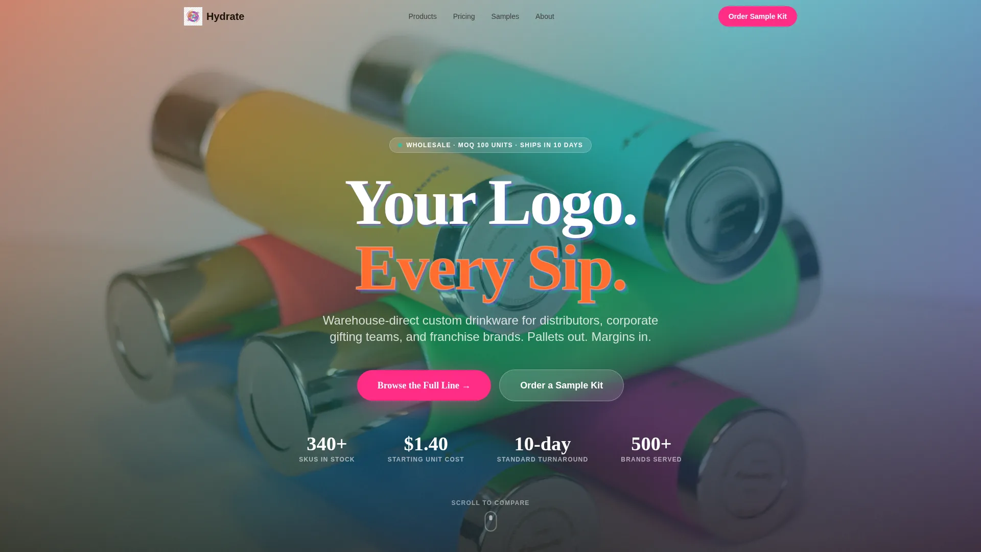
The header uses a candy-colored flat-lay photo of tumblers, sport bottles, and mugs arranged in a tight overhead grid. A chunky retro-modern slab headline, "Your Logo. Every Sip.", punches through the center with shadow and grain texture evoking a risograph print. The primary "Browse the Full Line" call-to-action button sits inside the header to catch buyers on arrival.
Bento Grid Comparison Layout
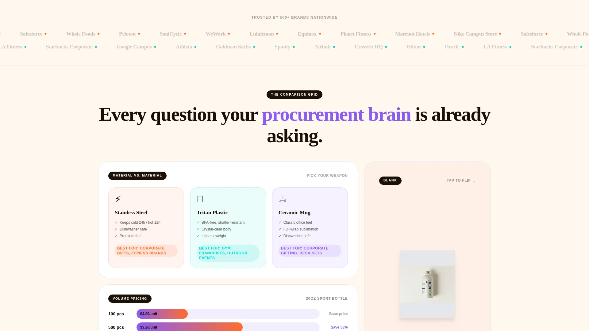
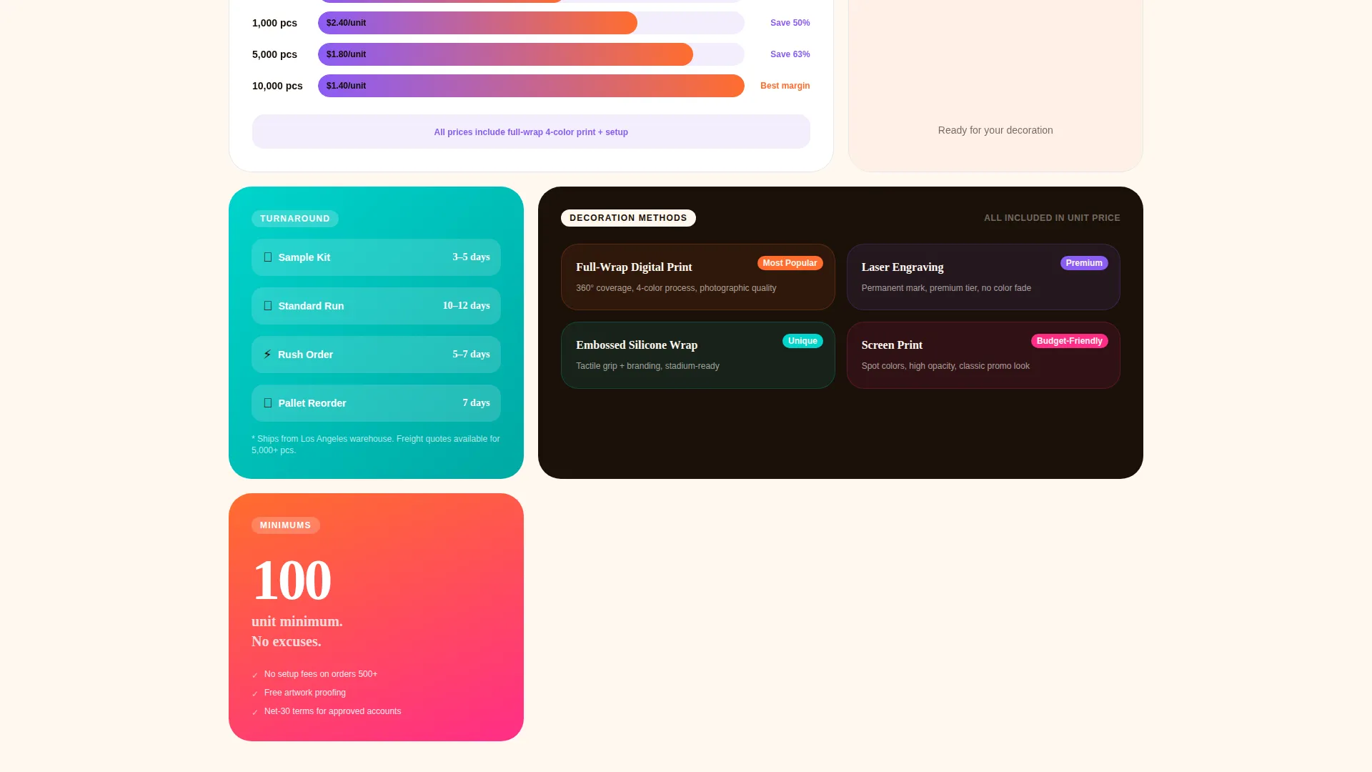
The main content area is organized as a bento grid where each card is a self-contained argument. Cards vary in size, tall, wide, and square, so the eye roams rather than marches down a single column, matching how wholesale buyers naturally scan and compare.
Volume Pricing Visualizer Card
A wide bento card displays unit cost at 100, 1,000, and 10,000 pieces. A savings bar fills with grape violet as volume climbs, making the price-break benefit immediately visible without requiring buyers to do mental math.
Material Comparison Card
A tall card places stainless steel against Tritan plastic side by side, with specs overlaid in bold type. Buyers can evaluate material trade-offs at a glance without navigating to a separate spec sheet.
Flip-Card Product Visual
A square card toggles between a blank white bottle and a full-wrap custom print on tap or click. This single interaction answers the decoration method question more convincingly than descriptive text alone.
Sticky Call-to-Action Pill
A magenta pill button persists on scroll and routes buyers to the wholesale catalog with filters pre-set. It appears only after the header call to action has passed out of view, so the prompt to act follows the buyer through every comparison card.
Page sections overview
| Section | Purpose |
|---|---|
| Full-Bleed Header | Introduce brand and primary call to action |
| Material Comparison Card | Compare stainless versus. Tritan specs |
| Volume Pricing Card | Show cost per unit at scale |
| Flip-Card Product Visual | Demonstrate custom decoration options |
| Decoration and Turnaround Card | Address fulfillment objections |
| Minimums Info Card | Clarify order quantity requirements |
| Sample Request Form | Capture low-commitment buyer intent |
| Sticky call to action Pill | Persist catalog routing on scroll |
Design & branding system
The visual identity runs on a Dopamine Pop color system inside a Neo-Retro theme. The palette feels like a 1970s roller rink lit with modern LEDs: nostalgic shapes filled with colors too saturated to be old. Off-white dominates the grid gutters to keep content readable while the accent colors carry the energy.
- Tangerine (#FF6D2E) and swimming-pool cyan (#00D4CC) alternate as card backgrounds; grape popsicle violet (#8B5CF6) anchors section headers; creamy off-white (#FFF8F0) fills gutters
- Hot magenta (#FF2D87) appears exclusively on hover states and call-to-action buttons, training the eye to find clickable elements instantly
- Typography pairs rounded sans-serifs with chunky slab type; grain and shadow textures on the headline give the risograph-poster effect described in the brief
Mobile & speed optimization
The bento grid is structured so cards reflow into a readable vertical stack on smaller screens. No card requires horizontal scrolling to read its content. The sticky call-to-action pill remains accessible at every scroll position on mobile.
- Card sizes and type scales are set to remain legible without pinch-to-zoom on standard phone viewports
- The flip-card toggle responds to tap as well as click, keeping the product visual interaction usable on touch screens
How this template helps you convert
The page is built as a click-through landing page. Its job is to answer objections in sequence and then push a qualified buyer into the catalog or sample request flow.
- The header call to action captures buyers who arrive ready to browse; they click through without needing to scroll at all
- The bento grid handles the objection sequence, material, price break, decoration, turnaround, minimums, so buyers feel informed by the time the sticky pill reappears
- The sample request form inside the pricing card asks only for company name, shipping address, and three product category preferences, keeping friction low for buyers who are not yet ready to place a full order
Other information about this template
This template is categorized under Retail and E-Commerce, with a focus on the Water Bottles and Drinkware Store subcategory. It is matched to a wholesale and dropshipping drinkware niche with a high intersection match score of 9 out of 10.
- The creative direction is a Comparison Journey, meaning the layout is sequenced to mirror a procurement buyer's natural decision process
- The header concept is a Bundle Deal framing that positions assortment breadth as the hook
- The template style is Bento Grid and the landing page direction is Marketplace and Multi, making it suitable for operations that carry a wide product assortment
- The theme is Neo-Retro, and the color system applied is Dopamine Pop, which diverges from the Cloud Canvas default listed in the source data in favor of the electric palette described in the project brief
Theme
Neo-Retro
Creative direction
Comparison Journey
Color system
Cloud Canvas
Style
Bento Grid
Direction
Marketplace/Multi
Page Sections
Full-bleed Overhead Photo Header
Bento Grid Comparison Layout
Volume Pricing Visualizer
Stainless Versus. Tritan Comparison Card
Flip-card Product Visual
Sticky Catalog Call to Action Pill
Related questions
What types of drinkware businesses is this template designed for?
Can I customize the color palette to match my own brand?
How does the sample request form work?
Does the sticky call-to-action button work on mobile?
What is the main conversion goal of this landing page?



