Prestigious Academic Publication Landing Page Template
Cite is a prestigious academic landing page template built for researchers who want their published work to command attention. It uses an Overlap/Layered layout, a Before/After Slider header, and a frosted Tech Glass visual identity to turn a scholar's publication record into a polished, waitlist-ready profile page that signals authority from the first scroll.
by Rocket studio
Quick summary
Cite is a single-page academic publication landing page template. It combines a layered card layout with a Before/After Slider header, animated citation counters, and a floating waitlist form. The design draws from an Ink and Paper color system set inside a Tech Glass visual frame, making scholarly work look as refined as it reads.
Who this template is for
This template serves researchers and academics who need more than a plain list of publications. It is built for people whose professional credibility lives in their citation record.
- Postdoctoral researchers building a public-facing publication profile before a job search
- Tenure-track faculty who want a polished landing page ready before their annual review cycle
- Graduate students and early-career academics presenting doctoral theses or conference proceedings to a broader audience
What problem this template solves
Most academic profiles look like database exports. They list papers without context, skip recognition signals, and give visitors no reason to pause. Cite solves that by turning a publication record into a persuasive, visually layered experience.
- Raw manuscript drafts and tracked-change documents feel unprofessional when shared publicly; this template presents the finished, formatted version instead
- Researchers lose early adopter advantages at new scholarly platforms by waiting; the built-in waitlist form with scarcity signals solves that directly
- Citation counts and impact factors are buried across multiple sites; this template surfaces them in one focused, well-designed page
What you get with this template
You get a fully structured, single-section-led landing page ready to represent an academic publication profile. Every component described below comes from the source brief and is part of the template as designed.
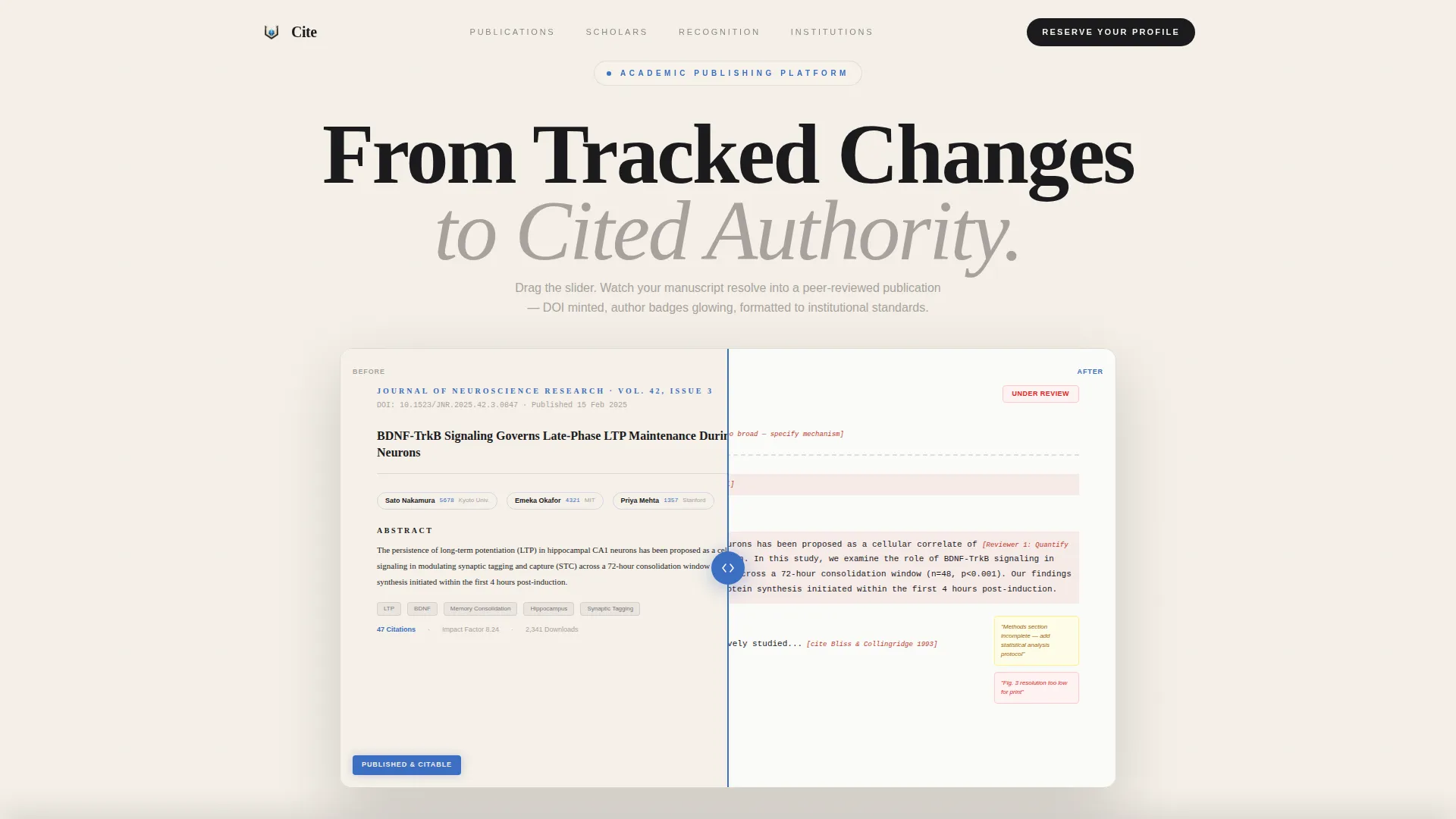
- A Before/After Slider header showing a raw manuscript transforming into a DOI-minted, publication-ready paper
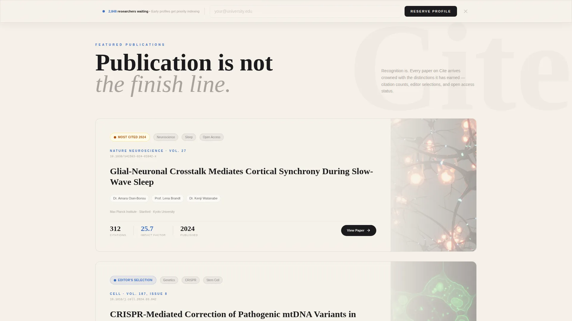
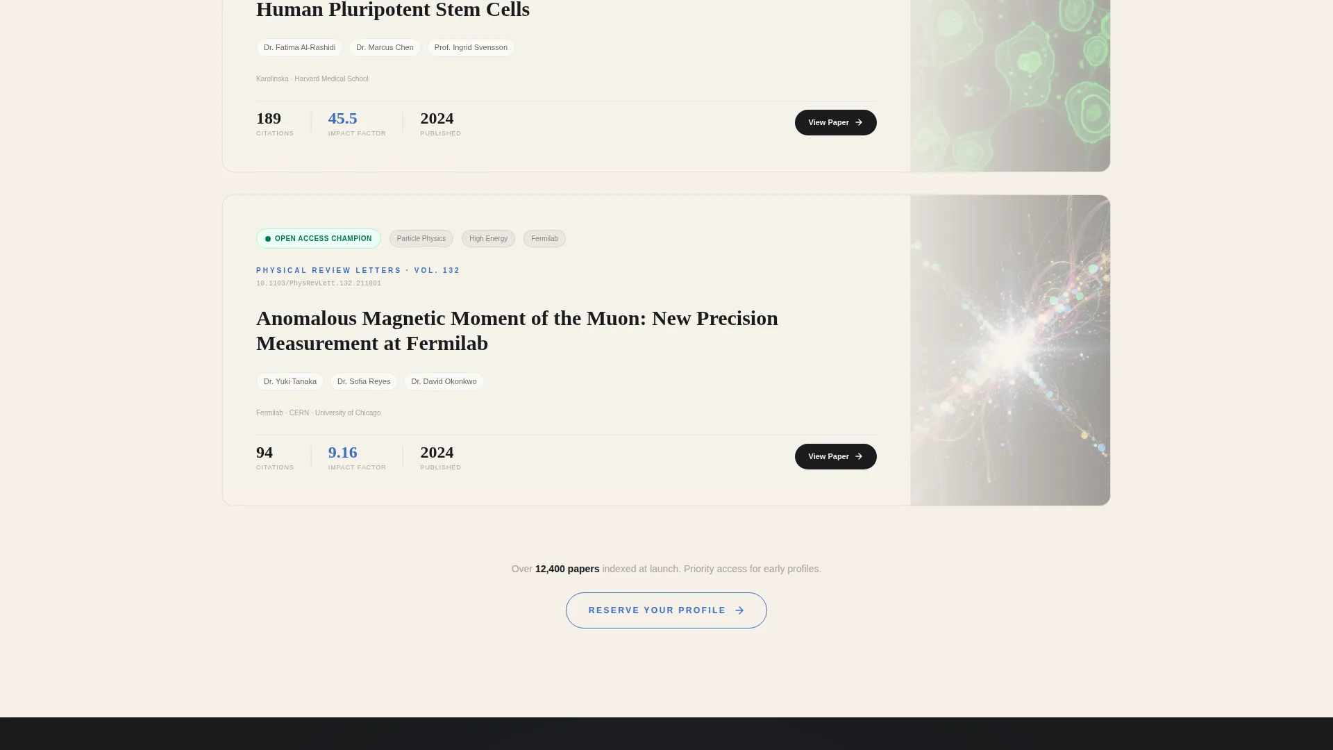
- Layered overlap cards that rise in sequence, each featuring a distinct publication with recognition badges such as "Most Cited 2024," "Editor's Selection," and "Open Access Champion"
- A floating frosted-glass waitlist bar with an institutional email field, a research discipline dropdown, an optional DOI paste field, and a secondary "Notify My Department" path
Feature list
This template is built around components that serve the specific workflow of academic publishing and researcher identity.
Before/After Manuscript Slider
The header fills the full viewport with a draggable slider. On one side sits a raw manuscript covered in tracked changes and reviewer comments. On the other side, the same paper appears in clean publication format with a minted DOI and glowing author badges. Visitors interact with this directly, making the value of the platform immediately tangible.
Layered Overlap Card Scroll
As visitors scroll, each publication card rises from beneath the previous one. This stacked reveal keeps the page feeling dynamic without losing the structured weight appropriate for scholarly content. Each card is a distinct featured publication, not a generic content block.
Recognition Badge System
Every featured publication card carries distinction markers. Badges like "Most Cited 2024," "Editor's Selection," and "Open Access Champion" are displayed prominently. These signals escalate the narrative from individual papers to a full scholarly identity.
Animated Citation Counters
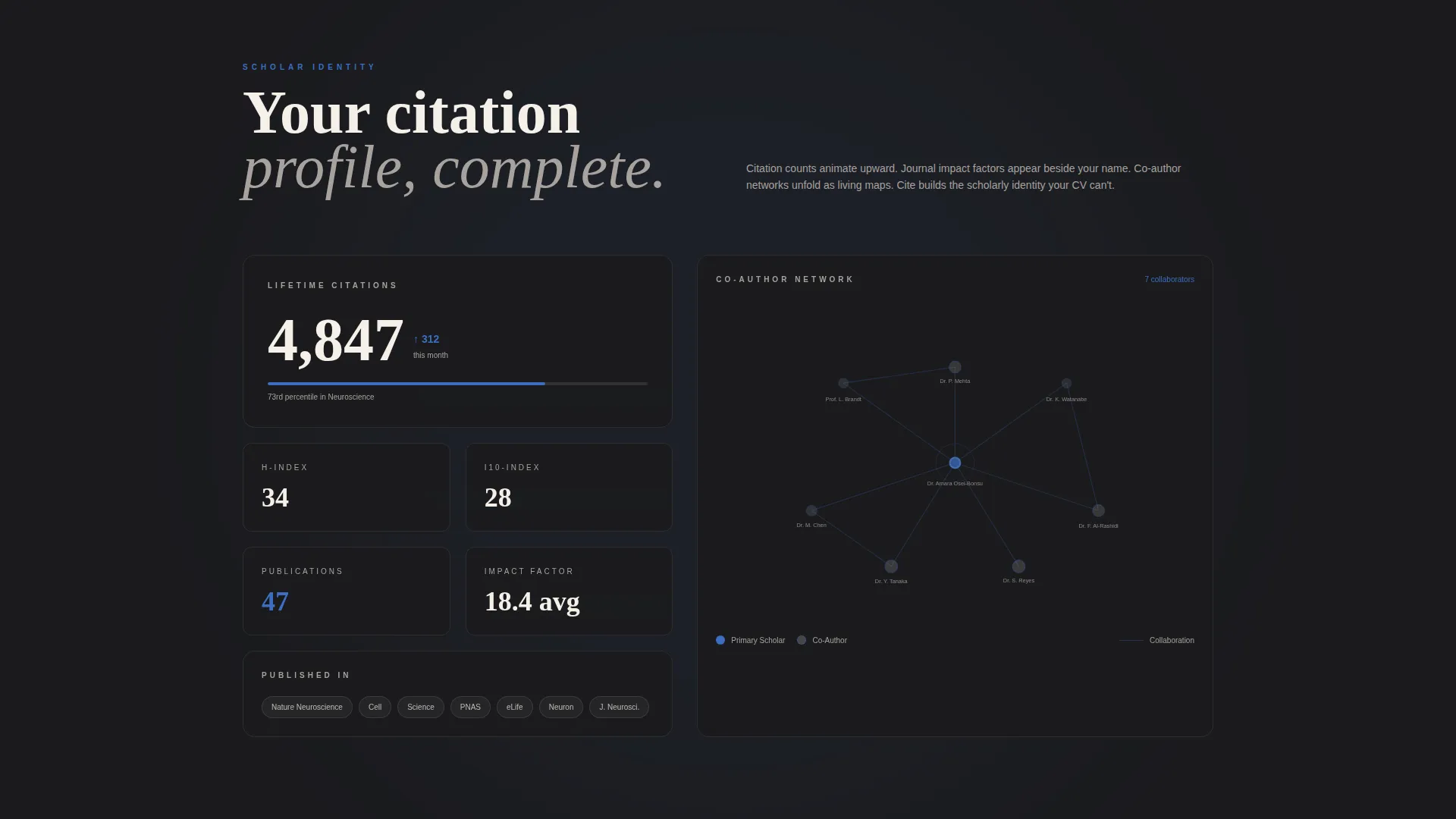
Citation counts animate upward as the visitor scrolls past each featured work. Journal impact factors appear beside author names. The motion is purposeful and data-driven, not decorative, giving visitors a real-time sense of a researcher's academic reach.
Interactive Co-Author Node Map
Co-author networks are visualized as interactive node maps within the scrolling experience. This component communicates research collaboration depth and positions the profile owner within a broader scholarly community.
Floating Waitlist Conversion Bar
A frosted-glass bar layers over the page content as the visitor scrolls. It holds the primary "Reserve Your Profile" call to action alongside a live waitlist position counter. The form collects institutional email, research discipline, and an optional most-cited DOI field.
Page sections overview
| Section | Purpose |
|---|---|
| Before/After Header | Show manuscript-to-publication transformation via draggable slider |
| Featured Publication Cards | Reveal layered papers with recognition badges as visitor scrolls |
| Citation Counter Row | Animate citation counts and display journal impact factors |
| Co-Author Node Map | Visualize research collaboration as an interactive network |
| Floating Waitlist Bar | Capture early signups with scarcity signals and a live position counter |
| Department Notify Path | Let visitors submit a faculty mailing list for group awareness |
Design & branding system
The visual identity follows a Tech Glass theme expressed through an Ink and Paper color palette. The result feels like a typeset journal page displayed inside a frosted acrylic case: scholarly in weight, luminous in finish.
- Core palette: archival black (#1B1B1E) for headers and abstracts, vellum cream (#F5F0E8) as the dominant reading surface, margin-note gray (#A8A29E) for card separators and supporting text, and peer-review blue (#3B6EC1) reserved for links, badges, and interactive highlights
- Typography is set large enough to display real sentences from actual abstracts and footnotes, so the Before/After transformation reads as substantive rather than decorative
- Frosted glass layering appears throughout: in the floating waitlist bar, the overlap card transitions, and the overall surface treatment that gives the page its modern, luminous character
Mobile & speed optimization
The Overlap/Layered template style is designed to perform across screen sizes without sacrificing the visual depth that makes the page distinctive.
- The Before/After Slider is touch-friendly, allowing mobile visitors to drag across the viewport with the same interaction quality as desktop users
- Layered card reveals and the floating waitlist bar are structured to remain readable and functional on smaller screens without collapsing the visual hierarchy
- The page follows a single-page, section-led flow, which keeps the load surface focused and the scroll path linear on any device
How this template helps you convert
Every design and structural decision in this template is aimed at moving a visiting researcher toward one action: reserving their profile before the platform launches.
- The Before/After Slider creates immediate, personal relevance. Visitors see their own workflow reflected in the header and understand the platform's value before reading a single line of body copy.
- The live waitlist counter and the "Early profiles receive priority indexing at launch" note create genuine scarcity. Visitors who hesitate see their position number tick upward, which shortens decision time.
- The escalating recognition narrative across the layered cards shifts the visitor's frame from "this is a repository" to "this is where academic careers get recognized," making the signup feel like a career move rather than a form submission.
Other information about this template
Cite fits naturally within the Personal and Resume category, specifically the Academic and Research Profile subcategory. It is designed for the Academic Publication Page niche and carries a strong intersection match between its creative direction, layout style, and audience intent.
- The Award and Recognition creative direction is intentional: every scroll gesture reveals another layer of scholarly distinction, building a cumulative case for why early profile reservation matters
- The Waitlist and Coming Soon landing-page direction means this template is purpose-built for pre-launch moments, not evergreen portfolio pages; the scarcity mechanics only work when the platform is genuinely new
- The template style is classified as Overlap/Layered, which refers to the stacked card reveal behavior where each new section physically rises from beneath the previous one as the visitor scrolls
Theme
Tech Glass
Creative direction
Award & Recognition
Color system
Ink & Paper
Style
Overlap/Layered
Direction
Waitlist/Coming Soon
Page Sections
Before/after Manuscript Slider
Layered Overlap Card Reveal
Recognition Badge System
Animated Citation Counters
Interactive Co-author Node Map
Floating Waitlist Conversion Bar
Related questions
Who is the primary audience for this template?
What makes the header different from a standard hero section?
Is this template designed for a waitlist or an evergreen profile page?
What does the waitlist form ask visitors to fill in?
What does 'priority indexing at launch' mean in the waitlist section?



