Personal Injury & Litigation Reviews Website Template
Claim is a workers' compensation attorney landing page built to convert injured workers into case evaluation leads. It pairs a split-photo hero with a six-row insurer-versus-law comparison table, before-and-after settlement results, and a state-specific statute of limitations urgency module. Every section moves visitors toward one action: clicking "Get Your Free Case Review."
by Rocket studio
Quick summary
Claim is a single-page, click-through landing page designed for a workers' compensation litigation practice. It opens with a quiet, authoritative hero, walks visitors through insurer denial tactics row by row, then builds urgency with real settlement results and deadline awareness. The page has one job: earn the click to a free case review intake.
Who this template is for
This template is built for workers' compensation attorneys who litigate contested claims rather than settle them cheaply. It speaks directly to injured workers who have already been denied, delayed, or lowballed, and who need a reason to stop waiting and make a call.
- Workers' compensation attorneys and litigation practices handling denied or disputed injury claims
- Personal injury law firms expanding into workplace injury representation
- Solo practitioners who want a professional, conversion-focused page without a generic legal template look
What problem this template solves
Injured workers distrust attorneys almost as much as they distrust insurers. They arrive at a law firm page already frustrated, already confused by claim denials, and already skeptical of big promises. Most legal landing pages make that worse with stock-photo courtrooms and vague "we fight for you" copy.
- Visitors leave without acting because the page never explains what the insurer is actually doing wrong
- Generic legal designs feel cold and transactional, not trustworthy
- No single clear action means visitors scroll, feel uncertain, and close the tab
What you get with this template
You get a fully structured, single-page layout that takes an injured visitor from skepticism to action in one scroll. Every section is purposeful, with no decorative filler competing for attention.
- A split hero section with a photographic composition, headline, and a primary call-to-action button
- A six-row comparison table contrasting insurer messaging against actual worker rights under the law
- Before-and-after case result pairs, a statute of limitations urgency module, and a differentiators section with trust signals
Feature list
Split Hero with Floating Stat Cards
The hero uses a half-page photo and text layout. The left side holds a desaturated, tightly cropped photograph of attorney and worker hands across a conference table. The right side delivers the headline and subtext in litigation navy, with floating stat cards reinforcing credibility beside the call-to-action button.
Six-Row Insurer versus. Law Comparison Table
The comparison table is the page's editorial core. Each row places an insurer denial tactic directly against the legal reality, covering denied claims, lowball offers, recorded-statement traps, and more. Rows reveal on scroll with a stagger animation, and each row includes a hover state for desktop users. An anchored call-to-action button sits directly below the table.
Before-and-After Case Results
Settlement results are displayed as before-and-after pairs: the insurer's initial offer on the left, the final settlement on the right. Each pair includes a one-sentence case summary identifying the worker's industry and injury type. Counter animations bring the numbers to life as visitors scroll into view.
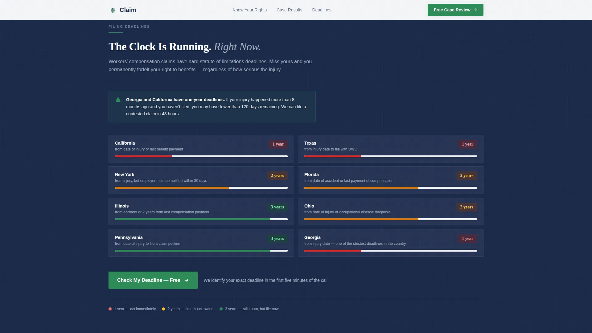
Statute of Limitations Urgency Module
A dedicated section surfaces state-specific filing deadline information to make inaction feel costly. The layout uses a countdown-feel design to communicate urgency without being alarmist, encouraging visitors to act before their legal window closes.
Fixed Mobile Call-to-Action
On mobile devices, a "Get Your Free Case Review" button is fixed to the bottom of the viewport at all times. This ensures the primary conversion action is always one tap away, regardless of where the visitor is in the scroll.
Accordion FAQ and Trust Signals
The "Why Claim" section combines practice differentiators with trust signals and an accordion-style FAQ. This gives visitors a structured way to resolve final objections before clicking through to the intake page.
Page sections overview
| Section | Purpose |
|---|---|
| Hero split layout | Establish authority and present the primary call-to-action |
| Insurer versus. Law table | Educate visitors on denial tactics row by row |
| Case results pairs | Demonstrate settlement outcomes with before-and-after figures |
| Statute of limitations | Build urgency around state-specific filing deadlines |
| Why Claim differentiators | Present practice strengths and trust signals |
| Linear footer row | Deliver contact and navigation in a single clean row |
Design & branding system
The visual system follows a Corporate Precision theme built on a Cloud Canvas palette. Every color choice is deliberate: backgrounds feel like heavy bond paper, text reads like authoritative legal ink, and the only warm color on the page is reserved for action.
- Cloud Canvas palette: open white (#F7F8FA) background, litigation navy (#1B2A4A) for headlines and primary text, silver briefcase gray (#A3AEBF) for table borders and secondary elements, and verdict green (#2E8B57) exclusively on calls-to-action and winning-outcome highlights
- Typography pairing: Fraunces serif for headlines (authoritative and readable) and DM Sans for body text and interface elements (clean, modern, legible at small sizes)
- No decorative elements, no stock-photo gavels or smiling attorneys; the photographic composition features worker and attorney hands on a conference table under natural morning window light
Mobile & speed optimization
The template is built mobile-first, reflecting the reality that injured workers are far more likely to arrive on a phone than a desktop. Every layout decision prioritizes thumb-friendly navigation and fast comprehension on a small screen.
- Fixed bottom call-to-action button on mobile keeps the conversion action visible at every scroll position
- Scroll-triggered reveals and table row stagger animations use medium animation weight, keeping motion purposeful without slowing the experience
- Server Components handle static content sections, with minimal JavaScript kept to interactive elements only such as the comparison table hover states and accordion FAQ
How this template helps you convert
The page is engineered around one conversion: getting the visitor to click through to a free case review intake. It earns that click by making the visitor feel informed and appropriately motivated to act.
- The comparison table reframes the visitor's situation by showing exactly how insurer tactics conflict with their legal rights, shifting them from confusion to clarity and mild urgency.
- Before-and-after settlement pairs and the statute of limitations module stack evidence and deadline pressure, giving hesitant visitors two strong reasons to act before they close the tab.
Other information about this template
This template is designed for the United States market, with copy and structural placeholders reflecting USD settlement figures and state-specific legal deadline references. The intake page it clicks through to is a short form asking for injury type, date of injury, and whether a claim has already been denied.
- The footer follows a Pattern 1 Linear Single-Row layout, keeping the bottom of the page clean and distraction-free
- Animation behavior is set to medium intensity: scroll-triggered section reveals, counter animations on case result figures, and stagger effects on comparison table rows
- The template is categorized under Legal and Compliance, within the Personal Injury and Litigation subcategory, targeting the workers' compensation attorney niche
- No form lives on this landing page; the entire page is optimized to earn a single click to the intake screen


Theme
Corporate Precision
Creative direction
Problem→Solution Arc
Color system
Cloud Canvas
Style
Comparison Table
Direction
Click-Through
Page Sections
Split Hero with Floating Stat Cards
Six-row Insurer Versus. Law Comparison Table
Before-and-after Case Results
Statute of Limitations Urgency Module
Fixed Mobile Call-to-action Button
Accordion FAQ and Trust Signals
Related questions
Does this template include a contact form?
Can I update the case result figures and settlement amounts?
How does the comparison table display on mobile devices?
Is the statute of limitations section customizable by state?
How many times does the call-to-action appear on the page?


