Insurance Adjuster Landing Page Template
Claimshield is a lead-generation landing page built for licensed public adjusters and claims firms. It uses bold settlement metrics, side-by-side comparison tables, and a zip-code-first intake form to turn storm-damaged homeowners, commercial property managers, and attorneys into qualified leads fast.
by Rocket studio
Quick summary
Claimshield is a single-page template designed for public adjuster firms that need to convert distressed policyholders into booked consultations. The page leads with three oversized performance metrics, walks visitors through a transparent claim process via comparison tables, and closes with a structured lead form. Every design choice is built to project authority and reduce hesitation.
Who this template is for
This template is built for claims professionals who need a credible, conversion-ready online presence. It suits firms that handle residential and commercial property damage claims and want to communicate expertise without a lengthy sales pitch.
- Licensed public adjusters serving homeowners after wind, water, fire, or mold damage
- Commercial property managers and portfolio claim handlers who need a firm that understands scale
- Attorneys who require a documented loss valuation before filing suit
What problem this template solves
Most policyholders receive a carrier's first offer and have no way to evaluate whether it is fair. Public adjuster websites often fail to explain the value gap or give visitors a reason to act now. This template fixes that directly.
- It shows the cost of going without professional representation through clear, data-led comparison tables
- It answers the "do you cover my area?" question instantly with a zip-code confirmation badge
- It gives hesitant visitors a low-commitment entry point through a downloadable Policyholder's Rights Guide
What you get with this template
The template delivers a fully structured, section-led landing page ready to represent a public adjuster's service area. Every section is intentional, moving the visitor from awareness to action in a single scroll.
- A stats-driven hero with three headline metrics and a halftone policy-document background texture
- Three escalating comparison tables contrasting unrepresented versus represented claim outcomes
- A multi-field lead capture form with zip-code-first validation and a gated PDF secondary offer
Feature list
This template packages several purpose-built components into one cohesive landing page. Each feature supports the core goal: turn a skeptical visitor into a booked lead.
Stats-Forward Hero Section
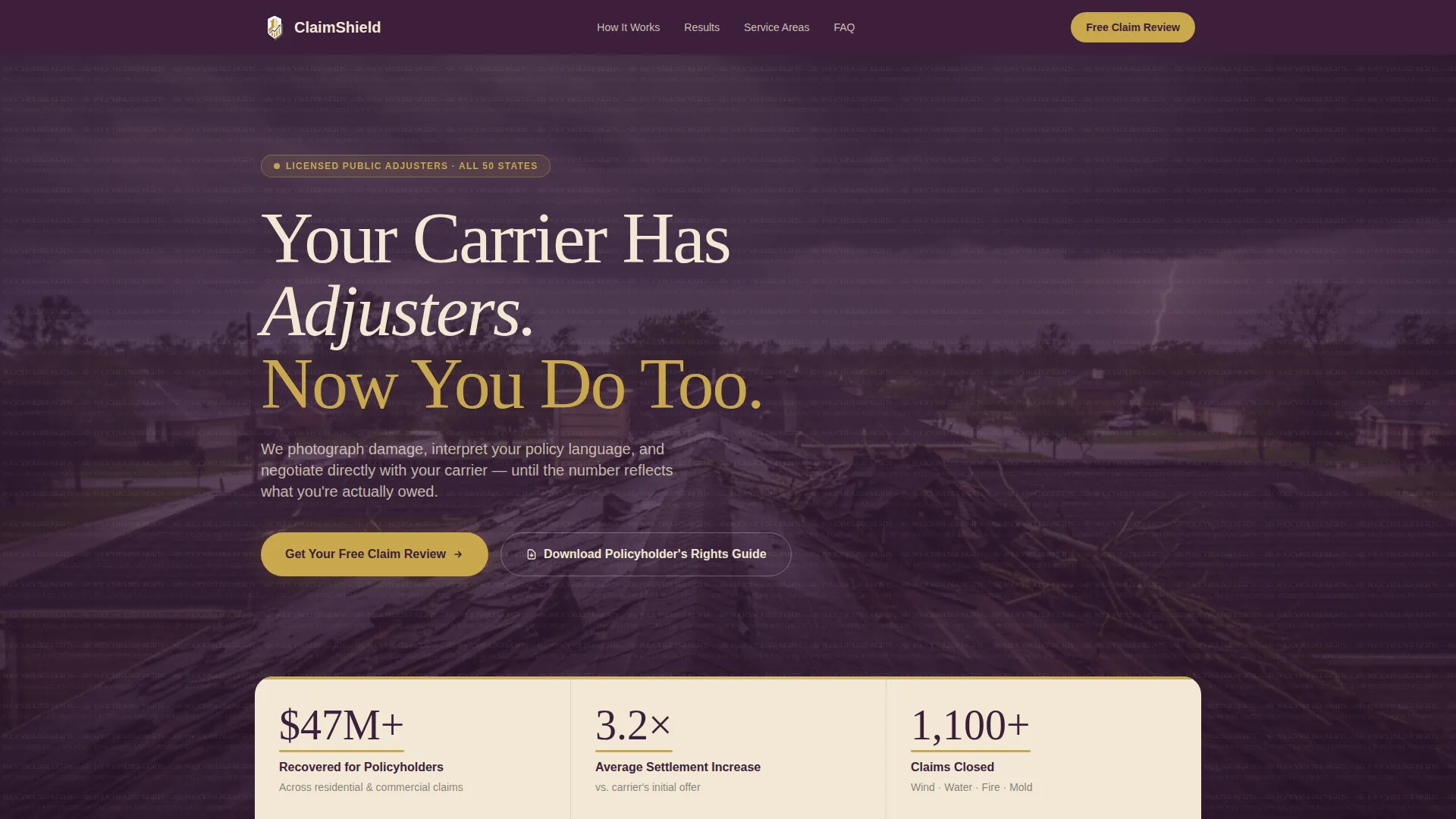
Three oversized figures dominate the opening viewport: "$47M+ Recovered for Policyholders," "3.2x Average Settlement Increase," and "1,100+ Claims Closed." Each metric is set in deep plum against a champagne background, underlined in gold like a ruled ledger line. A halftone insurance-policy texture sits behind the figures at fifteen percent opacity.
Escalating Comparison Tables
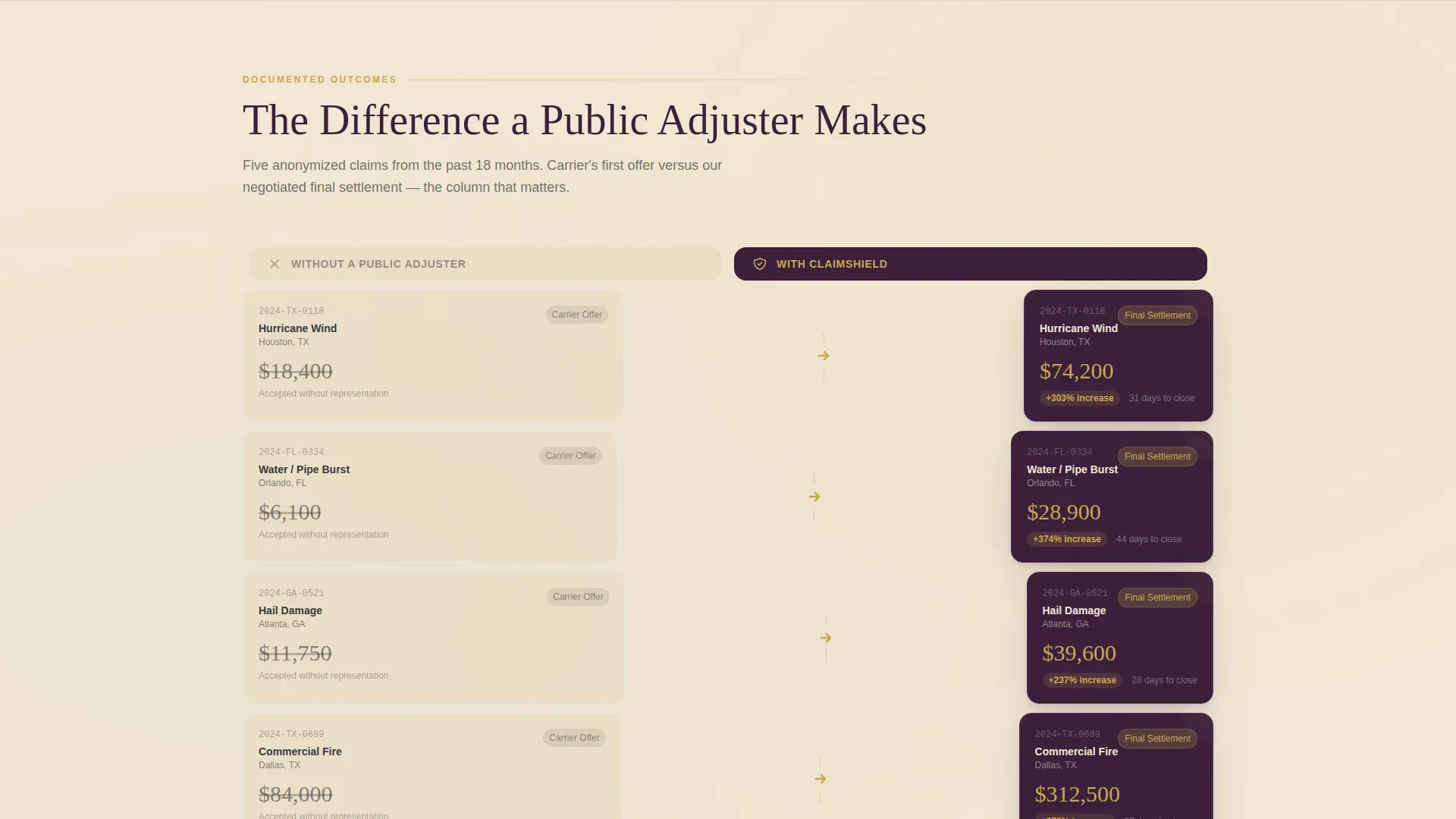
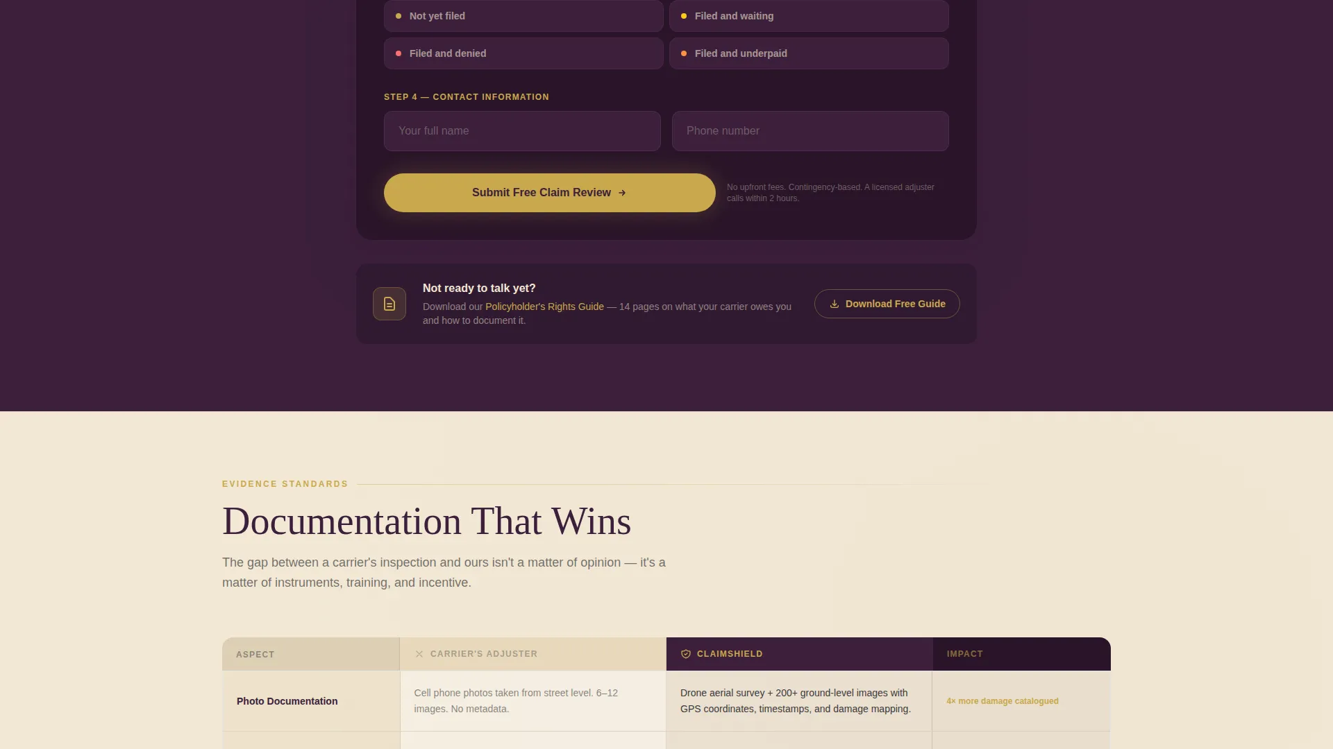
Three side-by-side tables place "Without a Public Adjuster" against "With Our Team" across real claim scenarios. The first table compares initial offer versus final settlement. The second contrasts claim timelines. The third maps documentation quality, covering carrier photos against thermal imaging, moisture readings, and engineering reports.
Zip-Code-First Lead Form
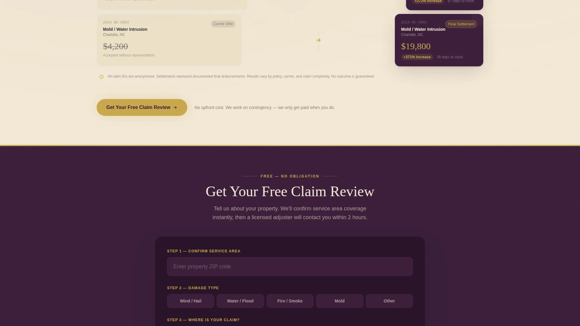
The intake form opens with a property zip code field. On entry, it instantly returns a confirmation badge reading "We cover [City], [State]." This proves service-area relevance before asking for contact details, reducing form abandonment. Subsequent fields capture damage type, claim status, and a phone number.
Sticky Call-to-Action Bar
The primary call to action, "Get Your Free Claim Review," appears after the first comparison table and again as a persistent sticky bar during scroll. This keeps the conversion path visible regardless of where a visitor pauses on the page.
Gated Resource Secondary Path
Visitors not ready to call can access "Download the Policyholder's Rights Guide," a gated PDF that captures leads from the research stage. This secondary path broadens the funnel without diluting the primary offer.
Geographically Anchored Social Proof
Single-sentence client quotes are placed between comparison tables. Each quote references a specific service area, grounding the firm's credibility in real locations and reinforcing local coverage for visitors scanning for relevance.
Page sections overview
| Section | Purpose |
|---|---|
| Stats Hero | Opens with three headline metrics and the core positioning statement |
| Headline Statement | Sets the competitive framing: "Your Carrier Has Adjusters. Now You Do Too." |
| Offer versus. Settlement Table | Compares carrier's initial offer against final negotiated settlement across five claims |
| Primary call to action Block | First appearance of "Get Your Free Claim Review" form after the first table |
| Timeline Comparison Table | Contrasts how long claims take with and without professional representation |
| Documentation Quality Table | Maps carrier photo evidence against thermal imaging and engineering reports |
| Area Quote Strips | Single-sentence client quotes tied to specific service-area locations |
| Sticky call to action Bar | Persistent scroll bar keeping the primary call to action visible throughout |
| Gated PDF Offer | Secondary conversion path for visitors not ready to engage by phone |
| Lead Capture Form | Zip-code-first form with damage type, claim status, and phone number fields |
Design & branding system
The visual identity follows a Legal Shield theme built around the Plum Executive color system. The palette communicates authority, precision, and trust without relying on insurance industry clichés.
- Deep plum (#3B1F3B) anchors headers and the primary navigation bar; muted champagne (#F2E8D5) fills section backgrounds like aged parchment; gunmetal charcoal (#3A3A3C) is used for body text
- Decisive gold (#C9A84C) appears exclusively on calls to action and key metric highlights, functioning like a brass clasp on a senior partner's briefcase
- A halftone texture of an insurance policy document runs behind the hero at fifteen percent opacity, legible enough to signal context without overpowering the headline figures
Mobile & speed optimization
The layout is structured for clean rendering on smaller screens without sacrificing the authority the design needs to project. Comparison tables, the sticky bar, and the zip-code form are all built with mobile interaction in mind.
- Comparison tables reflow to stacked columns on narrow viewports so side-by-side data stays readable
- The sticky call-to-action bar and zip-code form maintain full functionality across screen sizes
- Section backgrounds and the halftone texture are layered to render cleanly without heavy visual overhead
How this template helps you convert
The page is engineered around a single goal: turn a visitor with a crumpled carrier offer into a booked claim review. Every structural decision serves that outcome.
- The zip-code confirmation badge removes the most common reason visitors abandon adjuster inquiry forms: uncertainty about whether the firm serves their area
- The three escalating comparison tables build a progressive case for representation, making the cost of going alone feel less like a risk and more like a certainty
- The dual-path conversion structure captures both ready-to-act leads through the primary form and research-stage visitors through the gated PDF, maximizing the yield from every page visit
Other information about this template
This template is categorized under Professional Services and sits within the Insurance Adjuster Online Presence subcategory. It is purpose-built for the Insurance Adjuster Service Area and Location Page niche, where local relevance and documented authority matter most.
- The Transparent Process creative direction is central to the template's structure: each scroll layer peels back one step of the actual claim workflow
- The template style is Comparison Table, meaning the persuasion architecture relies on structured contrast rather than testimonial-heavy or narrative-heavy layouts
- The header concept is Stats/Metrics, leading with proof before explanation to match the mindset of a visitor already holding a low carrier offer
Theme
Legal Shield
Creative direction
Transparent Process
Color system
Plum Executive
Style
Comparison Table
Direction
Lead Generation
Page Sections
Stats-forward Hero with Metric Highlights
Three Escalating Comparison Tables
Zip-code-first Lead Capture Form
Sticky Call-to-action Bar on Scroll
Gated PDF Secondary Conversion Path
Geographically Anchored Client Quotes
Related questions
What types of clients is this landing page designed to attract?
Can I replace the comparison table data with my firm's real results?
How does the zip-code confirmation badge work?
What is the gated PDF offer included in the template?
Is this template suitable for a firm covering multiple service areas?



