Allergy Clinic Landing Page Template
A split-screen landing page built for allergy clinics that want to turn website visitors into booked appointments. The interactive symptom checklist guides patients through a personal audit, building clarity and urgency before they reach the booking form. Clean Medical Clarity design and a structured lead capture flow make this template ready to deploy for any allergist practice.
by Rocket studio
Quick summary
This is a single-page, split-screen (50/50) landing page template for allergist appointment booking. It walks visitors through an interactive symptom audit, explains testing options, and closes with a lead capture form. The design uses a clinical Slate and Sky color system with warm typographic choices to feel both trustworthy and approachable.
Who this template is for
This template is built for allergy clinics and independent allergist practices that need a focused, conversion-ready online presence. It suits any practice that wants to move patients from "I wonder if I have allergies" to "I booked my evaluation" in a single session.
- Allergists and allergy clinics running appointment-based practices
- Healthcare marketers building landing pages for seasonal or food allergy campaigns
- Practice managers replacing outdated contact forms with a structured booking flow
What problem this template solves
Many allergy practices rely on generic contact pages that do nothing to educate or motivate a hesitant visitor. People arrive unsure whether their symptoms are serious enough to warrant a visit. They leave without booking.
- Visitors lack the self-awareness to recognize their symptoms as allergy-related
- Generic forms create no urgency and offer no reassurance about the appointment process
- Mobile users abandon pages that bury the call to action below lengthy text blocks
What you get with this template
You get a fully structured, single-page layout that takes a visitor from first impression to completed lead form. Every section has a clear job, and the split-screen format keeps clinical context and patient experience visible side by side at every scroll depth.
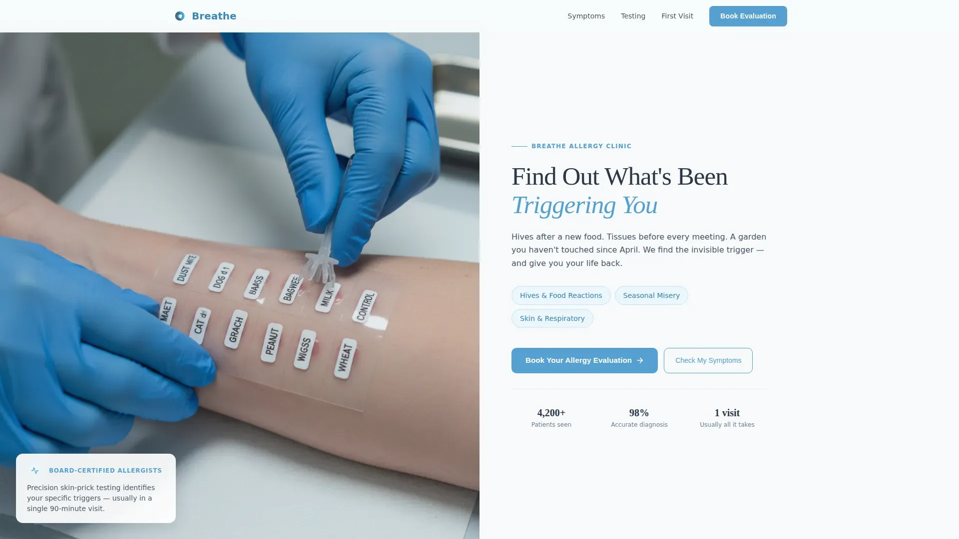
- A hero section with a photographic left panel and a clear headline-driven right panel
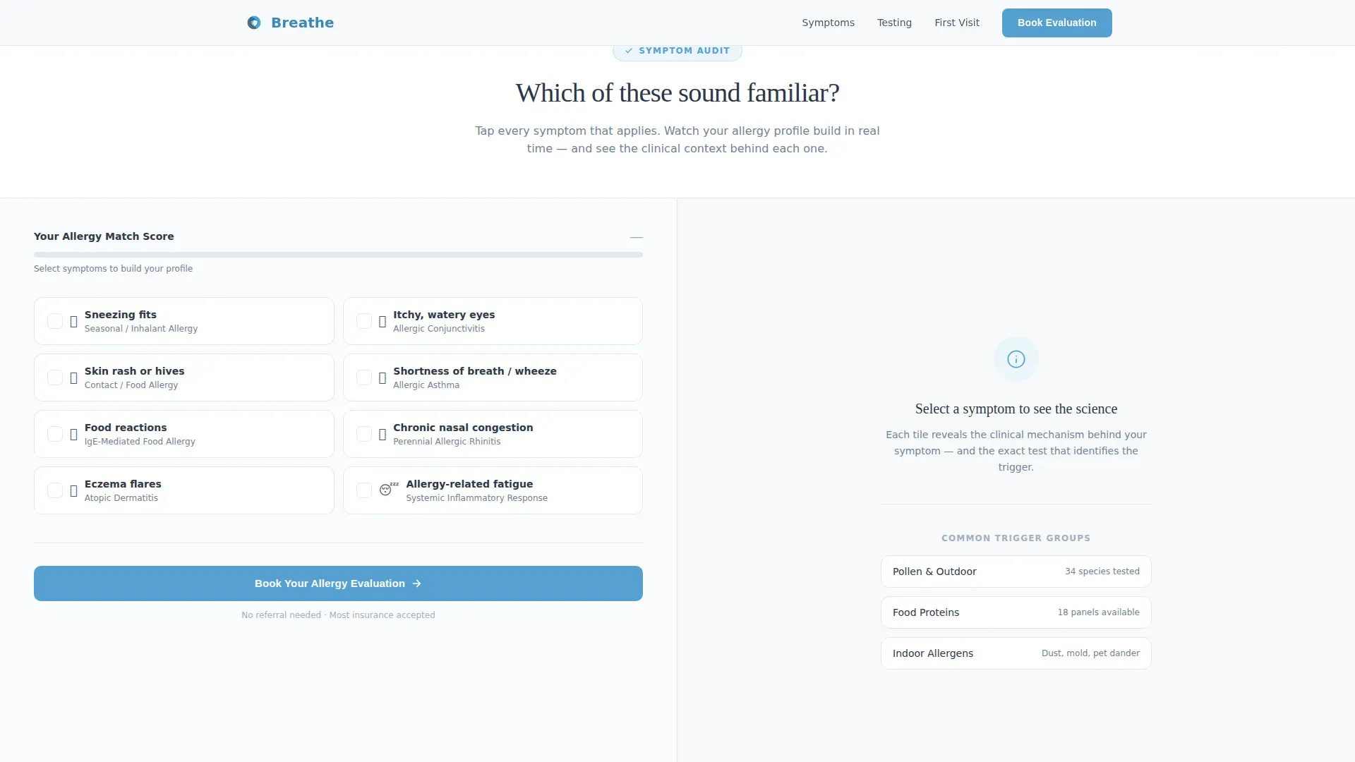
- An interactive symptom checklist with a live match score and clinical explanation panel
- A multi-field booking form plus a secondary path for visitors not yet ready to commit
Feature list
This template includes a carefully sequenced set of interactive and structural features, each grounded in the goal of converting allergy sufferers into booked patients.
Interactive Symptom Checklist with Live Match Score
Visitors tap tiles covering common symptoms such as sneezing, itchy eyes, skin rash, shortness of breath, and food reactions. Each selection updates a visible match score and reveals a short clinical explanation on the opposite panel. The checklist turns passive scrolling into a personal audit that builds conviction before the booking form appears.
Split-Screen (50/50) Section Layout
Every major section pairs two panels side by side. Patient-side experience sits on the left; clinical detail and context appear on the right. This structure lets visitors process emotional reassurance and factual information simultaneously without either competing for attention.
Lead Generation Booking Form
The primary form captures the visitor's name, preferred contact method (call or text), insurance carrier via a dropdown, and a free-text field labeled "Describe your worst symptom." This last field reduces friction by letting patients express their concern in plain language rather than selecting from a rigid list.
Secondary PDF Download Path
Visitors who are not ready to book can request a downloadable pre-visit checklist in exchange for their email address. This secondary conversion path keeps those visitors inside the lead funnel without forcing them to commit to an appointment before they feel ready.
Scroll-Linked Section Reveals
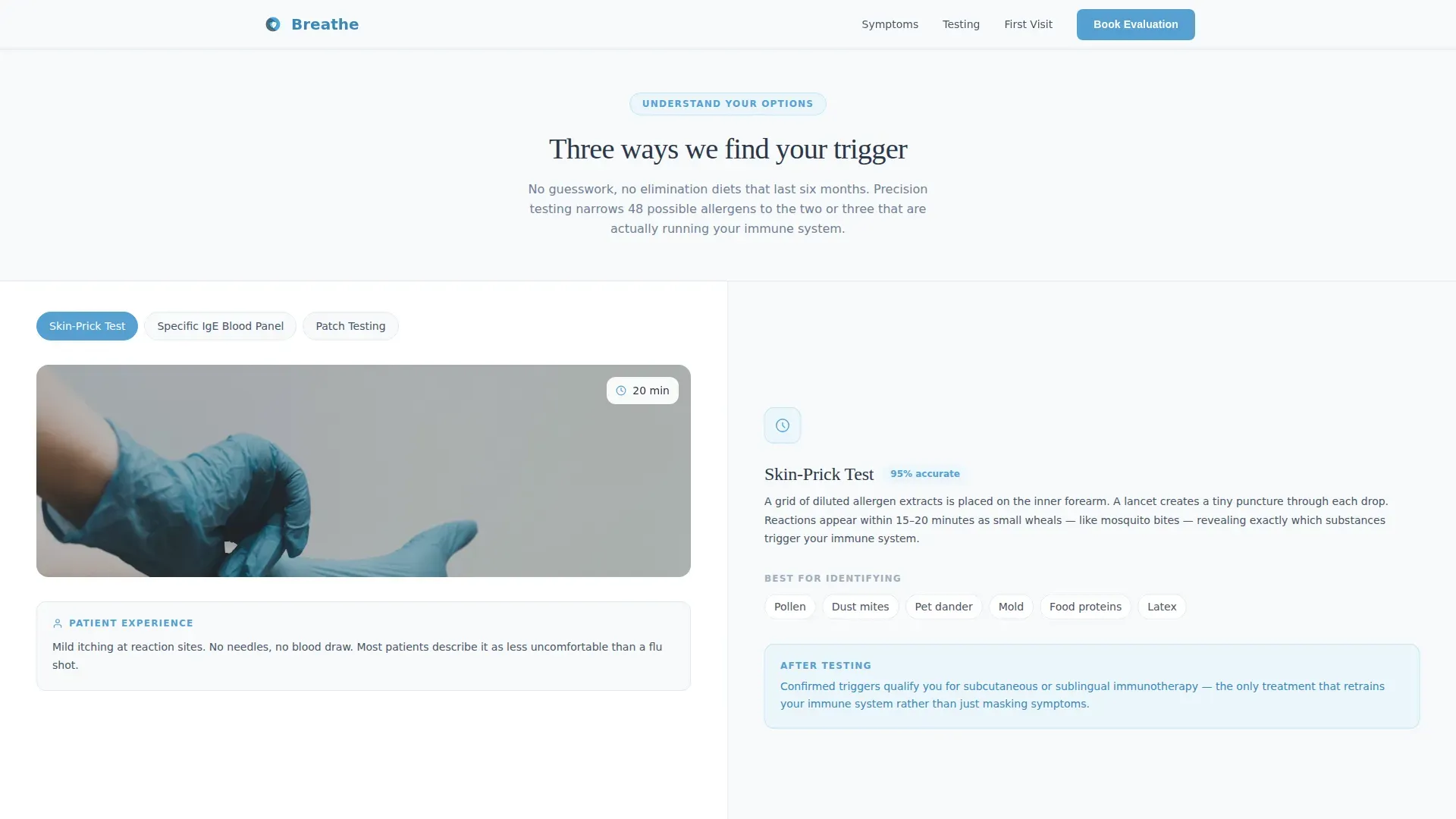
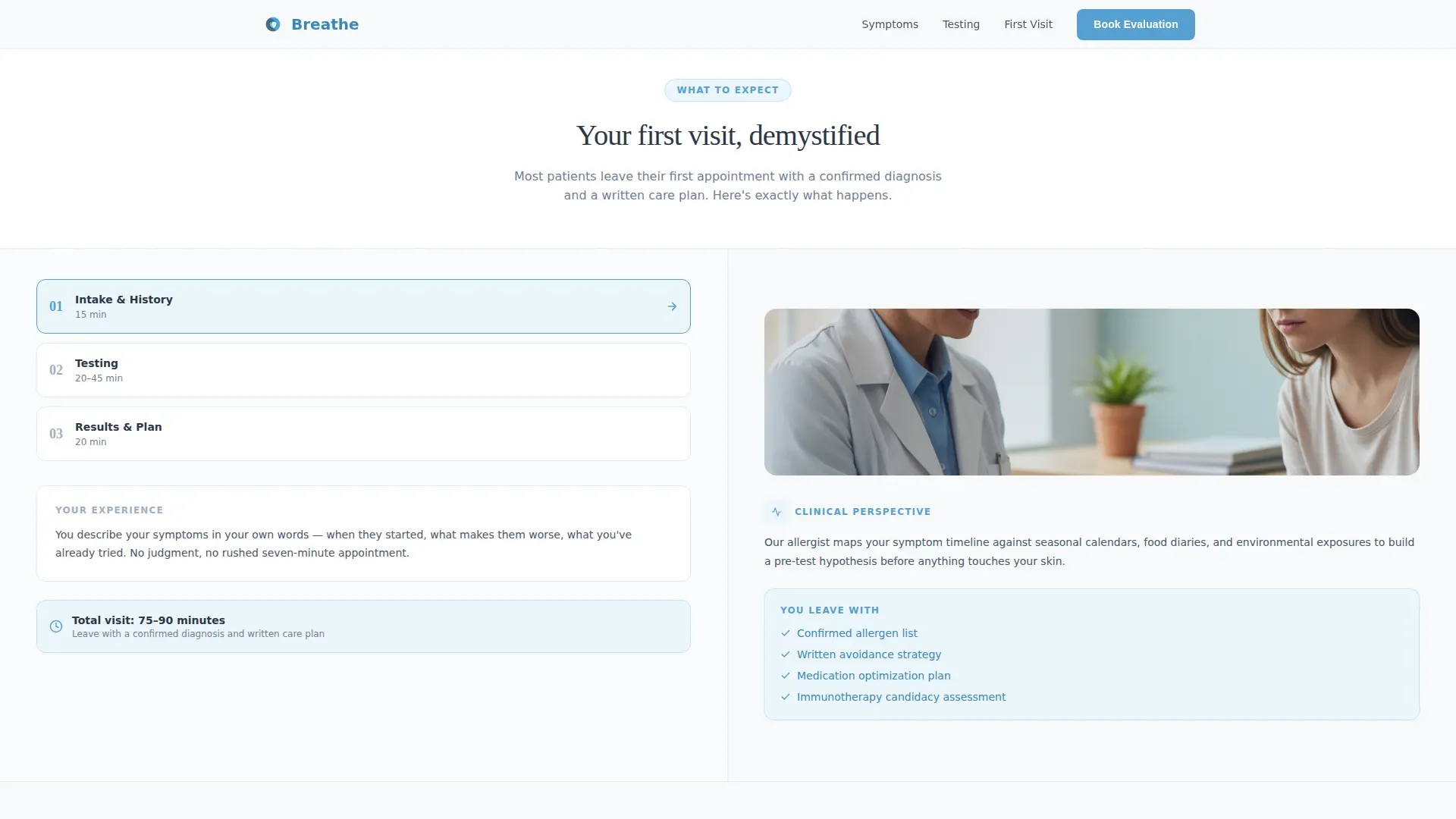
Sections escalate in sequence: identify your symptoms, understand testing options, then see what a first visit looks like. Each scroll reveal uses animation tied to the user's progress, so the page feels responsive and purposeful rather than static.
Sticky Mobile Booking Bar
On mobile devices, the primary call-to-action button remains fixed at the bottom of the screen throughout the session. This ensures that visitors who finish the symptom audit on a phone can book immediately without scrolling back to find the form.
Page sections overview
| Section | Purpose |
|---|---|
| Hero Split Panel | Introduce the practice and name the three most common visit reasons |
| Symptom Checklist Audit | Let visitors self-identify symptoms and build personal urgency |
| Testing Options Split | Explain scratch tests, blood panels, and patch tests in plain language |
| First Visit Walkthrough | Show step-by-step what patients can expect during their evaluation |
| Booking Form + PDF | Capture leads via appointment form or downloadable pre-visit checklist |
| Footer Row | Provide practice contact details and navigation in a single linear row |
Design & branding system
The visual identity follows a Medical Clarity theme that pairs clinical precision with human warmth. The Slate and Sky color system keeps every panel feeling composed and trustworthy, while two typeface choices prevent the layout from reading like a sterile data sheet.
- Color palette: clinical slate (#4A5568) for body text and navigation, open-sky blue (#56A0D3) for calls to action and progress indicators, sterile white (#F7FAFC) for panel backgrounds, and soft graphite (#2D3748) for display headlines
- Typography: DM Sans handles body copy and interface labels for clean legibility; Fraunces is used for display headlines to add warmth and distinction
- Photography direction: the hero left panel features a shallow depth-of-field close-up of a skin-prick grid being placed on a patient's inner forearm, with the consultation room blurred into soft blue-gray tones
Mobile & speed optimization
The template is built with mobile-first priorities, recognizing that many patients will arrive via a phone search during a symptomatic moment. Static sections use server-side rendering for a fast initial load, while interactive elements such as the symptom checklist load on the client side.
- Sticky bottom call-to-action bar keeps the booking button accessible throughout the mobile session
- Scroll-linked animations are set to medium intensity to remain smooth without taxing lower-powered devices
- The split-screen layout reflows gracefully for narrower viewports so no content is hidden or truncated
How this template helps you convert
The page is sequenced deliberately. By the time a visitor reaches the booking form, the symptom audit has already done the persuasion work. The visitor arrives at the form already identifying as someone who needs the appointment.
- The symptom checklist creates personal relevance early. Visitors who see their own symptoms reflected in the audit tiles feel understood rather than sold to, which lowers resistance to booking.
- The match score and clinical explanations build quiet confidence. Each checked symptom becomes a small piece of evidence that a professional evaluation makes sense, moving the visitor from uncertainty to intent.
- The dual conversion path removes pressure. Visitors who are not ready to book today can still exchange their email for the pre-visit PDF, keeping them connected to the practice without abandoning the page empty-handed.
Other information about this template
This template is designed as a standalone, single-page lead generation asset. It does not require a multi-page website structure to function effectively. The footer follows a Pattern 1 linear single-row layout, keeping the bottom of the page clean and uncluttered.
- Target audience spans adults aged 25 to 55 with undiagnosed allergy symptoms, including parents seeking pediatric evaluations for children
- The insurance carrier dropdown is built for US-based practices and uses a US date format and USD-aligned conventions throughout
- Animation intensity is set to medium, with scroll-linked reveals and tile check interactions that feel purposeful without overwhelming clinical tone
- The template supports localization for English-language US markets and is suitable for practices treating hives, seasonal allergy symptoms, and food-related reactions
Theme
Medical Clarity
Creative direction
Checklist & Audit
Color system
Slate & Sky
Style
Split Screen (50/50)
Direction
Lead Generation
Page Sections
Interactive Symptom Checklist with Match Score
Split-screen 50/50 Section Layout
Multi-field Lead Capture Form
Secondary PDF Download Path
Sticky Mobile Booking Bar
Scroll-linked Section Reveals
Related questions
How does the interactive symptom checklist work?
Can I use this template if I only offer one type of allergy testing?
How does the secondary PDF download path work?
Does this template work well on mobile devices?



