Audiology Clinic Landing page Template
This single-column landing page helps audiology clinics turn anxious first-time visitors into booked appointments. A warm multi-step form opens the experience, and each scroll section walks patients through exactly what happens during a visit. The Soft Mist color palette and transparent process layout replace clinical coldness with quiet confidence, guiding adults, parents, and musicians toward booking a hearing assessment.
by Rocket studio
Quick summary
This audiologist appointment booking landing page puts a guided multi-step form front and center. Visitors answer one warm question at a time, then scroll through a transparent visit process that dissolves pre-appointment anxiety. The Soft Mist palette, waveform watermark, and interactive audiogram demo make the experience feel calm and clear rather than clinical.
Who this template is for
This template is built for independent audiology clinics and hearing care practices that want to convert online visitors into scheduled appointments. It speaks directly to three types of prospective patients.
- Adults in their fifties who have noticed the television volume creeping up or started missing words in dinner conversation
- Parents of toddlers who did not pass a newborn hearing screening and need a clear next step
- Musicians who rely on their high-frequency range and want a non-alarming way to protect what they have
What problem this template solves
First-time audiology patients often put off booking because they do not know what to expect. A generic clinic website with a phone number and a contact form does not answer the questions people type into a search bar at midnight. This template solves that directly.
- It removes every major unknown about the visit before a patient ever picks up the phone
- It replaces cold clinical imagery with a process-led layout that builds trust one scroll at a time
- It gives nervous visitors an easy low-commitment entry point through a two-minute online hearing check
What you get with this template
You get a fully structured single-column landing page designed around one goal: moving a hesitant visitor into a confirmed appointment slot. Every section earns the next click before asking for it.
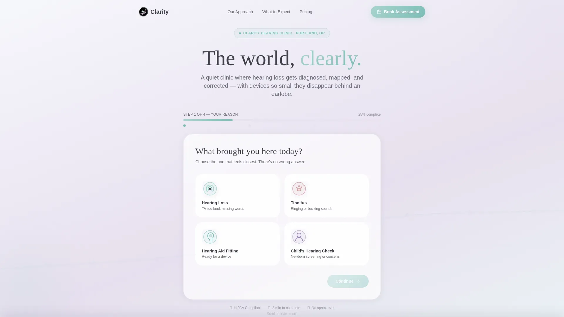
- A four-step multi-step intake form as the hero, with illustrated reason cards and a seafoam progress bar
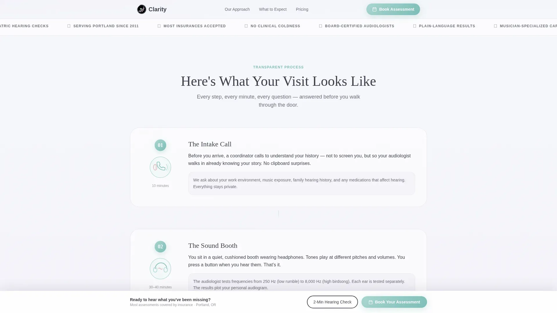
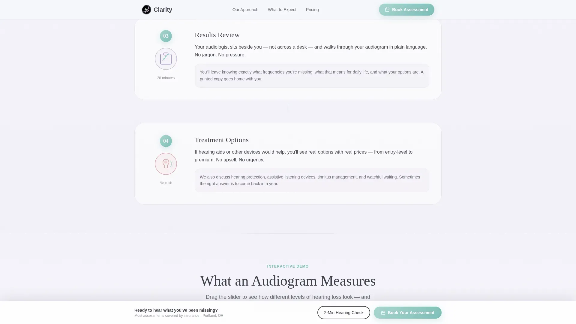
- A transparent four-stage visit process section with ear-anatomy illustrations and plain-language copy
- An interactive frequency slider, a sample annotated audiogram, a treatment options area with honest price ranges, and a persistent bottom booking bar
Feature list
A paragraph introducing the feature set: Each built-in component was chosen to reduce patient anxiety and shorten the path from "I think I might have a hearing problem" to "I have a booking confirmed."
Multi-Step Intake Form Hero
The hero skips stock photography entirely. Instead, visitors see a single warm question, "What brought you here today?", with four illustrated tap cards covering hearing loss, tinnitus, hearing aid fitting, and a child's hearing check. A slender seafoam progress bar tracks completion across four steps, keeping momentum without pressure.
Transparent Visit Process Section
Four sequential scroll sections walk the patient through the intake call, the sound booth, the results review, and the treatment conversation. Each stage is described in plain language with a supporting illustration, so nothing about the appointment feels like a surprise.
Interactive Frequency Slider
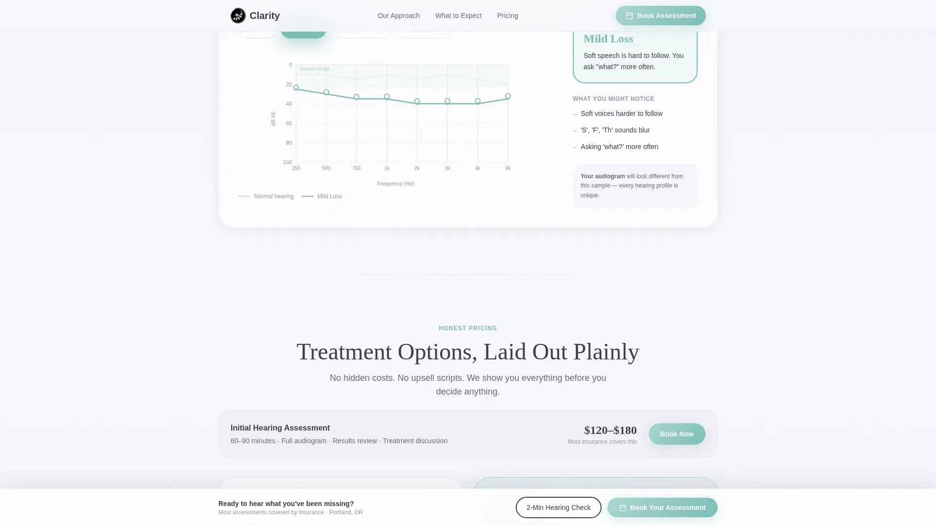
Visitors can drag a frequency slider to hear the difference between mild and moderate hearing loss levels. This hands-on demo makes the audiogram concept tangible and personal before the patient even arrives.
Annotated Sample Audiogram
A sample audiogram with plain-language callouts shows what the results of a hearing assessment actually look like. Patients arrive already familiar with the format, which reduces anxiety during the results review.
Two-Minute Online Hearing Check
A secondary conversion path offers a short tone-based hearing check directly on the page. The quiz ends with personalized results and routes the visitor back to the same "Book Your Hearing Assessment" call to action.
Persistent Booking Bar
After the visitor scrolls past the process sections, a bottom bar remains visible with the primary booking call to action. This ensures the invitation to schedule is always one tap away without interrupting the reading experience.
Page sections overview
| Section | Purpose |
|---|---|
| Hero multi-step form | Warm intake entry point with four illustrated reason cards and progress bar |
| Transparent visit process | Four sequential steps showing exactly what happens after booking |
| Audiogram demo | Interactive frequency slider plus annotated sample audiogram |
| Treatment options | Honest pricing table with ranges for each care path |
| Hearing check call to action | Two-minute online tone test with personalized results and booking prompt |
| Persistent bottom bar | Always-visible booking call to action after scrolling past process sections |
| Footer | Horizontal flow footer for clinic contact details and navigation |
Design & branding system
The visual identity follows a Soft Gradient approach built around the Soft Mist color system. The overall feel is described in the brief as early morning fog lifting off a still lake, nothing clinical and nothing cold.
- Colors run from cloud white (#F7F8FC) at the top into lavender haze (#E8E0F0), with calm seafoam (#A8D5D0) for the progress bar and interactive elements, warm charcoal (#3D3D4A) for body text, and gentle rose (#D4A0A0) for hover states
- A faint watercolor audiogram waveform sits behind the hero form as a decorative SVG watermark, reinforcing the clinical context without harsh imagery
- Typography pairs Fraunces as the display serif for headings with DM Sans as a clean sans-serif for body copy, balancing warmth with readability
Mobile & speed optimization
The page is built mobile-first because the brief notes that anxious patients research hearing concerns on their phones late at night. Every interactive element is designed to work comfortably on a small touch screen.
- The multi-step form, frequency slider, and online hearing check are all built for tap interaction, not mouse-hover dependency
- Scroll reveals use a slideInBlur stagger animation with native CSS scroll behavior, keeping motion smooth without heavy third-party scripts
- Server and client rendering responsibilities are split to keep initial load fast on mobile connections
How this template helps you convert
The page is a click-through landing page with one job: move the visitor into the clinic's existing booking calendar. Every design and copy decision supports that goal.
- The multi-step form starts with a low-stakes question and only asks for contact details at the final step, reducing form abandonment before commitment is established
- The transparent process section answers every question a nervous first-time patient would search for at midnight, removing the hesitation that causes visitors to close the tab without booking
- The two-minute hearing check gives undecided visitors a personalized reason to engage further, and it ends on the same primary call to action: "Book Your Hearing Assessment"
Other information about this template
This template sits within the Health and Medical category under the Audiologist Website subcategory, with a niche focus on audiologist appointment booking pages. A few additional details worth noting before you build with it.
- The template style is Single Column Flow, meaning all content reads in one uninterrupted vertical scroll with no sidebar or tabbed navigation to distract
- The creative direction is labeled Transparent Process, which means the layout's core value is showing patients the full visit journey rather than selling them on credentials
- The header concept is a Multi-Step Form, making the booking entry point the first thing a visitor interacts with rather than a passive hero banner
- The landing page direction is Click-Through, so the template is optimized to route visitors to the clinic's own scheduling system rather than capturing leads inside the page itself
- The Intersection Match Score for this template's category, subcategory, and niche combination is 13, indicating a tightly focused use-case fit
Theme
Soft Gradient
Creative direction
Transparent Process
Color system
Soft Mist
Style
Single Column Flow
Direction
Click-Through
Page Sections
Multi-step Intake Form as Hero
Transparent Visit Process Layout
Interactive Frequency Slider Demo
Annotated Sample Audiogram
Two-minute Online Hearing Check
Persistent Bottom Booking Bar
Related questions
Can I connect this template to my clinic's existing booking calendar?
Does the multi-step form collect and store patient data?
Can I update the four illustrated reason cards to match my services?
Is the interactive frequency slider a clinical hearing test?
What page type and layout style does this template use?



