Consultant Career Professional Website Template
Clarity is a single-page consultant landing page template built for solo strategy practitioners. It layers overlapping accolade cards, named client outcomes, and a proprietary framework teaser across a deep indigo canvas. Every section stacks proof before asking for anything. The primary call to action is a gated framework PDF download, supported by a secondary newsletter sign-up path.
by Rocket studio
Quick summary
Clarity is a dark-luxury consultant landing page template designed for solo strategy practitioners. It uses an overlap-and-layer visual approach to stack credentials, case outcomes, and methodology proof in sequence. The page builds trust through stacked evidence before presenting a framework PDF download as the primary conversion goal.
Who this template is for
This template is built for independent strategy consultants who serve senior decision-makers. It suits practitioners whose credibility is built on documented results, published frameworks, and recognizable accolades rather than a large team or agency brand.
- Solo consultants advising CEOs, founders, and nonprofit directors on complex strategy challenges
- Independent practitioners with keynote features, published work, or award recognition to showcase
- Strategy advisors offering a proprietary methodology they want to package as a downloadable resource
What problem this template solves
Senior executives arrive skeptical. A generic bio page does nothing to earn their attention. This template solves the trust gap by arranging proof in a deliberate sequence, so visitors experience a career's worth of credibility before they ever see a form field.
- Consultants lose qualified leads because their site lacks the weight their reputation deserves
- A scattered portfolio page fails to communicate the depth and specificity of cross-industry experience
- Generic call-to-action placement asks for commitment before the visitor has any reason to give it
What you get with this template
The template delivers a fully structured single-page layout with five distinct content zones, each built to advance a specific stage of the trust-building sequence. Every section is production-ready and customizable to your own awards, case data, and framework copy.
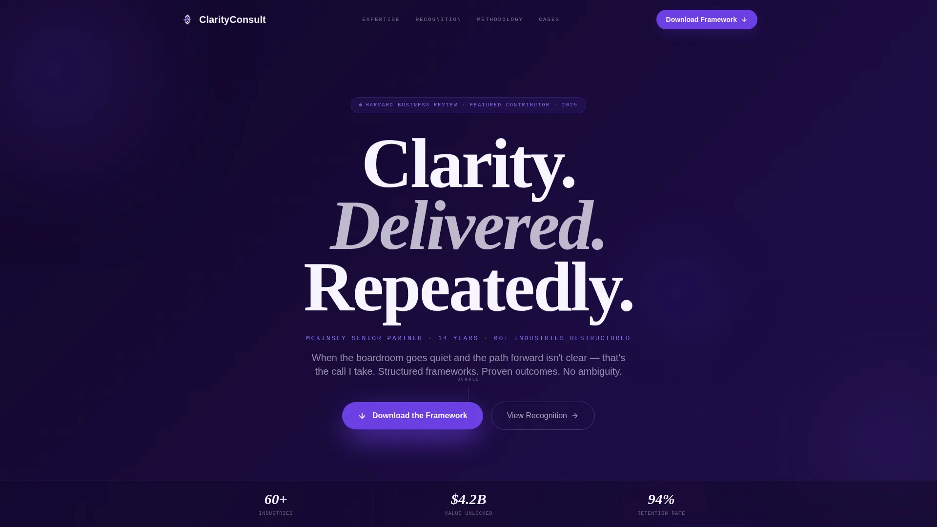
- A hero section with a parallax giant serif headline, credential badge, and violet call-to-action pill
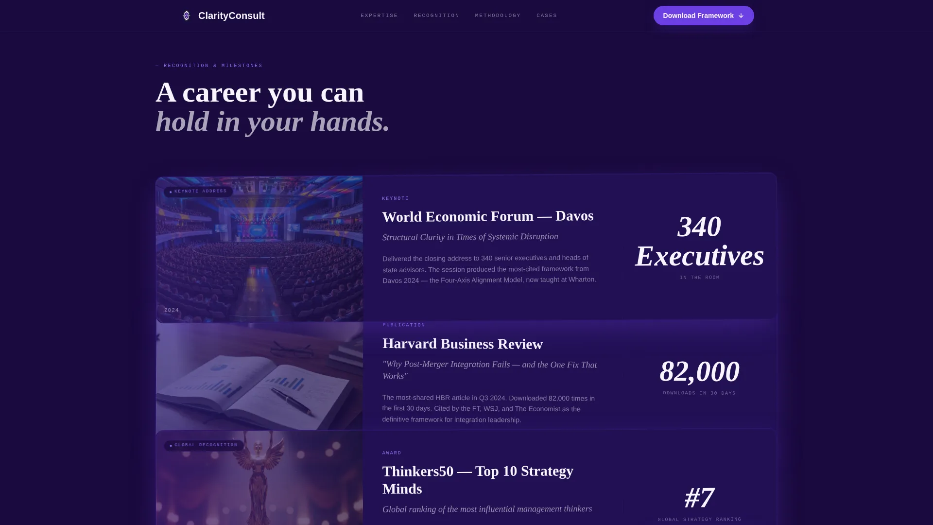
- Overlapping recognition-layer cards, a three-case transformation section, a methodology showcase, and a gated download form
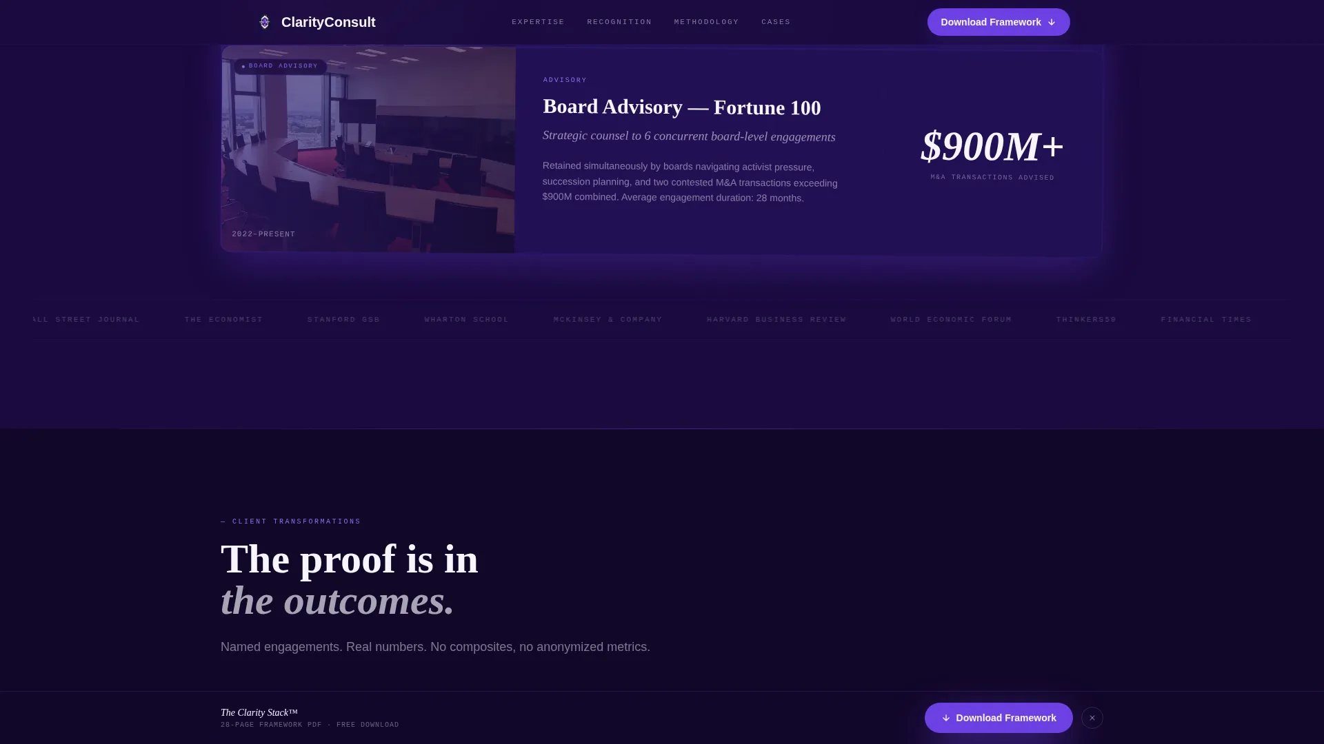
- A sticky bottom call-to-action bar that resurfaces after the third recognition layer and persists through the methodology section
Feature list
This template is built around one purpose: converting skeptical senior professionals into framework download leads by stacking visual proof in a deliberate, accelerating rhythm.
Parallax Giant Serif Hero
The hero fills eighty percent of the viewport with a three-word serif headline set in Fraunces typeface against nightfall indigo. A subtle parallax scroll effect makes the headline feel etched into glass hovering above the page. A single line of violet text below names the most recognizable credential, functioning as proof rather than biography.
Overlapping Recognition Layer Cards
Award and accolade cards slide into view in sequence, physically overlapping at their edges to create the visual impression of framed certificates being hung on a wall. Each card carries a distinct milestone: a keynote clip embed, a published framework with journal cover, or a named client transformation. The stacking rhythm tightens as the visitor scrolls, building visual momentum.
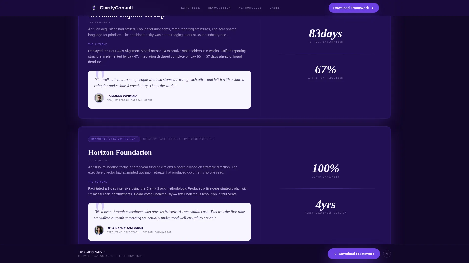
Named Case Transformation Section
Three client outcome blocks present real-scenario transformations with named metrics and counter animations. Each block is one focused paragraph, keeping the proof specific and scannable. This section follows the recognition layers to reinforce that the awards connect to measurable client results.
Gated Framework Download Form
The primary call to action collects a work email, company name, and a single dropdown asking "What challenge are you facing?" with options including post-merger alignment, growth strategy, and board readiness. The form is placed after the methodology section, so visitors arrive at it having already seen the evidence. A secondary path offers newsletter sign-up requiring only an email address.
Sticky Bottom Call-to-Action Bar
After the third recognition layer, a sticky call-to-action bar pins to the bottom of the viewport. It persists through the methodology and download sections. This ensures the primary offer stays accessible without interrupting the credential-reading flow.
Spotlight Hover and Depth Effects
Cards respond to cursor movement with spotlight border highlights and a depth-shift hover state that makes layered elements appear to slide forward. Counter animations trigger when case metric blocks enter the viewport. These interactions reinforce the physical-depth metaphor of credentials stacked on a desk.
Page sections overview
| Section | Purpose |
|---|---|
| Hero Headline | Establish authority instantly with a giant serif statement and top credential badge |
| Recognition Layer Cards | Stack awards and accolades as overlapping sliding proof panels |
| Case Transformation Blocks | Present three named client outcomes with animated metrics |
| Methodology Framework Showcase | Preview the proprietary strategy PDF with journal cover visual |
| Download Call to Action | Capture work email, company name, and challenge context via form |
| Sticky Bottom Bar | Keep the framework download offer visible throughout the scroll journey |
| Footer | Close with horizontal flow pattern and secondary navigation |
Design & branding system
The visual identity follows a Lens and Frame theme built on an Electric Indigo color system. The palette is described in the brief as resembling the glow of a projector in a darkened keynote hall: authoritative, singular, and visually commanding. Typography pairs a classical serif with a clean modern body face and a monospaced label font for a layered typographic hierarchy.
- Color palette: nightfall indigo (#1A0A3E) as the primary background, charged violet (#6C3FE2) for accents and hover states, cool platinum (#E8E4F0) for body text, and sharp electric white (#F7F5FF) for pull-quote panels
- Typography: Fraunces for serif display headlines, DM Sans for body copy, JetBrains Mono for labels and metadata text
- Visual style: dark luxury with layered card depth, soft violet card shadows, and a private-study atmosphere built from overlapping surfaces
Mobile & speed optimization
The template is designed desktop-first to match the browsing habits of senior executives reviewing the page on a laptop. All animations are built using CSS and the IntersectionObserver browser API, avoiding heavy third-party libraries. The layout scales to responsive mobile without removing the core depth-and-layer experience.
- Desktop-first layout prioritizes the full-viewport headline and layered card experience for laptop users
- Animations use CSS transitions and IntersectionObserver, keeping the interaction layer lightweight
- Responsive breakpoints carry the stacked-card rhythm and sticky call-to-action bar to smaller screens
How this template helps you convert
The conversion architecture is deliberate. The page earns the download by building a case through stacked evidence before ever displaying a form. Each section adds a layer of proof, and the call-to-action placement reflects the psychological sequence of a skeptical senior executive warming to a practitioner they have just discovered.
- The hero section signals authority immediately with a commanding headline and a single named credential, prompting visitors to scroll rather than leave
- Recognition layers and case transformation blocks accumulate proof across multiple formats, so by the time the methodology section appears, the visitor already has strong reasons to trust the offer
- The sticky call-to-action bar and the gated download form together close the loop, offering a concrete next step at the exact moment the visitor's confidence peaks
Other information about this template
This template belongs to the Personal and Resume category with a Consultant Career subcategory, specifically matched to the Consultant Personal Website niche. It is built as a single-page overlap and layered structure using the Overlap and Layered template style. The creative direction is Award and Recognition, the header concept is Giant Headline Centered, and the conversion direction is Content and Resource delivery.
- The template is localized for English-language audiences using United States date format and USD currency references
- Six testimonial slots are included in the social proof layer alongside named metric blocks and recognition badges
- The footer uses a horizontal flow pattern suited to a solo practitioner's minimal navigation needs
- This template is well suited to consultants building a personal website that doubles as a lead generation asset for B2B professional services engagements
Theme
Lens & Frame
Creative direction
Award & Recognition
Color system
Electric Indigo
Style
Overlap/Layered
Direction
Content/Resource
Page Sections
Parallax Giant Serif Hero Section
Overlapping Recognition Card Layers
Named Client Transformation Blocks
Gated Framework Download Form
Persistent Sticky Call-to-action Bar
Spotlight Hover and Card Depth Interactions
Related questions
Can I replace the placeholder awards and credentials with my own?
What does the framework download form collect from visitors?
Is this template suitable if I do not have a proprietary PDF framework yet?
When does the sticky call-to-action bar appear on the page?
How many testimonials and social proof elements does this template include?



