Local Brick & Mortar Business Booking Website Template
Clarity is a bold, Neo-Retro bento grid landing page built for hearing aid centers ready to ditch the beige medical aesthetic. It pairs a warm Citrus Burst color system with an asymmetric grid, Before/After reveal tiles, and three conversion paths so visitors move from emotional engagement straight to booking their free hearing test.
by Rocket studio
Quick summary
Clarity is a single-page bento grid landing page designed for hearing aid centers that want to lead with story before they sell with science. The layout combines a golden-hour hero photograph, interactive Before/After tiles, and three nested conversion paths into one warm, visually confident experience that feels nothing like a typical medical practice page.
Who this template is for
This template is built for hearing care businesses that serve real people with real life stories, not just clinical diagnoses. It works best for practices that want a layout as distinctive as the results they deliver.
- Hearing aid centers and audiology clinics looking to stand out from competitors
- Local brick-and-mortar practices ready to convert walk-in traffic and online visitors in one place
- Healthcare retail businesses that want a warm, story-led page instead of a sterile product catalog
What problem this template solves
Most hearing aid landing pages look like insurance forms with stock photography. They lead with technical specifications and bury the emotional truth that actually moves a hesitant visitor toward a booking. Clarity flips this entirely.
- Visitors arrive skeptical and leave with evidence: every Before/After tile proves transformation before a single call to action appears
- The three-path conversion grid serves different buyer stages without sending anyone to a separate page
- The bold Neo-Retro visual identity signals that this practice takes its patients seriously enough to show up differently
What you get with this template
You get a fully structured bento grid landing page with every section, tile, and conversion element already in place. The design is built to be customized with your own photography, copy, and contact details.
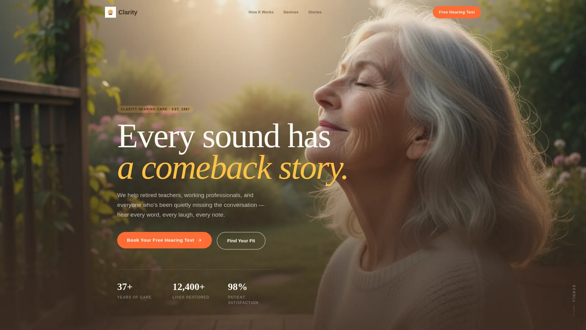
- A full-bleed golden-hour hero section with fade-in headline typography
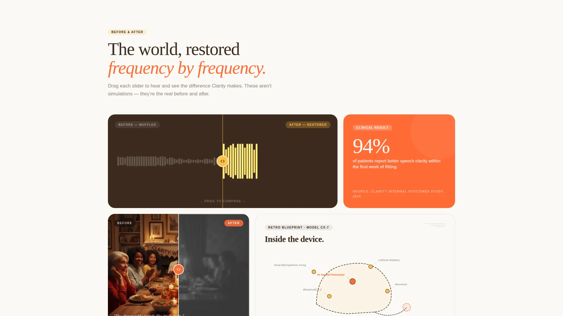
- An asymmetric bento grid featuring Before/After reveal tiles, waveform comparisons, lifestyle photography pairs, and retro-blueprint technology diagrams
- Three nested conversion paths: a free hearing test booking form, a guided device-matching quiz, and a click-to-call rotary dial button
Feature list
The sections below describe the core built-in components that ship with this template.
Full-Bleed Golden-Hour Hero
The header opens with an intimate, portrait-depth photograph shot at golden hour. A silver-haired woman listens to a vinyl record player, a nearly invisible hearing aid catching the light. The headline "Every sound has a comeback story." fades in over soft bokeh once the eye has settled, creating an emotional hook before any product information appears.
Before/After Reveal Grid Tiles
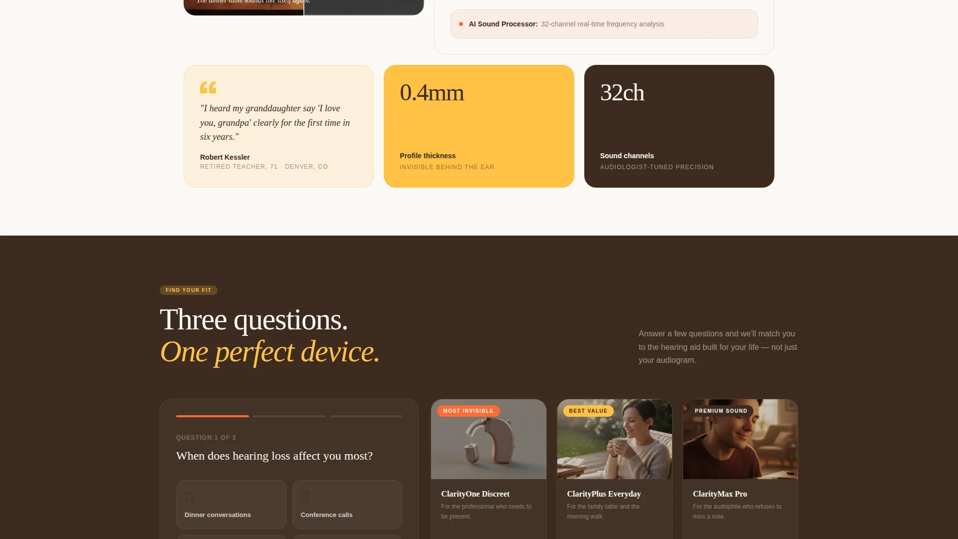
A draggable waveform slider shows compressed, flat audio on the left against rich, full-spectrum sound on the right. A lifestyle tile pairs a grainy, desaturated dinner scene with a sharp, saturated version. These tiles serve as visual evidence of transformation, placed before any call to action so trust is earned, not assumed.
Retro-Blueprint Technology Diagrams
Hearing aid device tiles open up in exploded-diagram style, referencing the illustrated service manuals of the 1970s. Components are labeled and visible, giving technically curious visitors a reason to linger while reinforcing the precision behind each device recommendation.
Three-Path Conversion Grid
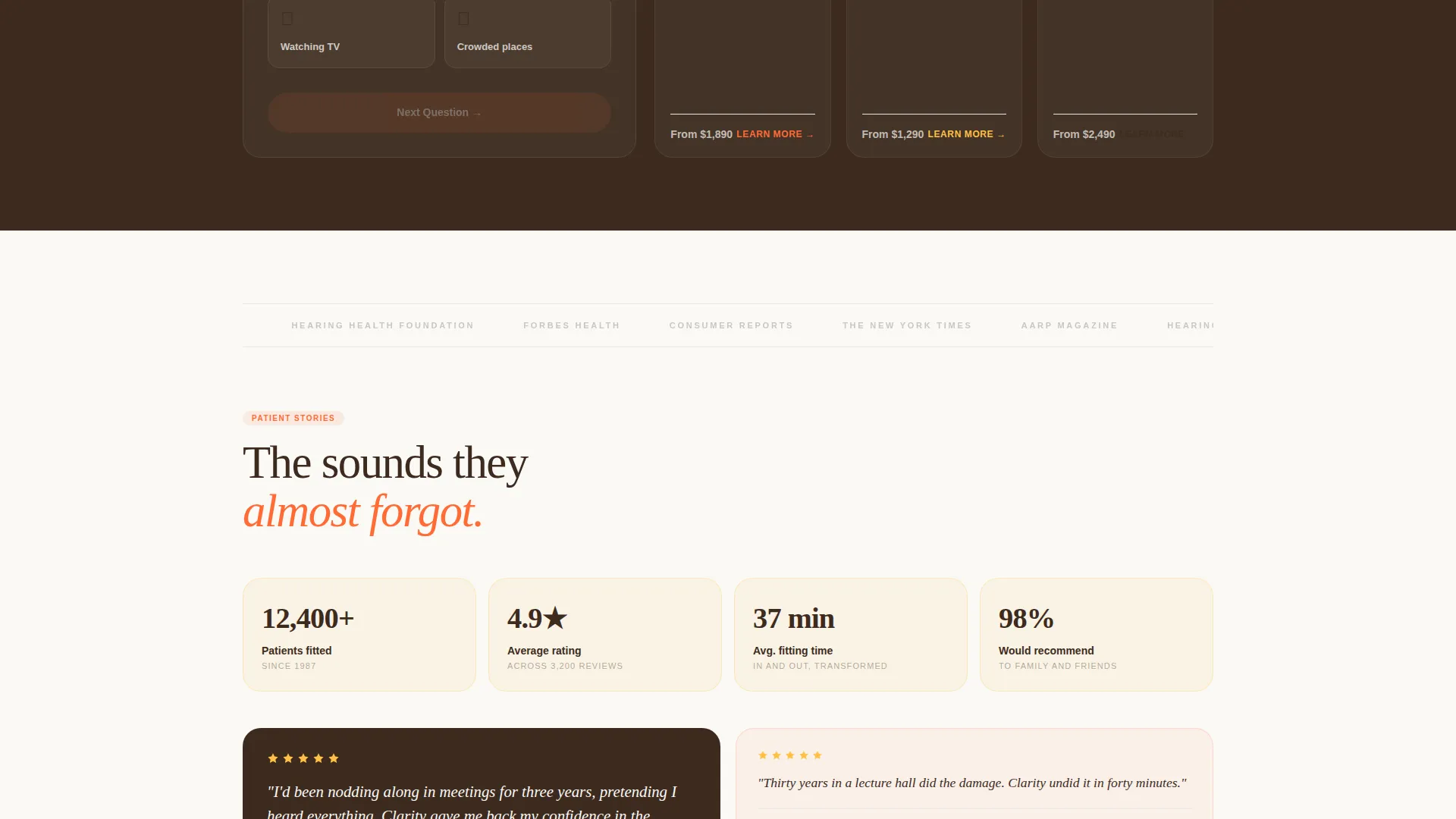
Three distinct conversion paths are built directly into the bento grid. The primary path offers a free hearing test booking form with a zip code field, location dropdown, and morning or afternoon toggle. A secondary path launches a guided lifestyle quiz that matches answers to device recommendations. A third path surfaces a click-to-call button styled as a rotary dial icon with the phone number displayed in tangerine.
Asymmetric Bento Layout
The grid breathes with intentional asymmetry. Large hero tiles break into smaller detail tiles, then reassemble as the visitor scrolls. The rhythm is designed to feel like tuning a dial, each section clicking into a clearer frequency, making the scroll itself part of the brand experience.
Neo-Retro Citrus Burst Branding
The entire color system, from tangerine call-to-action buttons to golden accent tiles to deep vinyl brown navigation, is pre-applied across every element. The palette references a 1960s hi-fi advertisement printed on modern matte stock, giving the practice immediate visual authority without requiring a separate brand session.
Page sections overview
| Section | Purpose |
|---|---|
| Golden Hour Hero | Opens with emotional photography and fade-in headline |
| Waveform Reveal Tile | Contrasts muffled audio with restored full-spectrum sound |
| Lifestyle Before/After | Shows the human difference hearing restoration makes |
| Device Blueprint Tiles | Explains technology through retro-diagram visual storytelling |
| Free Test Booking | Primary call to action with zip code, location, and time-of-day fields |
| Device Quiz Path | Guided lifestyle quiz linking results to product detail cards |
| Click-to-Call Tile | Rotary dial icon with tangerine phone number display |
Design & branding system
The visual identity is built around the Citrus Burst color system applied through a Neo-Retro lens. Every color has a specific role, and the system is consistent across all tiles and states.
- Tangerine pop (#FF6B35) drives all call-to-action elements and interactive highlights
- Golden analog warmth (#FFC145) fills accent tiles, sound-wave illustrations, and hover states
- Deep vinyl brown (#3D2B1F) anchors navigation, body typography, and structural framing, while audiogram white (#FAF9F6) breathes through grid gaps like silence between notes
Mobile & speed optimization
The bento grid is structured to reflow cleanly on smaller screens without losing the asymmetric character that makes the layout distinctive. Section stacking follows the same emotional sequence as the desktop experience.
- Hero photograph and fade-in headline remain the opening beat on all screen sizes
- Before/After tiles and the draggable waveform slider are built for touch interaction
- Conversion paths, including the booking form and the click-to-call button, stay accessible and easy to tap throughout the mobile layout
How this template helps you convert
The page is architected around the principle that a visitor needs to believe transformation is real before they will book an appointment. Every layout decision supports that sequence.
- The Before/After reveal tiles accumulate evidence of real change as the visitor scrolls, removing doubt before the first call to action appears
- Three distinct conversion paths serve different buyer readiness levels in the same page visit, whether someone is ready to book now, needs a quiz to find the right device, or simply wants to call and ask a question
Other information about this template
Clarity was designed using the Masonry and Pinterest-style grid approach adapted for a bento layout, giving it the visual energy of a curated mood board while maintaining clear conversion intent. The template sits within the Retail and E-Commerce category under Local Brick and Mortar Business, making it relevant for practices that depend on neighborhood trust and in-person appointments. The Unboxing Experience creative direction is reflected in the retro-blueprint device tiles, which reveal product internals the way a carefully opened box reveals something worth keeping. The header concept follows a full-bleed photo treatment that prioritizes atmosphere over product shots, a deliberate choice for a category where emotional resonance drives action more reliably than specification lists.
- The template theme is Neo-Retro, blending mid-century visual references with a modern grid structure
- The Marketplace and Multi landing-page direction means all three conversion paths coexist in one scrollable experience without requiring separate pages
- Color, typography, and tile layout are all editable so you can match your practice's specific photography, location details, and device inventory
Theme
Neo-Retro
Creative direction
Unboxing Experience
Color system
Citrus Burst
Style
Masonry/Pinterest
Direction
Marketplace/Multi
Page Sections
Full-bleed Golden-hour Hero Section
Before/after Reveal Tiles
Retro-blueprint Device Diagrams
Three Nested Conversion Paths
Asymmetric Bento Grid Layout
Neo-retro Citrus Burst Color System
Related questions
Can I use this template without professional photography?
How do the three conversion paths work together on one page?
Is the waveform slider interactive in this template?
Can I edit or remove tiles from the bento grid?
What type of hearing care business fits this template best?



