ADHD Clinical Trial Finder Landing Page Template
Clarity is a split-screen landing page built to connect adults and parents of children with ADHD to active, nearby clinical trials using only a zip code. Designed around a Healing Space visual identity, it pairs real participant voices with clean trial details, reducing the path to the matching questionnaire to a single, low-commitment click.
by Rocket studio
Quick summary
Clarity is a single-page ADHD clinical trial finder built for people who are tired of dead links and outdated study listings. A zip code input replaces a medical intake form. Real participant testimonials replace stock photography. The result is a calm, focused landing page that earns trust before it ever asks for a click.
Who this template is for
This template was designed for health-tech teams, clinical research organizations, and patient advocacy groups that need to connect real people with active ADHD trials. The audience arriving on this page is specific and emotionally invested.
- Parents whose children have cycled through multiple ADHD medications without lasting relief
- Adults recently diagnosed with ADHD who are exploring treatment alternatives
- College students and young adults facing medication shortages and seeking study options
What problem this template solves
Finding an ADHD clinical trial online is exhausting. Most listings are written in dense clinical language, link to studies that closed months ago, and immediately ask for personal health history. This template removes every one of those friction points.
- Visitors feel judged or overwhelmed by medical jargon before they can assess whether a trial fits their situation
- Outdated or inactive study listings waste time and erode trust
- Long intake forms create commitment anxiety that stops people from taking the first step
What you get with this template
You get a fully structured, single-page layout built around one conversion goal: moving the visitor into a trial-matching questionnaire with a single click. Every section is designed to reduce hesitation and build trust incrementally.
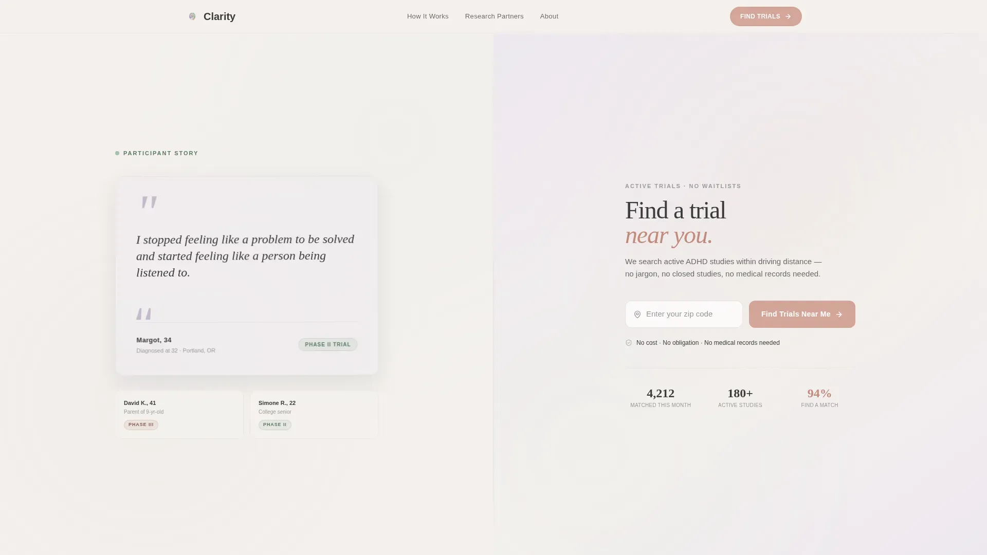
- A 50/50 split-screen hero with a testimonial card on one side and a zip code finder on the other
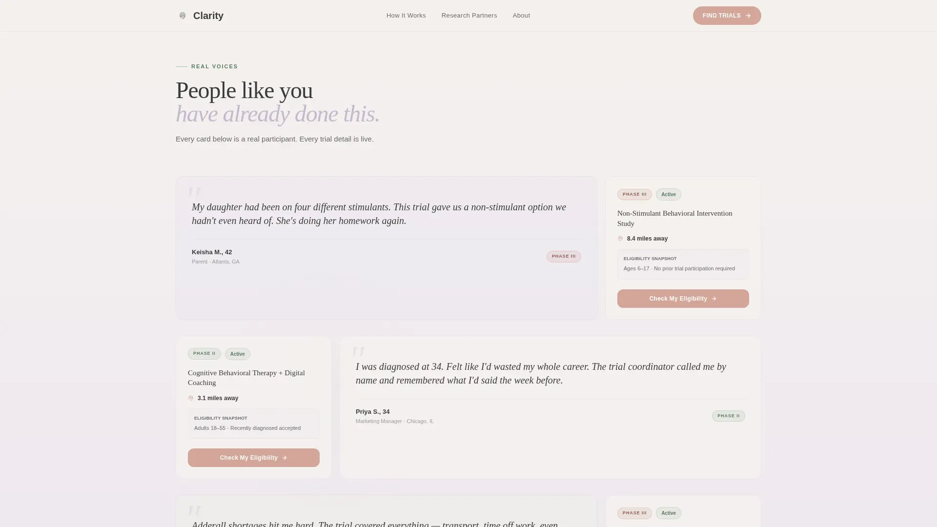
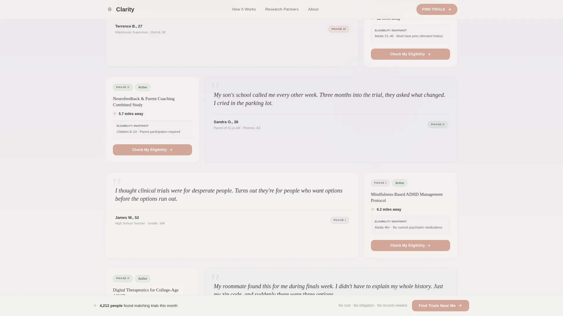
- A scrolling testimonial mosaic that pairs participant voices with trial phase, distance, and eligibility details
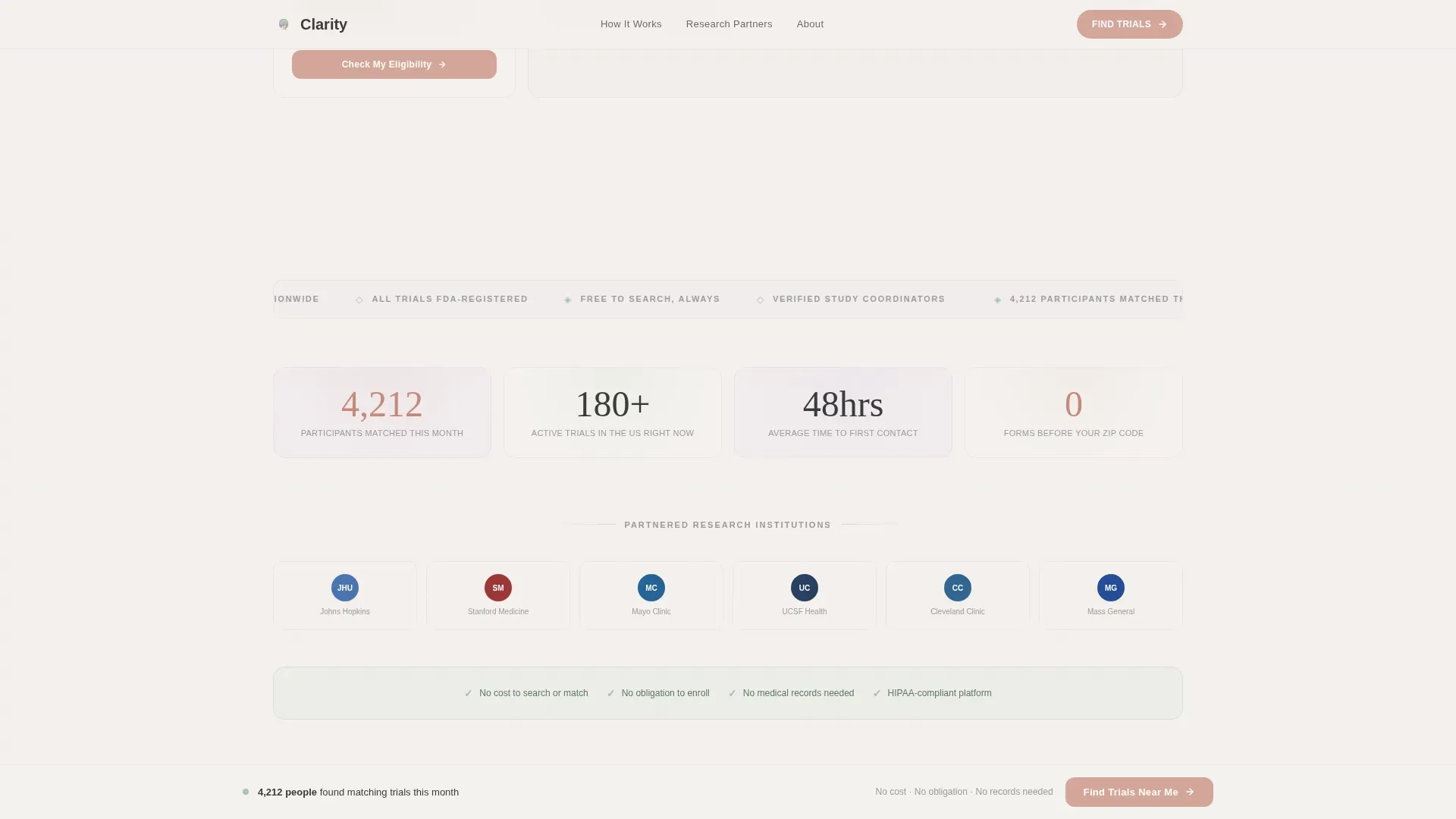
- A stats and trust row, a three-step how-it-works section, a persistent bottom call-to-action bar, and a single-row footer
Feature list
This template includes the following built-in components and design capabilities.
Split-Screen Hero with Zip Code Input
The hero divides the screen evenly. The left half holds an oversized testimonial card with handwritten-style quotation marks in washed lavender. The right half holds a minimal zip code input field and a warm clay call-to-action button. No form fields beyond the zip code appear on this page.
Testimonial Mosaic Grid
After the hero, a living grid of participant cards tiles, overlaps, and shifts gently on hover. Each card carries a different voice: a parent, a young professional, a retiree, a teenager's guardian. The right half of each split section shows the corresponding trial detail including phase, distance, and an eligibility snapshot.
Single-Stat Breathing Rooms
Between mosaic clusters, full-width sage callout blocks display a single matched-participant statistic. These act as visual pauses that reinforce credibility without adding cognitive load.
Persistent Bottom Call-to-Action Bar
After the visitor scrolls past the second section, a bottom bar appears and stays visible. It carries the primary "Find Trials Near Me" button in warm clay, keeping the conversion path in reach without interrupting reading.
Trust and Reassurance Row
A dedicated section displays a "No cost, no obligation, no medical records needed" reassurance line in sage alongside a logo row of partnered research institutions. This section does the social-proof work that paid advertising cannot.
Asymmetric How-It-Works Section
A three-step layout with floating detail cards walks the visitor through the process in plain language. Steps are numbered and compact, reducing the sense of complexity before the click.
Page sections overview
| Section | Purpose |
|---|---|
| Hero Split Screen | Introduce zip finder and lead testimonial |
| Testimonial Mosaic Grid | Build trust through varied participant voices |
| Stats and Trust Row | Reinforce credibility with data and logos |
| How It Works | Explain the three-step matching process |
| Persistent call to action Bar | Keep conversion path visible after scroll |
| Footer Row | Provide minimal navigation and legal links |
Design & branding system
The visual identity follows a Healing Space theme built around the Soft Mist color palette. Every tone is deliberately muted, creating the atmosphere of a calm clinical waiting room rather than a medical website.
- Fog white (#F4F1ED) and pale lavender (#C5B9CD) alternate as section backgrounds; charcoal (#3B3B3B) handles all body text without reaching full black
- Quiet sage (#A7BEAE) underlines progress indicators, trust badges, and reassurance lines; warm clay (#D4A59A) is reserved exclusively for buttons and active states
- Typography pairs Fraunces serif headlines for emotional weight with DM Sans for clean, readable body copy
Mobile & speed optimization
This template was built with a mobile-first priority, acknowledging that many visitors will arrive on a phone during a pediatrician visit or a spare moment in a waiting room. The layout adapts fluidly from a 50/50 desktop split to a stacked single-column mobile view.
- The zip code input and clay call-to-action button are thumb-friendly and prominent at the top of the mobile stack
- Server Components handle all static sections; the zip input and scroll observer run as Client Components to keep interaction responsive without slowing the initial load
How this template helps you convert
The page is structured as a click-through landing page with one measurable goal: a single tap into the trial-matching questionnaire. Every design and copy decision supports that moment.
- Commitment is reduced to one non-medical, non-intimidating action; the visitor types a zip code, nothing more, before clicking through to learn more
- Trust accumulates section by section through participant testimonials, matched-participant statistics, institution logos, and a plain-language reassurance line, so the click feels earned rather than demanded
Other information about this template
This template is built for the ADHD care space within the broader health and medical category. It is suited to clinical trial matching applications that operate in a business-to-consumer model and need to reach emotionally cautious audiences without clinical-sounding copy.
- The template uses English language copy with United States zip code localization and MM/DD/YYYY date formatting
- Animations include staggered fadeInUp entrance effects, a floating card effect, hover mosaic shifts, and a spotlight on individual cards
- The footer uses Pattern 1, a linear single-row layout, keeping the page exit clean and minimal
- The template is designed for teams that want participant voices and human storytelling to carry the persuasive load instead of promotional claims
Theme
Healing Space
Creative direction
Testimonial Mosaic
Color system
Soft Mist
Style
Split Screen (50/50)
Direction
Click-Through
Page Sections
Split-screen Hero with Zip Input
Scrolling Testimonial Mosaic
Single-stat Sage Callouts
Persistent Bottom Call to Action Bar
Trust and Reassurance Row
Asymmetric How-it-works Section
Related questions
Does this landing page ask visitors to share a medical diagnosis?
How many form fields does this landing page include?
Can the testimonial cards be updated with real participant quotes?
What does the click-through lead to?
Is this template suitable for organizations running several ADHD studies simultaneously?



