Mammography Center Landing Page Template
Clarity is a hub and spoke anchor-nav landing page template built for women's imaging and mammography centers. It uses a warm Forest Trust color system, editorial serif typography, and a transparent step-by-step layout to guide anxious visitors toward booking. A pinned "Schedule Your Mammogram" call to action and a frictionless three-field form make the path to an appointment feel simple and safe.
by Rocket studio
Quick summary
Clarity is a single-page mammography center template designed around one goal: turning a worried late-night Google search into a scheduled appointment. Seven focused sections walk a visitor from first impression to booked visit. The layout is calm, warm, and built to answer every question before the visitor has to ask it.
Who this template is for
This template is built for women's imaging centers, breast health clinics, and diagnostic radiology practices that offer direct-to-patient mammography scheduling. It suits practices that want their website to feel personal and reassuring, not clinical and transactional.
- Women's imaging centers offering 3D mammography with same-day results
- Diagnostic labs and imaging practices serving women aged 30 and older
- Clinics looking to reduce scheduling friction and serve mobile-first patients
What problem this template solves
Most medical imaging pages are built for search engines, not for the woman reading them at midnight with a referral slip on her nightstand. They bury the booking form, skip the human language, and leave every anxious question unanswered. Clarity solves that.
- Removes the friction of multi-step portals and long intake forms before booking
- Answers the four questions women actually Google: what happens, will it hurt, when will I know, and what if something is found
- Replaces cold clinical language with warm, first-person copy that builds trust before the visit
What you get with this template
Clarity delivers a fully structured, mobile-first landing page with seven distinct content sections and a pinned anchor navigation bar. Every section is purposeful, mapped to a real patient concern, and designed to lead gently toward the scheduling form.
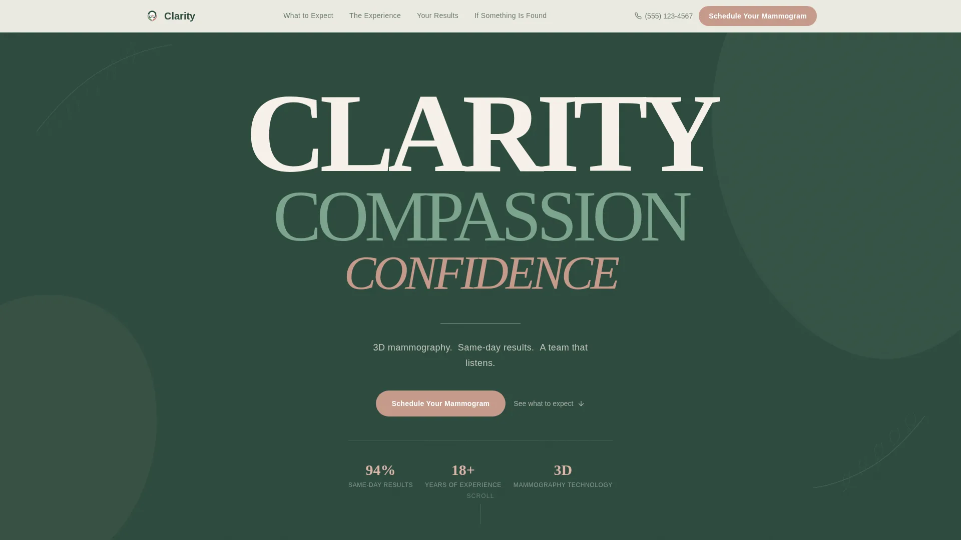
- A hero section with a stacked typographic tower in deep evergreen, birch cream, and clay rose
- A sticky anchor navigation bar with five spoke links and a persistent booking call to action
- A three-field scheduling form collecting preferred location, insurance carrier, and best day of week
Feature list
This template ships with six core features, each grounded in the specific needs of a women's imaging and mammography practice.
Stacked Type Tower Hero
The hero displays three words in a narrowing column: CLARITY in birch cream, COMPASSION in fern, and CONFIDENCE in clay rose. The deep evergreen background and generous negative space create an immediate feeling of calm authority. A single tagline anchors the section below the tower.
Pinned Anchor Navigation
A sticky navigation bar travels with every scroll. It holds five spoke links pointing to each content section and keeps the "Schedule Your Mammogram" call to action button visible at all times. Active states use the clay rose color to show a visitor exactly where she is on the page.
Transparent Process Sections
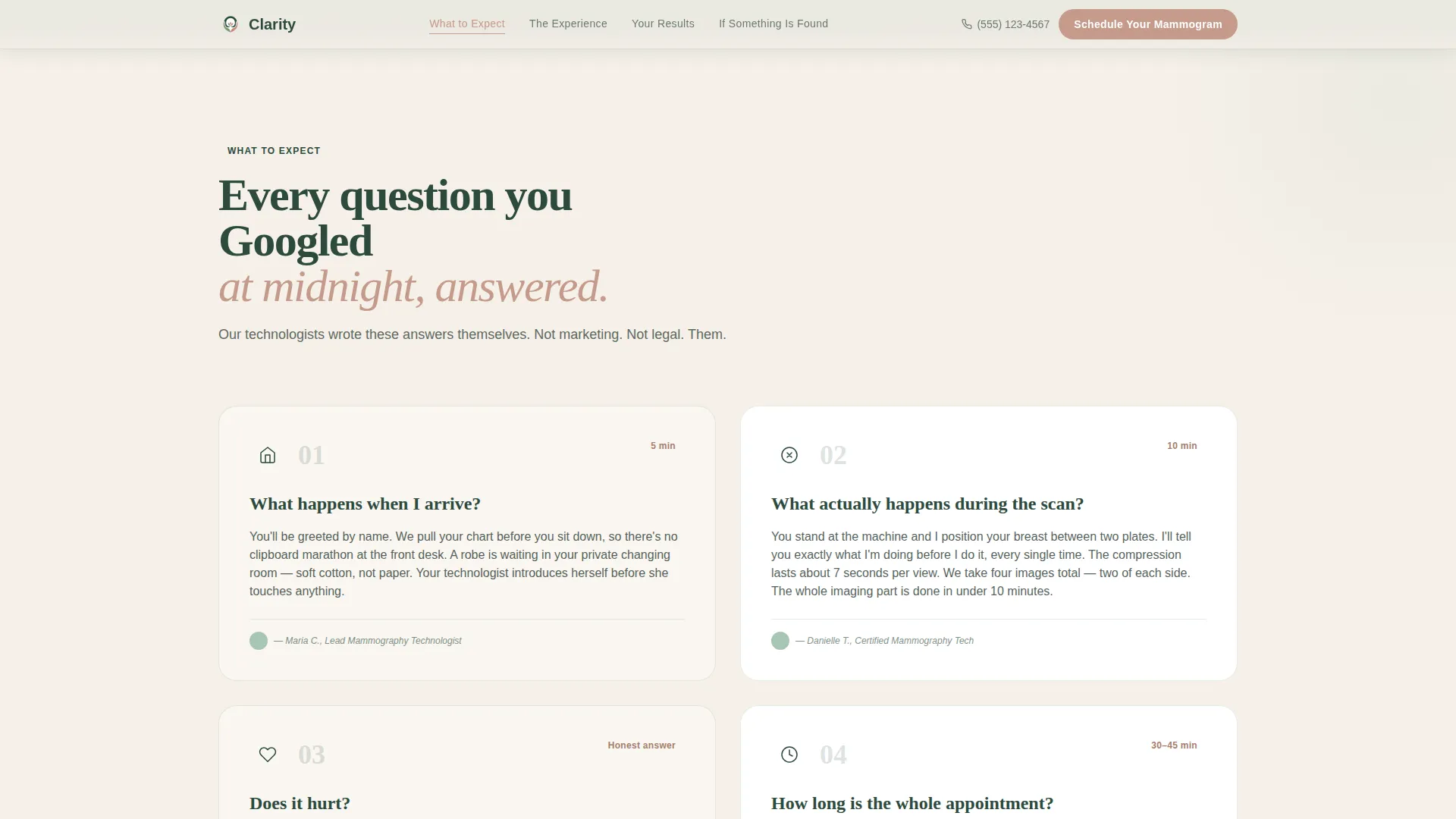
Four spoke sections demystify the mammography experience step by step. Each section answers a specific question a patient might search for: what the appointment looks like, how it feels, when results arrive, and what support exists if something is found. First-person language from the technologist's perspective keeps the tone grounded and human.
Frictionless Three-Field Booking Form
The scheduling section asks only three things: preferred location, insurance carrier, and best day of the week. There is no medical history form, no portal login, and no account creation. A secondary tap-to-call option serves patients who prefer speaking to someone directly.
Social Proof Integration
The template includes dedicated placement for first-person technologist quotes, patient sentiment statements, and supporting statistics such as same-day results rates and years of clinical experience. These proof elements are woven into the relevant sections, not tucked away in a footer.
Scroll Reveal Animations
Medium-intensity animations include staggered type entrance on the hero, scroll-triggered section reveals, and subtle floating organic shapes used as decorative accents. The motion is calm and intentional, reinforcing the organic warmth of the overall design without feeling distracting.
Page sections overview
| Section | Purpose |
|---|---|
| Hero Tower | Establish brand tone and display the tagline |
| Anchor Navigation | Provide pinned section links and persistent booking call to action |
| What to Expect | Walk through the appointment process step by step |
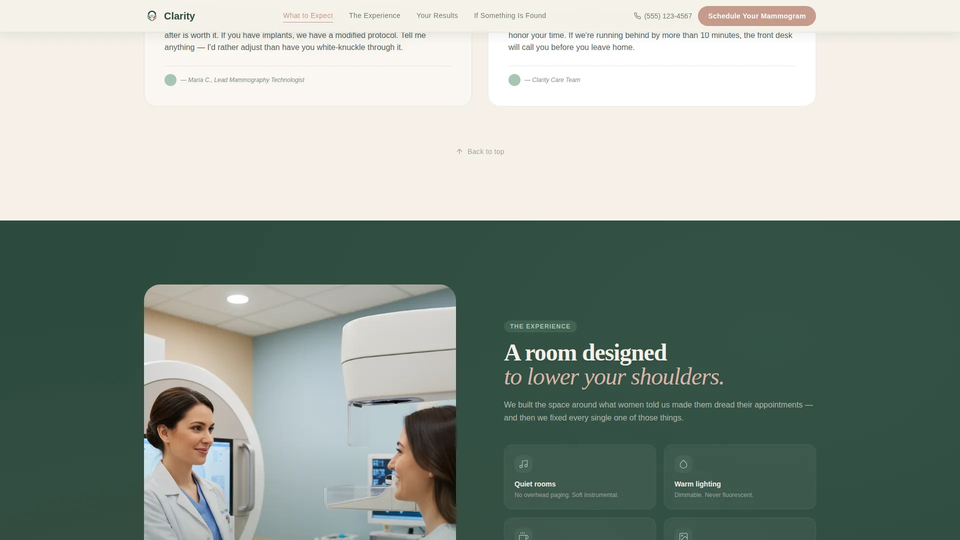
| The Experience | Answer sensory questions about comfort and duration |
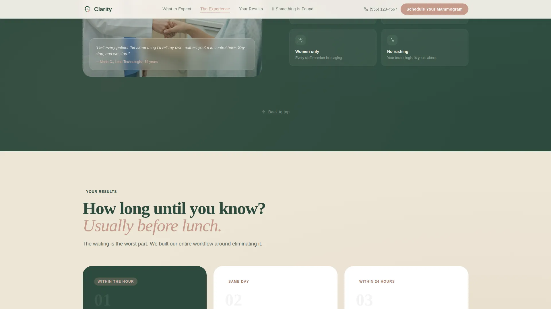
| Your Results | Communicate the same-day results promise |
| If Something Is Found | Offer calm, honest, supportive next-step guidance |
| Schedule Form | Collect location, insurance, and availability to book |
| Footer | Display minimal linear contact and policy links |
Design & branding system
The visual language follows an Organic Flow theme using a four-color Forest Trust palette. Typography pairs Fraunces, an editorial display serif, with DM Sans for body text. Soft illustration-style decorative shapes and organic floating accents reinforce warmth without adding visual noise.
- Forest Trust palette: deep evergreen (#2D4A3E), soft fern (#7BA38C), birch cream (#F5F0E8), and clay rose (#C49A8A)
- Fraunces for display headings, DM Sans for all body and form copy
- Soft organic shapes used as background accents, not as dominant visual elements
Mobile & speed optimization
This template is built mobile-first. Women researching breast health often do so on their phones, late at night, in private moments. Every section is sized and sequenced for a vertical scroll experience before it adapts to wider viewports.
- Static sections use server-rendered components to keep initial load lean
- The anchor navigation and booking form use client-side behavior for scroll tracking and interactivity
- Touch-friendly tap-to-call button ensures mobile visitors can reach the clinic without typing
How this template helps you convert
Clarity earns the booking click by removing every unknown before the visitor reaches the form. The page is structured so that trust builds progressively, section by section, until the only feeling left is readiness.
- The pinned call to action button stays visible throughout the entire scroll, so a visitor can book the moment she feels ready without hunting for the form.
- The three-field form removes all unnecessary friction. Asking only for location, insurance, and availability means a visitor can complete it in under a minute.
- Every spoke section resolves a specific fear before it can become a reason to leave, so the visitor arrives at the form feeling informed rather than anxious.
Other information about this template
Clarity is designed for the USA market, in English, with no currency elements. The template style is hub and spoke with anchor navigation, meaning the hero acts as a central hub and each section is a navigable spoke. The creative direction is Transparent Process, a content strategy that uses sequential disclosure to reduce patient anxiety. The header concept is a Stacked Type Tower, which is a typographic composition rather than a photographic hero. This approach suits clinics that want their personality communicated through language and color rather than stock imagery. The template is well-suited for practices exploring women's health digital presence, breast imaging clinic websites, and direct-to-patient booking flows for diagnostic imaging services.
- Template style: Hub and Spoke with anchor navigation
- Creative direction: Transparent Process
- Header concept: Stacked Type Tower
- Theme: Organic Flow
- Color system: Forest Trust
- Landing page direction: Booking and Scheduling
- Market: USA, English language, no currency
Theme
Organic Flow
Creative direction
Transparent Process
Color system
Forest Trust
Style
Hub & Spoke (Anchor Nav)
Direction
Booking/Scheduling
Page Sections
Stacked Type Tower Hero
Pinned Anchor Navigation Bar
Transparent Process Spoke Sections
Frictionless Three-field Booking Form
Social Proof Content Blocks
Scroll Reveal and Motion System
Related questions
Can I change the color palette to match my clinic's existing brand?
Does the booking form connect to a scheduling system automatically?
Is this template suitable for a single-location practice or a multi-location group?
Can the spoke sections be reordered or reduced?
What kind of social proof does the template support?



