Dental Insurance Landing Page Template
Clarity is a single-page dental insurance landing page built around radical transparency. It shows real costs, a plain-language claims timeline, and a searchable network tool, all without forms or fine print. The zigzag layout earns trust section by section, ending with a clear call to action that sends visitors to a plan comparison tool.
by Rocket studio
Quick summary
Clarity is a dental insurance landing page that replaces vague promises with real numbers. A giant centered headline states the monthly cost, deductible, and annual maximum upfront. Each alternating section peels back one layer of how dental coverage works, building enough trust that clicking through to compare plans feels like a natural next step.
Who this template is for
This template is built for dental insurance providers who want to stand out by being genuinely straightforward. It speaks directly to the people most likely to be comparison-shopping after hours.
- Mid-career parents in their thirties and forties who need family coverage and want to understand what they are actually paying for
- Freelancers who no longer have employer coverage and are quietly procrastinating on finding a solo plan
- Small-business owners searching for affordable group dental options between their other daily tasks
What problem this template solves
Most dental insurance pages bury the important details. Visitors land on a page, scan for a number, find an asterisk instead, and leave. This template solves that trust gap directly.
- Hiding the monthly cost, deductible, and annual maximum behind request forms or fine print loses visitors before they scroll
- Vague claims about "comprehensive coverage" do not answer the real question: what does a cleaning actually cost me with this plan versus without it
- A confusing or invisible claims process makes people assume the worst and choose a competitor instead
What you get with this template
You get a fully structured, single-page layout designed to guide a skeptical visitor from curiosity to confidence. Every section has a job, and every job is about earned trust.
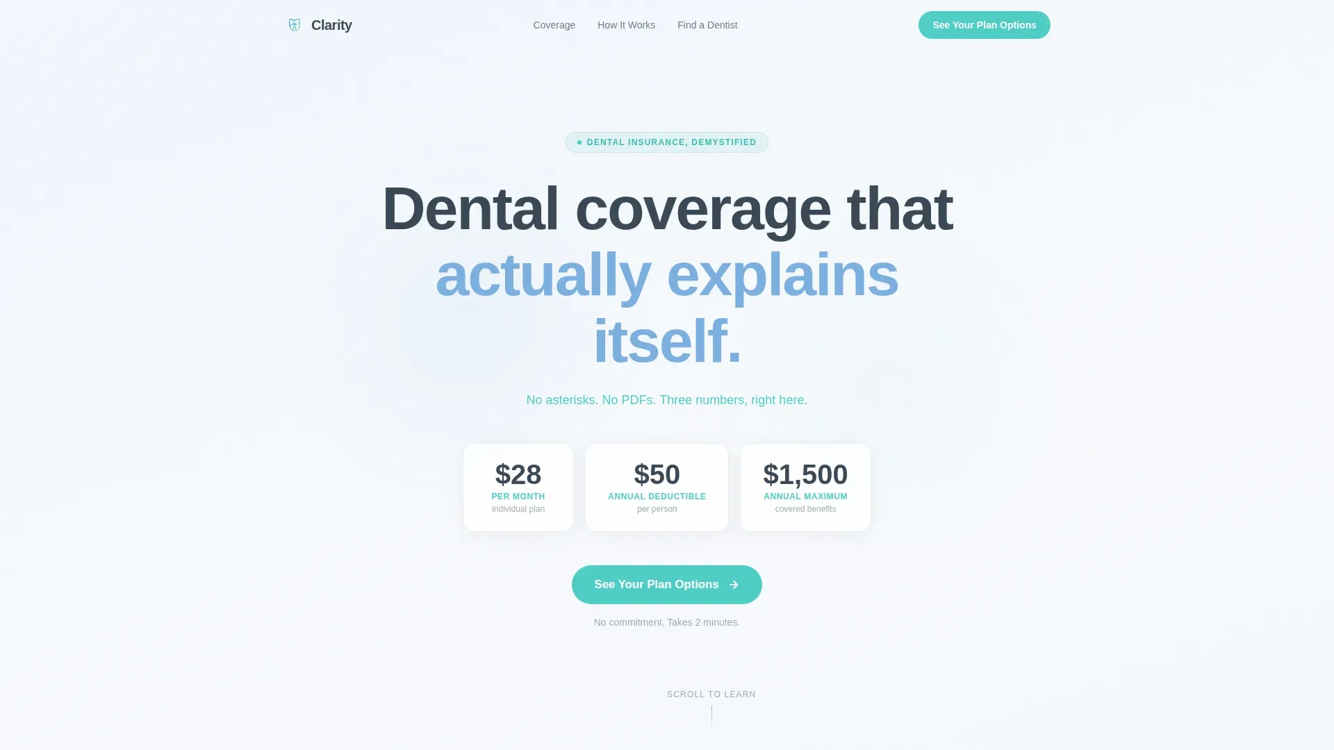
- A hero section with a giant centered headline, three transparent plan numbers displayed without asterisks, and a primary call-to-action button
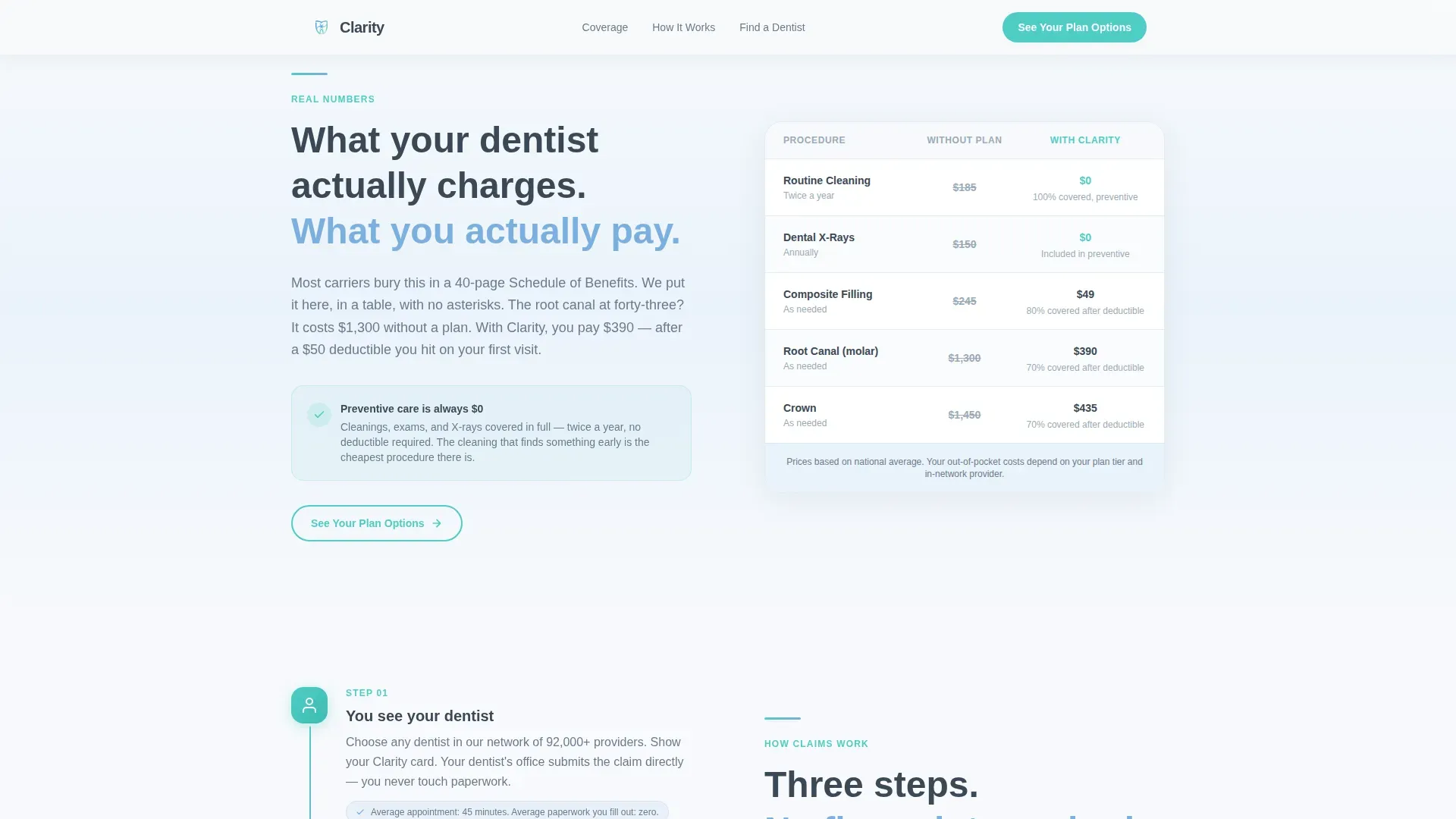
- Four zigzag content sections covering real cost comparisons, a three-step claims timeline, a zip-code network search field, and a three-persona "who it's for" block
- A linear single-row footer and a persistent ghost call-to-action button that appears at the bottom of each alternating section and solidifies on hover
Feature list
This section details the specific components and design decisions built into the Clarity template.
Giant Centered Hero Headline
The hero opens with a large, stark slate-colored headline on a sky-to-white soft gradient background. Directly beneath it, a single teal subhead displays the monthly cost, deductible, and annual maximum as three plain numbers with no asterisks or qualifying language. No stock photography and no icon decorations are used.
Side-by-Side Cost Comparison Block
The first zigzag section places real dollar figures for a routine cleaning next to each other: the out-of-pocket cost without coverage and the cost with the plan. The layout is direct and factual, giving visitors the specific savings context they need before they scroll further.
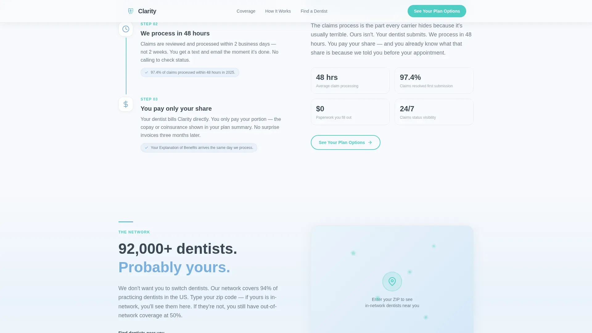
Three-Step Claims Timeline
Instead of presenting a dense block of policy fine print, the claims process is laid out as a clear three-step visual timeline. Each step is labeled simply, so a first-time buyer can follow the process without needing to decode insurance terminology.
Embedded Zip-Code Network Search
A zip-code input field sits directly inside the network coverage section of the page layout. Visitors can check whether local providers are in-network without leaving the page or opening a separate tool.
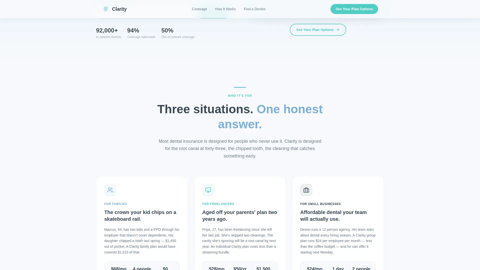
Three-Persona "Who It's For" Section
A dedicated zigzag block presents three specific buyer scenarios: a parent facing unexpected family dental costs, a freelancer who let coverage lapse, and a small-business owner looking at group options. Each scenario is brief and concrete, helping visitors self-identify quickly.
Persistent Ghost Call-to-Action Button
A ghost-style "See Your Plan Options" button anchors the bottom of every alternating section. On hover, the button transitions from outlined to solid teal, reinforcing interactivity without cluttering the layout.
Page sections overview
| Section | Purpose |
|---|---|
| Hero headline block | Display plan numbers upfront and launch the primary call to action |
| Cost reality (zigzag left) | Compare real cleaning costs with and without coverage side by side |
| Claims process (zigzag right) | Replace fine print with a plain three-step claims timeline |
| Network coverage (zigzag left) | Let visitors search for in-network providers by zip code |
| Who it's for (zigzag right) | Match three buyer personas to specific dental coverage scenarios |
| Linear single-row footer | Close the page with minimal, uncluttered navigation and links |
Design & branding system
The Clarity template uses a Soft Gradient theme built on the Slate and Sky color system. The palette is calm and clinical without feeling cold, designed to evoke the quiet confidence of a well-run dental office.
- Deep slate (#3B4856) is used for all primary text, providing strong contrast and readability against the light backgrounds
- Mid-morning sky (#7BAFDE) washes gently across alternating section backgrounds, while clinical white (#F7F9FC) provides the breathing-room base; soft teal (#4ECDC4) is reserved exclusively for buttons and interactive highlights
- Typography is set in DM Sans throughout, a clean geometric typeface that reads as trustworthy without feeling sterile or overly corporate
Mobile & speed optimization
The template is built desktop-first to serve the midnight tab-comparing parent on a laptop, but the layout adapts cleanly to smaller screens without losing its core structure.
- Zigzag sections restack vertically on mobile so that cost comparisons, the claims timeline, and the network search field all remain fully readable on a phone
- Scroll-reveal animations use a medium-weight stagger approach, and the gradient drift effects are handled with minimal JavaScript so interactive elements remain smooth without heavy resource use
- Static sections are built with server components to reduce unnecessary client-side load, keeping the page responsive on lower-bandwidth connections
How this template helps you convert
The page earns the click rather than demanding it. By the time a visitor reaches the bottom, they have already absorbed the information most carriers hide in a portable document format.
- Transparency accumulates section by section: real cost figures, a readable claims process, and a live network check all reduce the fear of commitment before any form or payment is involved
- The persistent ghost call-to-action button reinforces the next step without pressure, appearing at the close of each section so the path to the plan comparison tool is always visible
- The no-form structure removes the biggest friction point on insurance pages; clicking "See Your Plan Options" feels like a logical continuation, not a surrender of personal data
Other information about this template
This template is a strong fit for dental insurance providers who want a modern, content-led approach to converting cost-conscious shoppers. A few additional details worth knowing before you build with it.
- The page is designed exclusively as a click-through landing page; it does not include an on-page form or quote calculator, and the primary call to action links to a separate plan comparison tool
- The zip-code search field is included as a layout component; connecting it to a live provider directory requires a separate data or network integration on your end
- The zigzag layout and alternating section structure make it straightforward to add or remove persona blocks and cost comparison rows as your plan offerings change
- Animation behavior includes scroll-triggered reveals with stagger timing, a gradient drift effect across section backgrounds, and the ghost-to-solid hover transition on call-to-action buttons
Theme
Soft Gradient
Creative direction
Transparent Process
Color system
Slate & Sky
Style
Zigzag/Alternating
Direction
Click-Through
Page Sections
Giant Centered Hero with Plan Numbers
Side-by-side Cost Comparison
Three-step Claims Timeline
Embedded Zip-code Network Search
Three-persona Scenario Block
Persistent Ghost Call-to-action Button
Related questions
Does this template include an on-page quote form?
Can I update the plan numbers shown in the hero section?
How does the zip-code network search field work?
Who is this landing page best suited for?
Can I add more personas or cost comparison rows?



