Life Coach Transparent Process & Comparison Website Template
Clarity is an editorial life coach landing page template built around a comparison table structure and a transparent process flow. It suits coaches who want their page to feel authoritative and considered rather than promotional. The design uses deep navy, warm parchment, and muted gold to create a typographically driven experience that builds trust before asking for a booking.
by Rocket studio
Quick summary
Clarity is a single-page life coach landing page template with an editorial magazine aesthetic. It centers on a comparison table that breaks down three coaching tiers side by side. The page earns trust through radical transparency, giving away the diagnostic framework before asking for a call. Typography and restraint do the persuasion work.
Who this template is for
This template is built for independent life coaches who work with high-functioning adults navigating meaningful crossroads. It suits practitioners whose clients arrive informed, self-aware, and skeptical of vague promises.
- Coaches working with mid-career professionals, founders, or people rebuilding identity after a major life shift
- Practitioners who want their page to demonstrate method and depth rather than rely on testimonial carousels
- Independent coaches ready to gate a lead magnet and qualify prospects before a discovery call
What problem this template solves
Most coaching pages speak in generalities. They promise transformation without explaining the mechanics. Skeptical, high-achieving clients read those pages and move on. This template solves the credibility gap by making the process itself the content.
- Potential clients cannot evaluate a coach without understanding what actually happens in a session
- A vague headline and a booking button do not justify a significant financial and emotional commitment
- Coaches lose warm leads because nothing on their page earns the click before asking for it
What you get with this template
You get a fully structured, single-page layout built to show your method and convert thoughtful visitors into booked clients. Every section is editorially sequenced to reveal depth progressively.
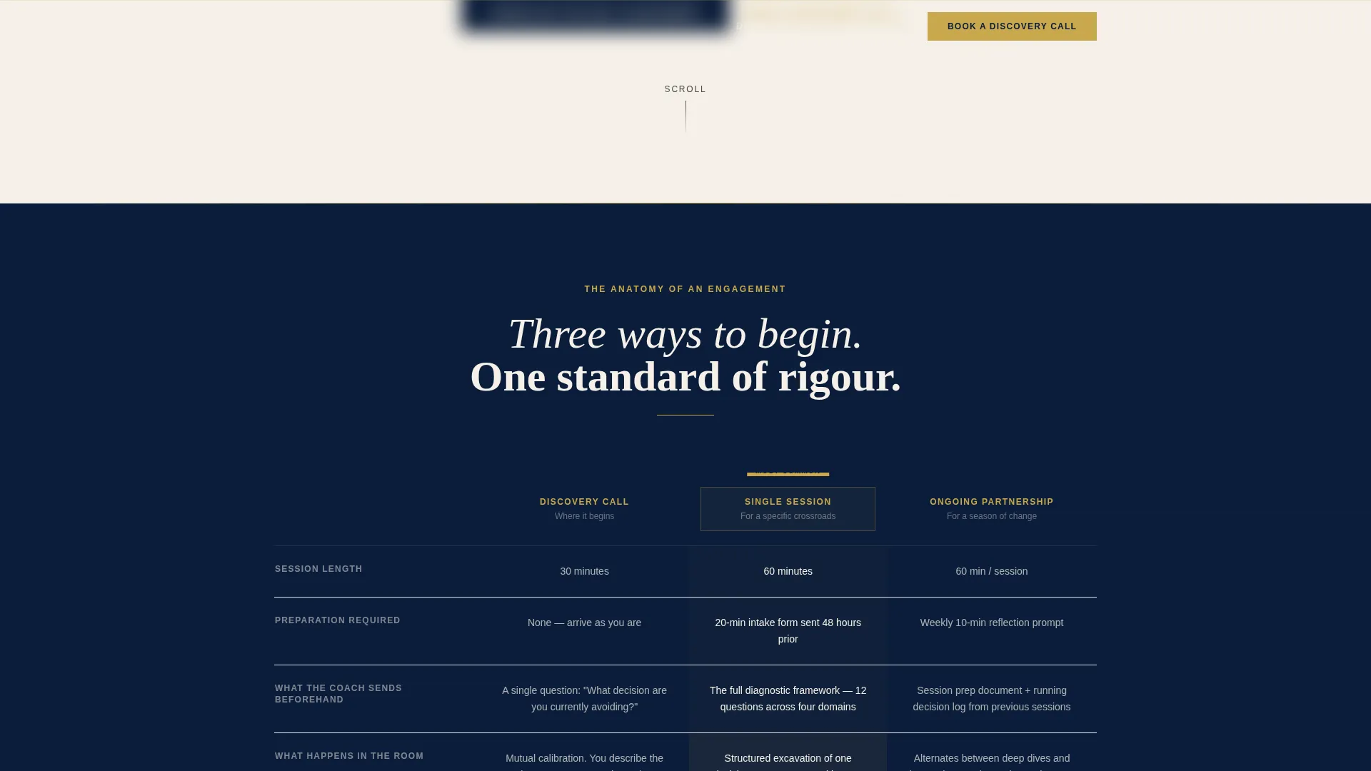
- A giant centered headline section with a gold rule and italic subhead, followed by a three-column comparison table covering Discovery Call, Single Session, and Ongoing Partnership
- Editorially styled process sections with pull quote placements, a reproduced intake questionnaire block, and a week-by-week six-month engagement timeline
- A primary content download call to action gated behind an email and a single qualifying question, plus a secondary booking call to action and a fixed bottom bar
Feature list
This template includes the following purpose-built sections and components.
Three-Column Comparison Table
The structural spine of the page. It compares Discovery Call, Single Session, and Ongoing Partnership across rows covering session length, preparation required, pre-session materials, what happens in the room, and what the client leaves with. Visitors understand the full coaching offer at a glance.
Giant Editorial Headline Block
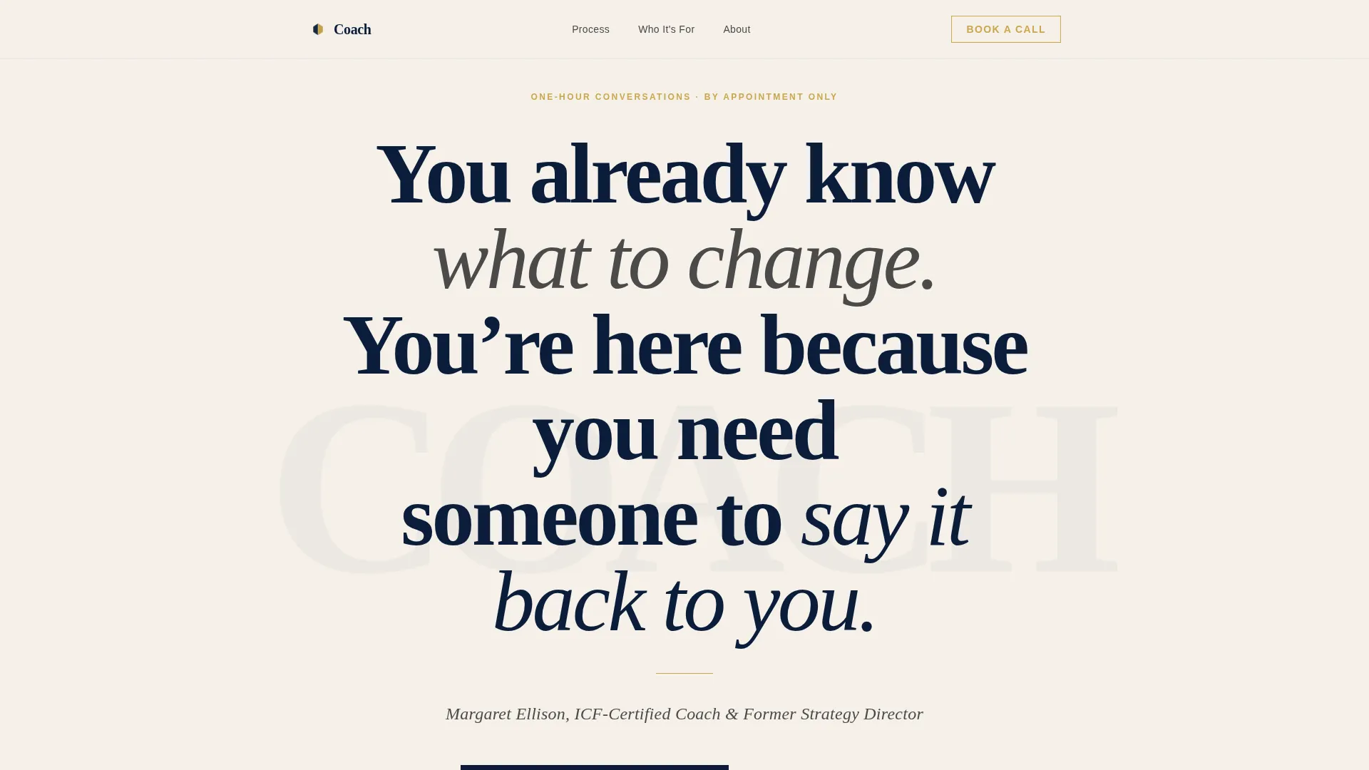
A 120-pixel minimum serif headline sits centered on a white parchment background with no image or illustration. A thin gold rule separates it from a single-line italic subhead naming the coach and credential. The restraint of the layout signals authority without a single marketing word.
Pull Quote and Process Sections
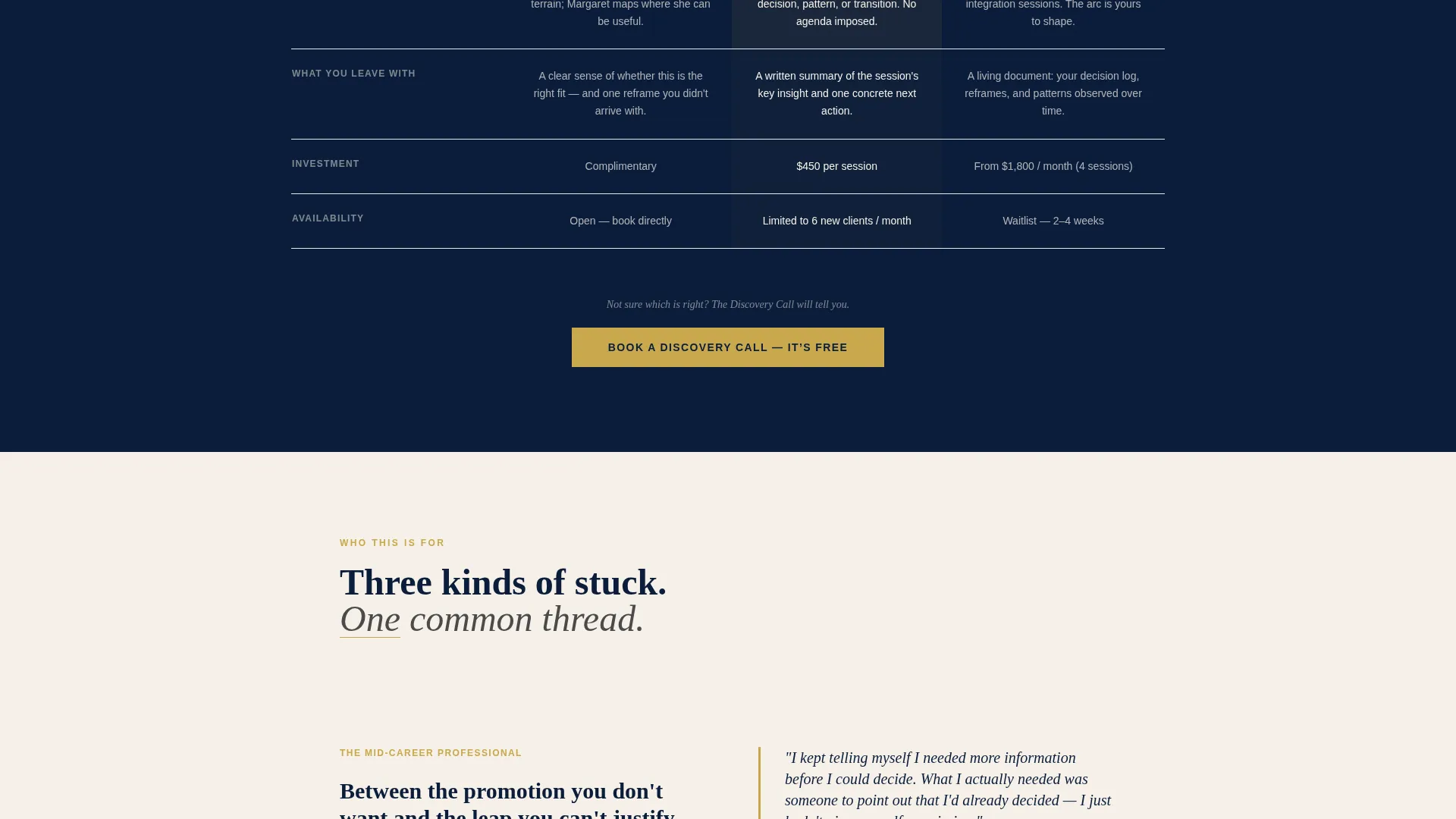
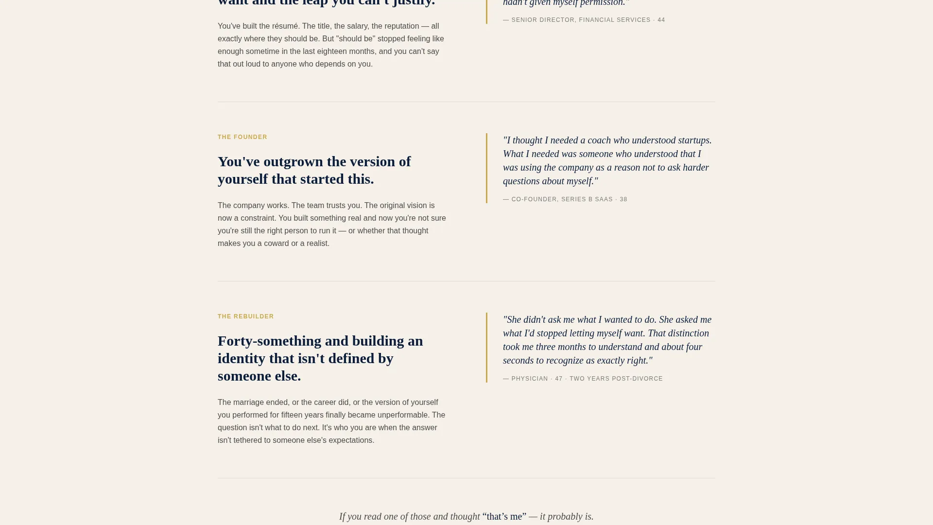
Below the comparison table, each coaching phase unfolds through editorially placed pull quotes drawn from anonymized real sessions. This section reads like a long-form profile, giving the scroll a narrative arc that builds trust progressively.
Intake Questionnaire Reproduction
The actual intake questionnaire is reproduced in full as a designed page element. Showing the real diagnostic tool removes mystery and demonstrates the coach's rigor before any money changes hands.
Gated Self-Assessment Download
The primary call to action offers a downloadable PDF of the same diagnostic framework used in the first session. It is gated behind an email field and a single question: "What decision are you currently avoiding?" The question qualifies leads and creates emotional commitment simultaneously.
Fixed Bottom Booking Bar
A secondary "Book a Discovery Call" call to action appears in muted gold beneath the comparison table. It reappears as a fixed bottom bar once the visitor scrolls past the process sections, keeping the booking action within reach without interrupting the editorial reading experience.
Page sections overview
| Section | Purpose |
|---|---|
| Giant Headline Block | Opens with a single editorial serif statement that frames the entire coaching offer |
| Gold Rule Subhead | Separates headline from coach name and credential with typographic restraint |
| Comparison Table | Shows all three coaching tiers side by side across five structured rows |
| Phase Detail Sections | Unfolds each coaching phase editorially with pull quotes and session context |
| Intake Questionnaire Block | Reproduces the real diagnostic tool to demonstrate method and rigor |
| Six-Month Timeline | Visualizes a typical engagement week by week to reduce uncertainty |
| Self-Assessment call to action | Gates the PDF download behind email and one qualifying question |
| Discovery Call call to action | Muted gold booking button placed beneath the comparison table |
| Fixed Bottom Bar | Persistent booking prompt that appears after the visitor passes the process sections |
Design & branding system
The visual identity follows an Editorial Magazine theme built on a Navy Authority color system. Every palette decision reinforces the feeling of a considered, serious practice.
- Core colors: deep editorial navy (#0B1D3A) for backgrounds and structural elements, warm parchment (#F5F0E8) for primary content surfaces, and quiet graphite (#4A4A4A) for body text
- Accent: muted gold (#C9A84C) reserved exclusively for interactive elements, pull quote markers, and calls to action, keeping its weight felt every time it appears
- Typography leads all visual hierarchy; the editorial serif headline at 120 pixels minimum and the italic graphite subhead do the work a lesser page would assign to a hero image or video
Mobile & speed optimization
The layout is designed to translate its editorial weight to smaller screens without losing the typographic authority that makes the desktop experience feel significant.
- The giant headline and comparison table are structured to reflow cleanly at mobile widths so the core offer remains readable without horizontal scrolling
- The fixed bottom booking bar is positioned to stay useful on mobile without obscuring the editorial content that earns the click
How this template helps you convert
The page converts by proving competence before making an ask. Every section is sequenced to reduce friction and increase earned trust.
- The comparison table gives skeptical visitors a clear, honest picture of every coaching tier so they can self-select the right entry point without needing to ask
- The gated self-assessment trades genuine value for an email address while the qualifying question filters for visitors who are emotionally ready to commit
Other information about this template
This template is part of the Clarity editorial series and is categorized under Professional Services for life coach online presence. It is designed as a content and resource destination rather than a pure sales page.
- The template style is a Comparison Table layout, making it well suited for coaches who offer tiered or phased service structures
- The creative direction is Transparent Process, meaning the method itself is the marketing and the page rewards visitors who read deeply
- The header concept is Giant Headline Centered, a deliberate choice that positions restraint as authority and avoids the visual noise common in service-business templates
- This template works as a life coach booking page for practitioners who want their digital presence to reflect the same quality of thinking they bring to a session
Theme
Editorial Magazine
Creative direction
Transparent Process
Color system
Navy Authority
Style
Comparison Table
Direction
Content/Resource
Page Sections
Three-column Comparison Table
Giant Editorial Headline Block
Pull Quote and Process Sections
Intake Questionnaire Reproduction
Gated Self-assessment Download
Fixed Bottom Booking Bar
Related questions
Who is this landing page template designed for?
What does the comparison table actually compare?
How does the lead capture work on this template?
Can a coach with only one service tier use this template?
Does this template include the actual content, or just the design structure?



