Endometriosis Care Education Website Template
This endometriosis patient education landing page guides women from first pelvic pain to diagnosis clarity through specialist-led content and an interactive symptom quiz. Built with a warm clinical aesthetic, zigzag expert panels, medical illustrations, and a seven-step inline assessment, it turns a confusing medical journey into a clear, navigable, and deeply human experience.
by Rocket studio
Quick summary
This landing page template is built for endometriosis patient education. It pairs medical illustrations with plain-language specialist content, guiding women through a structured journey from undiagnosed pelvic pain to actionable clarity. A seven-step inline symptom quiz delivers a personalized profile and specialist-matched reading path without requiring an email address upfront.
Who this template is for
This template is built for women's health educators, patient advocacy platforms, and digital health teams who want to serve women navigating undiagnosed or recently confirmed endometriosis. It suits organizations that lead with credibility and want conversions built on genuine trust.
- Endometriosis patient education platforms serving women aged 20 to 35
- Women's health clinics and advocacy groups publishing specialist-led content
- Digital health teams building interactive, quiz-driven patient engagement tools
What problem this template solves
Women experiencing chronic pelvic pain are routinely dismissed by multiple doctors, and the average diagnosis delay stretches from seven to ten years. They search for answers late at night, on their phones, and find only clinical jargon or unsympathetic pages that don't reflect their reality. This template addresses that gap directly.
- Translates complex anatomy and specialist language into accessible, plain-language explanations
- Replaces the cold, generic health-page experience with a warm, credible, specialist-voiced format
- Moves visitors from passive reading to active engagement through a personalized symptom assessment
What you get with this template
You get a fully structured single-page layout that moves visitors through a logical, emotionally resonant journey. Every section is purpose-built to earn trust and guide action, from the portrait-centered hero to the inline quiz to the treatment paths grid.
- A hero section with a specialist portrait, a direct headline, and a coral-colored quiz call to action
- Four zigzag expert panel sections with specialist portraits, credentials, pullquotes, and myth-versus-fact toggles
- A seven-step inline symptom quiz with a body-map tap, a pain severity slider, toggles, and a personalized results profile
Feature list
This template is designed around a high-interactivity, mobile-first patient education experience. Every feature listed below is grounded in the source brief.
Portrait-Centered Hero Section
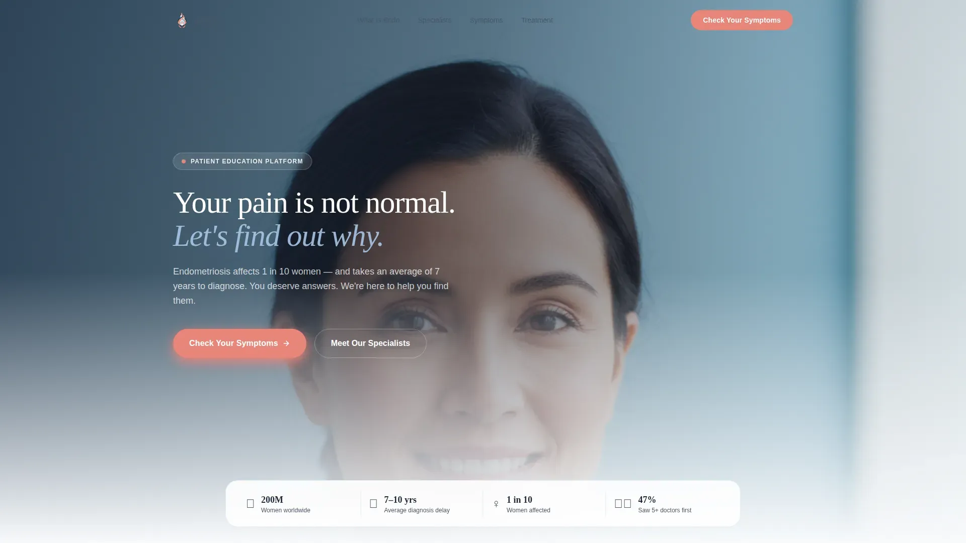
The hero opens with a warm, shoulders-up specialist portrait set against a soft sky-blue gradient. A single headline in deep dusk type reads "Your pain is not normal. Let's find out why." A coral "Check Your Symptoms" button appears directly beneath, and a floating statistics strip displays key figures such as 200 million people affected worldwide and the seven-to-ten-year average diagnosis delay.
Zigzag Expert Panel Layout
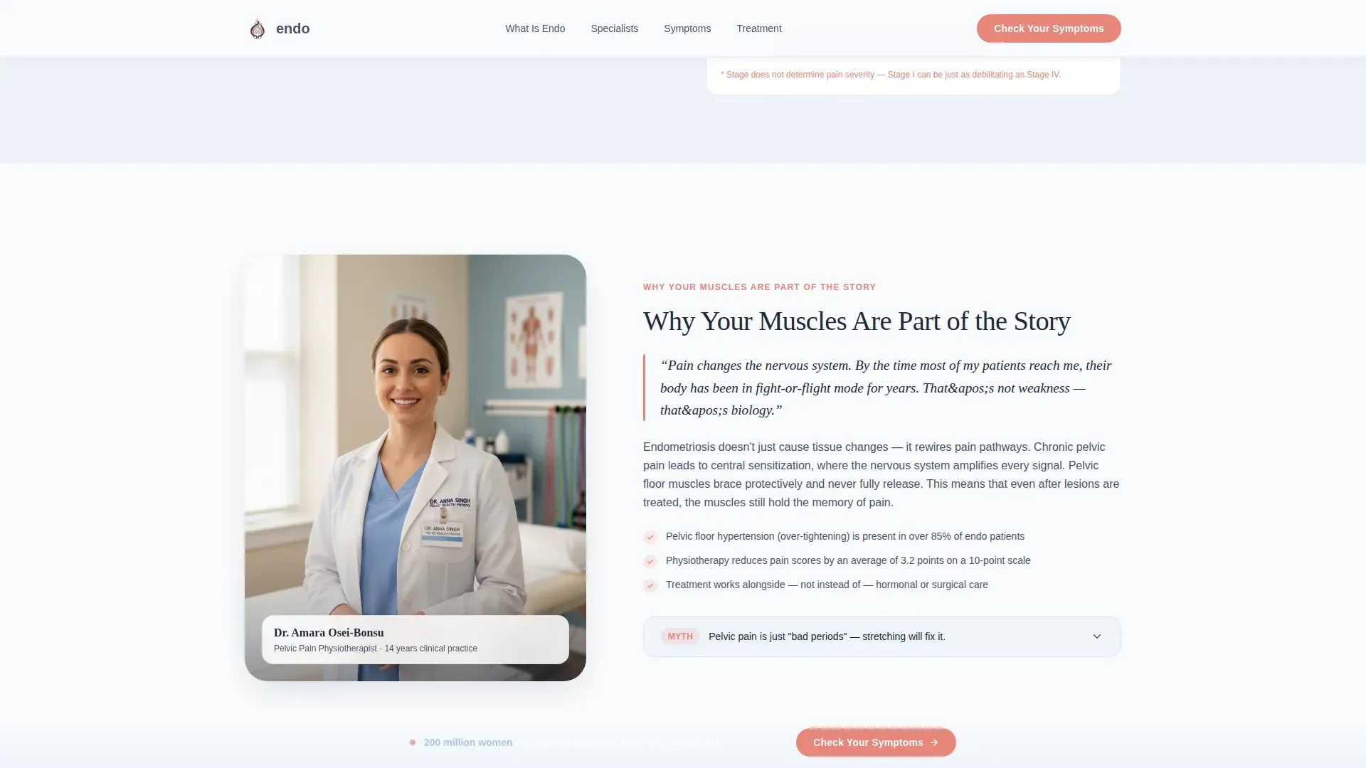
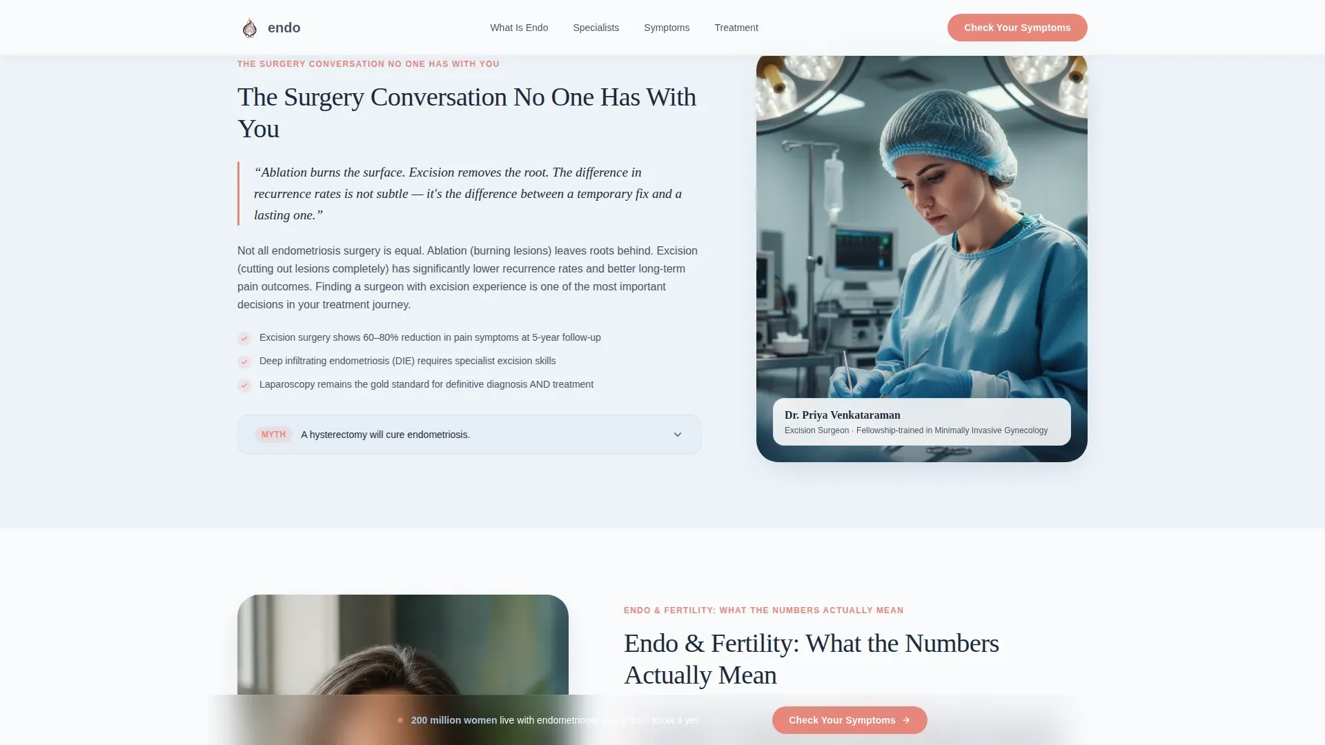
Four specialist sections alternate portrait position left and right, creating a conversational visual rhythm. Each section features a different expert, a pelvic pain physiotherapist, an excision surgeon, a fertility counselor, and a psychologist, with their portrait, credential line, a pullquote in enlarged typography, and a myth-versus-fact toggle at the close of each section.
Seven-Step Inline Symptom Quiz
The assessment opens inline on the page, never in a modal. Visitors move through seven progressive questions: pain location via body-map tap, cycle regularity, pain severity on a visual analog slider, family history toggle, daily-life impact, previous diagnoses, and desired outcome. Results deliver a personalized symptom profile and a specialist-matched reading path. The email prompt appears only after results are shown.
Sticky Quiz Call-to-Action Bar
After the second section, a sticky bottom bar carrying the coral "Check Your Symptoms" button remains visible as the visitor scrolls. This keeps the primary conversion action accessible throughout the page without interrupting content flow.
Anatomy Illustration Section
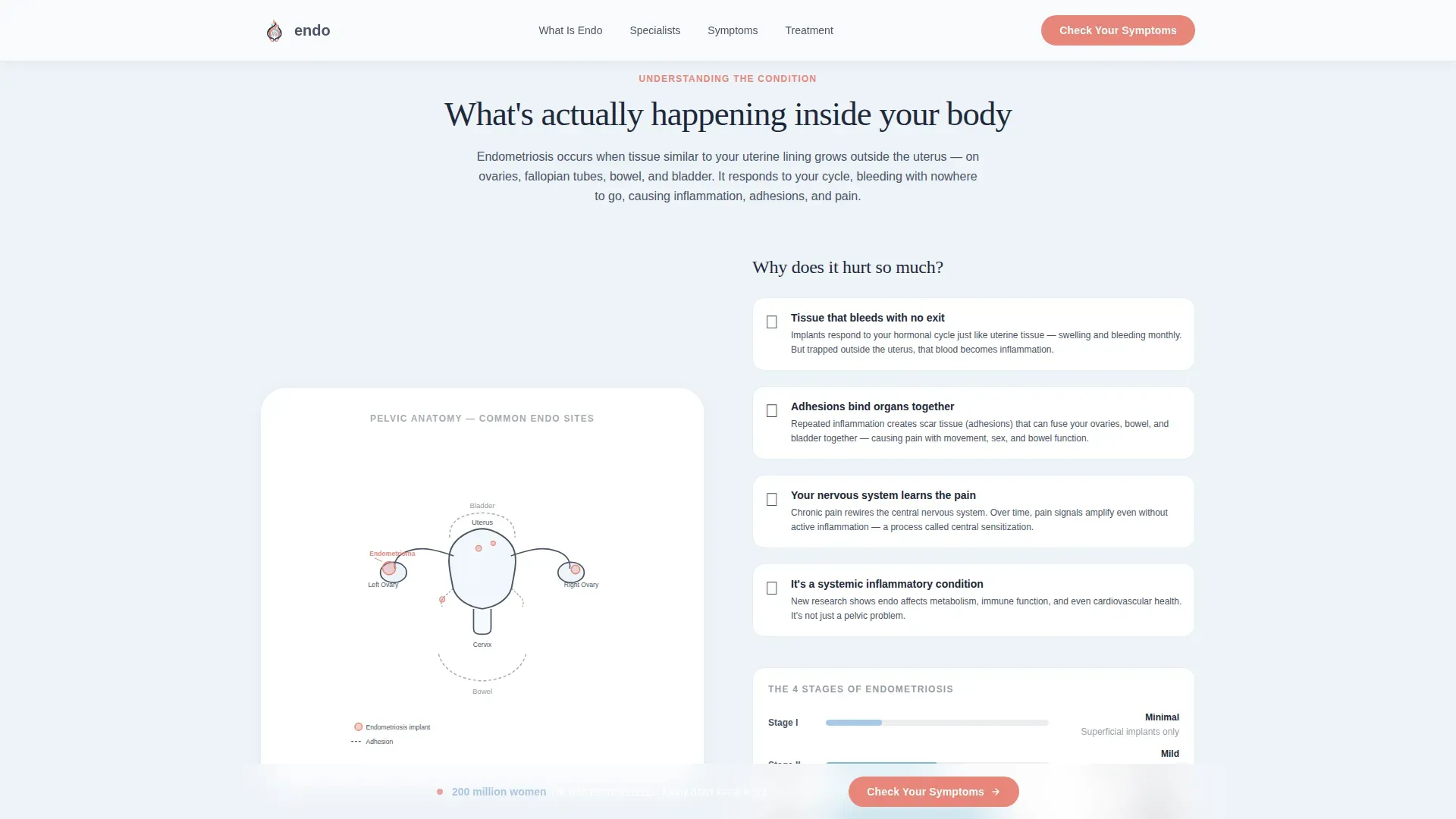
A slate line-art illustration of the female reproductive system sits opposite a plain-language explanation of what endometriosis is and how it develops. This section is designed to feel like a doctor actually using an anatomical model to explain something clearly for the first time.
Treatment Paths Bento Grid
An asymmetric bento grid presents treatment options with specialist matching. Each cell corresponds to a treatment approach and is paired with the relevant specialist type, giving visitors a structured view of their next possible steps after completing the quiz.
Page sections overview
| Section | Purpose |
|---|---|
| Hero Portrait | Opens with specialist portrait, direct headline, coral quiz call to action, and stats strip |
| Expert Panel Zigzag | Four alternating specialist sections with portraits, credentials, pullquotes, and myth/fact toggles |
| Anatomy Illustration | Slate line-art diagram paired with plain-language endometriosis explanation |
| Inline Symptom Quiz | Seven-step progressive assessment delivering a personalized symptom profile |
| Treatment Paths Grid | Asymmetric bento grid of treatment options with specialist matching |
| Footer | Horizontal footer pattern with navigation and supporting links |
Design & branding system
The visual identity follows an Educational Guide theme using a Slate and Sky color system. The aesthetic reads like a modern women's health clinic: serious enough to trust, soft enough to stay. Typography pairs Fraunces serif headings with DM Sans for body text and interface elements.
- Deep dusk (#1E293B) for all headers and navigation; clinical slate (#4A5568) for body text and diagram labels
- Soft sky (#A7C7E7) section backgrounds that feel calm and unhurried; coral (#E8857A) used exclusively for interactive elements and quiz calls to action
- Fraunces serif headings for authority and warmth; DM Sans for clear, readable body and interface copy
Mobile & speed optimization
The template is built mobile-first, reflecting the reality that the target audience most often searches at midnight on a phone. Quiz interactivity, body-map taps, and slider inputs are designed for touch screens. Reveal-on-scroll animations are set to medium intensity to keep the experience smooth without heavy overhead.
- Mobile-first layout ensures all quiz steps, body-map interactions, and specialist panels read naturally on small screens
- Images are optimized and the inline quiz uses React useState for lightweight, client-side state management
- Reveal-on-scroll, myth-versus-fact toggle transitions, and quiz step animations are balanced for performance without visual excess
How this template helps you convert
The conversion strategy is built around delivering value before making any ask. The quiz gives visitors a personalized result before requesting an email address, which means trust is earned rather than assumed.
- The coral "Check Your Symptoms" call to action appears in the hero and repeats in the sticky bottom bar after the second section, keeping the primary action visible throughout the scroll without interrupting expert content.
- The seven-step quiz collects meaningful context through body-map taps, sliders, and toggles, then returns a personalized symptom profile and specialist-matched reading path. The email prompt arrives only after results are delivered, framed as "Save your profile" rather than a lead capture gate.
- Myth-versus-fact toggles at the close of each expert panel section reward curiosity and deepen engagement, moving visitors naturally toward the quiz rather than away from the page.
Other information about this template
This template is part of a broader patient education and digital health platform category. It is designed for teams building B2C women's health experiences where credibility, emotional resonance, and structured guidance all matter equally.
- The page references globally relevant statistics: approximately 200 million people affected by endometriosis worldwide and an average diagnosis delay of seven to ten years in the United States context
- Social proof is built through specialist credentials and research-cited statistics rather than user testimonials, which suits regulated health content environments
- The footer follows a horizontal pattern layout and supports navigation and supporting page links
Theme
Educational Guide
Creative direction
Expert Panel
Color system
Slate & Sky
Style
Zigzag/Alternating
Direction
Quiz/Assessment
Page Sections
Portrait-centered Hero with Stats Strip
Zigzag Expert Panel with Myth Toggles
Seven-step Inline Symptom Quiz
Sticky Quiz Call-to-action Bar
Slate Line-art Anatomy Section
Treatment Paths Bento Grid
Related questions
Who is this landing page template designed for?
Does the symptom quiz require an email address to see results?
How many specialist sections are included in the zigzag layout?
Is this template suitable for mobile users?
Can the color system and typography be customized?



