Hearing & Audiology Comparison Website Template
This landing page template is built for an online hearing test platform. It guides visitors through a self-assessment checklist, a side-by-side comparison table, and a sticky call to action, all in a single scrollable page. The Medical Clarity design uses clinical whites, calm grays, and diagnostic teal to build quiet confidence before asking for the click.
by Rocket studio
Quick summary
This is a single-page landing page template designed for an online hearing test platform. It combines an interactive self-assessment checklist, a three-path comparison table, and a guided lead-capture section. The design follows a Medical Clarity theme that feels clinical but approachable, moving visitors from vague concern to a clear next step in one focused scroll.
Who this template is for
This template suits health platforms and digital wellness products that need to convert cautious, self-directed visitors into engaged test-takers. It works especially well when your audience arrives with a nagging suspicion rather than an urgent need.
- Founders and product teams building direct-to-consumer hearing health tools
- Health content publishers offering free screening resources alongside paid services
- Clinics or audiology practices promoting an online pre-screening option
What problem this template solves
Many people suspect they have a hearing gap but delay action because the path to answers feels complicated or clinical. This template removes that friction by letting visitors self-diagnose first, then presenting a clear comparison of their options.
- Visitors bounce when they feel pushed toward a hard sell before they trust the product
- A flat, static page cannot capture the graduated concern that builds as someone works through a checklist
- Without a structured comparison, visitors cannot easily weigh a free online test against a home kit or an in-clinic visit
What you get with this template
You get a fully structured, single-page layout with interactive components, a lead-capture flow, and a design system ready to apply to any online hearing assessment product. Every section is purposeful and sequenced to reduce drop-off.
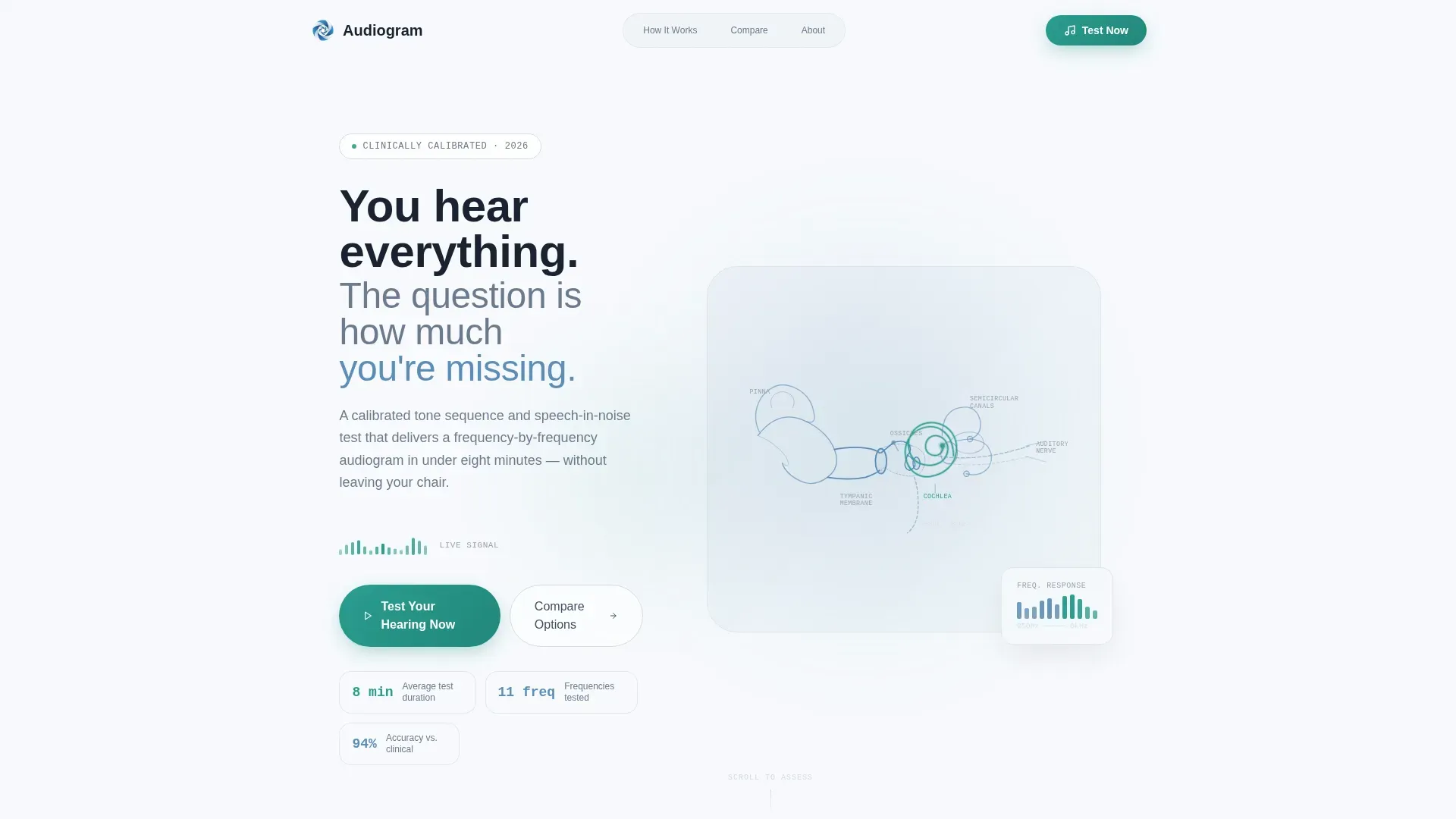
- Hero section with an SVG ear anatomy illustration, animated cochlea pulse, and a headline fade-in effect
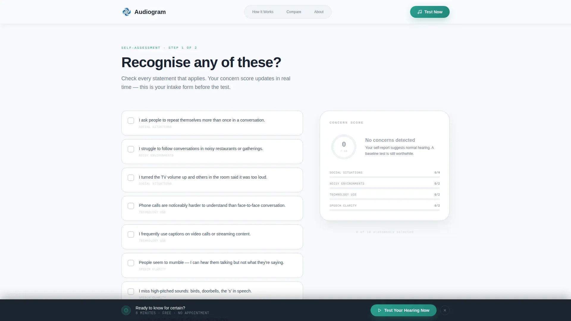
- Interactive self-assessment checklist with a live concern score counter displayed in a sidebar
- Three-column comparison table, email capture section with age-range field, sticky bottom call-to-action bar, testimonial cards, and a footer
Feature list
This template is built around a specific set of interactive and visual components that work together to guide a hesitant visitor toward a confident decision.
Interactive Concern Score Checklist
The self-assessment section presents relatable statements such as "I ask people to repeat themselves." Each ticked box increments a visible concern score in a sidebar. Visitors build their own case for taking the test before you make the ask.
Three-Path Comparison Table
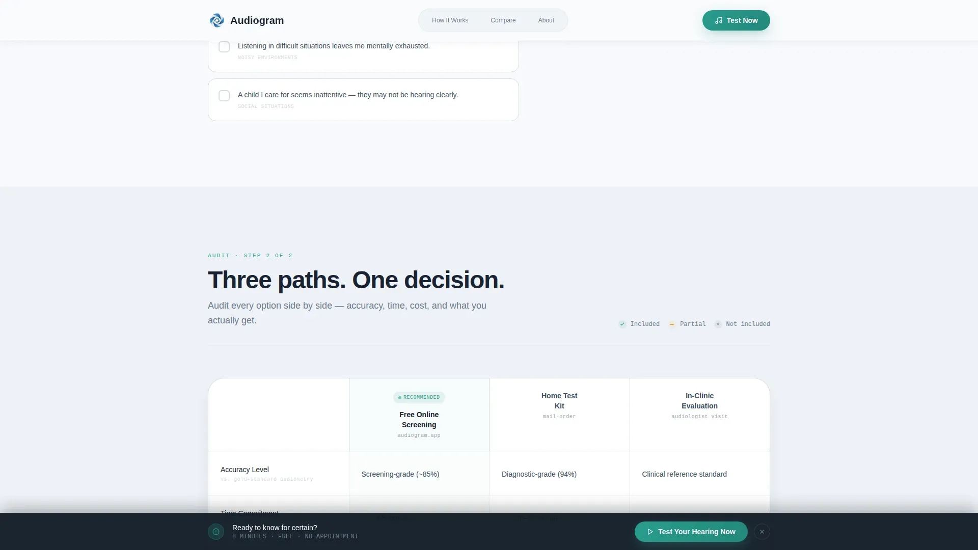
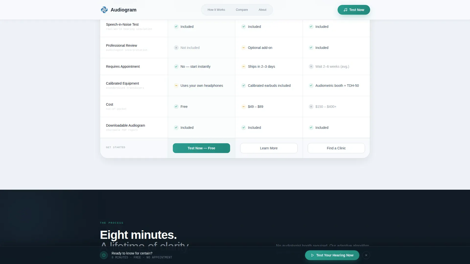
A structured table audits three options side by side: a free online screening, a comprehensive home test kit, and an in-clinic evaluation. Rows cover accuracy level, time commitment, frequency range tested, professional review inclusion, and cost. Teal check marks and gray dashes let the eye parse differences instantly.
Sticky Bottom Call-to-Action Bar
A bottom bar anchored to the viewport appears after the visitor interacts with the checklist. The primary call to action reads "Test Your Hearing Now" and stays accessible without interrupting the reading experience above it.
Hearing Health Guide Lead Capture
A secondary conversion path offers a downloadable PDF guide on audiogram reading, common hearing loss patterns, and when to see a specialist. Visitors enter an email address and age range to receive it, giving the platform a qualified lead with useful segmentation data.
SVG Ear Anatomy Hero Illustration
The header uses a precise line-art cross-section of the human ear rendered in thin strokes of the primary blue. The cochlea pulses gently using an SVG animation. No photography or stock imagery is used, keeping the visual tone exactly clinical.
Dark Bento Grid How-It-Works Section
A three-step process is laid out in a dark bento grid format. This section explains how the browser-based assessment works, creating confidence in the method before the visitor commits to starting.
Page sections overview
| Section | Purpose |
|---|---|
| Hero with illustration | Introduce the product and create immediate visual trust |
| Self-assessment checklist | Let visitors score their own concern level interactively |
| Comparison table | Audit three hearing test paths side by side |
| How it works | Explain the three-step assessment process clearly |
| Testimonial cards | Reinforce trust with specific hearing outcome stories |
| Guide download call to action | Capture email and age range via a PDF offer |
| Footer | Provide navigation and closing context |
Design & branding system
The visual identity follows a Medical Clarity theme built on the Cloud Canvas color system. The palette is deliberately restrained so data and interactive elements carry all the visual weight.
- Colors: soft clinical white (#F7F9FC) for backgrounds, calm atmospheric gray (#D4DAE3) for dividers and secondary surfaces, steady reassurance blue (#5B8DB8) for primary illustration and typographic accents, and diagnostic teal (#2A9D8F) reserved strictly for interactive elements, progress indicators, and call-to-action buttons
- Typography: DM Sans handles all interface and body copy for clean legibility; JetBrains Mono is used for data labels, medical values, and audiogram references to reinforce clinical precision
Mobile & speed optimization
The template is built desktop-first with full mobile responsiveness across all interactive sections. Scroll reveals, the sticky bar, and the checklist counter all adapt to smaller viewports without losing their function.
- Static layout sections use server-rendered components to keep initial load lightweight
- Interactive elements such as the live checklist and email capture form use client-side components only where interactivity is required
- The comparison table reflows cleanly on mobile so all three paths remain readable without horizontal scrolling
How this template helps you convert
The conversion architecture is progressive. Each section earns the next click by giving the visitor something useful before asking for anything in return.
- The checklist builds personal investment by letting visitors identify with specific hearing scenarios, so by the time they reach the call to action they already suspect they need the test.
- The comparison table removes decision paralysis by clearly showing what the free online screening offers versus paid alternatives, making the no-cost first step feel like the obvious choice.
- The guide download captures a second conversion path for visitors who are not yet ready to test, collecting a qualified email address and age-range data in exchange for genuinely useful educational content.
Other information about this template
This template is a strong fit for health content destinations where the visitor arrives in a research mindset rather than a purchasing one. The Checklist and Audit creative direction is well suited to audiences who respond to self-directed discovery rather than top-down sales messaging.
- The Content and Resource landing page direction means the page earns engagement through value delivery first, with commercial intent expressed only after the visitor has already invested attention
- The Line Art header concept avoids the clinical coldness of medical photography while still communicating professional precision
- The template is built as a single-page layout, meaning all sections scroll sequentially without routing to separate pages
- Animation intensity is high by design: the cochlea SVG pulse, scroll reveal transitions, and the concern score counter are all specified as core interactive behaviors in the template
Theme
Medical Clarity
Creative direction
Checklist & Audit
Color system
Cloud Canvas
Style
Comparison Table
Direction
Content/Resource
Page Sections
Interactive Concern Score Checklist
Three-path Comparison Table
Sticky Bottom Call-to-action Bar
Hearing Health Guide Lead Capture
SVG Ear Anatomy Hero with Cochlea Pulse
Dark Bento Grid How-it-works Section
Related questions
Can I adapt this template for a different health screening product?
Does the comparison table support more or fewer than three options?
Is the concern score counter connected to any external system?
What format is the ear anatomy header illustration delivered in?
Who handles the emails captured through the guide download form?



