Eye Care & Optometry Booking Website Template
The Clarity landing page template is built for LASIK and vision correction clinics. It guides prospective patients from curiosity to booked consultation using an FAQ-driven scroll, a side-by-side procedure comparison table, and an inline four-step eligibility quiz. Educational in tone and warm in design, it turns anxious late-night researchers into confident, pre-qualified leads.
by Rocket studio
Quick summary
Clarity is a single-page landing page template for vision correction clinics. It leads visitors through anatomy, eligibility, and procedure comparison before presenting a short inline quiz that pre-qualifies them as leads. The design feels like a trusted medical textbook, not a sales brochure, so patients arrive at their consultation already informed.
Who this template is for
This template is built for LASIK clinics, refractive surgery practices, and eye care providers who want to educate prospective patients before asking them to book. It serves both the coordinator writing copy and the patient reading it at midnight.
- Vision correction clinics offering LASIK, PRK, or SMILE procedures
- Eye care practices launching a patient education and lead generation page
- Clinic marketing teams who need a polished, content-first landing page without building from scratch
What problem this template solves
Most vision correction pages push the booking button before the patient is ready. They skip the questions patients actually have, which creates hesitation and drop-off. This template solves that trust gap by answering real concerns in a structured, readable flow.
- Patients arrive uninformed and anxious; the FAQ-driven structure meets them where they are
- Comparing LASIK, PRK, and SMILE side by side is confusing without a clear visual framework
- Clinics lose warm leads when there is no low-friction middle step between reading and calling
What you get with this template
You get a fully structured, single-page layout with every section designed around the patient decision journey. Each component has a clear purpose and a defined place in the scroll flow.
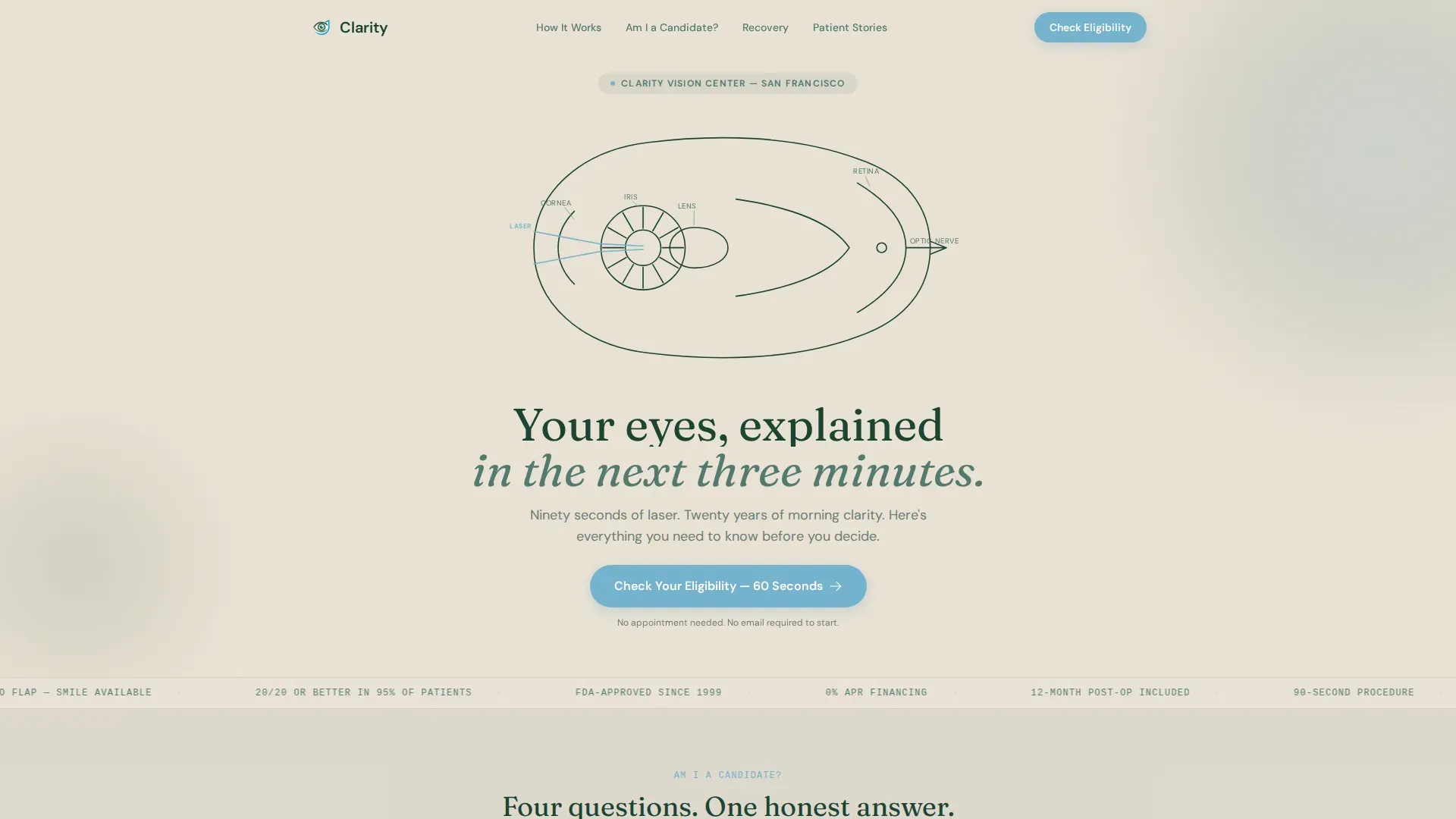
- An animated hero section with an SVG eye illustration and a headline reveal
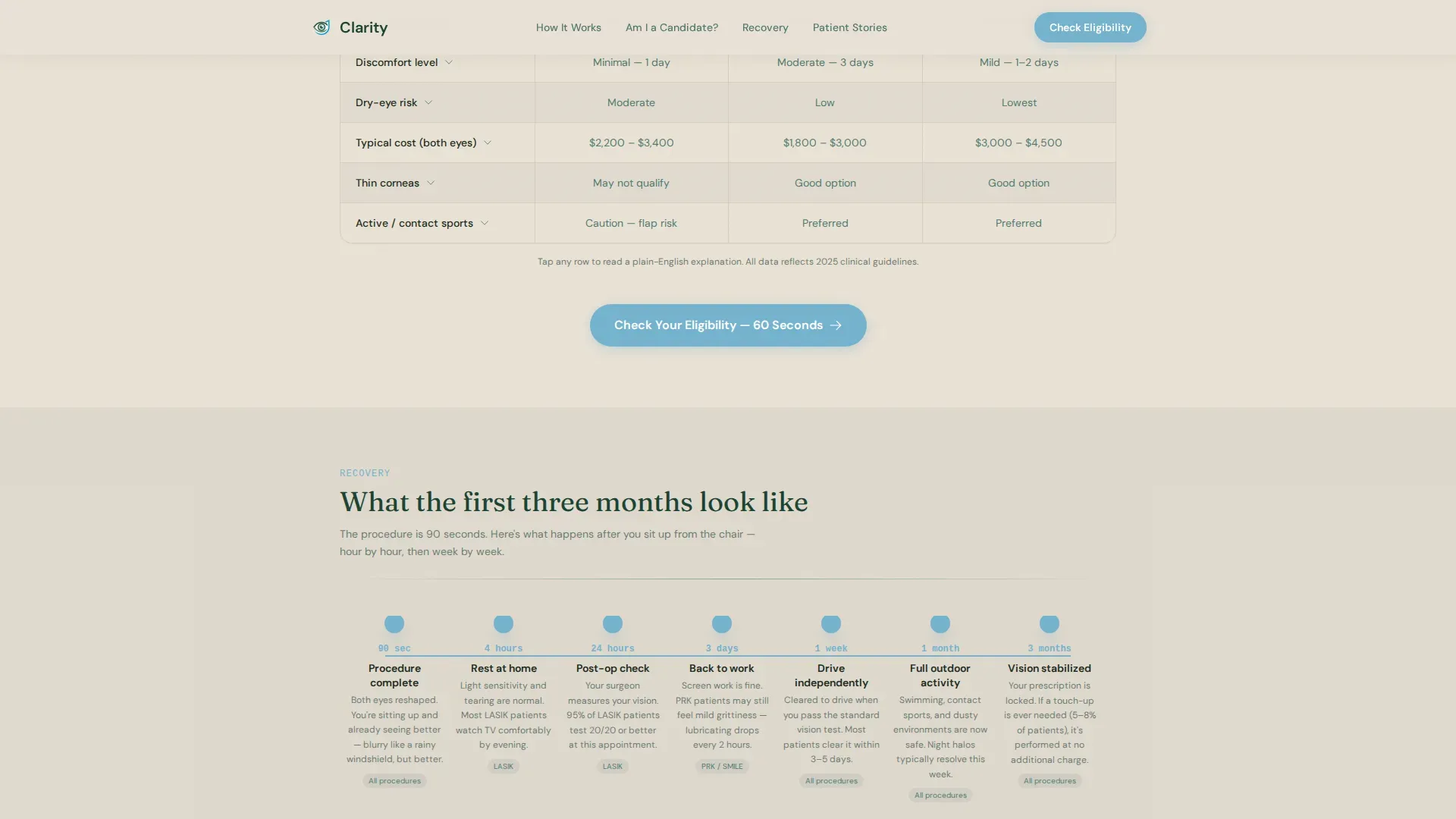
- A procedure comparison table with expandable rows and a recovery timeline
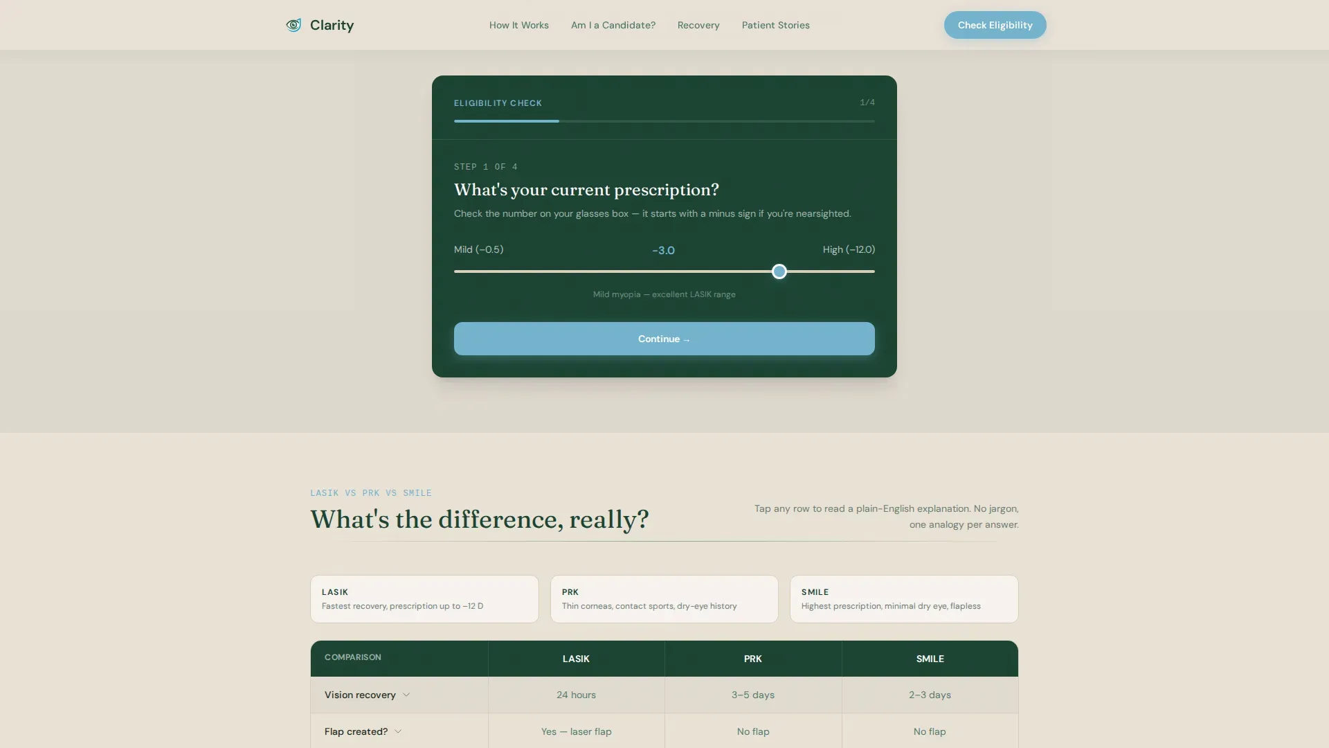
- An inline eligibility quiz with a results view and a coordinator callback field
Feature list
This template includes purpose-built components that handle education, comparison, and conversion in one continuous page.
Animated SVG Eye Illustration
The header features a line art cross-section of the human eye drawn in evergreen ink on a birch-bark cream background. The stroke animates on page load over two seconds, giving the impression of a surgeon sketching in real time. This immediately signals expertise and sets the educational tone before the visitor reads a single word.
Inline Four-Step Eligibility Quiz
The quiz opens directly on the page without a modal or redirect. It collects prescription strength via a slider, age bracket via four buttons, current correction method via icon selection, and dry-eye history via a yes/no toggle. Results return a candidacy estimate and a recommended procedure, followed by a phone number field and preferred callback window.
Procedure Comparison Table
A structured table maps LASIK, PRK, and SMILE against recovery time, candidacy range, flap involvement, and cost brackets. Each row expands on tap to show a short plain-language explanation written at an accessible reading level with one concrete analogy. Visitors can self-sort without any sales pressure.
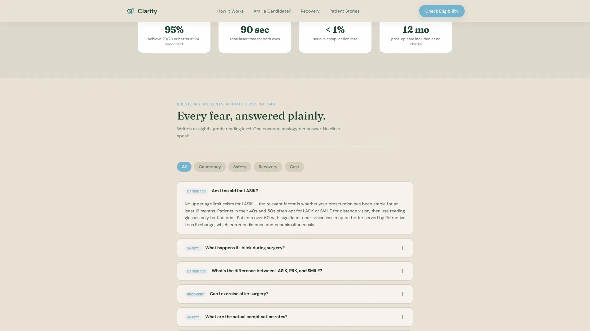
FAQ-Driven Scroll Sections
Each scroll section answers a specific question patients type during late-night research, such as age eligibility, procedure differences, and what happens during the procedure itself. The content builds from anatomy to eligibility to comparison to recovery, lowering one barrier per section.
Recovery Timeline Visual
A horizontal visual timeline marks recovery milestones from the day of surgery through full stabilization. It gives patients a concrete sense of what to expect week by week and reduces the fear of the unknown that delays booking decisions.
Secondary Lead Capture Path
A "Download the Complete Vision Guide" prompt appears in the testimonials section. It captures an email address from visitors who are not yet ready to call, giving the clinic a way to stay in contact with patients still in the research phase.
Page sections overview
| Section | Purpose |
|---|---|
| Hero with Quiz call to action | Introduce the clinic and prompt the eligibility quiz |
| Inline Eligibility Quiz | Collect four data points and return a candidacy estimate |
| Procedure Comparison Table | Compare LASIK, PRK, and SMILE side by side |
| Recovery Timeline | Show week-by-week milestones after surgery |
| Testimonials and Email Capture | Build trust and capture emails for undecided visitors |
| Footer | Single-row linear navigation and contact links |
Design & branding system
The visual identity follows an Educational Guide theme built on a Forest Trust color system. The palette draws from nature rather than clinical sterility, making the page feel authoritative and warm at the same time.
- Deep evergreen (#1B4332) anchors headers and navigation; soft fern (#52796F) carries secondary text and alternating table rows; birch-bark cream (#EAE2D6) grounds the page background
- Clear-sky blue (#74B3CE) highlights interactive elements, active quiz states, and call-to-action buttons so they feel like openings in the canopy
- Fraunces serif handles headlines for a trusted medical textbook feel; DM Sans handles body text and interface elements for clean readability
Mobile & speed optimization
The template is designed desktop-first but fully responsive for mobile. Patients frequently research vision correction late at night on their phones, so the layout adapts without losing the comparison table or quiz functionality.
- Static content sections are structured to render cleanly on mobile without horizontal scrolling
- The quiz slider, age buttons, and icon-tap correction selection are all touch-friendly by design
- Scroll-triggered section reveals and SVG animations are scoped to the interactive client layer so static content loads independently
How this template helps you convert
The page is structured as a progressive trust funnel, not a direct sales pitch. Each scroll section removes one specific barrier before presenting the next action.
- The FAQ scroll lowers informational barriers first, so visitors feel educated rather than sold to before they reach the quiz or comparison table.
- The inline eligibility quiz converts passive readers into identifiable leads by returning a personalized candidacy result and requesting a callback number with a preferred time window.
- The secondary email capture path retains visitors who are not ready to call, keeping them in the clinic's reach for future follow-up.
Other information about this template
This template is categorized under Health and Medical, specifically Eye Care and Optometry, with a primary focus on the LASIK and vision correction niche. It is designed as a comparison table landing page with an FAQ-driven creative direction.
- The template uses a Quiz/Assessment landing-page direction, meaning the primary conversion path flows through the inline eligibility quiz rather than a direct booking button
- The header concept is Line Art, using a single continuous SVG stroke to draw the eye cross-section rather than a photograph or stock illustration
- The intersection match score for this template's category, subcategory, and niche alignment is 13, indicating a high degree of specificity for vision correction patient education use cases
- Typography pairing is Fraunces for display headings and DM Sans for body and interface copy, a combination chosen for its balance of medical authority and everyday readability
Theme
Educational Guide
Creative direction
FAQ-Driven
Color system
Forest Trust
Style
Comparison Table
Direction
Quiz/Assessment
Page Sections
Animated SVG Eye Illustration
Inline Four-step Eligibility Quiz
Procedure Comparison Table
Faq-driven Scroll Structure
Recovery Timeline Visual
Secondary Email Capture Path
Related questions
Can I edit the comparison table to match my clinic's procedures and pricing?
Does the eligibility quiz send results somewhere automatically?
Is this template suitable for a clinic that only offers one procedure?
How does the secondary lead capture path work?
What kind of patient testimonials work best in this template?



