Inclusive Beauty & Skincare Blog Website Template
Clarity is a luxe minimal landing page template for acne-prone skin beauty blogs. It pairs a full-screen cinematic header, overlapping editorial card stacks, and a five-step visual quiz that guides visitors to a personalized skin pattern routine map. Built for ingredient-literate women, every section feels intentional, moody-soft, and conversion-ready.
by Rocket studio
Quick summary
Clarity is a single-page editorial template built for beauty journals focused on breakout-prone skin. It uses a layered overlap layout, a Merlot and Smoke color system, and a quiz-led conversion flow. The design feels like a luxury skincare editorial, quiet, precise, and personal, while guiding every visitor toward a skin pattern result and email capture.
Who this template is for
This template is for skincare content creators, beauty editors, and independent blog founders who write for ingredient-literate audiences. It fits anyone building a direct-to-consumer editorial presence around acne-prone or hormonally triggered skin.
- Beauty bloggers and editorial founders serving women ages 20 to 35
- Skincare writers who want a quiz-led email capture built into the page design
- Content brands that lead with expertise, voice, and routine-based guidance
What problem this template solves
Generic skincare landing pages treat all visitors the same. This template solves the problem of impersonal, list-heavy pages that fail to hold attention or earn trust from an ingredient-aware reader.
- It replaces static product roundups with a narrative scroll anchored to real skin moments
- It removes friction from email capture by letting visitors see their routine map before entering an address
- It gives a breakout-prone skin blog a visual identity that feels credible, not clinical
What you get with this template
You get a fully structured, single-page layout with five distinct editorial sections, a five-step visual quiz modal, and a layered card design system. Every section is purpose-built and visually distinct.
- A full-screen video background hero with a floating rose-gold call-to-action button
- Four seasonal skin moment card stacks, an ingredient editorial section, and a voice-memo testimonial layout
- A full-width quiz call-to-action section with a multi-step modal and a minimal horizontal footer
Feature list
This template delivers a tightly scoped set of features grounded in the source brief. Each one serves the editorial mission and the quiz-led conversion strategy.
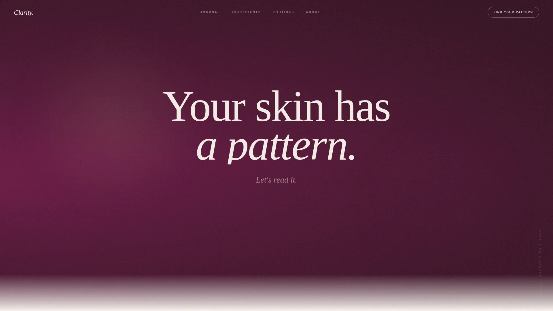
Full-Screen Cinematic Hero Section
The header fills the entire viewport with slow-motion macro skincare footage: a serum bead on a glass dropper, mist settling on bare skin, fingertips pressing cream until it absorbs. Shallow depth of field and warm directional light keep the mood intimate. A single serif headline fades in over the footage: "Your skin has a pattern. Let's read it."
Seasonal Layered Card Stacks
Four overlapping card stacks anchor each scroll section to a real skin moment, a hormonal surge, a long-haul flight, post-summer hyperpigmentation, and a winter barrier disruption. The merlot tones shift cooler or warmer as the visitor scrolls, creating a seasonal rhythm. Each card reveals a routine, an ingredient breakdown, and a reader testimonial.
Five-Step Visual Quiz Modal
The quiz opens in a layered modal that matches the page aesthetic. Five questions appear one at a time, using visual selectors and a drag slider for oiliness level. No email is required until results are shown. The visitor sees a personalized routine map first, then enters an address to save it and unlock the full seasonal guide.
Floating and Pinned Call-to-Action System
The primary call to action, "Find Your Skin Pattern," appears first as a floating rose-gold pill button after the hero video. It then resurfaces pinned at the bottom of every seasonal section. This keeps the conversion path visible without interrupting the editorial reading experience.
Voice-Memo Style Testimonial Layout
Reader testimonials are arranged in a staggered layout designed to sound and feel like voice memos. The presentation avoids polished quote cards in favor of raw, personal language that resonates with a reader who has tried many products and still searches for answers.
GSAP ScrollTrigger Animation System
Sections reveal through staggered entrance animations and parallax layering driven by GSAP ScrollTrigger. Cards slide into view as the visitor scrolls. The modal layers in with a smooth transition that mirrors the overlap design of the page itself. GPU-accelerated transforms keep motion smooth on mobile.
Page sections overview
| Section | Purpose |
|---|---|
| Cinematic Video Hero | Draws visitors in and sets the editorial tone |
| Seasonal Skin Moments | Anchors content to real, recognizable skin events |
| Ingredient Intelligence | Presents editorial ingredient breakdowns in a rotated card layout |
| Reader Voice Memos | Builds trust through raw, staggered reader testimonials |
| Quiz Call to Action | Drives email capture through a personalized routine result |
| Minimal Horizontal Footer | Closes the page with an ultra-clean, low-distraction end |
Design & branding system
The visual identity uses a Luxe Minimal editorial style built on the Merlot and Smoke color system. The palette feels moody without being gothic and soft without being sweet.
- Colors: deep wine (#4A0E2E) for section backgrounds, charcoal smoke (#3B3B3B) for body text, blush fog (#E8D5D0) for layered card surfaces, and aged rose gold (#C4917B) reserved for buttons and progress indicators
- Typography: Fraunces serif for display headings, DM Sans for body copy
- Layout system: overlapping blush-edge cards float on merlot-washed backgrounds, with CSS custom properties controlling the full color and spacing system
Mobile & speed optimization
This template is built mobile-first. The target audience reads on phones in bathrooms, and every layout decision reflects that priority.
- All card stacks, quiz steps, and section transitions are designed for single-thumb vertical scrolling on small screens
- CSS custom properties and GPU-accelerated transforms reduce layout recalculation and keep animations fluid on mobile hardware
How this template helps you convert
The quiz-led conversion model is the core of this template. It earns attention before asking for anything in return.
- The floating and pinned call-to-action buttons keep "Find Your Skin Pattern" visible at every scroll depth without interrupting editorial content
- The quiz delivers a personalized routine map before requesting an email address, so the visitor perceives clear value before committing
- The seasonal narrative structure holds attention across the full scroll, increasing the chance a visitor reaches the quiz call-to-action section with genuine intent
Other information about this template
This template is a strong fit for beauty content founders who want an editorial presence that doubles as a lead generation tool. A few additional details worth knowing before you start customizing:
- The quiz modal includes five visual question steps with image selectors and a drag slider, all styled to match the page aesthetic
- The footer follows a horizontal ultra-minimal layout pattern, keeping the close of the page as clean as the open
- The animation stack relies on GSAP ScrollTrigger for staggered reveals and parallax layers, with no additional animation library required
- The template is localized for English (United States) with no currency formatting or date localization built in


Theme
Luxe Minimal
Creative direction
Seasonal/Moment
Color system
Merlot & Smoke
Style
Overlap/Layered
Direction
Quiz/Assessment
Page Sections
Full-screen Cinematic Hero
Seasonal Layered Card Stacks
Five-step Visual Quiz Modal
Floating and Pinned Call to Action System
Voice-memo Testimonial Layout
GSAP Scrolltrigger Animation System
Related questions
Does this template include the quiz functionality already built in?
Can I update the colors and fonts to match my brand?
Is this template suitable for a new skincare blog with limited content?
What kind of video works best for the hero section?
How does the email capture work in this template?


