Oncology Clinic Website Template for Cancer Patients & Families
A split-screen oncology landing page built for cancer patients, families, and second-opinion seekers who need clarity, not jargon. The template pairs a guided multi-step intake form with a scroll-driven educational journey, delivering downloadable resources at every stage. Deep teal, charcoal, seafoam, and amber create a calm, clinical warmth that earns trust before it asks for an email address.
by Rocket studio
Quick summary
This is a split-screen oncology landing page designed for physician practices that want to guide patients through a diagnosis with calm authority. A three-step intake form opens the experience, and a scroll-driven pathway delivers downloadable resources at every phase of the oncology journey. The design balances clinical precision with human warmth from the first scroll to the final call to action.
Who this template is for
This template is built for oncologists and cancer-care practices that serve patients at the most uncertain moments of their lives. It suits practices that want to lead with education and earn a patient's trust before requesting contact details.
- Oncology practices launching a patient education resource library
- Physicians offering formal second-opinion consultation services
- Cancer care teams wanting a structured, empathetic digital intake experience
What problem this template solves
Newly diagnosed patients and their families often arrive at a practice website overwhelmed and unsure where to start. Generic contact forms and dense clinic pages add confusion rather than clarity. This template removes that friction by turning the landing page into a guided experience that answers the next logical question at every scroll.
- Patients feel helped before they feel asked, because the form collects medical context first and contact details last
- Families researching late at night get a clear, structured pathway instead of scattered information
- Practices stand out by demonstrating educational depth before a single appointment is booked
What you get with this template
You get a fully structured single-page layout with five scroll-anchored content sections, a three-step intake form, and a complete design system ready to customize. Every section has a defined purpose and a matching resource delivery moment.
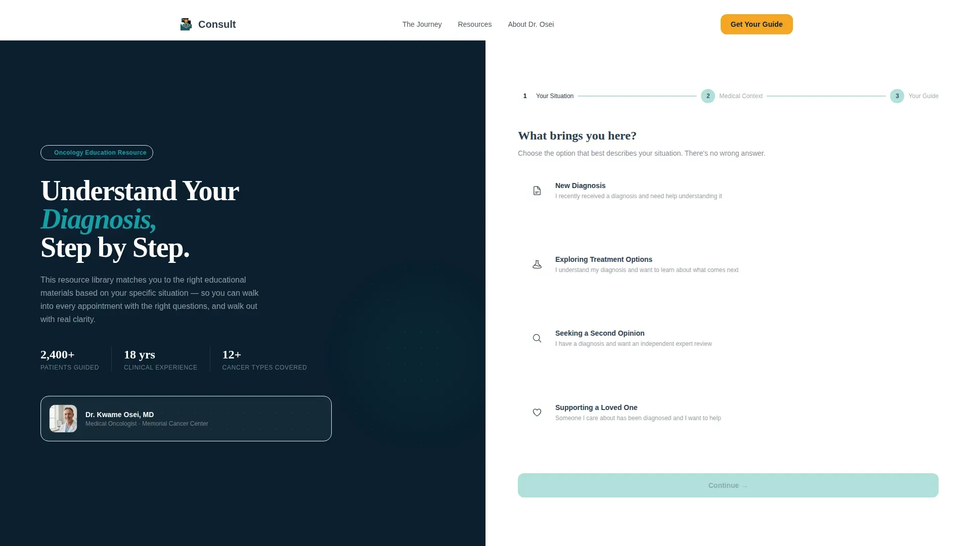
- A hero split-screen with a guided intake form featuring clickable card selectors for "New Diagnosis," "Exploring Treatment Options," "Seeking a Second Opinion," and "Supporting a Loved One"
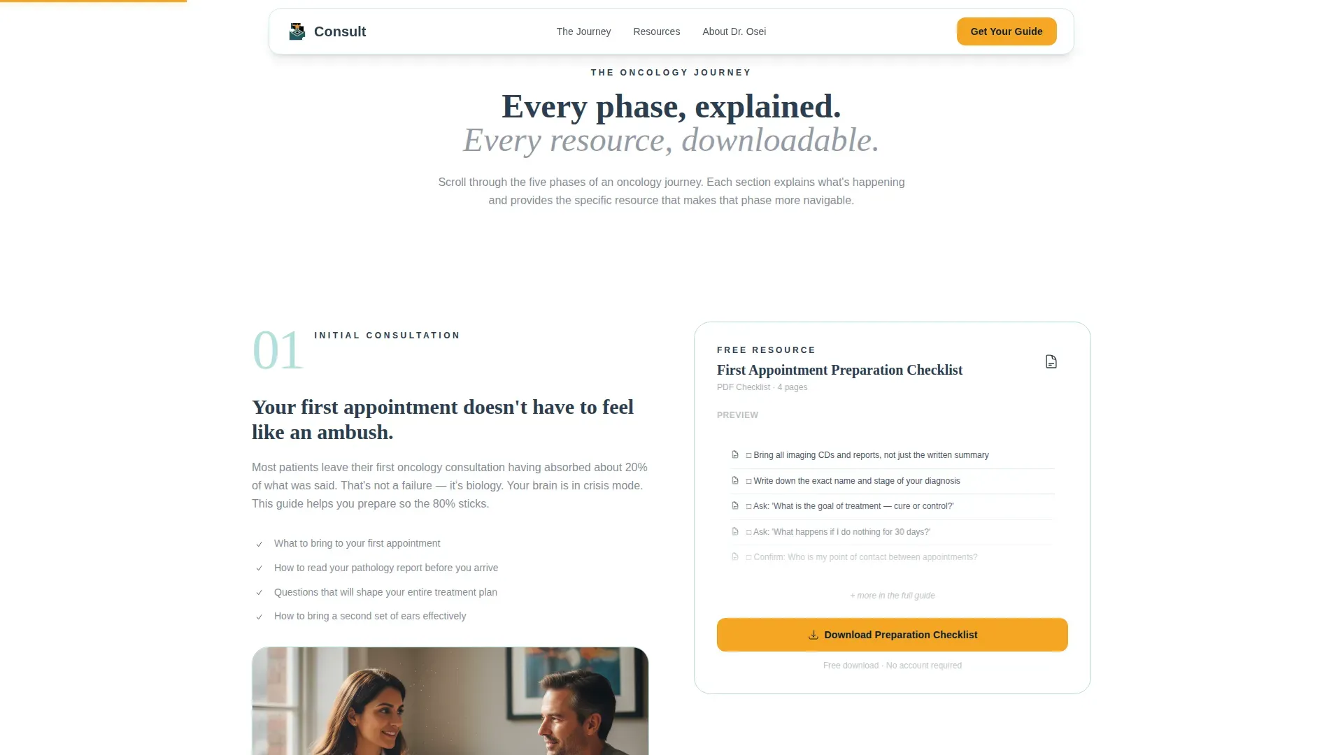
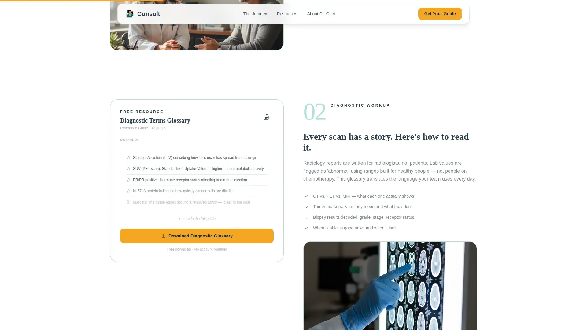
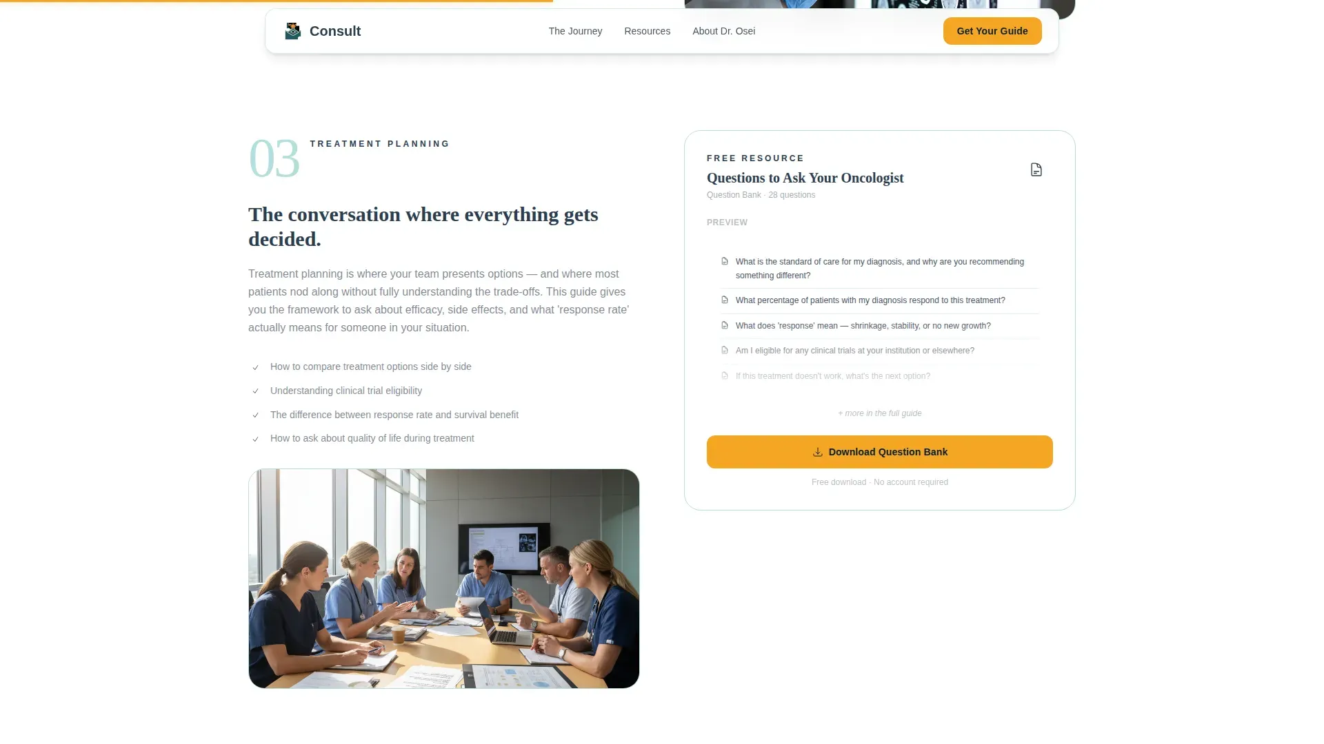
- Five journey-phase sections, each pairing a left-side illustrated explanation with a right-side downloadable resource card
- Two call-to-action paths: a personalized guide tied to form completion and a full resource library bundle for immediate download
Feature list
This template ships with a focused set of interactive and structural features, each grounded in the oncology patient education use case.
Guided Multi-Step Intake Form
The header form runs across three steps: diagnosis type, current treatment stage, and email address, in that order. Medical context comes first so patients feel helped before they feel asked. Each step uses large, clearly labeled card selectors rather than dropdowns, making the form feel like a conversation rather than a registration wall.
Scroll-Linked Amber Progress Bar
An amber progress indicator fills as the visitor scrolls down the page. It reinforces that the oncology journey has a beginning, a middle, and forward motion. The animation is tied to scroll position, giving patients a quiet visual signal that they are moving through a structured, navigable process.
Split-Screen Journey Sections
Five staggered split-screen sections map the oncology pathway from initial consultation through survivorship. The left panel explains each phase in plain language. The right panel presents the corresponding downloadable resource, such as a preparation checklist, a lab-values glossary, a questions-to-ask PDF, or a side-effect management guide.
Partially Visible Resource Previews
Checklists, glossaries, and timelines are partially visible before the visitor downloads them. This preview approach proves the content is real, specific, and written by someone who understands the waiting room. It earns the email by delivering visible value at every scroll.
Dual Call-to-Action Path
The primary call to action, "Get Your Personalized Guide," appears in amber at form completion and again at each resource card. A secondary path offers "Download the Full Resource Library" as a single PDF bundle. Both paths serve different patient behaviors without competing for attention.
Credibility and Social Proof Section
A dedicated section surfaces physician credentials, practice philosophy, years of experience, and patient volume. Specific patient testimonials with outcome context are included to establish authority before the final call to action.
Page sections overview
| Section | Purpose |
|---|---|
| Hero Split Form | Capture patient intent with a warm, three-step card-selector intake form |
| Consultation Phase | Explain initial consultation and deliver a preparation checklist download |
| Diagnostic Workup | Walk through the diagnostic process and offer a lab-values glossary |
| Treatment Planning | Outline planning options and provide a questions-to-ask-your-oncologist PDF |
| Active Treatment | Describe active treatment and surface a side-effect management guide |
| Survivorship Phase | Cover life after treatment and offer a survivorship planning resource |
| Resource Previews | Show partial checklist and glossary cards to prove content depth |
| Physician Credibility | Display credentials, patient volume, and testimonials with outcomes |
| Final Call to Action | Present amber personalized-guide button and full library bundle download |
Design & branding system
The visual identity follows an Educational Guide theme built on the Teal Catalyst color system. Every color choice has a role: teal anchors authority, charcoal keeps body text readable, seafoam creates calm, and amber signals action without ever overwhelming the composition.
- Deep teal (#0D7377) for headers and section dividers, charcoal (#2C3E50) for body text, and soft seafoam (#E0F2F1) washing across background panels
- Warm amber (#F5A623) reserved exclusively for interactive elements, progress indicators, and call-to-action buttons, the single point of warmth in an otherwise composed palette
- Fraunces display headings for calm authority, DM Sans body text for clinical readability, and a teaching-hospital aesthetic that feels like natural light through frosted glass
Mobile & speed optimization
The template is designed desktop-first to match the research behavior of patients working on laptops. Careful mobile consideration is built in so the split-screen layout and multi-step form adapt cleanly to smaller screens without losing their guided structure.
- Static page sections are built with server-rendered components for fast initial load, while the interactive intake form runs as a client component
- Staggered section reveals and scroll-linked animations are set to medium intensity, keeping the experience fluid without sacrificing legibility on any device
How this template helps you convert
Every structural decision in this template is built to reduce hesitation and build trust incrementally, moving a frightened patient from uncertainty toward a clear next step.
- The intake form leads with medical context and asks for an email only after two steps of relevant, judgment-free questions, making patients feel helped before they feel solicited
- Partially visible resource previews demonstrate content depth at every scroll, so visitors have concrete evidence of value before they commit to sharing their contact details
- The amber call-to-action button appears at natural stopping points throughout the page, repeated at form completion and at each resource card, so the path forward is always visible without feeling pushy
Other information about this template
This template is category-matched to the Health and Medical vertical, specifically the Doctor and Physician Practice subcategory with an Oncologist niche focus. It carries a high intersection match score, meaning the combination of its form type, layout style, creative direction, and content delivery mode is tightly aligned to this specific use case.
- Template style is Split Screen (50/50), with the Transparent Process creative direction guiding every layout decision
- The header concept is a Multi-Step Form, and the landing page direction is Content and Resource delivery
- The color system is Teal Catalyst, and the theme is Educational Guide, both selected to serve patients in a high-stakes, high-trust medical context
- Localization is set to English (United States), with imperial measurements and USD as defaults
Theme
Educational Guide
Creative direction
Transparent Process
Color system
Teal Catalyst
Style
Split Screen (50/50)
Direction
Content/Resource
Page Sections
Guided Multi-step Intake Form
Scroll-linked Progress Indicator
Split-screen Journey Sections
Partially Visible Resource Previews
Dual Call-to-action Path
Physician Credibility Section
Related questions
Who is this landing page template designed for?
Does the intake form ask for an email address right away?
Can I customize the form steps and downloadable resource titles?
What are the two call-to-action paths on this landing page?
Can this template be adapted for specialist practices outside oncology?



