Oncologist Booking Website Template
A calm, structured landing page for oncology consultation booking. It walks newly diagnosed patients, caregivers, and survivors through three consultation types using a side-by-side comparison table, then guides them step by step toward a simple four-field booking form. The design uses soft clinical white, slate, sky blue, and sage green to reduce anxiety before asking for a single detail.
by Rocket studio
Quick summary
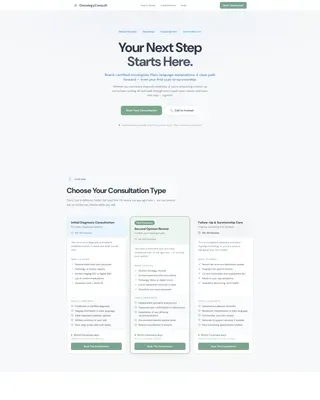
This is a single-page booking experience designed for an oncology clinic. It opens with a centered headline, moves through a consultation comparison table, an appointment walkthrough, and a post-visit support section, then closes with a focused booking form. Every section is built to replace uncertainty with a clear, human process before the visitor is asked for anything personal.
Who this template is for
This template is built for oncology practices that want their website to feel as reassuring as their care. It serves clinics offering multiple consultation types and needing a structured, low-pressure path to appointment bookings.
- Oncologists and clinic administrators launching or refreshing a patient-facing booking page
- Medical practices offering initial diagnosis consultations, second opinion reviews, or follow-up and survivorship care
- Healthcare teams whose patients include overwhelmed newly diagnosed individuals, midnight-researching caregivers, and survivors managing ongoing follow-up schedules
What problem this template solves
Patients arriving at a medical booking page carry a heavy load of unanswered questions. Most clinic websites ask for personal details before explaining what will actually happen. That gap creates hesitation and abandoned forms.
- It removes the fear of the unknown by walking visitors through each consultation type before the booking form appears
- It addresses the needs of caregivers and patients who need process clarity, not just a date picker
- It provides a secondary contact path for patients who need a voice before they need a form
What you get with this template
You get a fully structured landing page organized around a step-by-step guide creative direction. The layout moves visitors from orientation to action without a single moment of unnecessary pressure.
- A hero section with a giant centered headline, generous white space, and a sky blue practice tagline covering specializations
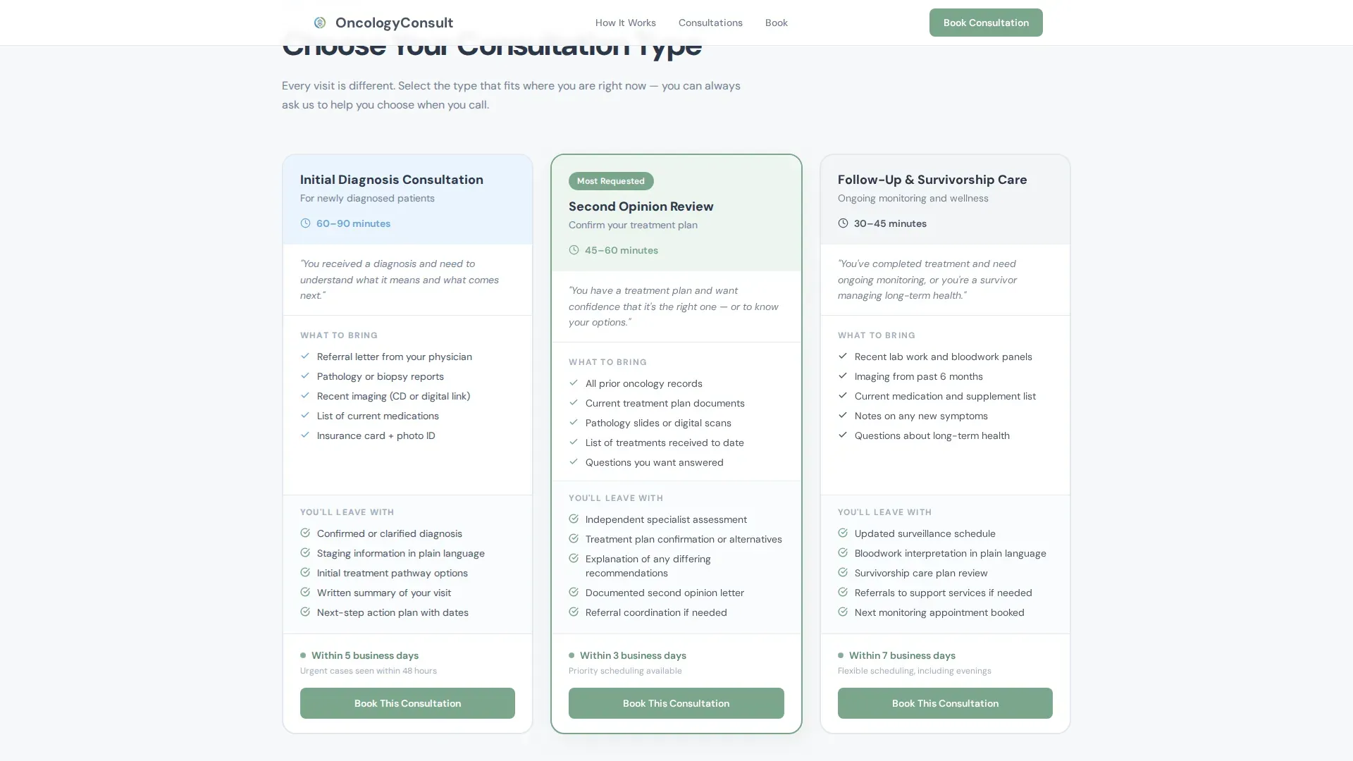
- A three-column consultation comparison table contrasting consultation type, duration, what to bring, what you will leave with, and availability windows
- A sequential appointment walkthrough, a post-visit support section, a four-field booking form, and a linear single-row footer
Feature list
This template includes a focused set of purpose-built components. Each one is designed to reduce patient anxiety and move a hesitant visitor toward confident action.
Consultation Comparison Table
A side-by-side table contrasts Initial Diagnosis Consultation, Second Opinion Review, and Follow-Up and Survivorship Care. Columns cover duration, what to bring, what the patient leaves with, and availability windows. Column highlighting on hover helps visitors quickly identify the right option.
Step-by-Step Appointment Walkthrough
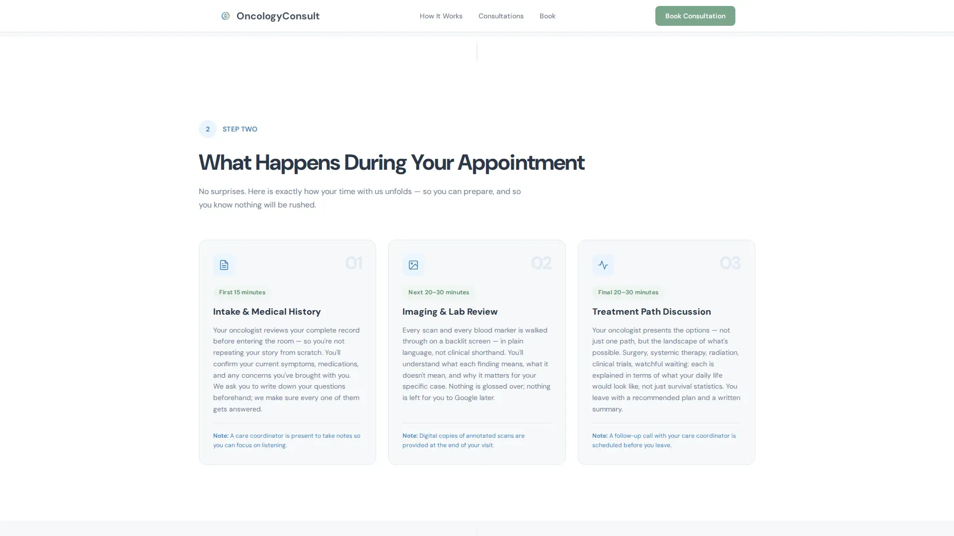
Three sequential cards walk through what happens during the visit itself. The flow covers intake, imaging review, and treatment discussion in order, so patients know exactly what to expect before they arrive.
Post-Visit Support Section
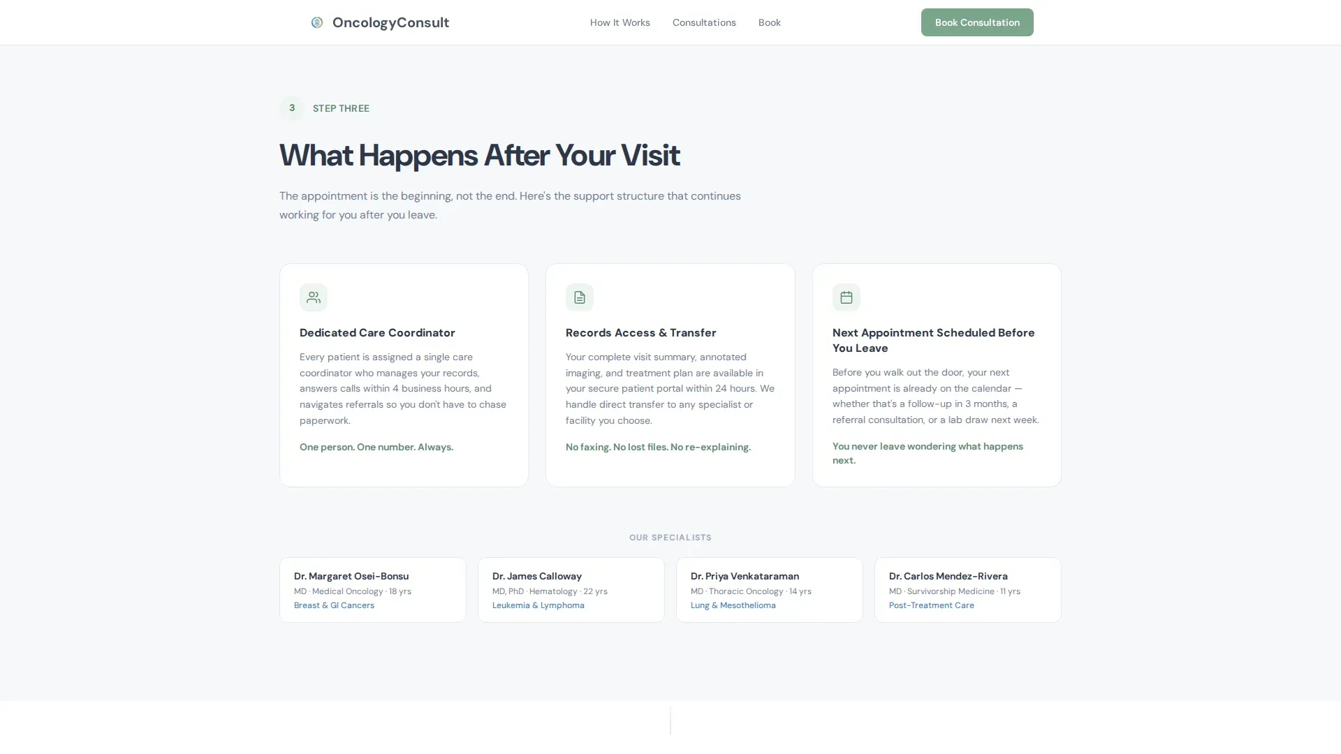
A dedicated section covers what happens after the appointment. It outlines care coordination, records access, and next-appointment scheduling, resolving the uncertainty that often lingers after a first oncology visit.
Four-Field Booking Form
The booking form asks for consultation type first, with pre-selection active if the visitor clicked from the comparison table. It then asks for preferred date range, insurance carrier, and referring physician name. Nothing clinical, nothing invasive.
"Call Us Instead" Secondary Path
A visible fallback offers a direct phone line and clinic hours alongside the form. This path is built for patients who need a human voice before committing to a form submission.
Persistent Mobile Booking Bar
On mobile, a sticky bottom bar keeps the primary call to action visible throughout the scroll. Caregivers researching at midnight on a phone can reach the booking action from any point on the page.
Page sections overview
| Section | Purpose |
|---|---|
| Hero Headline | Orients visitors with a calm, centered headline and practice specialization line |
| Consultation Comparison Table | Lets visitors identify the right consultation type before booking |
| Appointment Walkthrough Cards | Explains intake, imaging review, and treatment discussion in sequence |
| Post-Visit Support | Covers care coordination, records access, and follow-up scheduling |
| Booking Form | Collects four fields and routes visitors to confirm their consultation |
| Call Us Instead | Provides a direct phone fallback for patients who prefer voice contact |
| Footer | Single-row linear footer with practice information |
Design & branding system
The visual identity follows a Medical Clarity theme built on the Cloud Canvas color system. The palette is deliberately free of alarm colors, using tones that feel like morning light across clean, private-room bedsheets.
- Soft clinical white (#F7F8FA) serves as the page background, keeping every section breathable and uncluttered
- Calming slate (#4A5568) anchors all body text and headers with quiet authority; reassuring sky blue (#6BA3D6) highlights navigational elements and informational callouts
- Warm sage green (#7BA68D) appears only on confirmation states and call-to-action buttons, making every action feel like an invitation rather than a demand
Mobile & speed optimization
The template is built mobile-first, recognizing that caregivers and patients often research and book late at night from a phone. The layout adapts cleanly across screen sizes without sacrificing the calm, structured feel.
- The persistent bottom bar on mobile keeps the primary "Book Your Consultation" call to action reachable at all times during scroll
- Static sections use server components for faster initial load, while the booking form and sticky mobile bar use client components for interactivity
- Scroll reveal animations and staggered card entrances use low-to-medium motion, keeping the page feeling alive without introducing jarring or distracting movement
How this template helps you convert
The page is structured so that every anxious question is answered before the visitor is asked for a single personal detail. That sequence is the conversion strategy.
- The comparison table resolves the first and most common question: which consultation type is right for me? By the time a visitor reaches the form, they have already self-identified their path and the form pre-selects their choice.
- The appointment walkthrough and post-visit support sections replace the fear of the unknown with a clear, human process, lowering the emotional barrier to clicking "Book Your Consultation."
- The "Call Us Instead" fallback ensures that patients who are not ready for a form still have a route to the clinic, capturing appointments that would otherwise be lost to hesitation.
Other information about this template
This template is built specifically for the oncologist appointment booking niche within the broader health and medical category. It is designed as a patient-facing conversion page where emotional tone and information architecture carry as much weight as visual design.
- Typography uses DM Sans throughout, a clean and human typeface that feels approachable without being casual
- Credential callouts and board certification references are supported in the design as social proof elements, reinforcing trust before the booking ask
- The template style is a comparison table landing page, making it well suited for any oncology practice that offers more than one consultation pathway and needs to clearly differentiate them for patients
Theme
Medical Clarity
Creative direction
Step-by-Step Guide
Color system
Cloud Canvas
Style
Comparison Table
Direction
Booking/Scheduling
Page Sections
Consultation Comparison Table
Step-by-step Appointment Walkthrough
Post-visit Support Section
Four-field Booking Form
Call Us Instead Fallback
Persistent Mobile Booking Bar
Related questions
What consultation types does this template support?
Can a visitor pre-select their consultation type before reaching the booking form?
Is there a contact option for patients who are not ready to fill out a form?
How does the mobile layout handle the primary call to action?
What information does the booking form collect?



