Eye Care & Optometry Advanced Booking Website Template
Clarity is a single-column landing page for a boutique optical studio. It uses a Stacked Type Tower hero, FAQ-driven content sections, and a quiet editorial visual style to build trust before asking for anything. Visitors explore honest answers about lenses, prescriptions, and eye care, then book a consultation or download a lens guide.
by Rocket studio
Quick summary
Clarity is a landing page built for a boutique optical studio offering hand-adjusted eyewear and honest guidance. The design layers a dramatic serif hero over an accordion-style FAQ flow, earning visitor trust through real answers before presenting a single call to action. The result feels less like a sales page and more like a quiet, expert conversation.
Who this template is for
This template is designed for independent optical studios and eyewear professionals who want to stand apart from generic chain stores. It works best when the brand's real strength is care, craft, and clear communication.
- Independent opticians and boutique eyewear studios serving local clients
- Eye care professionals targeting adults frustrated by impersonal optical chains
- Practitioners who see parents, retirees, and screen-heavy professionals as their core patients
What problem this template solves
Most optical store pages lead with promotions and inventory. Visitors with real questions, about why their glasses cause headaches or whether their child needs contacts, leave without answers and without booking. This template flips that pattern entirely.
- It addresses the most common unasked questions visitors bring to an eye care appointment
- It positions the studio as a trusted guide before making any offer
- It removes hesitation by demonstrating expertise through honest, jargon-free content
What you get with this template
You get a fully structured, single-column landing page with six clearly defined sections, interactive FAQ accordions, a gated PDF resource section, and recurring calls to action placed at natural scroll intervals.
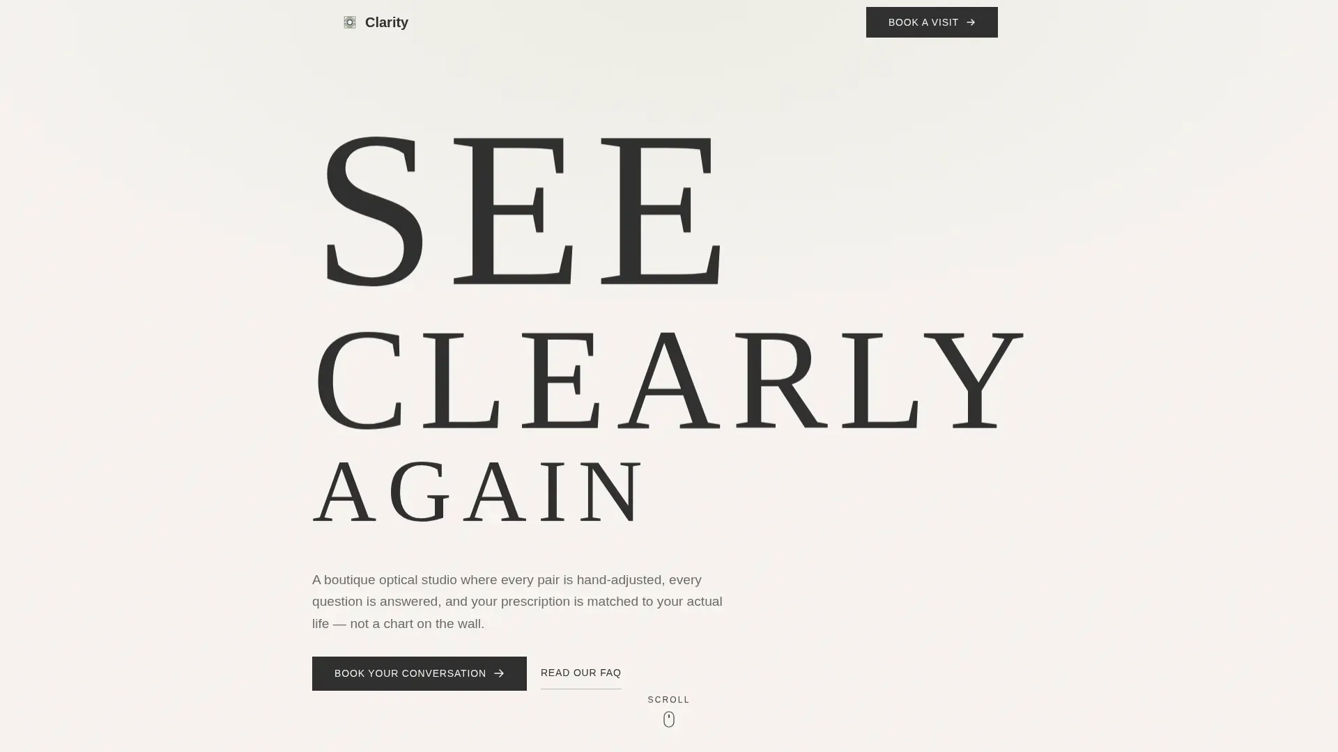
- A Stacked Type Tower hero with a cascading serif typographic layout
- Two FAQ content blocks with expand-and-collapse accordion interactions
- An email-gated lens guide download section and a linear single-row footer
Feature list
This template is built around a small set of purposeful, well-executed components. Each one serves a specific role in the visitor's journey from curious to confident.
Stacked Type Tower Hero
The hero opens with three words set in large, thin serif type: "SEE," "CLEARLY," and "AGAIN." They cascade down the viewport like an eye chart in reverse, growing more legible rather than harder to read. No imagery competes. The typography carries the full visual weight.
FAQ Accordion Blocks
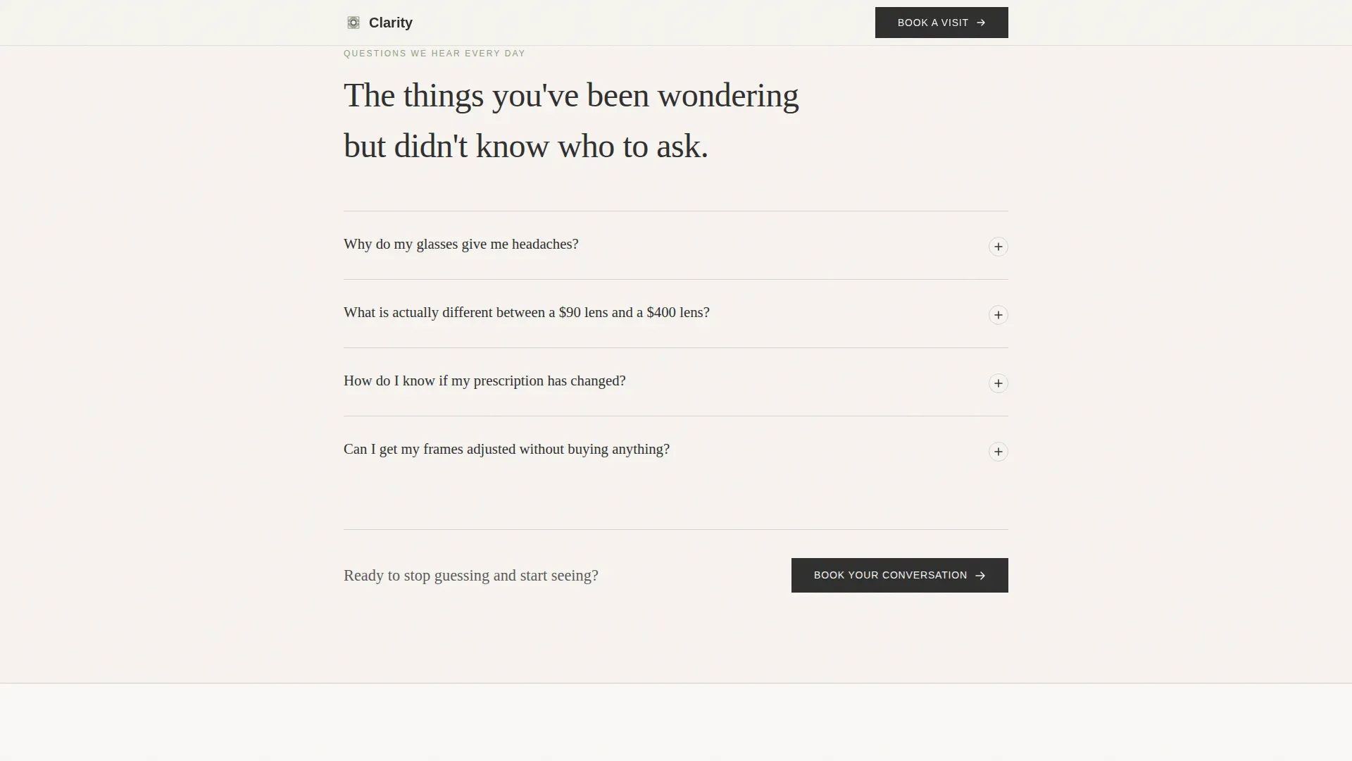
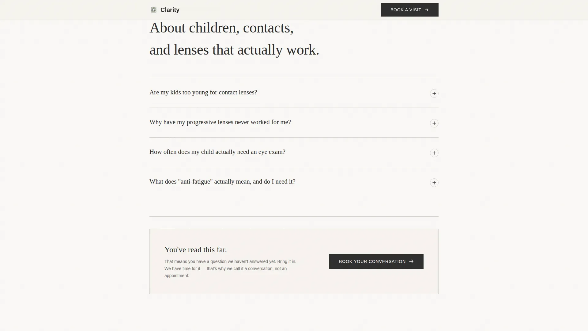
Two dedicated FAQ sections hold the page's core content. Each question sits in large type on its own. Visitors tap or click to reveal a calm, thorough answer. The expand-and-collapse animation keeps the page clean without hiding the substance.
Recurring Call to Action Placement
A "Book Your Conversation" button appears after every third FAQ entry. It never interrupts the reading flow but stays within reach as trust builds with each answered question.
Email-Gated Lens Guide Download
A dedicated section offers a downloadable PDF comparing lens types, coatings, and price tiers. Access requires only an email address. The section earns the submission by delivering genuine value before asking for it.
Asymmetric Client Vignette Grid
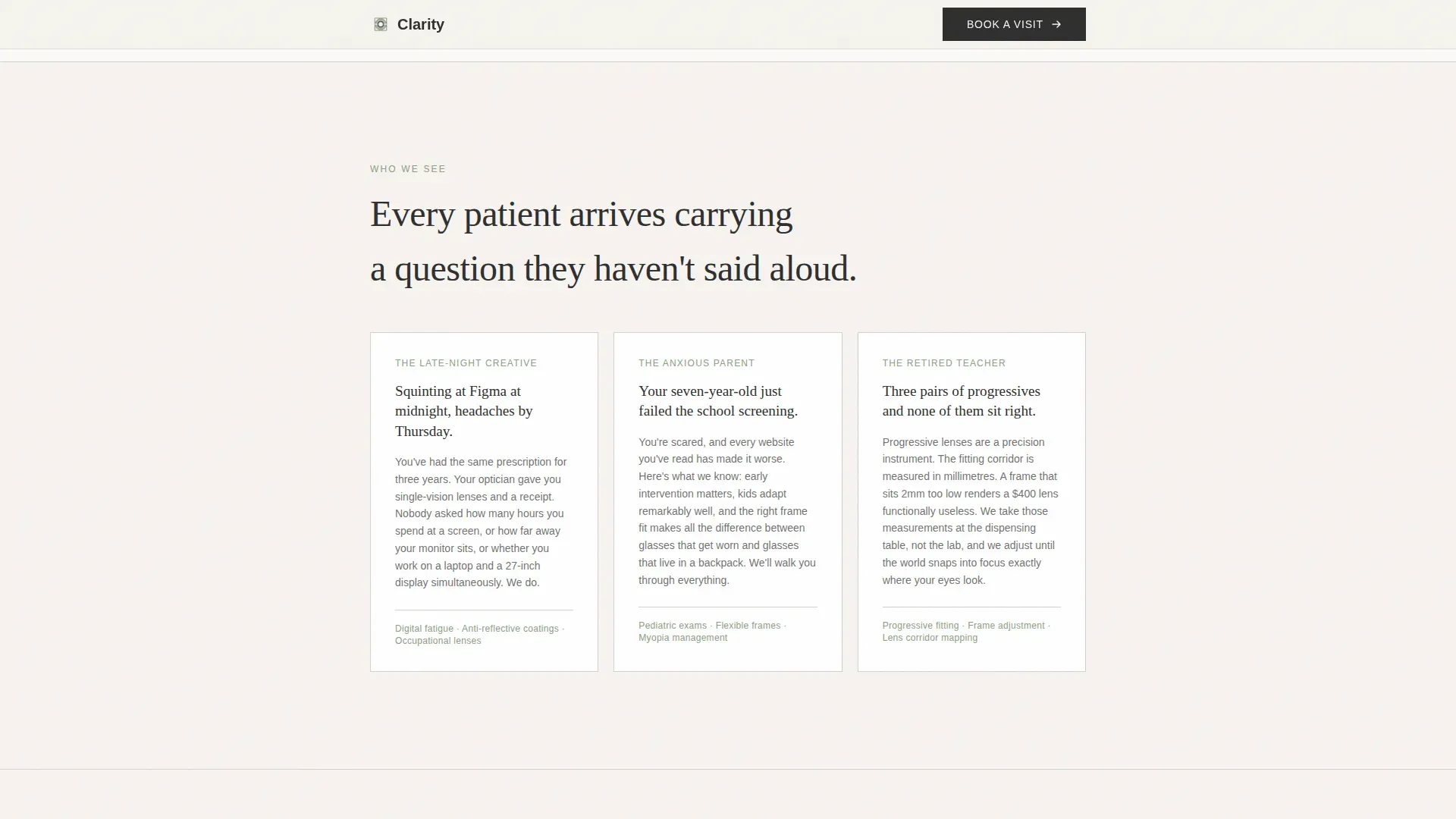
A "Who We Help" section uses an asymmetric bento-style layout to present three client portraits. Each vignette reflects a real visitor type: the screen-fatigued creative professional, the parent of a child with a failed school screening, and the retiree whose progressive lenses have never felt right.
Scroll-Triggered Reveal Animations
Staggered text reveals and scroll-triggered fades add a sense of calm, deliberate pacing. Animations are medium in intensity, supporting the unhurried tone without adding visual noise.
Page sections overview
| Section | Purpose |
|---|---|
| Hero Type Tower | Opens with cascading "SEE / CLEARLY / AGAIN" serif display |
| Who We Help | Shows three client vignettes in an asymmetric bento grid |
| FAQ Block A | Covers headaches and lens quality with accordion reveals and a call to action |
| FAQ Block B | Addresses kids, contacts, and progressives with accordion reveals and a call to action |
| Lens Guide Download | Gates a PDF lens comparison resource behind an email field |
| Footer | Closes with a single linear row of studio links and contact details |
Design & branding system
The visual identity follows a Healing Space theme built around a Soft Mist color palette. Every choice reinforces a sense of calm, clinical care, and quiet expertise.
- Linen white (#F7F4F0) as the primary background, fog gray (#D6D1CA) for dividers, muted sage (#A8B5A0) on interactive elements and accordion accents, and deep charcoal (#2E2E2E) for body text
- Fraunces serif for all display and heading type, DM Sans for body copy and user interface labels
- Generous letter-spacing, ample negative space, and a restrained layout that feels like a softly lit exam room rather than a retail storefront
Mobile & speed optimization
The template is built with equal priority given to desktop readers and mobile appointment-bookers. The single-column flow adapts naturally to smaller screens without restructuring the content hierarchy.
- Server Components handle all static content sections, keeping JavaScript to a minimum
- FAQ accordion interactions and the email gate form are the only client-side interactive elements
- Scroll-triggered animations are lightweight and do not delay content rendering
How this template helps you convert
Conversion is built into the content rhythm, not bolted on at the end. The page earns each click by giving something useful first.
- Every FAQ answer demonstrates real optician-level expertise, building confidence in the studio before a single price is shown.
- The "Book Your Conversation" call to action appears at regular scroll intervals, always present but never intrusive, so the moment a visitor is ready, the next step is right there.
- The lens guide download creates a low-commitment second conversion path, capturing email addresses from visitors who are researching rather than ready to book.
Other information about this template
This template is categorized under Health & Medical, specifically the Eye Care & Optometry subcategory, with a niche focus on the Optical Store and Eyewear market. It is built as a Content and Resource destination, meaning its primary job is to inform and reassure rather than to push a transaction.
- The template style is Single Column Flow, making it straightforward to adapt and extend
- Social proof in this template is implicit: expertise is demonstrated through the quality and honesty of FAQ answers rather than through testimonials or review widgets
- Localization defaults are set for English (United States), with USD pricing references and standard US date formatting
Theme
Healing Space
Creative direction
FAQ-Driven
Color system
Soft Mist
Style
Single Column Flow
Direction
Content/Resource
Page Sections
Stacked Type Tower Hero
FAQ Accordion Content Blocks
Recurring Call to Action Buttons
Email-gated Lens Guide Section
Asymmetric Client Vignette Grid
Scroll-triggered Reveal Animations
Related questions
What type of business is this landing page template designed for?
How does the FAQ accordion work on this template?
Can I add more FAQ questions beyond the ones included?
What is the lens guide download section and how does it work?
Does this template include any testimonial or review sections?



