Celiac Disease Care Education Website Template
Clarity is a split-screen celiac disease patient education landing page that turns clinical complexity into calm, plain-language guidance. Designed for newly diagnosed adults, parents of diagnosed children, and healthcare providers, it pairs raw medical sources with annotated translations, a curated resource library, and a pathway selector that personalizes the experience from the first click.
by Rocket studio
Quick summary
Clarity is a single-page celiac disease education platform built on a 50/50 split-screen layout. It pairs clinical source material on the left with plain-language translations on the right, walking visitors through every stage of their diagnosis journey. The soft gradient aesthetic, trust-first badge header, and no-registration resource library make it the calmest, most credible starting point for anyone navigating a new celiac diagnosis.
Who this template is for
This landing page is built for health education publishers, patient advocacy organizations, and gastroenterology practices that need a polished, trustworthy resource destination. It works equally well for solo clinicians who want ready-made patient handouts and for digital health teams building consumer-facing education content.
- Newly diagnosed adults in the first six months after a celiac diagnosis
- Parents managing a school-age child's gluten-free diet and cross-contamination risks
- Gastroenterologists and dietitians who need patient-ready educational materials
What problem this template solves
A celiac diagnosis arrives with a flood of clinical language, contradictory online advice, and very little that feels human. Most patients spend weeks piecing together reliable information from scattered sources. This template gives them a single, calm destination that earns trust visually and functionally before asking for anything in return.
- Patients leave appointments with clinical terms they do not understand, from villous atrophy to serology thresholds
- Caregivers struggle to translate medical guidance into practical grocery and school-lunch decisions
- Healthcare providers lack patient-friendly handouts that match the plain-language standard their patients actually need
What you get with this template
You get a fully structured, visually complete landing page ready to populate with your celiac education content. Every section is purpose-built and sequenced to guide the visitor from credibility to curiosity to action without friction.
- A scroll-linked split-screen translation demo showing clinical abstracts alongside annotated plain-language explanations
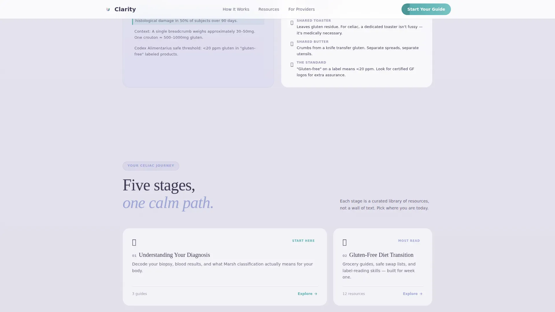
- A five-stage celiac learning journey rendered as an asymmetric bento grid covering diagnosis, diet, cross-contamination, emotional health, and long-term monitoring
- A resource library with three free resource cards, a pathway selector modal, and a secondary email digest conversion path
Feature list
This landing page ships with six core interaction and layout systems, each designed to reduce friction for a visitor who is already overwhelmed.
Floating Award Badge Header
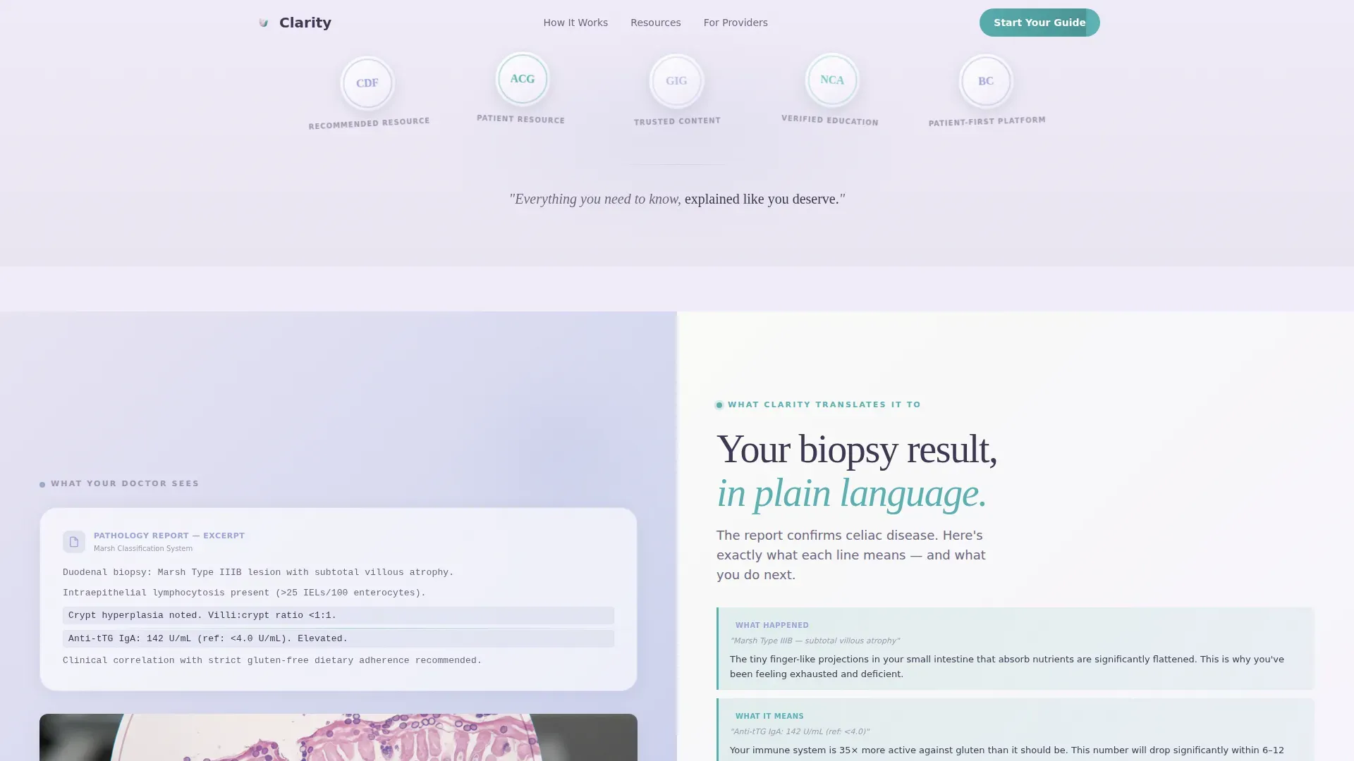
The page opens with softly embossed, pastel-toned badge medallions floating on a gradient field. They establish clinical credibility before any headline appears, signaling trusted recognition from gastroenterology and patient advocacy communities. A single fade-in tagline follows beneath them.
Scroll-Linked Translation Demo
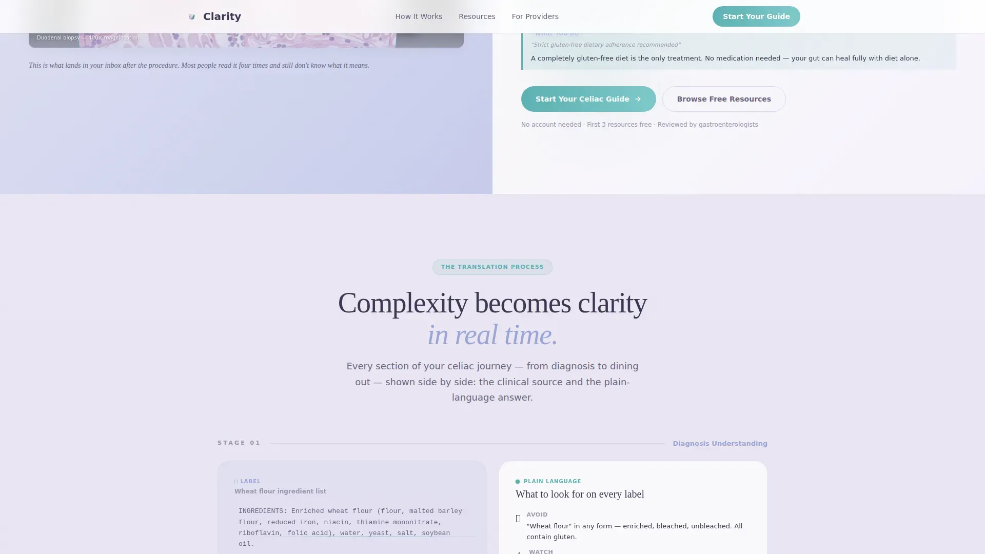
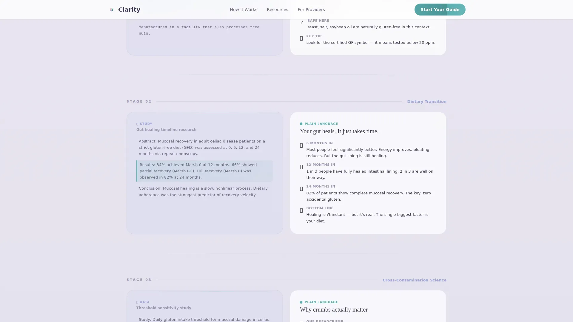
The 50/50 split panel scrolls through five patient journey stages. The left side holds the raw clinical source, such as a study abstract or biopsy image, while the right side reveals a color-coded, annotated plain-language translation in real time. Visitors watch complexity become clarity as they scroll.
Pathway Selector Modal
The primary call to action, "Start Your Celiac Guide," opens a short four-option selector. Visitors choose their situation: diagnosed less than six months ago, diagnosed over six months ago, caregiver or parent, or healthcare provider. Each path unlocks a curated set of relevant resources.
Expandable Resource Library
Three resource cards are accessible without registration. Downloads include grocery checklists, restaurant cards, symptom trackers, and video explainers. The design earns the email signup by demonstrating value before asking for it.
No-Registration First Access
The first three resources are available without any account or signup wall. This trust-first approach proves the platform's translation quality before requesting a visitor's contact details for the weekly digest.
Patient and Clinician Testimonials
A dedicated testimonials section features quotes from a patient, a parent, and a clinician, each specific and grounded. Social proof is reinforced throughout by medical association badge displays and visible resource download counts.
Page sections overview
| Section | Purpose |
|---|---|
| Hero Badge Header | Establish clinical credibility instantly |
| Split Translation Demo | Show clinical-to-plain-language process |
| Five-Stage Journey Grid | Map the full celiac learning path |
| Resource Library Cards | Deliver immediate, ungated value |
| Pathway Selector Modal | Personalize the resource experience |
| Testimonials Block | Reinforce trust with real voices |
| Footer Flow | Provide navigation and secondary links |
Design & branding system
The visual identity uses a Soft Gradient theme drawn from the Cloud Canvas color system. Every surface transitions gently into the next, creating the feeling of morning fog lifting rather than a clinical chart. Nothing is sharp, nothing competes for attention, and the teal accent appears only where the visitor can take action.
- Color palette: lavender-white (#F0EBF8), warm mist gray (#E2DFE8), gentle sky periwinkle (#9BA4D6), calm affirming teal (#5AAFB0), and grounded slate (#3D3852) for body text
- Typography pairing: Fraunces serif display for headings and DM Sans for body copy, creating warmth without sacrificing readability
- Teal is reserved strictly for interactive elements including buttons, progress indicators, and expandable panels, so the visitor always knows where to act
Mobile & speed optimization
The layout is desktop-first, built around the 50/50 split-screen experience. On smaller screens, the two-panel layout stacks gracefully so content remains readable and the scroll-linked demo still functions as intended.
- Static sections use server-rendered components to minimize load overhead on entry
- Interactive elements including the pathway selector modal and scroll-linked translation demo run as client components, keeping animation smooth without blocking the initial page view
- Floating badge animations, marquee scroll, IntersectionObserver reveals, and shimmer effects on calls to action are scoped to medium intensity so they enhance rather than distract
How this template helps you convert
Clarity converts by proving its value before asking for anything. The layout sequences trust signals, demonstrated usefulness, and low-friction entry points in the order a skeptical, overwhelmed visitor actually needs them.
- The badge header removes doubt in the first two seconds by showing recognized clinical endorsements before a single word of copy appears, so the visitor stays rather than bouncing
- The ungated three-resource access model lets visitors experience the translation quality firsthand, making the "Send Me the Research, Simplified" email signup feel like a natural next step rather than a toll gate
Other information about this template
This template is categorized under Health and Medical, specifically within the Celiac Disease Care subcategory. It is designed as a content and resource destination rather than a transactional page, which means the conversion model is built on demonstrated value rather than urgency tactics. The Transparent Process creative direction is the defining design philosophy: showing the work is the pitch.
- The Vercel Horizontal Flow footer pattern (Pattern 3) is included in the base layout
- The template is built for English (United States) audiences using standard US date and content formatting
- The intersection match score for this template within its Health and Medical, Celiac Disease Patient Education niche is 13, indicating strong alignment between the layout system and the educational content model
- Animation intensity is set to medium, using IntersectionObserver reveals, floating badge animations, marquee scroll, and shimmer effects on interactive elements
Theme
Soft Gradient
Creative direction
Transparent Process
Color system
Cloud Canvas
Style
Split Screen (50/50)
Direction
Content/Resource
Page Sections
Floating Award Badge Hero Header
Scroll-linked Split-screen Demo
Four-path Personalization Modal
Ungated Resource Library
Five-stage Learning Journey Grid
Patient, Parent, and Clinician Testimonials
Related questions
Can I use this template without a medical background?
Do visitors need to create an account to access resources?
How does the pathway selector modal work?
Is this landing page suitable for a healthcare provider's patient handout destination?
Can the colors and typography be updated to match an existing brand?



