Radiology Medicine Professional Website Template
Clarity is a split-screen landing page template built for radiology private practices that want to convert referring physicians into active referral partners. It stacks subspecialty proof, turnaround metrics, and direct-access evidence across a Checklist and Audit scroll flow, ending with a persistent call-to-action bar that drives clicks to a credentialing and account setup page.
by Rocket studio
Quick summary
Clarity is a single-page template designed for radiology private practices competing for physician referrals. The layout pairs a photographic hero with a scroll-driven diagnostic self-assessment, building cumulative confidence section by section. By the final call to action, every referring physician objection has already been answered with specific proof.
Who this template is for
This template is built for radiology private practices that depend on physician referrals to grow. It speaks directly to the people making referral decisions and to the staff who manage credentialing.
- Radiologists and practice owners who want to attract orthopedic surgeons, primary care physicians, and oncologists as referring partners
- Practice managers who handle credentialing setup, National Provider Identifier (NPI) registration, and communication preferences for new referral accounts
- Healthcare marketing professionals building a conversion-focused page for a subspecialty radiology group
What problem this template solves
Referring physicians trust routine radiology reads out of habit, not loyalty. Switching referral patterns feels risky without clear evidence that a new practice will deliver faster, more precise reports. This template is designed to dissolve that hesitation.
- It answers the exact questions a surgeon or oncologist asks before changing referral behavior: Are reads subspecialty-matched? Are reports structured? Can I reach someone by phone?
- It replaces vague marketing claims with specific proof blocks, credential badges, turnaround metrics, and surgeon testimonials
What you get with this template
You get a complete, conversion-optimized radiology landing page ready to customize with your practice details. Every section has a defined job in the referral conversion sequence.
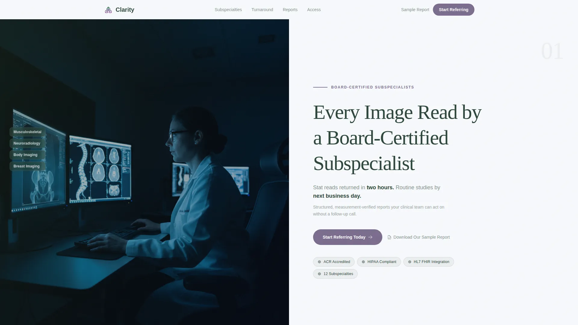
- A 50/50 split-screen hero with a radiologist workstation photograph on the left and a headline, supporting copy, and primary call-to-action button on the right
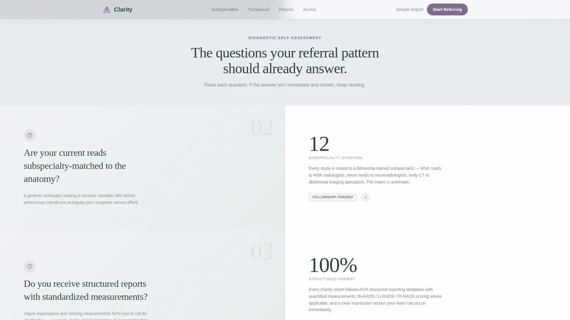
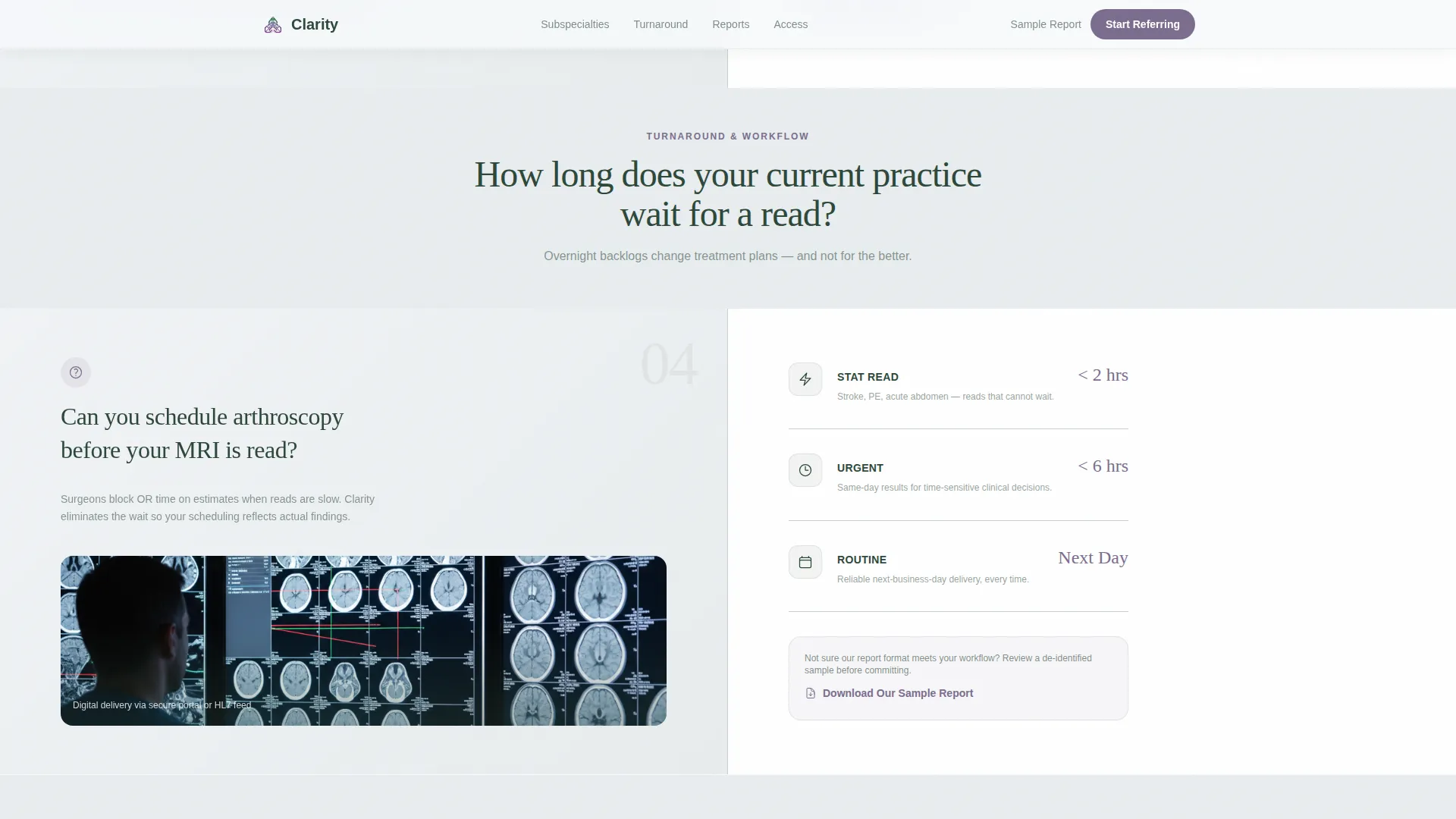
- Four scrollable content sections built around a Checklist and Audit framework, each pairing a pointed physician question with a short proof block
- A persistent bottom call-to-action bar that appears after the third checklist section and stays visible as the visitor scrolls
Feature list
This template ships with a clear set of built-in components, all grounded in the source brief.
Split-Screen Hero Layout
The header divides the viewport into two equal halves. The left panel holds a full-height photograph taken over a radiologist's shoulder at a dual-monitor workstation. The right panel carries the headline, a turnaround summary line, the primary "Start Referring Today" button, and a secondary "Download Our Sample Report" text link.
Checklist and Audit Scroll Sections
Three diagnostic self-assessment sections form the core of the page. Each section poses a specific question a referring physician already feels, then resolves it with a proof block containing a metric, a credential badge, or a brief surgeon testimonial. The accordion-style rhythm builds trust with each scroll.
Persistent Bottom Call-to-Action Bar
After the third checklist section, a fixed bottom bar locks into view and stays visible for the remainder of the scroll. The bar carries the "Start Referring Today" button and keeps the conversion action one tap away without interrupting reading flow.
Dual Call-to-Action Architecture
The primary call-to-action button moves physicians to a streamlined credentialing and account setup page where they enter practice name, NPI number, and preferred communication method. No form fields live on this landing page. A secondary text link below the first button lets physicians download a sample report before committing.
Alpine Fresh Color System
The visual identity uses four carefully assigned colors. Glacier white dominates backgrounds. Evergreen shadow anchors all headlines and body text. Morning fog gray creates soft horizontal dividers between sections. Alpine wildflower violet appears only on interactive elements and call-to-action states, so every touchpoint is visually unmistakable.
Scroll-Triggered Animation and Interactivity
Section reveals are triggered by scroll position using staggered entrance animations. The call-to-action button uses a magnetic hover state. Subtle parallax motion reinforces the high-altitude, clinical calm of the visual theme without distracting from the proof content.
Page sections overview
| Section | Purpose |
|---|---|
| Hero Split Screen | Establish credibility and deliver the primary call to action above the fold |
| Subspecialty Match Check | Answer whether reads are matched to the referring anatomy type |
| Turnaround and Reports | Prove structured report delivery and stat read windows with metrics |
| Direct Radiologist Access | Confirm phone access within fifteen minutes via surgeon testimonial |
| Final Confidence Block | Stack closing proof and repeat the persistent call-to-action bar |
| Footer | Single-row linear footer with practice contact and legal links |
Design & branding system
The template follows an Organic Flow theme anchored in the Alpine Fresh color palette. The visual result feels like a high-altitude clinical environment: cool, precise, and unhurried.
- Typography pairs Fraunces, a serif display face, for headlines with DM Sans for all body and interface text, creating a calm authority that reads well on desktop workstation monitors
- Colors are role-assigned: glacier white (#F7F9FC) for backgrounds, evergreen shadow (#2D4739) for text, morning fog gray (#C8D1D3) for section dividers, and alpine wildflower violet (#7B6D8E) exclusively for interactive highlights and call-to-action button states
Mobile & speed optimization
The template is designed desktop-first, reflecting the reality that referring physicians and surgeons review referral options primarily on workstation monitors. Mobile layout is still supported for practice managers reviewing on the go.
- Static sections use server components to minimize JavaScript load, keeping the page responsive without heavy client-side rendering
- Scroll-triggered animations and parallax effects are lightweight by design, so the visual storytelling does not compete with page responsiveness on clinical workstations
How this template helps you convert
The page earns its clicks by removing doubt before the visitor reaches the final call to action. Every section is sequenced to move a skeptical referring physician closer to action.
- The hero presents a specific, credible headline and turnaround proof immediately, so the physician's first impression is precision and speed rather than generic marketing
- The Checklist and Audit sections surface real frustrations in the physician's voice, then answer each one with hard evidence, so the cumulative effect shifts the internal question from "Should I switch?" to "Why haven't I already?"
- The persistent call-to-action bar removes friction at the moment of decision by keeping the "Start Referring Today" button visible without requiring the visitor to scroll back to the top
Other information about this template
This template is part of a Health and Medical category focused on the Radiology Medicine subcategory. It targets the Radiology Private Practice niche specifically, making it a precise fit for subspecialty groups competing for orthopedic, oncology, and primary care referrals.
- The template is localized for English-language practices operating in the United States, with content framing aligned to USA clinical workflows and NPI-based credentialing
- The footer follows a linear single-row pattern, keeping the page visually clean and professional without a complex multi-column footer structure
- The template style is Split Screen (50/50), and the landing page direction is Click-Through, meaning the page's sole conversion goal is moving the visitor to a separate onboarding flow rather than capturing a form submission on-page

Theme
Organic Flow
Creative direction
Checklist & Audit
Color system
Alpine Fresh
Style
Split Screen (50/50)
Direction
Click-Through
Page Sections
Split-screen Hero with Dual Call to Action
Checklist and Audit Scroll Flow
Persistent Bottom Call to Action Bar
Alpine Fresh Color System
Scroll-triggered Animation System
Desktop-first Responsive Layout
Related questions
Does this template include a contact form?
Who is this landing page template designed for?
Can I replace the placeholder proof blocks with my own practice data?
What is the conversion goal of this landing page?
What typography and color choices come with this template?



