Radiologist Comparison Website Template
Clarity is a single-page, lead-generation landing page built for radiology patient education hubs. It turns complex pre-procedure language into calm, readable guides and positions your imaging department as the approachable expert. The layout pairs a split hero, an audit-style comparison table, and a sequential onboarding checklist with dual conversion paths for qualified leads and earlier-funnel visitors.
by Rocket studio
Quick summary
Clarity is a precision-built landing page for radiology patient education teams. It translates dense procedural language into stepwise guides that patients actually read. The page is structured around a visual audit table, a sequential onboarding checklist, and a dual-path lead capture system built for referring physicians, office managers, and hospital imaging directors.
Who this template is for
This template is built for healthcare professionals who need a shareable, credible patient communication resource. It speaks directly to the people managing pre-procedure friction inside imaging departments.
- Referring physicians and office managers who need a single link to send anxious patients before a scan
- Hospital and imaging center marketing directors who want their department to feel approachable and professional
- Radiology practices that receive repeat pre-procedure calls and want to reduce that volume with written guides
What problem this template solves
Pre-procedure anxiety is one of the most common reasons patients no-show or flood front desks with calls the morning of their scan. Existing handouts are dense, generic, and written for compliance rather than comprehension. This template addresses those exact gaps.
- Patients arrive underprepared because typical PDF handouts are hard to read and easy to ignore
- Office staff spend hours answering the same questions about MRI prep, CT contrast, and fluoroscopy instructions
- Imaging departments lack a credible, shareable digital resource that reflects their clinical standards
What you get with this template
You get a fully structured, single-page layout designed to convert institutional visitors into qualified leads. Every section has a clear job, and the visual hierarchy guides the reader from problem recognition to action.
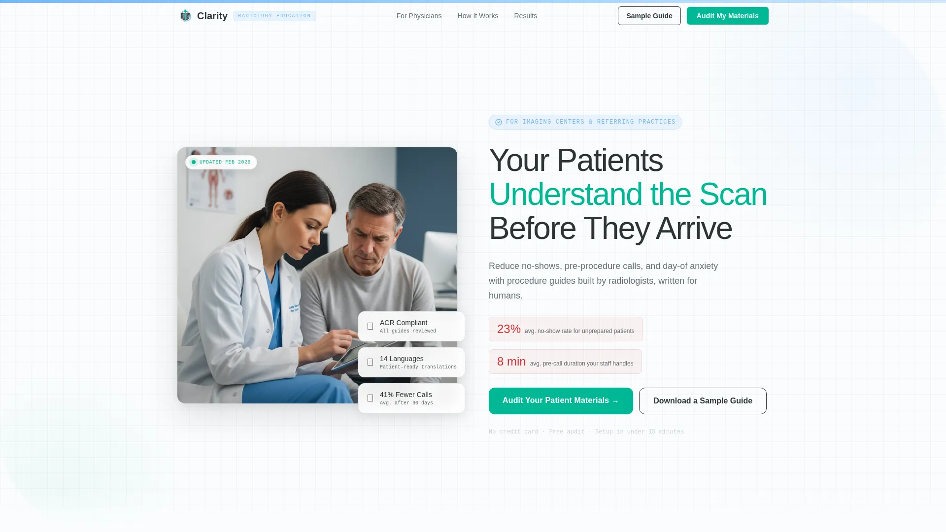
- A split-screen hero section with a headline, subheadline, and sky-blue accent stripe that sets an immediate clinical tone
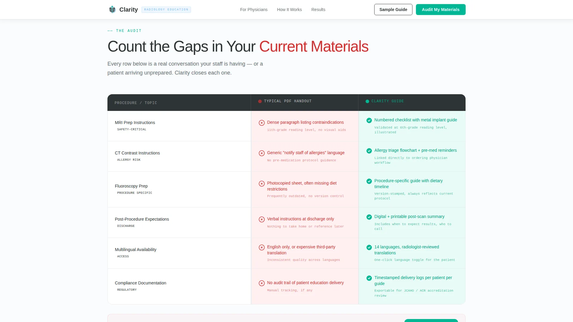
- An interactive comparison table auditing current patient materials against a Clarity Guide across six procedure dimensions
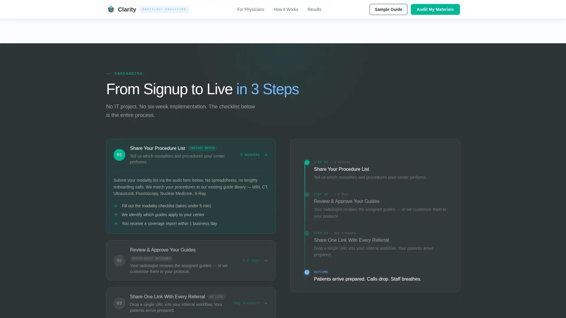
- A three-step onboarding checklist, a dual-path call to action form, and a social proof section with metrics and testimonial cards
Feature list
The Clarity template includes purpose-built components that work together to move institutional visitors from skepticism to sign-up.
Split-Screen Hero Section
The hero uses a half-page composition. A photograph of a radiologist and patient reviewing images together sits on the left. The right side carries a large charcoal headline and a one-line subhead naming the core pain point. A sky-blue accent stripe grounds the clinical visual identity immediately.
Interactive Comparison Table
The audit table is the page's centerpiece. It stacks rows for MRI prep, CT contrast instructions, post-procedure expectations, multilingual availability, and compliance documentation side by side. Each row shows a red-flagged "Typical PDF Handout" state and a teal-checked "Clarity Guide" state, making communication gaps visible and countable at a glance.
Sequential Onboarding Checklist
Below the comparison table, a three-step checklist collapses the perceived effort of onboarding. Each step expands on hover to reveal more detail. The format converts hesitation into a clear to-do list and makes the path forward feel manageable.
Dual-Path Lead Capture
The primary call to action, "Audit Your Patient Materials," anchors directly below the comparison table. Its form collects practice name, imaging modalities via multi-select checkboxes, patient volume range, and a work email. A secondary path, "Download a Sample Guide," captures earlier-funnel visitors with just an email field and delivers a real MRI prep document.
Social Proof Section
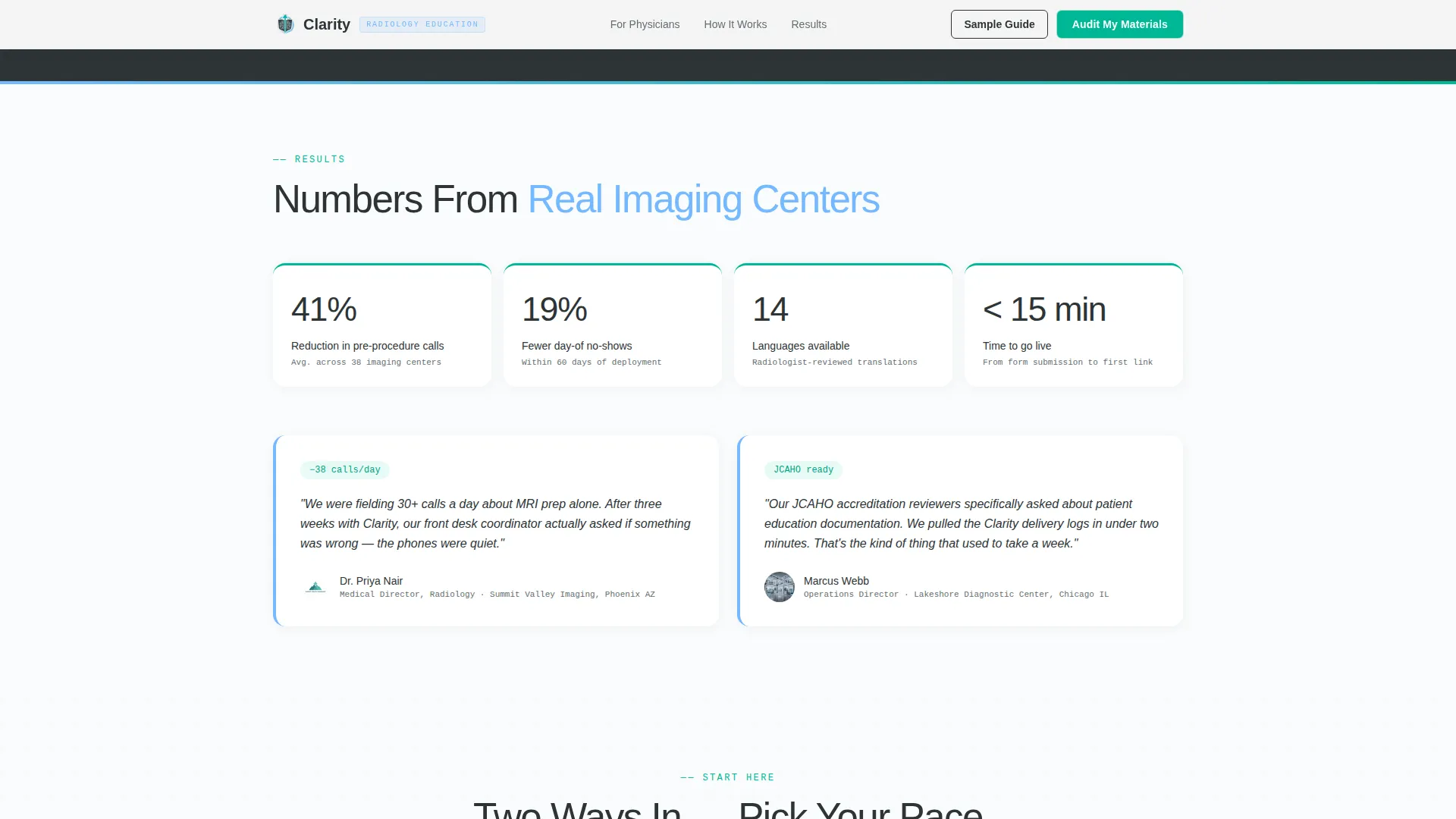
A metrics bar and two testimonial cards from imaging center directors provide quantified validation. The section uses specific figures around no-show reduction and call volume drop, giving institutional buyers the evidence they need before committing.
Corporate Precision Typography
The template uses DM Sans for headlines, Manrope for body text, and JetBrains Mono for labels and tags. This typographic system reinforces a clinical, trustworthy reading experience without feeling cold or inaccessible.
Page sections overview
| Section | Purpose |
|---|---|
| Hero Split Layout | Introduce value, set clinical tone, capture attention |
| Comparison Audit Table | Surface communication gaps between current handouts and Clarity Guides |
| Onboarding Step Checklist | Collapse perceived effort and show what getting started looks like |
| Social Proof Bar | Validate claims with quantified metrics and director testimonials |
| Dual Call to Action | Capture qualified leads via audit form and sample guide download |
| Single-Row Footer | Provide minimal, clean page close with legal and navigation anchors |
Design & branding system
The visual identity follows a Corporate Precision theme. Every color choice has a diagnostic rationale, and the palette reads as calibrated and credible rather than warm or decorative.
- Color system uses deep charcoal (#2D3436) for primary text, clinical mid-gray (#636E72) for secondary labels, open-sky blue (#74B9FF) for accent stripes, sterile white (#FAFCFD) for breathing room, and confident teal (#00B894) for interactive elements and confirmed states
- Typography pairs DM Sans headlines with Manrope body copy and JetBrains Mono for data labels, creating a layered reading hierarchy that feels precise without being cold
- The overall aesthetic evokes a freshly calibrated monitor in a reading room: no decorative warmth, every visual element purposeful and legible
Mobile & speed optimization
The template is designed desktop-first, reflecting the workstation-based review habits of physicians and office managers. A solid mobile fallback ensures the page remains usable across all devices.
- Interactive components such as the comparison table, multi-select form, and sample guide modal are built as client-side components, keeping the static hero fast on initial load
- GSAP-powered scroll reveals and staggered table row entry animations are scoped to non-blocking client components so they do not interfere with the primary content load
- The single-page structure limits navigation complexity, helping the page load cleanly and keeping users focused on the conversion path
How this template helps you convert
Every structural decision in Clarity is oriented toward turning a skeptical institutional visitor into a lead. The page does not rush the ask; it builds a case first, then presents two entry points.
- The comparison table creates a visible gap between what most imaging departments currently offer and what a Clarity Guide delivers. Visitors feel the problem before they read the call to action, which makes the primary form feel like a logical next step rather than a sales push.
- The dual-path conversion model captures visitors at two readiness levels. The "Audit Your Patient Materials" form qualifies leads with practice-level detail, while the "Download a Sample Guide" path gives hesitant visitors a low-friction reason to share their email and see the writing quality for themselves.
Other information about this template
This template is well-suited to practices that serve patients across multiple imaging modalities and need a single, shareable resource that covers the full pre-procedure journey.
- The multi-select modality checkboxes in the lead form support practices offering MRI, CT, ultrasound, X-ray, fluoroscopy, and nuclear medicine, making the form relevant to a wide range of imaging center sizes
- The linear single-row footer pattern keeps the page close clean and distraction-free, consistent with the overall focused lead-generation intent
- The template's localization is set for English (United States) and does not include date or currency display elements
Theme
Corporate Precision
Creative direction
Checklist & Audit
Color system
Slate & Sky
Style
Comparison Table
Direction
Lead Generation
Page Sections
Split-screen Hero with Accent Stripe
Audit-style Comparison Table
Three-step Onboarding Checklist
Dual-path Lead Capture Forms
Social Proof and Metrics Bar
Corporate Precision Typography System
Related questions
Who is the primary audience for this landing page template?
Can the comparison table rows be edited to match specific procedures?
What does the dual-path call to action include?
Is this template suitable for a single imaging center or a larger hospital system?
What visual style does this template follow?



