Radiologist Advanced Booking Website Template
Clarity is a single-page radiologist landing page template built for diagnostic imaging practices that need to reassure anxious new patients before asking for a booking. An interactive scan-cost estimator leads the page, followed by alternating stat-forward sections, a four-step booking modal, and named patient testimonials, all wrapped in a soft clinical gradient palette.
by Rocket studio
Quick summary
Clarity is a new patient welcome landing page for diagnostic imaging practices. It opens with a live cost estimator, moves through three zigzag stat sections that answer the questions patients are afraid to ask, and closes with testimonials that replace numbers with names. The design is calm, clinical, and conversion-focused from the first scroll.
Who this template is for
This template is built for radiologists and diagnostic imaging centers that want to attract new patients online and reduce the anxiety that keeps people from booking. It works equally well for an independent reading practice or a multi-modality imaging center.
- Adults aged 30 to 65 arriving with a referral slip and cost concerns
- Parents scheduling pediatric scans who need quick, clear reassurance
- Post-surgical patients returning for routine follow-up imaging
What problem this template solves
Most radiology websites tell patients almost nothing useful before asking them to call. Cost is unknown. Wait times are vague. Report turnaround is anyone's guess. That uncertainty is exactly why anxious patients delay or avoid booking altogether.
- Patients leave before booking because they cannot find cost or wait-time information
- Referring physician offices need a fast, direct fax-routing path to send patients
- Practices lose new patients to competitors who answer the cost question first
What you get with this template
You get a fully structured, single-page landing page designed specifically for radiologist new patient conversion. Every section is purposeful, every visual decision is deliberate, and the booking flow is built around reducing friction before asking for commitment.
- An interactive estimator section with scan type, insurance dropdown, and animated result cards
- Three alternating zigzag stat sections with oversized data callouts and human-story copy
- A four-step progressive booking modal and a persistent bottom booking bar
- A patient testimonials section and a single-row linear footer
Feature list
Interactive Scan Cost Estimator
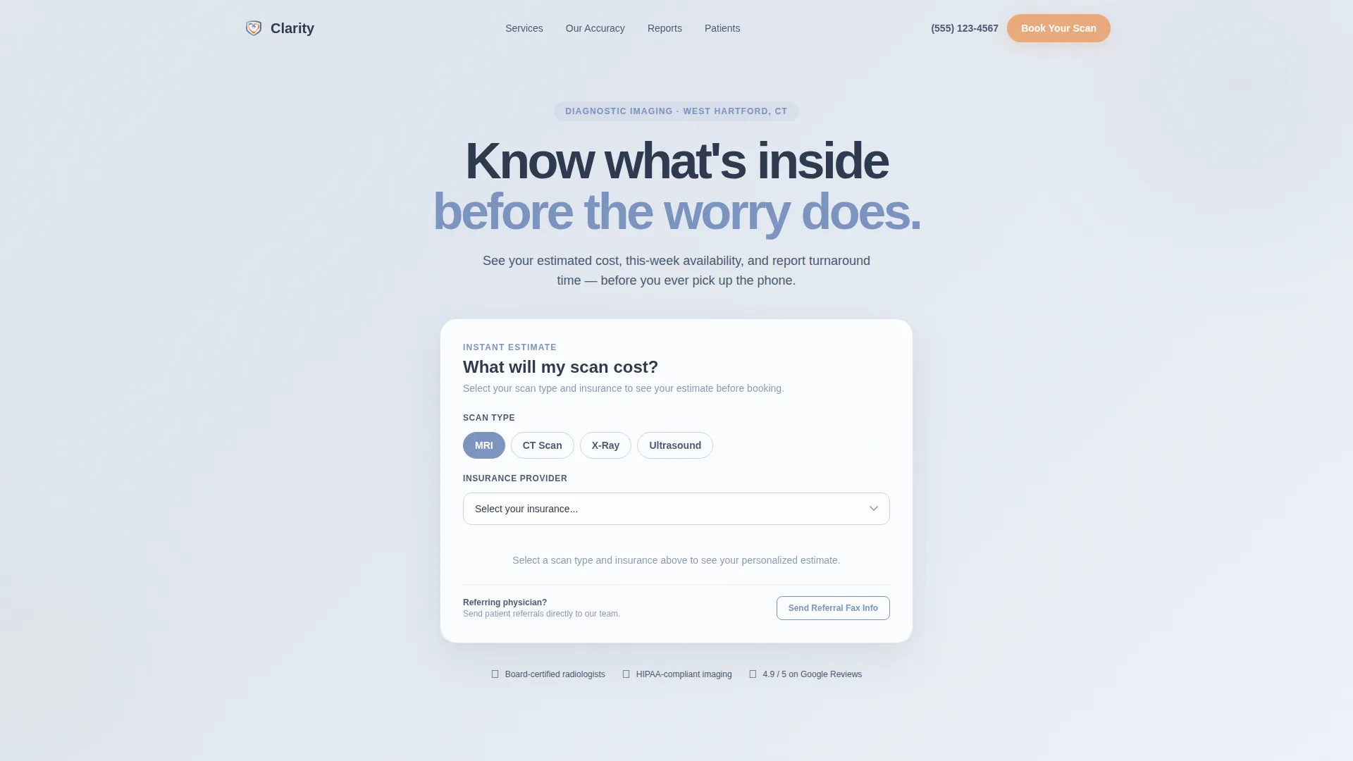
The header section replaces a static hero image with a live calculator. Visitors select their scan type (MRI, CT, X-ray, or Ultrasound), choose an insurance provider from a dropdown, and immediately see an estimated out-of-pocket cost, appointment availability for the current week, and average report turnaround time in hours. Results animate upward like departure boards, making the data feel immediate and trustworthy.
Stats-First Zigzag Layout
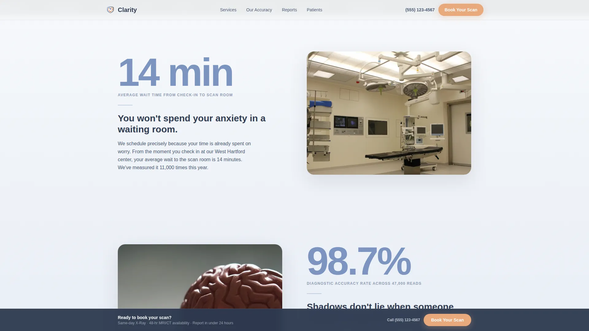
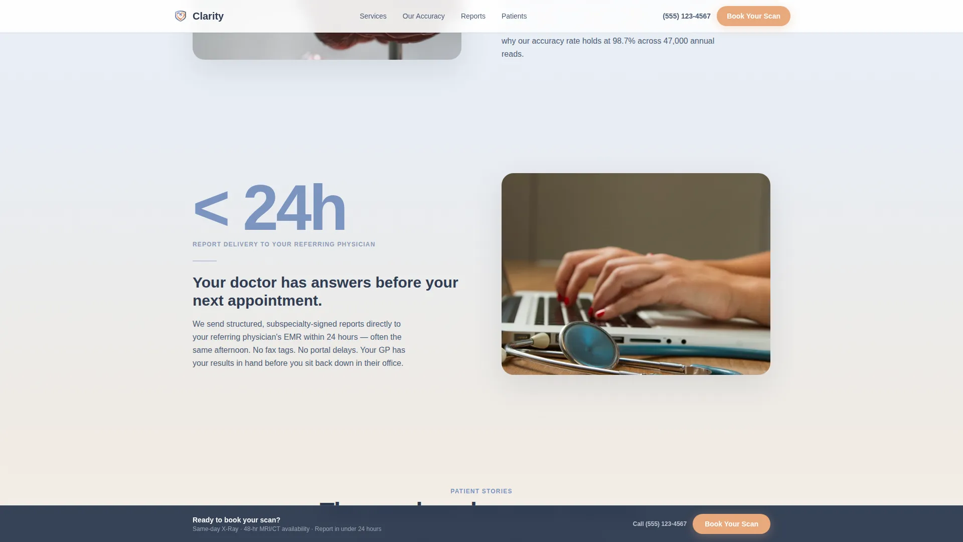
Three alternating sections each lead with a single oversized statistic before the eye travels to the supporting human story. The stat alternates left and right across sections, creating a chart-reading rhythm. The figures presented are 14 minutes for average wait time, 98.7 percent for diagnostic accuracy, and under 24 hours for report delivery to the referring physician.
Four-Step Progressive Booking Modal
The primary call to action, "Book Your Scan," appears first inside the calculator result card and then repeats in a persistent bottom bar after the second zigzag section. The booking modal reveals one field per step: scan type (pre-filled from the calculator), preferred date, referring physician name, and insurance identification number. Progressive disclosure keeps the flow approachable rather than overwhelming.
Physician Fax Referral Path
A secondary call to action, "Send My Referral Fax Info," gives physician offices a direct route to send patients without navigating the full booking flow. This secondary path sits alongside the primary booking option without competing for visual attention.
Scroll-Linked Gradient Warmth Shift
The page background transitions from a cool clinical white at the top toward a warmer tone as the visitor scrolls deeper. The shift moves from diffused white through atmospheric mist toward the apricot accent range, reflecting a journey from clinical confidence to personal care. Testimonials sit at the warmest point in the gradient.
Named Patient Testimonials Section
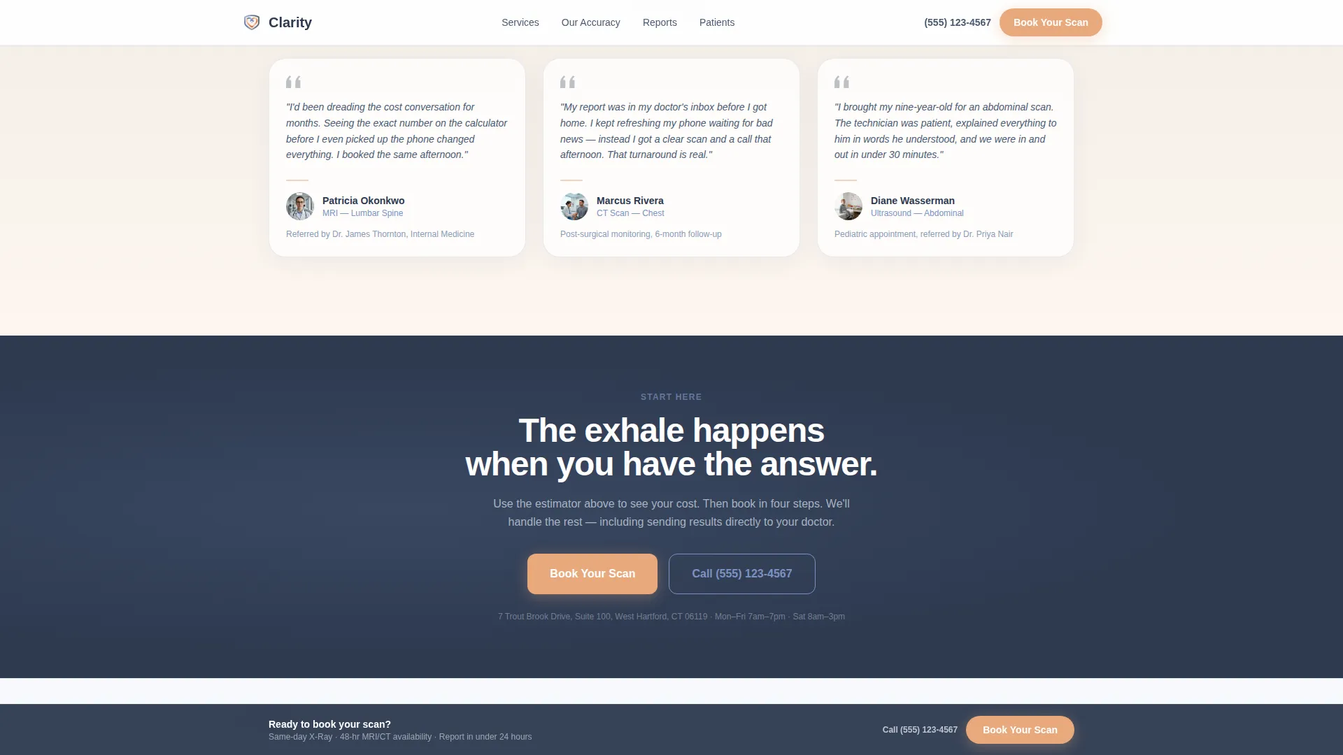
The final content section replaces statistics with real patient names and scan contexts. Each testimonial includes the scan type and referring physician context, grounding social proof in specifics rather than anonymous five-star ratings.
Page sections overview
| Section | Purpose |
|---|---|
| Hero Cost Estimator | Answers cost, availability, and turnaround before asking for commitment |
| Wait Time Stat | "14 min" average wait with human story on alternating side |
| Accuracy Rate Stat | "98.7%" diagnostic accuracy with patient-facing explanation |
| Report Delivery Stat | "Under 24 hrs" report turnaround with referring physician context |
| Patient Testimonials | Named reviews with scan type and referral context for trust-building |
| Linear Footer | Single-row footer with essential practice links and contact details |
Design & branding system
The visual identity uses a Cloud Canvas color system that feels like an early morning sky before the blue fully commits. Every color choice is deliberate: cool tones establish clinical credibility, and the single warm accent guides the eye toward action without disrupting calm.
- Background diffused white (#F7F9FC) and atmospheric mist (#DDE4EE) create a clean, unhurried canvas
- Calming periwinkle (#7B93C0) carries primary text and structural elements; reassuring deep slate (#2E3A50) anchors headings and trust callouts
- Soft apricot (#E8A87C) is reserved exclusively for call-to-action buttons and interactive highlights
Typography uses Plus Jakarta Sans for headings and DM Sans for body copy. Staggered zigzag section reveals and an airport-board flip counter animation add motion without visual noise.
Mobile & speed optimization
The template is built with a mobile-first priority because anxious patients are often on their phones in a waiting room or a parking lot, not at a desk. Static sections use server-rendered components; the interactive calculator and booking modal use client-side components, keeping the initial page load light.
- Staggered reveals and scroll-linked gradient shifts are designed to perform smoothly on mid-range mobile devices
- The four-step booking modal reveals one field at a time, reducing cognitive load on small screens
- The persistent booking bar stays visible without obscuring content on any viewport size
How this template helps you convert
The conversion strategy is built on a single insight: patients book when their biggest fear is answered first. This template structures the entire page around that principle.
- The estimator removes the cost unknown before the visitor sees any call to action, earning the click rather than demanding it
- The three zigzag stat sections build confidence progressively, moving from wait time to accuracy to turnaround speed in a deliberate order
- The persistent booking bar and pre-filled modal fields reduce the steps between decision and commitment to the absolute minimum
Other information about this template
This template is categorized under Health & Medical, specifically the Radiologist Website subcategory, and is designed for the Radiologist New Patient Welcome Page niche. It is localized for United States practices, using USD pricing, 12-hour time format, and a dropdown populated with US insurance providers.
- Animation level is high: the airport-board flip counter, scroll-linked gradient warmth shift, and staggered zigzag reveals are all included in the template design
- The template style is Zigzag/Alternating with a Soft Gradient theme and a Stats-First Impact creative direction
- The header concept is a Calculator/Estimator, and the landing page direction is Booking/Scheduling focused
- The intersection match for this template sits within the Health & Medical category, Radiologist Website subcategory, and Radiologist New Patient Welcome Page niche
Theme
Soft Gradient
Creative direction
Stats-First Impact
Color system
Cloud Canvas
Style
Zigzag/Alternating
Direction
Booking/Scheduling
Page Sections
Interactive Scan Cost Estimator
Stats-first Zigzag Sections
Four-step Progressive Booking Modal
Persistent Bottom Booking Bar
Physician Fax Referral Path
Named Patient Testimonials
Related questions
Who is this landing page template designed for?
Can I customize the scan types and insurance providers in the estimator?
Does the booking modal connect to a scheduling system?
What makes this different from a general medical landing page template?
Is this template suitable for mobile users?



