Optometrist Patient Portal Landing Page Template
Clarity is a single-page optometrist patient portal landing page built for neighborhood eye clinics. It walks visitors from unspoken vision symptoms to a confirmed appointment through a Problem→Solution Arc, a side-by-side comparison table, and a three-step booking form. The Alpine Fresh color system and Fraunces serif typography give the page a clean, trustworthy feel without ever looking sterile.
by Rocket studio
Quick summary
Clarity is a sharp, conversion-focused landing page template for neighborhood eye clinics. It opens with a floating testimonial card, moves through a symptom-led problem arc, presents a traditional-versus-portal comparison table, and closes with an inline three-step booking form. The soft gradient design feels clinical without feeling cold.
Who this template is for
This template is built for independent eye clinics and optometry practices that want to fill their appointment calendar without relying on phone calls and paper intake forms. It speaks directly to patients who already feel a vision problem but keep putting off the exam.
- Optometrists and eye care clinics ready to offer online scheduling
- Practice managers replacing phone-tag booking with a self-serve patient portal
- Clinics targeting adults with screen fatigue, parents of school-age children, and older patients concerned about night vision
What problem this template solves
Most clinic websites describe services but fail to connect with the symptoms a patient actually feels. Visitors arrive with a vague sense that something is wrong, find a phone number, and leave without booking. This template closes that gap by naming the problem out loud before presenting the solution.
- Unaddressed vision symptoms never become booked appointments because the path to scheduling is too friction-heavy
- Traditional booking flows force patients through phone calls, fax referrals, and paper intake forms that feel outdated
- Visitors who cannot quickly verify insurance or see available slots abandon the page before committing
What you get with this template
You get a fully designed, single-page landing page with every section pre-built and ready to customize. The layout moves visitors from emotional recognition of a problem to a clear, low-friction booking action in one continuous scroll.
- A floating testimonial hero card, a symptom problem arc with gradient cards, a comparison table, a social proof section, and a three-step booking form
- An Alpine Fresh color system with snowfield white, alpine sky blue, evergreen text, and wildflower violet interactive states
- Fraunces serif display type paired with DM Sans body type for readability and warmth
Feature list
This landing page template includes a carefully sequenced set of interactive and visual components, each designed to move a hesitant visitor toward booking an eye exam.
Floating Testimonial Hero Card
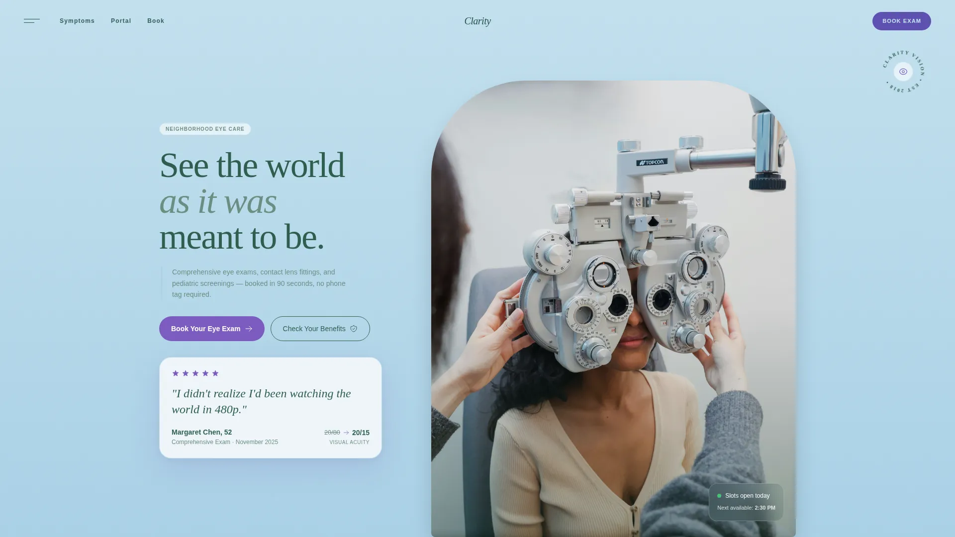
A frosted-glass card sits over a breathing white-to-blue gradient in the hero section. It displays a real patient quote in large serif type, a name and age, a before-and-after acuity score, and a five-star rating row. A faint violet shadow gives the card a sense of lifted altitude.
Symptom Problem Arc with Gradient Cards
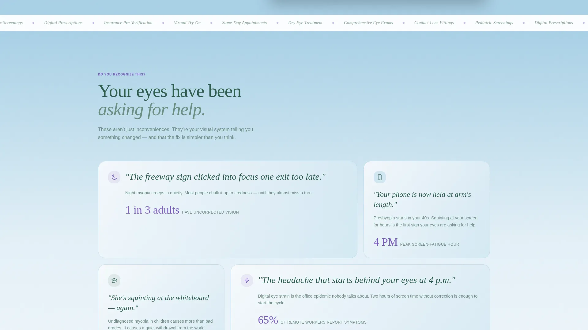
The first scroll section below the hero names common, unspoken vision complaints in short, gut-punch sentences. Each problem statement sits inside its own soft gradient card. The tone shifts naturally from "I feel this" to "here is the fix" as the visitor scrolls down.
Traditional versus. Portal Comparison Table
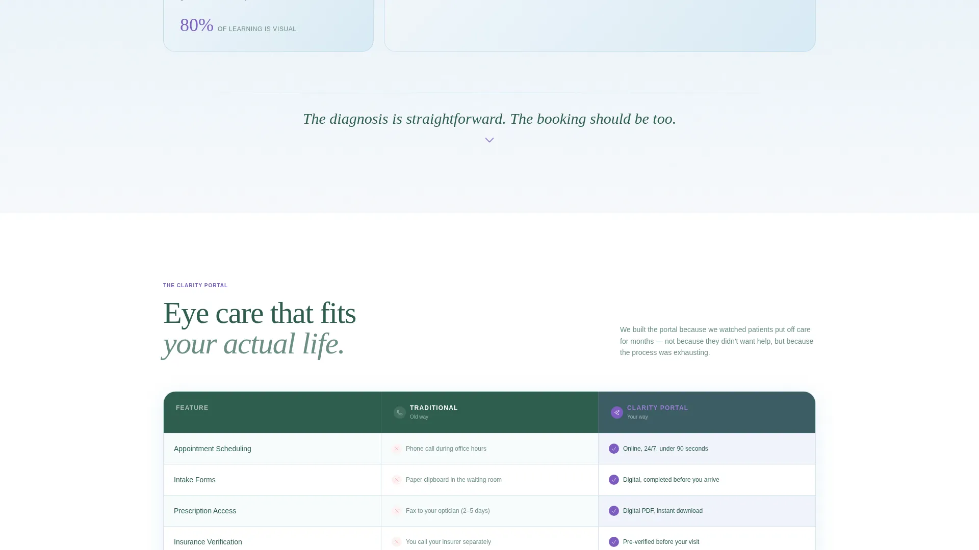
A side-by-side table compares traditional clinic booking against the patient portal in clean alpine-styled rows. Checkmarks bloom in wildflower violet as each portal advantage is revealed. The contrast makes the value of online scheduling immediately clear.
Three-Step Inline Booking Form
The booking form is built as a guided three-step flow: choose a visit type (comprehensive exam, contact lens fitting, or pediatric screening), pick a date from an open-slot calendar, then enter a name and insurance provider. The structure reduces decision fatigue and moves patients forward one choice at a time.
"Check Your Benefits" Secondary Path
A secondary call-to-action lets visitors verify insurance coverage before committing to a booking. This reduces the hesitation that causes people to delay care for months, keeping more visitors inside the conversion funnel.
Sticky Mobile Booking Bar
On mobile devices, a persistent bottom bar keeps the primary "Book Your Eye Exam" call-to-action visible at all times. Patients booking on their phones never have to scroll back up to find the action button.
Page sections overview
| Section | Purpose |
|---|---|
| Hero Testimonial Card | Opens with a patient quote and primary booking call-to-action floating over a gradient |
| Symptom Problem Arc | Names unspoken vision complaints in short gradient cards to create emotional recognition |
| Comparison Table | Contrasts traditional booking friction against the patient portal's streamlined features |
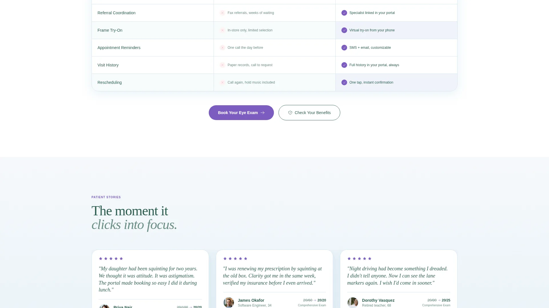
| Social Proof Strip | Displays patient testimonials with acuity scores, star ratings, and clinic statistics |
| Three-Step Booking Form | Guides visitors through visit type, date selection, and personal details in one inline flow |
| Page Footer | Closes with horizontal flow layout containing clinic contact details and navigation links |
Design & branding system
The visual identity uses the Alpine Fresh color system, which draws on the clarity of high-altitude landscapes. Every color choice reinforces the core promise: sharp, clean vision. The typography pairing adds warmth that prevents the page from feeling like a cold clinical document.
- Colors: snowfield white (#F7F9FC), alpine sky (#A8D0E6), evergreen (#2E5E4E) for body text, and wildflower violet (#7C5CBF) for buttons and active hover states
- Typography: Fraunces serif for display headings and pull quotes; DM Sans for body copy, form labels, and table text
- Animation: GSAP-powered gradient breathing in the hero, blur-reveal scroll animations, staggered gradient card entrances, blooming violet checkmarks in the comparison table, and a marquee stats strip
Mobile & speed optimization
The template is built mobile-first, with equal attention given to desktop. Patients most often book appointments on their phones, so every interactive element is sized and spaced for touch use.
- A sticky bottom bar keeps the "Book Your Eye Exam" button persistent on all mobile scroll positions
- Server Components handle all static sections for lighter initial loads; Client Components are scoped to the booking form and animation layers
- The three-step form, date picker, and comparison table are all fully functional on small screens without horizontal scrolling
How this template helps you convert
Every design and copy decision in this template points toward one outcome: a visitor booking an eye exam before they leave the page.
- The hero testimonial card creates immediate emotional trust by showing a real patient result, which lowers the barrier to scrolling further and engaging with the booking form.
- The Problem→Solution Arc meets visitors where they already are, naming the headaches, squinting, and blurred night driving they have been quietly living with, so the solution feels personally relevant rather than generic.
- The comparison table and "Check Your Benefits" path together remove the two biggest booking objections: not understanding the portal's advantage and not knowing whether insurance will cover the visit.
Other information about this template
This template is categorized under Health and Medical, specifically within the optometrist website and optometrist patient portal niche. It is built for English (United States) audiences, uses United States dollar pricing context, and formats dates in MM/DD/YYYY convention.
- The template style is Comparison Table, and the creative direction follows a Problem→Solution Arc with a Testimonial Card header concept
- The Soft Gradient theme is applied throughout, with backgrounds drifting between white and alpine blue in seamless vertical gradients
- The landing page direction is Booking and Scheduling, optimized for a neighborhood eye clinic's patient acquisition goals
- Clinic statistics such as patients seen, years in operation, and satisfaction rate are supported in the social proof section as customizable data points
Theme
Soft Gradient
Creative direction
Problem→Solution Arc
Color system
Alpine Fresh
Style
Comparison Table
Direction
Booking/Scheduling
Page Sections
Floating Testimonial Hero Card
Symptom Problem Arc with Gradient Cards
Comparison Table with Blooming Checkmarks
Three-step Inline Booking Form
Check Your Benefits Secondary Path
Sticky Mobile Booking Bar
Related questions
Who is this landing page template designed for?
Can I customize the booking form visit types?
Does the template support mobile users?
What is the Check Your Benefits option for?
Can I update the patient testimonials and clinic statistics?



