Hearing & Audiology Professional Website Template
Clarity is a single-column landing page template built for assistive listening device providers. It opens with three animated stat counters, moves through a decibel reality chart and a cost-of-inaction timeline, and closes with a lead capture form paired with an embedded 60-second hearing quiz. The design uses a soft Arctic White palette that feels calm, trustworthy, and clinical without feeling cold.
by Rocket studio
Quick summary
Clarity is a single-column flow landing page for hearing health providers. It leads with data, builds emotional resonance through scroll-triggered sections, and converts visitors with a free guide download and an embedded self-assessment quiz. The soft gradient aesthetic keeps the experience calm and credible, designed for adults in their fifties and sixties and the family members researching alongside them.
Who this template is for
This template is purpose-built for businesses and practitioners operating in the hearing health space. It suits providers who want to generate qualified leads without relying on hard-sell tactics.
- Assistive listening device providers looking to grow their patient or customer pipeline
- Audiologists seeking a trusted, professionally designed referral or intake landing page
- Health marketing teams targeting adults aged fifty-plus and their adult children
What problem this template solves
Many people delay addressing hearing loss for years, often because the topic feels clinical, stigmatizing, or overwhelming. A landing page that leads with empathy and evidence can bridge that gap. This template solves the communication problem before it solves the conversion problem.
- Visitors arrive skeptical or uncertain; the stats-first layout creates immediate recognition without pressure
- Adult children researching on behalf of a parent need reassurance, not a product brochure
- Generic health templates lack the scroll flow needed to move a visitor from awareness to action gradually
What you get with this template
You get a fully structured, single-page layout built around a clear content strategy: problem recognition, cost of inaction, social proof, and lead capture. Every section is designed to do one job well.
- Five core page sections plus a footer, each with a defined role in the visitor journey
- An embedded interactive quiz and a downloadable guide lead capture form
- Scroll-triggered animations including count-up counters, clip-in reveals, and an animated decibel chart
Feature list
This template includes the following built-in features grounded in its design and interaction brief.
Animated Stats Hero Section
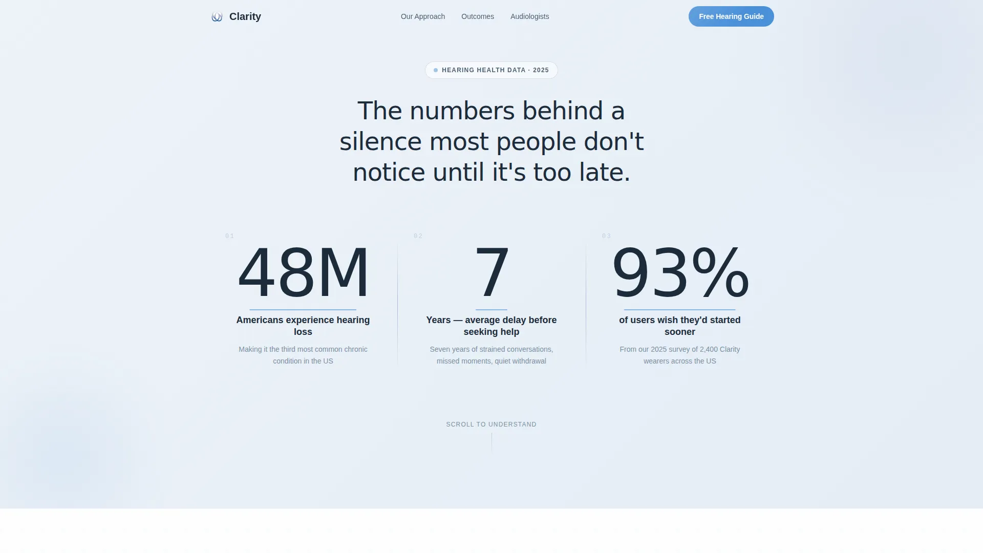
Three large count-up counters animate into view against a pale gradient wash. Each counter surfaces a single, arresting statistic about hearing loss in the United States, framed in thin elegant typography with a warm cerulean accent pulsing beneath each figure.
Decibel Reality Chart
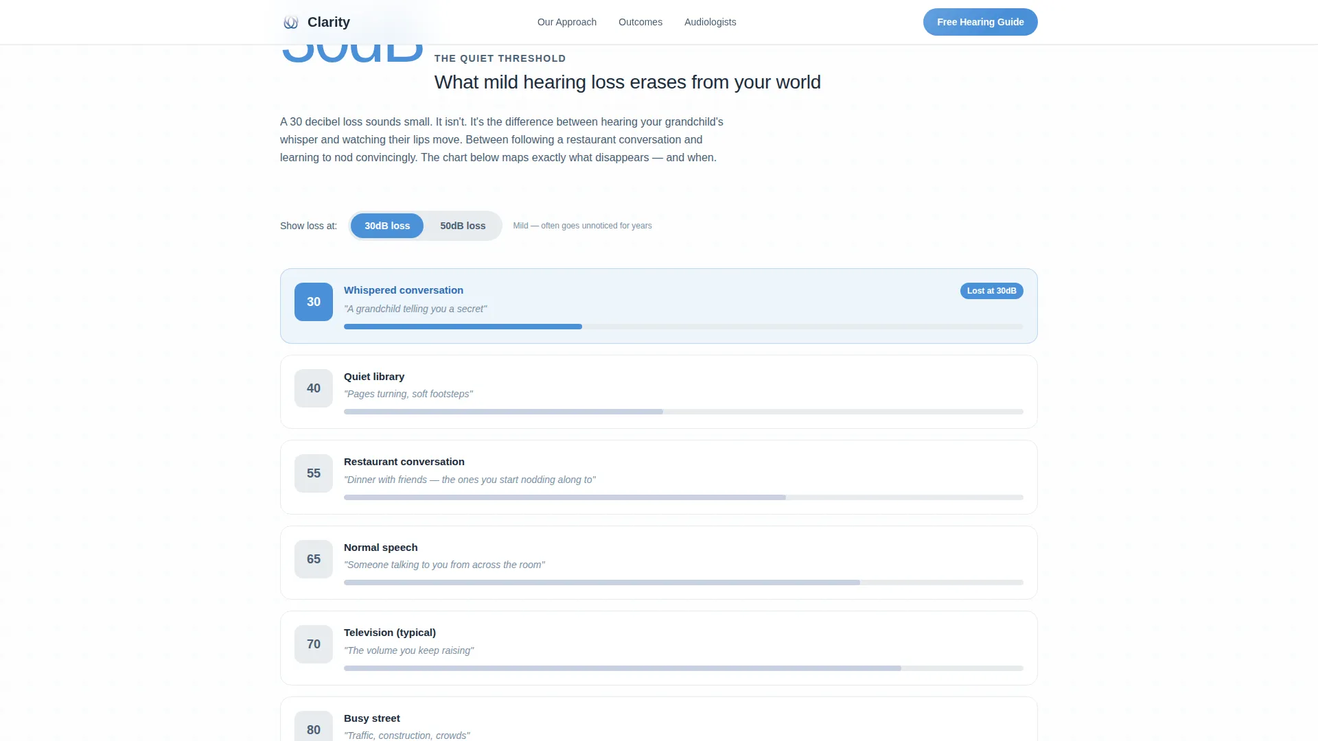
A visual chart illustrates what 30 decibels of hearing loss actually removes from everyday life. It translates an abstract clinical measure into concrete, relatable sounds, helping visitors connect the data to their own experience.
Cost-of-Inaction Timeline
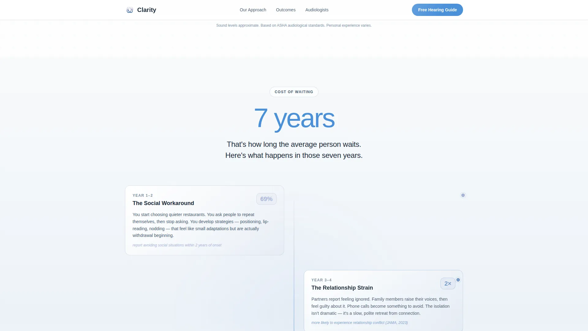
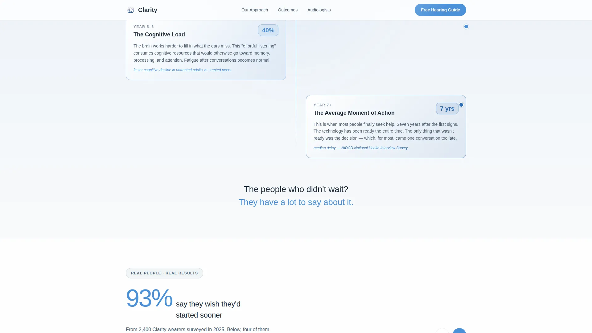
A year-by-year graphic maps the cognitive and social effects of untreated hearing loss over time. This section is positioned to peak motivation just before the primary call to action.
Embedded 60-Second Hearing Quiz
An interactive self-assessment quiz lives mid-page. It scores visitor responses and personalizes the guide recommendation, making the lead capture feel like a natural next step rather than a form wall.
Guide Download Lead Capture
A focused form asks only for a first name and email address. It is placed immediately after the cost-of-inaction section, when visitor motivation is at its highest point in the scroll journey.
Social Proof Carousel
A carousel pairs satisfaction percentages with short, first-person quotes. The tone shifts from clinical to warm in this section, grounding the statistics in real human experience.
Page sections overview
| Section | Purpose |
|---|---|
| Stats Hero | Open with three animated counters surfacing key hearing loss statistics |
| Decibel Reality Chart | Show visually what 30dB of hearing loss removes from daily life |
| Cost of Inaction Timeline | Map year-by-year cognitive effects to peak visitor motivation |
| Social Proof Carousel | Pair satisfaction percentages with first-person quotes for warmth |
| Guide Download Form | Capture first name and email at peak motivation with low friction |
| Footer | Single-row linear footer with essential navigation and legal links |
Design & branding system
The visual identity follows a Soft Gradient theme built on an Arctic White color system. The palette is described as morning light through frosted glass: clean, unhurried, and gentle. Nothing shouts, because the entire point is that the world does not have to be loud to be heard.
- Colors: glacier white (#F8FAFB) for backgrounds, whisper gray (#E8ECF0) for surface contrast, soft periwinkle (#A7B5D6) for accents, and warm cerulean (#4A90D9) for interactive elements and key statistics
- Typography: DM Sans in thin weight for large statistics, medium weight for body copy, and semibold for calls to action
- Animation style: scroll-triggered clip-in reveals, spotlight card hover states, and count-up counters create a high-interactivity feel without visual noise
Mobile & speed optimization
The template is built desktop-first, reflecting the primary audience of adults in their fifties and sixties who are more likely to research on a larger screen. Mobile layout is fully considered and responsive.
- Static content sections are structured as server components for efficient rendering
- Interactive elements including the quiz, animated chart, and count-up counters are isolated as client components
- The single-column flow adapts cleanly to smaller screens without requiring layout restructuring
How this template helps you convert
The conversion strategy is embedded in the scroll sequence itself. Visitors are not asked to act until they have been given genuine value and context.
- The stats hero creates immediate self-recognition, prompting visitors to pause and reflect before they scroll further
- The cost-of-inaction timeline raises stakes naturally, and the guide download form appears at the exact moment motivation peaks
- The embedded quiz personalizes the experience, making the guide download feel like a recommendation the visitor earned rather than a form they filled
Other information about this template
This template is well suited to the assistive listening device provider niche operating within the broader hearing and audiology category under health and medical services. It is built for a United States English audience with localization baked into its statistics and framing.
- The page supports a dual-audience structure: primary visitors in their fifties and sixties, and secondary visitors who are adult children researching for an aging parent
- The content and resource landing page direction means the primary conversion event is a guide download, not a direct purchase or booking
- The footer follows a linear single-row pattern, keeping the bottom of the page clean and uncluttered
- Template style is Single Column Flow, which keeps the scroll journey linear and reduces cognitive load for older audiences
Theme
Soft Gradient
Creative direction
Stats-First Impact
Color system
Arctic White
Style
Single Column Flow
Direction
Content/Resource
Page Sections
Animated Stats Hero with Count-up Counters
Decibel Reality Visual Chart
Cost-of-inaction Timeline Graphic
Embedded 60-second Hearing Quiz
Low-friction Guide Download Form
Social Proof Carousel with Quotes
Related questions
Who is this landing page template designed for?
What is the primary conversion goal of this template?
Can the quiz and form be customized for a specific practice?
Is this template suitable for an older adult audience?
What sections are included in this landing page?



