Optometrist Reviews Website Template
Clarity is a single-page optometrist testimonial and review landing page built around one irrefutable headline: 4.96 out of 5 from 1,247 real patients. A five-metric comparison table hits before any testimonial does. Then patient stories, a stats marquee, and a Vision Health Guide download form complete an evidence-first flow that earns trust before asking for anything.
by Rocket studio
Quick summary
Clarity is a Stats-First Impact landing page designed for optometry practices that want their verified review data to do the selling. The page opens with a dominant headline stat, flows into a five-metric comparison table, layers in service-specific testimonials, and closes with a lead-capture form offering a free Vision Health Guide download. Every section is built to feel like evidence, not advertising.
Who this template is for
This template is built for optometry practices that have strong review data and want to turn it into a patient acquisition tool. It works especially well for clinics serving adults who research carefully before booking.
- Optometrists looking to attract adults experiencing vision changes, including screen fatigue and blurry distance vision
- Practices offering specialized services such as pediatric screenings, progressive lenses, dry eye treatment, and contact lens fittings
- Clinics that want a content resource destination rather than a hard-sell appointment page
What problem this template solves
Most optometry pages lead with a photo of smiling staff and a "Book Now" button. Skeptical visitors, especially parents, teachers, and software engineers who spend hours researching before committing, need proof before they act. This template flips that structure.
- Visitors often arrive unsure whether a practice is meaningfully better than the one around the corner
- Review scores scattered across third-party platforms are hard to compare at a glance
- Practices with genuinely strong outcomes have no clear way to show that advantage on their own page
What you get with this template
You get a fully structured, single-page layout that leads with data and builds toward a soft-capture form. Every section is purposeful and sequenced to match how a cautious, research-oriented patient actually reads.
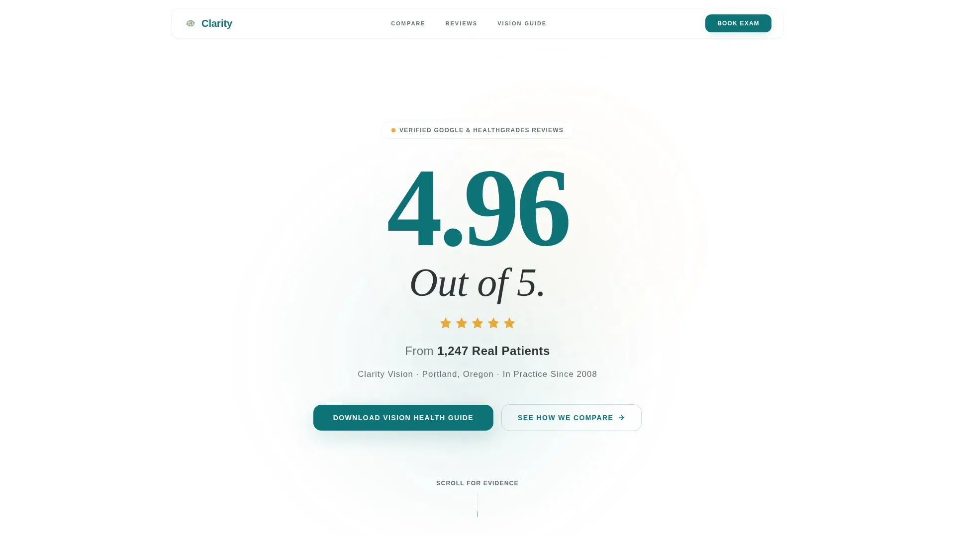
- A hero section with an oversized verified review stat as the primary visual element
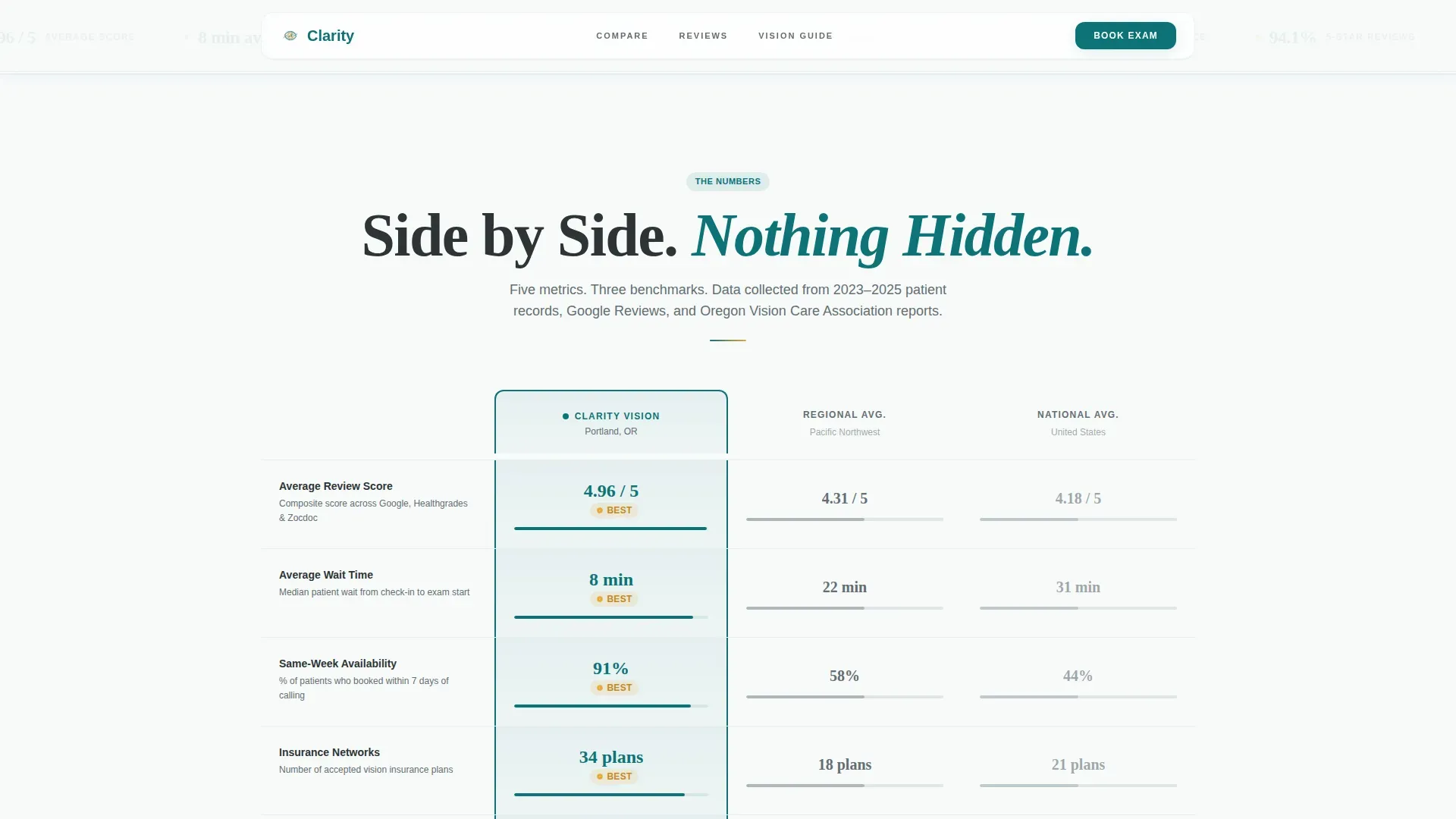
- A five-metric comparison table contrasting the practice against regional and national averages, with the practice column highlighted in teal
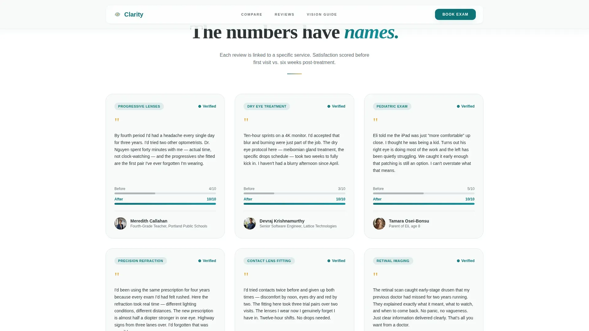
- Six testimonial cards segmented by service and patient type, each showing a before-and-after satisfaction score
Feature list
This section covers the core built-in capabilities of the Clarity template as described in the source brief.
Giant Headline Hero Section
The hero opens with a stark white background and oversized typography displaying the verified review score and patient count. No image competes with the number. The stat is the visual anchor, styled in a high-contrast sans-serif that fills the viewport the way the top line of an eye chart fills a darkened room.
Five-Metric Comparison Table
A horizontal comparison table places the practice side by side against regional and national benchmarks across five measurable metrics: average review score, wait time, same-week appointment availability, insurance networks accepted, and patient return rate. The practice column is highlighted in clinical deep teal. Hover states on competitor columns are styled in muted gray to keep the contrast intentional.
Service-Segmented Testimonial Cards
Six patient testimonial cards are organized by the specific service received, including progressive lenses, pediatric screening, and dry eye treatment. Each card includes a before-and-after satisfaction score, making individual stories feel like data points rather than marketing copy.
Infinite Stats Marquee
A continuously scrolling ticker displays secondary proof statistics between content sections. It reinforces the evidence rhythm of the page without interrupting the scroll flow. The marquee keeps supporting numbers visible without crowding the main layout.
Vision Health Guide Lead Capture Form
The primary call to action is a lead-capture form offering a downloadable Vision Health Guide. It collects an email address and an optional dropdown selection for the visitor's primary concern, such as blurry distance vision, screen fatigue, a child's first exam, or contact lens discomfort. The form appears after the evidence has already done its work.
GSAP Scroll Animation System
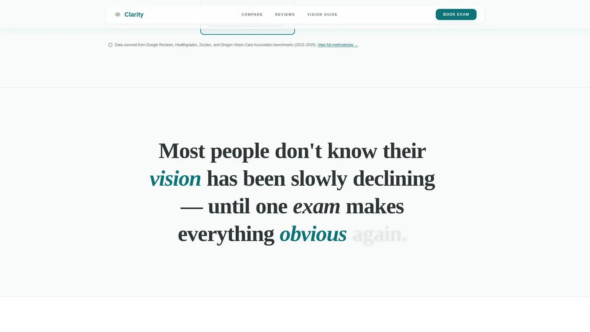
The template includes high-intensity GSAP ScrollTrigger animations throughout. Entrance effects, parallax background blobs, word-by-word scroll reveals, and a magnetic call-to-action button are all built in. Client components handle interactive elements while static sections use server-rendered components for reliable load behavior.
Page sections overview
| Section | Purpose |
|---|---|
| Hero Stat Headline | Opens with the verified 4.96/5 score in viewport-dominating typography |
| Five-Metric Comparison | Benchmarks the practice against regional and national averages |
| Testimonial Cards | Shows six service-specific patient stories with satisfaction scores |
| Stats Proof Marquee | Scrolls secondary proof statistics continuously between sections |
| Vision Guide Form | Captures email leads via a free Vision Health Guide download offer |
| Single-Row Footer | Closes the page with a clean linear footer layout |
Design & branding system
The visual identity follows the Medical Clarity theme, which pairs clinical precision with warm trust signals. The palette is deliberate: teal grounds the interface in credibility, white gives it room to breathe, and amber creates a single point of warmth that the eye always finds first.
- Primary color: clinical deep teal (#0D7377) used for the highlighted comparison column, key headings, and structural anchors
- Background color: soft optical white (#F7FAFA) across open sections, keeping the layout clean and easy to read
- Accent color: warm amber (#E8A838) reserved exclusively for star ratings, pull-quote marks, and hover states, never used as a general highlight
- Body text: charcoal lens-case gray (#2D3436) for all paragraph text, maintaining strong contrast without feeling harsh
- Typography: Fraunces serif for headline numbers and italic pull moments; DM Sans for all body copy and interface labels
Mobile & speed optimization
The template is designed desktop-first because the comparison table is the centrepiece of the page. Full mobile responsiveness is built in so the layout adapts cleanly across screen sizes without losing the data-forward structure.
- The comparison table collapses gracefully on smaller screens so metric rows remain readable without horizontal scrolling
- Server components render all static sections, while client components handle animations and interactive elements, keeping the interactive layer separate from the structural one
- GSAP animations are scoped to avoid blocking the initial render of critical above-the-fold content
How this template helps you convert
The conversion strategy is built on sequencing. Visitors encounter irrefutable numbers before they read a single patient quote. By the time the form appears, they are not being sold to; they are being invited to stay connected with a practice that has already proved its case.
- The hero stat headline removes doubt immediately. A score of 4.96 from 1,247 patients is a specific, verifiable claim that lands before any soft language can undermine it.
- The comparison table answers the "but is it actually better?" question with five measurable data points, giving research-oriented visitors the structured evidence they came looking for.
- The Vision Health Guide form converts interest into a lead without pressure. The optional concern dropdown makes the form feel personalized rather than generic, and the secondary "See How We Compare" link routes curious visitors to a methodology page rather than losing them entirely.
Other information about this template
The Clarity template is part of a broader Health and Medical category within the template marketplace. It is specifically designed for the optometrist testimonial and review page niche, where social proof density and data transparency are the primary trust drivers.
- The page style is classified as a Comparison Table template, making it one of the few health-category templates built around structured benchmark data rather than visual storytelling alone
- The creative direction is Stats-First Impact, meaning proof precedes narrative throughout the entire scroll sequence
- The header concept is Giant Headline Centered, a deliberate choice to make a single verified number the most dominant element on the page
- The landing page direction is Content and Resource, positioning the Vision Health Guide download as a value exchange rather than a direct appointment push
- The color system is called Teal Catalyst, a name that reflects the role teal plays as the clinical anchor that makes the amber accent feel earned rather than decorative
- Localization is set for English (United States), with date formatting in month/day/year order and currency in United States dollars
Theme
Medical Clarity
Creative direction
Stats-First Impact
Color system
Teal Catalyst
Style
Comparison Table
Direction
Content/Resource
Page Sections
Giant Verified Score Headline
Five-metric Comparison Table
Service-segmented Testimonial Cards
Infinite Scrolling Stats Marquee
Vision Health Guide Lead Capture
GSAP Scroll Animation System
Related questions
Can I update the hero review score and patient count to match my practice data?
How does the comparison table work, and can I edit the benchmark metrics?
Does this landing page template include the actual Vision Health Guide document?
What types of patients and concerns does the form dropdown cover?
Is the page usable for a practice that does not yet have 1,000 or more reviews?



