Psychiatrist Booking Website Template
Clarity is a psychiatrist condition and treatment library landing page built for adults searching for answers at their most vulnerable moments. It pairs plain-language condition explanations with week-by-week treatment paths in a zigzag layout. A credential band, amber booking call to action, and a three-question consultation form turn anxious browsers into booked appointments.
by Rocket studio
Quick summary
Clarity is a single-page psychiatrist landing page that reads like a calm, knowledgeable colleague explaining your diagnosis. It alternates condition overviews with treatment timelines in a zigzag layout, opens with a clinical credential band, and closes with a minimal booking form. The design uses deliberate teal, navy, and amber to feel like a thoughtful private practice, not a hospital.
Who this template is for
This template is built for psychiatrists and mental health clinics that want to turn confused, searching visitors into booked consultations. It works best when the practice offers multiple conditions and structured treatment pathways worth explaining in depth.
- Psychiatrists who want to publish a trustworthy condition and treatment library online
- Mental health clinics serving adults, caregivers, and parents referred by a pediatrician
- Private practices that rely on organic search traffic from newly diagnosed patients
What problem this template solves
Most psychiatric websites give visitors a list of conditions and a phone number. That leaves scared, newly diagnosed adults with no sense of what to expect. Clarity dissolves that fear by showing the full clinical process before anyone picks up the phone.
- Visitors arrive overwhelmed and leave with a clear picture of their diagnosis and treatment path
- The booking form removes friction by asking only three focused questions in sequence
- Credential signals in the header establish trust before a single paragraph is read
What you get with this template
You get a fully structured, single-page landing page that covers every stage of the patient decision journey. Each section has a defined purpose, and the visual hierarchy guides the reader from curiosity to confidence to booking.
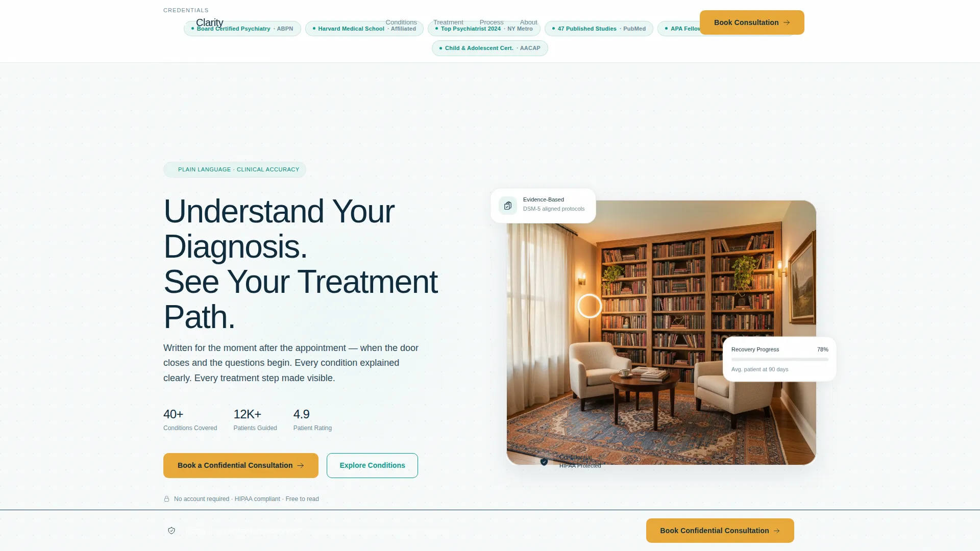
- A hero section with a credential badge band, headline, and amber primary call to action
- Three zigzag condition-and-treatment pairs, a process transparency grid, testimonials, and a booking form
- A sticky bottom call-to-action bar that appears after the second zigzag section and stays visible on scroll
Feature list
This section breaks down the core built-in capabilities included in the Clarity template.
Award Badge Credential Band
A horizontal band of board certification pills, metro-area honors, university affiliations, and published research counts sits directly below the headline. Each badge is rendered as a small muted-teal credential pill with legible institution names. Clinical authority is established in the first two seconds of the visit.
Zigzag Condition and Treatment Layout
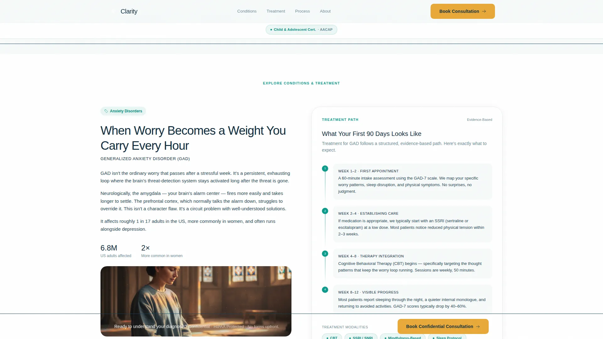
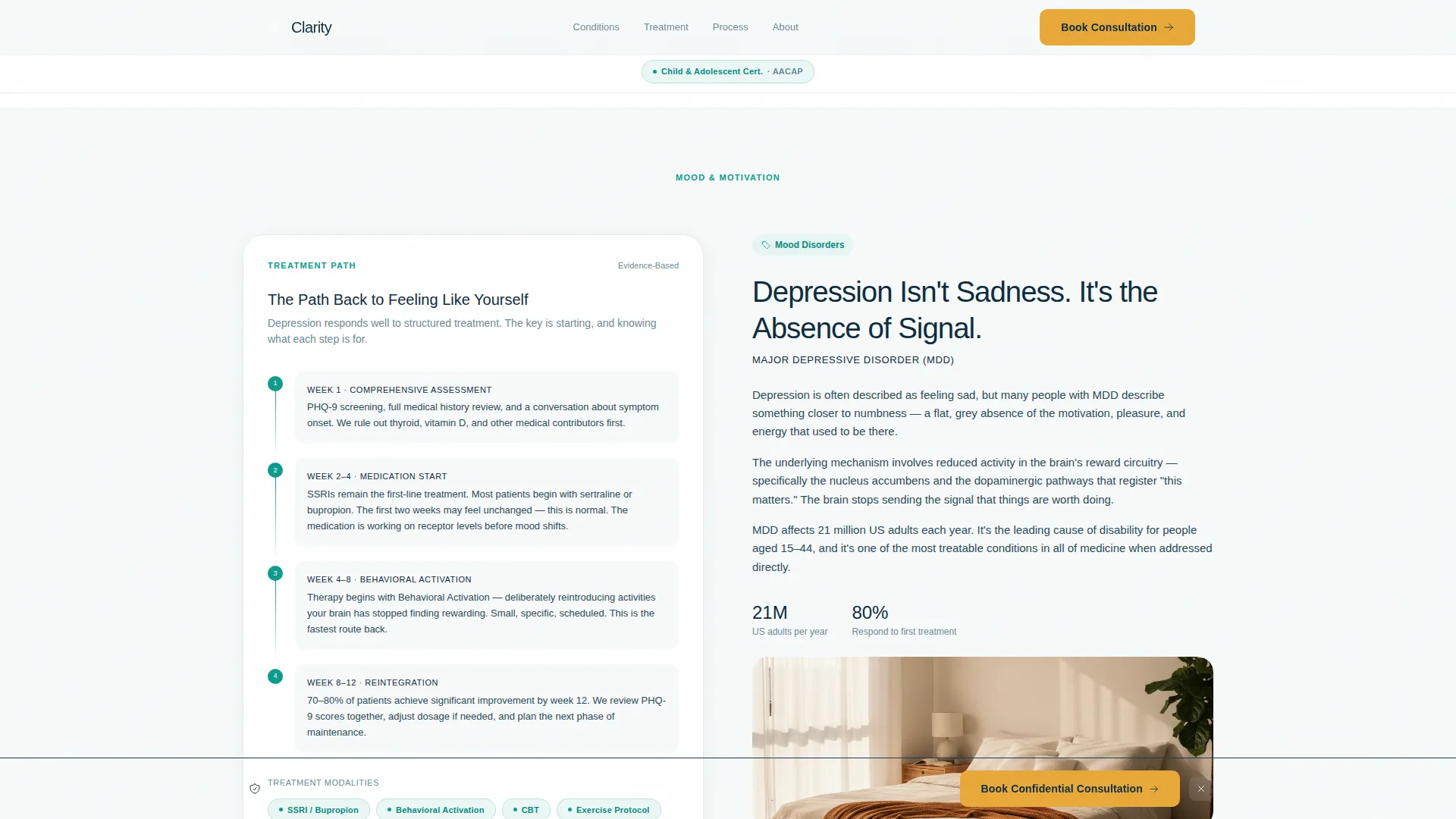
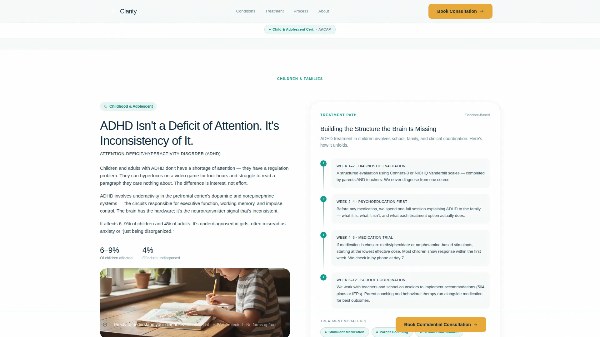
Three alternating left-right section pairs walk visitors through conditions and their matching treatment pathways. The left panel explains a condition in layered plain language. The right panel reveals the corresponding treatment path, covering the first appointment, assessment tools, medication timelines, therapy modalities, and progress checkpoints at 30, 60, and 90 days.
Three-Question Sequential Booking Form
The consultation form asks only three things in order: concern area from a dropdown of explored conditions, preferred contact method, and available time window. The sequence reduces friction and keeps the commitment feel low for anxious first-time visitors.
Secondary Email Capture Path
A "Download the Treatment Guide" option gives visitors who are not ready to book a useful reason to share their email. This secondary path lets them leave with something concrete and a clear route back to the practice.
Sticky Booking Call-to-Action Bar
After the visitor passes the second zigzag section, a persistent bottom bar carrying the "Book a Confidential Consultation" call to action remains visible throughout the rest of the scroll. The bar uses catalyst amber to stay visually distinct without being disruptive.
Process Transparency Grid
A four-card asymmetric bento grid labeled "What to Expect" lays out the clinical intake process in plain steps. Each card reduces a stage of care to a clear, reassuring description so nothing about the first appointment feels unknown.
Page sections overview
| Section | Purpose |
|---|---|
| Hero and Credential Band | Opens with badge constellation, headline, and amber call to action |
| Zigzag Pair One | Explains first condition and its full treatment timeline |
| Zigzag Pair Two | Explains second condition and its full treatment timeline |
| Zigzag Pair Three | Explains third condition and its full treatment timeline |
| Process Transparency Grid | Four-card "What to Expect" bento shows clinical intake steps |
| Testimonials Section | Three specific patient quotes trigger sticky call to action bar |
| Booking Form | Three-question sequential form for consultation requests |
| Footer | Linear single-row footer with practice essentials |
Design & branding system
The visual identity follows a Medical Clarity theme. The palette feels like a modern private practice where every color choice was intentional, not accidental.
- Clinical teal (#0D9B8C) carries all links, icons, credential pills, and progress indicators throughout the page
- Deep psychiatric navy (#0F2B3C) grounds all headings and body text for a calm, readable experience
- Warm catalyst amber (#E8A838) appears exclusively on calls to action and trust signals, never decoratively
- Soft antiseptic white (#F7FAFA) alternates as the section background across the zigzag layout
- Typography uses Plus Jakarta Sans in bold for headings and DM Sans for body text to balance authority with readability
Mobile & speed optimization
The template is built with a mobile-first priority because its primary visitor is likely on a phone late at night. The layout and interactive elements are designed to serve that context directly.
- All zigzag sections restack vertically on small screens so condition and treatment content stays readable in a single column
- The sticky call-to-action bar and three-question form are optimized for thumb-friendly interaction on mobile viewports
- Scroll-triggered animations use GSAP ScrollTrigger with staggered card entries and a scan pulse effect to keep motion smooth without overwhelming the reader
How this template helps you convert
Clarity is structured to move a frightened, uncertain visitor toward booking without pressure. Every section earns trust before asking for anything.
- The credential band converts skepticism into authority within the first two seconds, before any content is read
- The zigzag treatment timelines dissolve fear by showing exactly what happens at each clinical step, making the first appointment feel predictable and safe
- The three-question form and secondary email capture path offer two commitment levels, meeting both ready-to-book visitors and those who need more time
Other information about this template
This template is part of the Health and Medical category under the Psychiatrist Website subcategory. It is suited to practices serving English-speaking audiences in the United States, using standard US date formats throughout the booking form and process sections.
- The template includes six or more credential badge slots, four stat metric display areas, and three testimonial cards with space for specific, attributed quotes
- Animation behavior uses GSAP ScrollTrigger reveals and staggered card entries; the sticky bar and booking form use client-side rendering while static sections use server component logic
- The footer follows a linear single-row pattern designed to keep focus on the booking path rather than distracting navigation
Theme
Medical Clarity
Creative direction
Transparent Process
Color system
Teal Catalyst
Style
Zigzag/Alternating
Direction
Booking/Scheduling
Page Sections
Award Badge Credential Band
Zigzag Condition and Treatment Pairs
Three-question Booking Form
Sticky Amber Call-to-action Bar
Secondary Email Capture Path
Process Transparency Grid
Related questions
Can I customize the conditions covered in the zigzag sections?
Does the template include the booking form logic?
Who is the intended visitor for this landing page?
Is there a way to capture leads from visitors not yet ready to book?
Does this template work for a solo psychiatrist as well as a clinic?



