Teleaudiology Landing Page Template for Hearing Care
Clarity is a teleaudiology landing page template built to turn first-time visitors into booked hearing screening calls. It pairs an interactive three-slider hearing benefit estimator with a four-step zigzag walkthrough, warm Scandinavian visual design, and near-zero-friction lead capture, all in a single, focused page flow.
by Rocket studio
Quick summary
Clarity is a single-page teleaudiology landing page template designed for lead generation. An interactive hearing benefit estimator opens the experience, a four-step alternating layout walks visitors through the remote care process, and a minimal three-field form closes the loop. The design is calm, clinical, and built to earn trust from adults who are unfamiliar with remote audiology.
Who this template is for
This template is made for teleaudiology platforms and remote hearing care providers who need to convert cautious, first-time visitors into booked consultations. It suits providers whose audience is not yet ready to buy, only ready to take one small next step.
- Adults in their late fifties and sixties who recently failed a general practitioner hearing screening and want plain-language guidance
- Retirees in rural areas where the nearest audiology clinic requires a long drive
- Adult children searching on behalf of a parent who is reluctant to admit a hearing concern
What problem this template solves
Most hearing care pages lead with clinical terminology, long intake forms, or insurance questions. That approach loses the exact audience that needs help most. Clarity removes every unnecessary barrier between a concerned visitor and a fifteen-minute screening call.
- Visitors arrive anxious and uncertain; the estimator gives them a personal result before they read a single word of marketing copy
- The zigzag step layout answers the unspoken question: "What actually happens after I click?"
- The lead form asks only three fields, keeping drop-off low and the path to a booked call short
What you get with this template
You get a complete, ready-to-build teleaudiology landing page with every section planned and structured. Each part of the page has a defined job, and the visual system is fully specified so customization stays consistent.
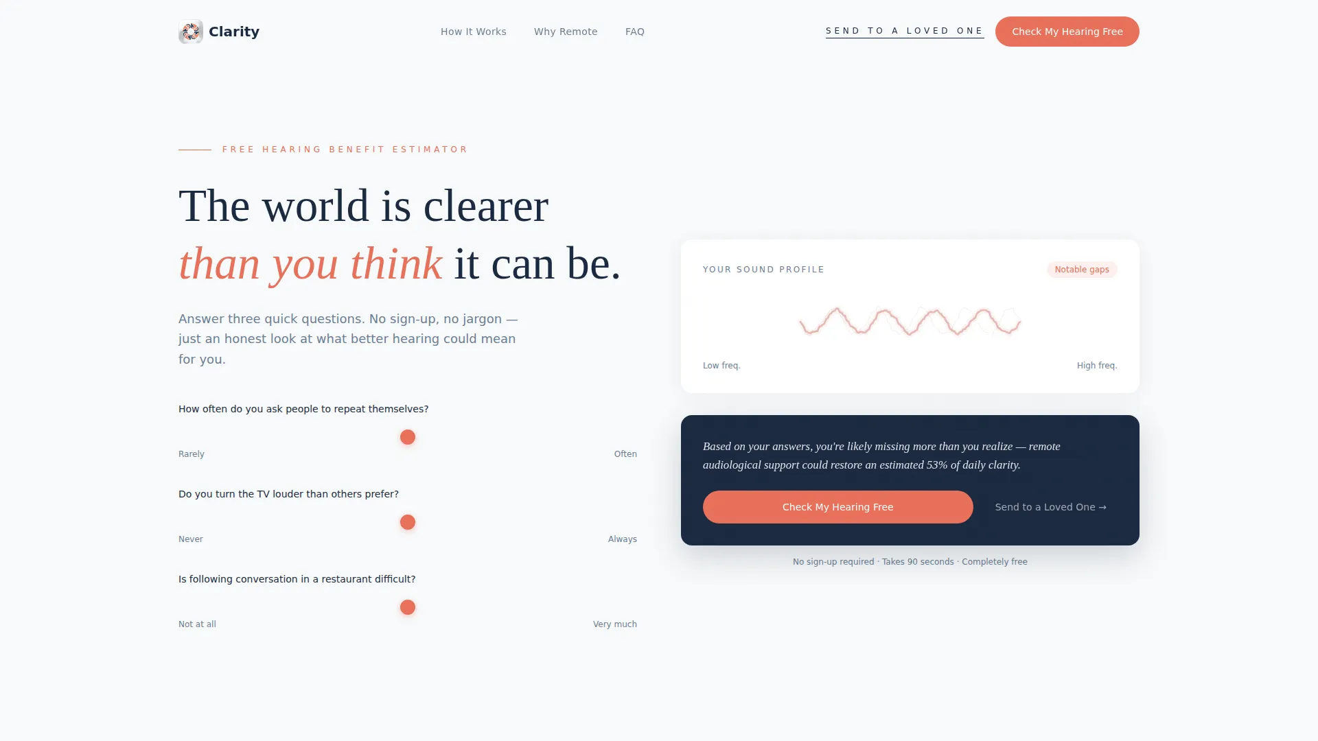
- A hero section with a three-slider hearing benefit estimator, animated waveform illustration, and a real-time personalized result sentence
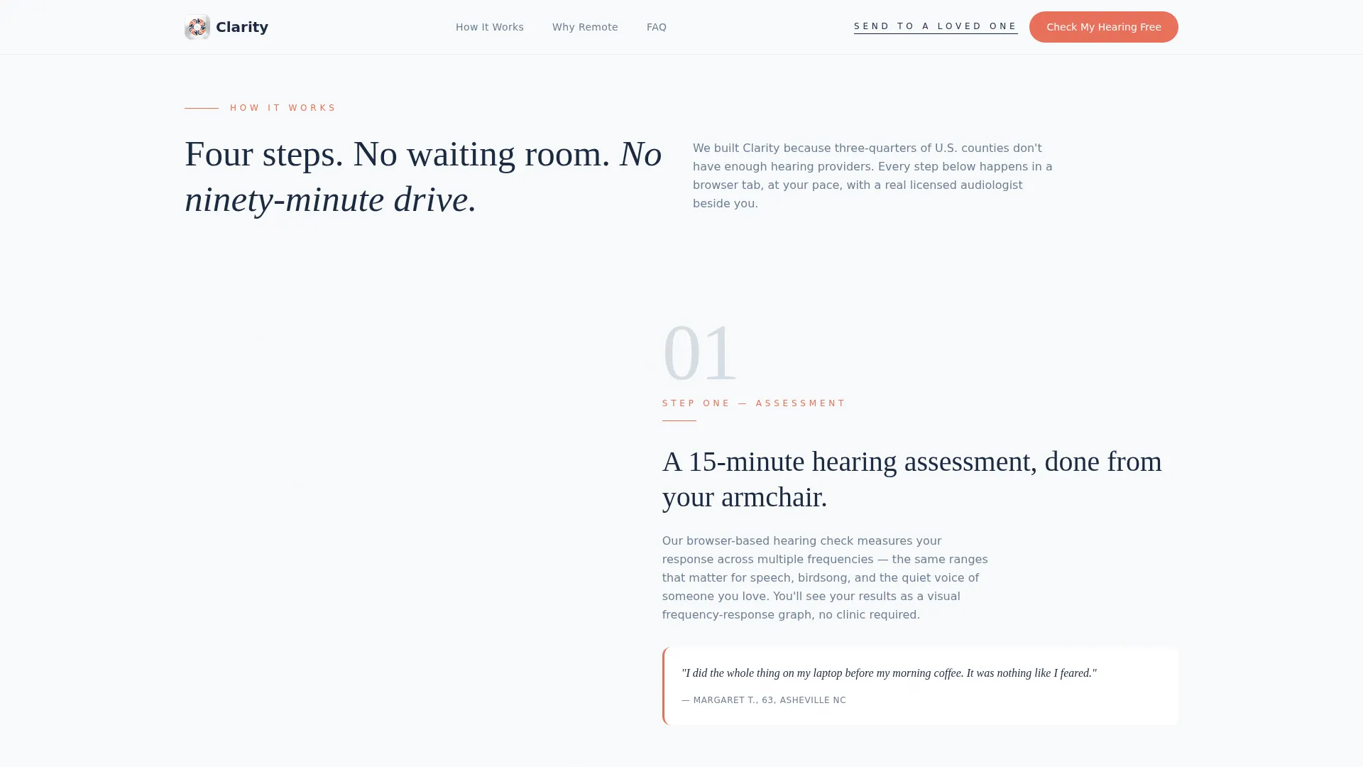
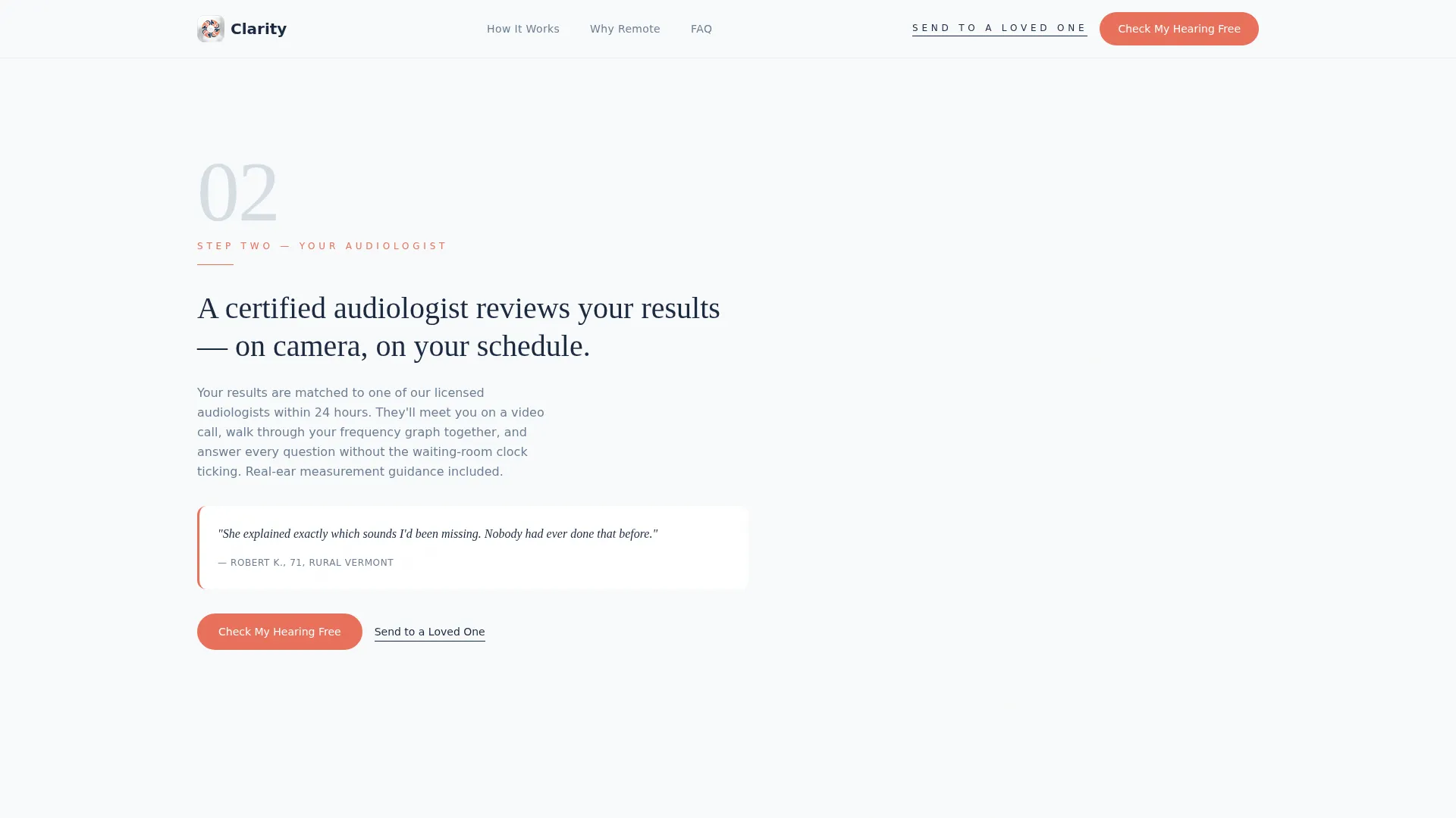
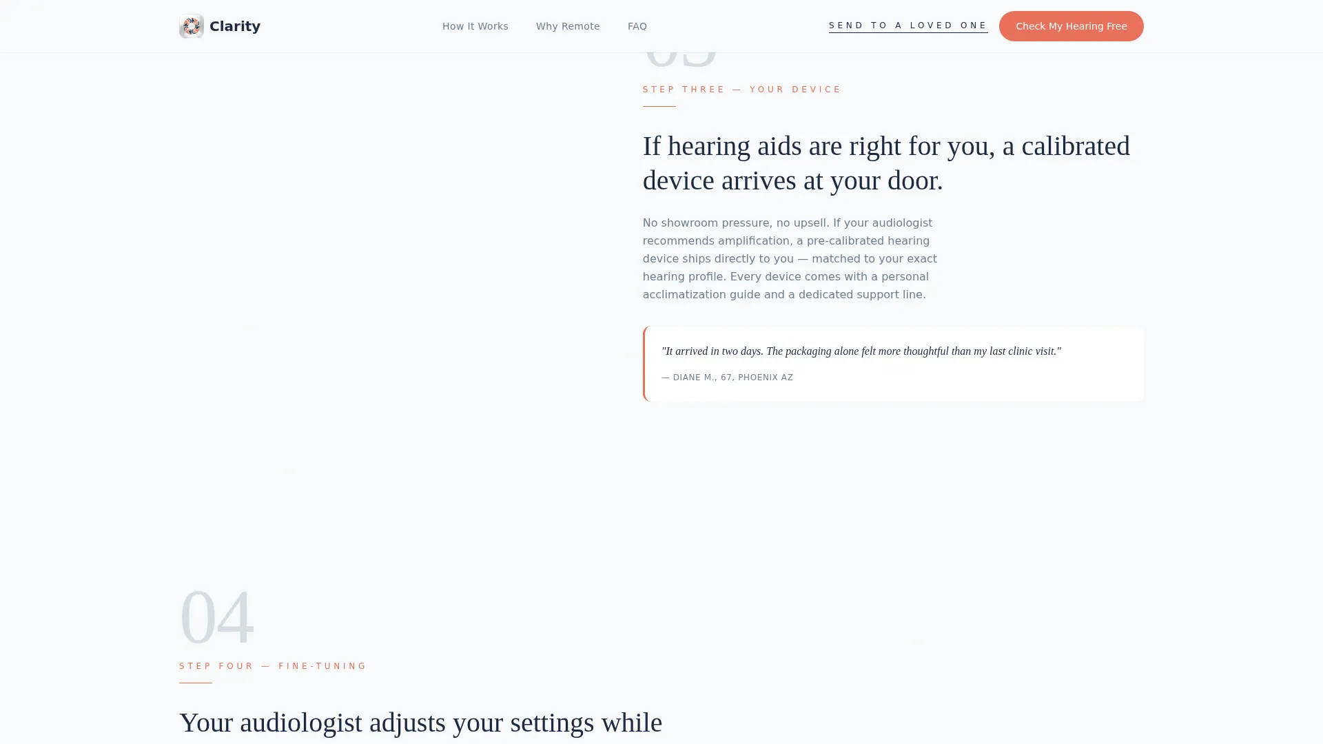
- A four-section zigzag How It Works walkthrough with alternating image and text blocks, each carrying a patient quote
- A Trust and Proof section, a low-friction three-field lead capture form, an accordion FAQ, and a minimal single-row footer
Feature list
This template is built around a clear set of functional and visual components drawn directly from the project brief.
Interactive Hearing Benefit Estimator
Three friendly sliders let visitors rate how often they ask people to repeat themselves, whether they raise the TV volume, and how hard it is to follow conversation in a restaurant. As each slider moves, an animated waveform shifts from jagged to smooth and a personalized result sentence assembles in real time. No clinical intake, no jargon, just immediate personal relevance.
Zigzag Four-Step Process Layout
The How It Works section alternates image-left/text-right and image-right/text-left across four steps. Each step introduces one stage of the remote care journey: online assessment, audiologist review, device delivery, and remote fine-tuning. A patient quote sits beneath each step to build confidence through lived experience rather than marketing claims.
Low-Friction Progressive Lead Form
The primary call to action, "Check My Hearing Free," opens a short three-field form asking only for a first name, an age range, and an optional open-text hearing concern. There are no insurance questions and no medical history fields. A secondary "Send This to a Loved One" link opens an email-share modal for visitors searching on behalf of someone else.
Trust and Social Proof Section
This section presents audiologist profiles, real-world statistics, and plain-language evidence for why remote hearing care works. The section is designed to address hesitation directly, using data rather than vague reassurance.
Accordion FAQ Section
Plain-language answers to the most common objections sit inside a collapsible accordion. Visitors who are not yet ready to book can read through concerns at their own pace without leaving the page.
Organic Flow Visual System
The Arctic White color palette, Fraunces serif headlines, and DM Sans body text create a Scandinavian clinical aesthetic. Generous negative space, soft gray block separators, and warm coral accent calls to action give the page a calm, trustworthy feel that matches the audience's expectations.
Page sections overview
| Section | Purpose |
|---|---|
| Hero Estimator | Opens with three interactive sliders and a real-time personalized hearing benefit result |
| How It Works | Four zigzag alternating steps walk through the full remote care process |
| Trust and Proof | Audiologist profiles, statistics, and evidence for remote care effectiveness |
| Lead Capture Form | Three-field progressive form with coral primary call to action |
| Accordion FAQ | Plain-language answers to top visitor objections |
| Minimal Footer | Single-row linear footer with essential links |
Design & branding system
The visual identity follows an Organic Flow theme built on the Arctic White color system. Every design decision reinforces calm, medical credibility without feeling cold or institutional.
- Color palette: clinical snow (#F8FAFB) for section backgrounds, soft cartilage gray (#D6DDE3) for block separators, warm auditory nerve coral (#E8705A) for calls to action and accents, and deep cochlear navy (#1B2A41) for all headlines and body text
- Typography pairing: Fraunces serif for headlines, delivering warmth and authority together; DM Sans for body text, keeping readability high across all screen sizes
- Visual language: generous negative space dominates every section, coral appears only where action is needed, and the waveform illustration morphs from fragmented to fluid as the estimator sliders move
Mobile & speed optimization
The template is structured with a desktop-first layout that also performs well on tablets and mobile screens. The primary audience uses desktops and tablets, while adult children searching for a parent often arrive on mobile.
- Static sections use server-side rendering to keep initial load fast; the interactive estimator runs as a client-side component so it does not slow down the rest of the page
- GSAP ScrollTrigger animations reveal content progressively as the visitor scrolls, keeping the experience engaging without overwhelming slower connections
- The zigzag layout adapts cleanly to narrower viewports, stacking image and text blocks vertically while preserving the step-by-step reading order
How this template helps you convert
Every design and copy decision on this page is pointed at one outcome: a booked fifteen-minute hearing screening call. The page removes friction at each stage rather than adding it.
- The estimator delivers a personal result before any sales message appears, so the visitor feels understood rather than marketed to, this makes the first call to action feel like a natural next step rather than a demand
- The zigzag walkthrough answers process anxiety in advance, so the visitor already knows what happens after they click before they ever reach the lead form
- The "Send This to a Loved One" secondary path captures the significant portion of visitors who are researching for someone else, turning a potential exit into a referral
Other information about this template
This template is part of the Health and Medical category, specifically the Hearing and Audiology subcategory, and is purpose-built for the teleaudiology platform niche. A few additional details worth knowing before you build.
- The template is localized for English (US) audiences, with United States date formatting and dollar currency context assumed throughout
- Animation intensity is set to medium: ScrollTrigger reveals on scroll, SVG waveform morphing tied to slider interaction, and hover states on accordion items and buttons
- The footer follows a Pattern 1 Linear Single-Row layout, keeping the page ending clean and uncluttered
- The 67 percent hearing aid misfit rate and 30 percent real-ear measurement adoption statistic referenced in the Trust and Proof section are drawn from the project brief as social proof anchors
Theme
Organic Flow
Creative direction
Step-by-Step Guide
Color system
Arctic White
Style
Zigzag/Alternating
Direction
Lead Generation
Page Sections
Interactive Hearing Benefit Estimator
Four-step Zigzag Walkthrough
Low-friction Three-field Lead Form
Send to a Loved One Modal
Trust and Social Proof Section
Organic Flow Arctic White Design System
Related questions
Who is this landing page template designed for?
What makes the estimator section different from a standard hero?
How does the lead form stay low friction?
Can this template serve visitors researching on behalf of a parent?
What animation and interactivity is included in this template?



