Urologist Patient Education Landing Page Template
Clarity is a single-column landing page template built for urology practices that want to educate patients with warmth and honesty. It leads with an oversized testimonial card, guides visitors through a four-minute inline symptom assessment, and layers patient stories by condition throughout the scroll. The result feels calm, clinical, and genuinely human.
by Rocket studio
Quick summary
Clarity is a patient education landing page for urology practices. It opens with a powerful testimonial card hero, then builds trust through condition-specific patient stories tiled in as visitors scroll. A four-minute inline symptom assessment serves as the primary call to action, making it easy for anxious visitors to get clarity without feeling pressured.
Who this template is for
This template is designed for urology practices that want to reach patients who are nervous, uninformed, or quietly researching before they ever pick up the phone. It speaks directly to the people most likely to delay care.
- Men over fifty researching prostate-specific antigen results late at night on a phone
- Women referred after recurrent urinary tract infections who want to understand why
- Parents preparing questions before a child's surgical consultation
What problem this template solves
Most urology practice pages feel cold, clinical, and written for other doctors. Patients arrive already anxious and leave more confused than when they started. This template solves that gap by presenting urological health in plain, reassuring language paired with real patient voices.
- Visitors feel seen before they ever read a condition description
- The assessment path removes the barrier between "just looking" and "actually asking"
- Educational micro-sections break up medical content so it stays readable and digestible
What you get with this template
You get a fully structured single-column landing page with every section built and sequenced for maximum patient trust. The layout moves visitors naturally from emotional recognition to informed action.
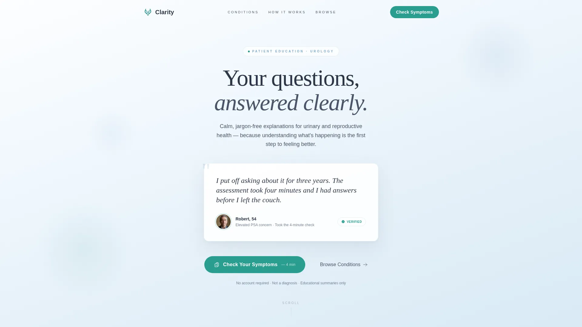
- A testimonial card hero with a quote, first-name attribution, age, and circular avatar
- An inline symptom assessment with one question per step and plain-language toggles
- A condition mosaic, educational myth-debunking sections, and a browse-conditions card grid
Feature list
This template includes the following purpose-built components, each designed to reduce patient hesitation and encourage informed engagement.
Testimonial Card Hero
The page opens with a single oversized patient quote on a softly shadowed white card, centered in the viewport. The quote is first-name and age attributed, keeping it human without compromising privacy. A subtle gradient background shifts from cloud white to the palest sky blue behind the card.
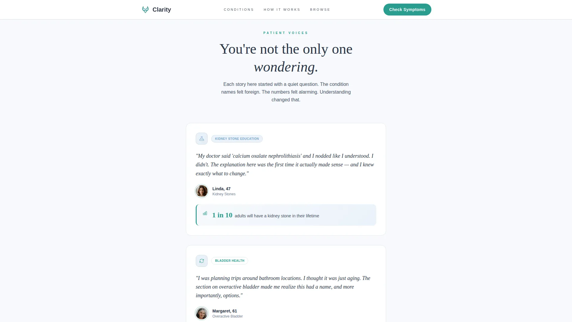
Condition-Specific Testimonial Mosaic
As visitors scroll, patient stories tile into view one at a time. Each story is anchored to a specific urological concern such as kidney stones, overactive bladder, elevated prostate-specific antigen, or pediatric reflux. The mosaic mirrors a visitor's unspoken concern back to them before they have named it themselves.
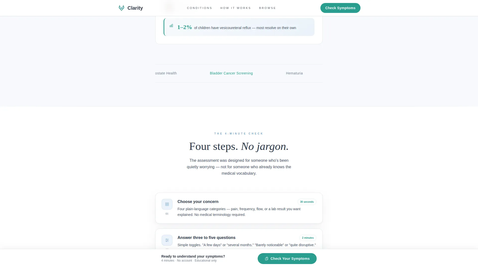
Inline Four-Minute Symptom Assessment
The primary call to action is a step-by-step inline quiz flow. Visitors first choose a symptom category from four illustrated icons: pain, frequency, flow, or screening. Three to five plain-language toggle questions follow. The final step collects only an email address and preferred contact method, with a promise of a personalized educational summary.
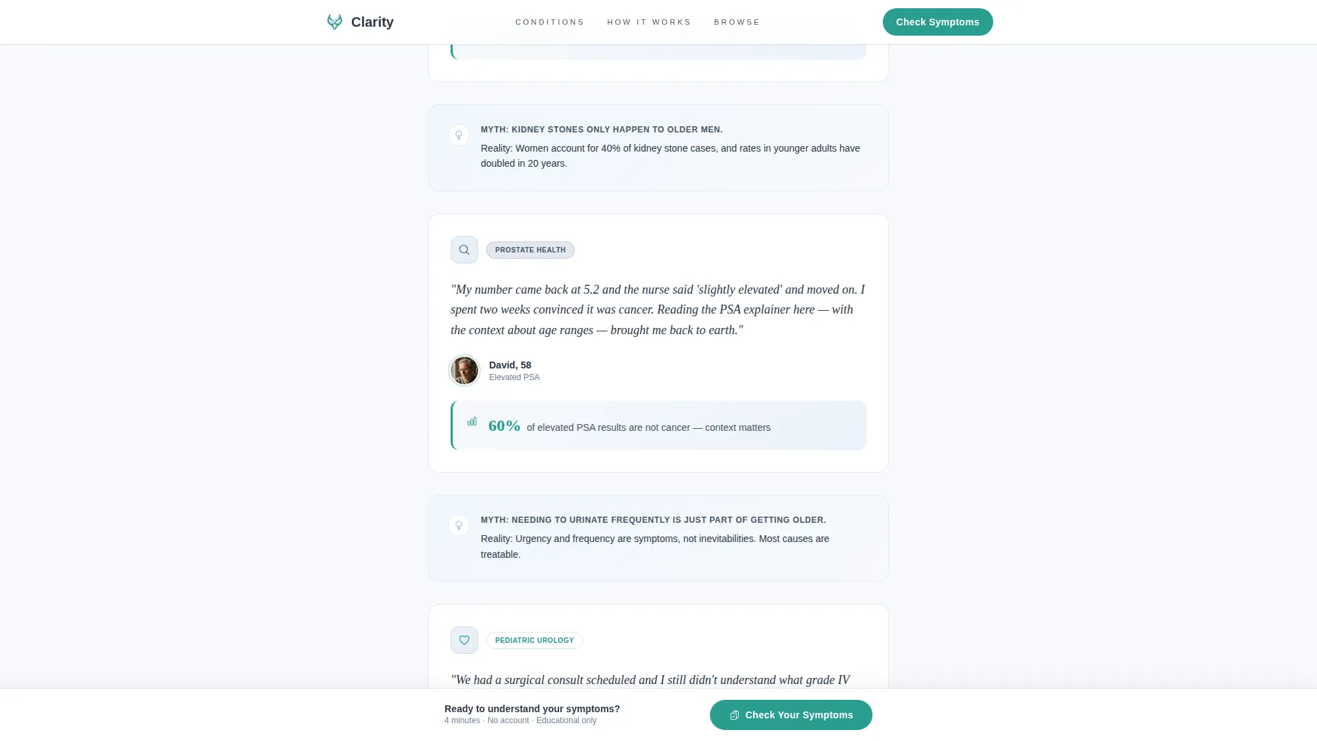
Sticky Assessment Call to Action Bar
After the second scroll, a subtle bottom bar pins the "Check Your Symptoms" button persistently in view. The bar uses the affirmation teal color so the eye finds it naturally without the bar feeling intrusive or pushy.
Educational Myth and Stats Micro-Sections
Between testimonial clusters, short educational segments appear: a single statistic, a myth debunked, or a diagram simplified. These sections give the scroll intellectual rhythm and establish the practice as a calm, credible voice.
Browse Conditions Card Grid
A secondary navigation path lets cautious visitors self-educate by condition before committing to the assessment. The card grid lets people move at their own pace, reinforcing that understanding is the first and most important step.
Page sections overview
| Section | Purpose |
|---|---|
| Testimonial Card Hero | Opens with patient voice and primary call to action |
| Condition Mosaic | Tiles patient stories by urological concern |
| Myth Debunked Stats | Delivers educational rhythm between testimonials |
| Assessment Flow Preview | Demonstrates the four-minute inline quiz steps |
| Browse Conditions Grid | Offers a self-education path for cautious visitors |
| Footer | Single linear row with essential practice links |
Design & branding system
The visual identity follows a Corporate Precision theme built on the Cloud Canvas color system. The palette feels sterile without being cold and trustworthy without being intimidating. Typography pairs Fraunces serif headlines with DM Sans body text for a tone that is both authoritative and approachable.
- Colors: soft clinical white (#F7F9FC) base, calm slate (#4A5568) body text, reassuring sky (#7BA7C9) accents, and warm affirmation teal (#2A9D8F) for buttons and positive-outcome highlights
- Teal appears only where the page wants the eye to move, keeping the layout clean and focused
- Animations use GSAP ScrollTrigger reveals, staggered card entries, and clip-path transitions to create a smooth, unhurried scroll experience
Mobile & speed optimization
This template is built with mobile-first visitors as the priority audience. The people most likely to use this page are searching quietly from a phone, often late at night.
- Single-column layout adapts cleanly to small screens without reflow or truncation issues
- The inline quiz flow is designed for thumb navigation with plain-language toggles rather than complex form inputs
- Static sections use server-rendered components while interactive quiz elements load as client components to keep the initial page fast
How this template helps you convert
Every design and copy decision in Clarity is built to move a hesitant visitor toward a single, low-pressure action: completing a four-minute symptom assessment.
- The testimonial mosaic provides repeated social proof tied to real conditions, so visitors see themselves in other patients before the call to action appears.
- The assessment is framed as an educational summary, not a diagnosis, which removes the fear of commitment and lowers the barrier to clicking "Check Your Symptoms."
- The sticky bottom bar keeps the primary call to action visible throughout the scroll without interrupting the reading experience.
Other information about this template
Clarity is suited to practices that prioritize patient literacy alongside clinical credibility. It works as a standalone patient education hub or as a focused entry point for new patient acquisition.
- Template style is Single Column Flow, keeping the reading path linear and distraction-free
- The header concept is a Testimonial Card, which establishes emotional trust before any clinical content appears
- Creative direction follows the Testimonial Mosaic approach, building a growing sense of community through layered patient voices
- The landing page direction is Quiz and Assessment, with the inline symptom flow as the primary conversion mechanism
- Localization is English, United States, with no currency references in the layout
Theme
Corporate Precision
Creative direction
Testimonial Mosaic
Color system
Cloud Canvas
Style
Single Column Flow
Direction
Quiz/Assessment
Page Sections
Testimonial Card Hero Section
Condition-specific Mosaic Layout
Inline Step-by-step Symptom Quiz
Sticky Bottom Call to Action Bar
Educational Micro-sections
Browse Conditions Card Grid
Related questions
Can I replace the placeholder testimonials with my own patient quotes?
How does the inline symptom assessment work for visitors?
Is this template designed for mobile users?
Can I add or remove conditions from the Browse Conditions card grid?
Does this template work as a standalone page or as part of a larger practice website?



