Virtual Clinic Landing Page Template
This hub and spoke landing page template is built for virtual allergy clinics run by board-certified allergists. It features a sticky anchor nav, a testimonial mosaic with diagnosis-to-resolution timelines, and a three-step progressive booking form. The design uses a Soft Mist color system to feel clinical, calm, and trustworthy from the first scroll.
by Rocket studio
Quick summary
A hub and spoke landing page template designed for virtual allergy clinics. It opens with credential badges, flows through four specialty hubs anchored in a sticky nav, and closes with a progressive booking form. The Soft Mist palette and Fraunces serif headlines deliver a tone that is precise, calm, and immediately credible to patients seeking real answers.
Who this template is for
This template is built for board-certified allergists and telehealth allergy practices that want to convert first-time visitors into booked consultations. It works especially well for practices treating complex or underdiagnosed cases remotely.
- Parents of toddlers with recurring hives or food-triggered reactions who need fast, trustworthy answers
- Adults living with chronic unexplained reactions such as mast cell activation syndrome or angioedema
- Travelers who need documented epinephrine action plans before international trips
What problem this template solves
Many allergy patients spend months cycling through general practitioners before reaching a specialist. A virtual clinic landing page must do two things at once: establish clinical authority fast and lower the perceived barrier to booking. Most generic medical templates fail at both.
- Patients arrive anxious and skeptical; credential badges and testimonial timelines build trust before a single word of copy is read
- The booking flow often causes drop-off; the three-step progressive form addresses insurance cost anxiety first, before asking for symptom details
- Visitors who are not ready to book still need a path forward; the symptom assessment quiz captures hesitant visitors and guides them toward a pre-filled booking form
What you get with this template
The template delivers a fully structured single-page layout with five distinct content zones, each designed to move a specific type of visitor closer to booking. Every section serves a defined purpose in the patient journey.
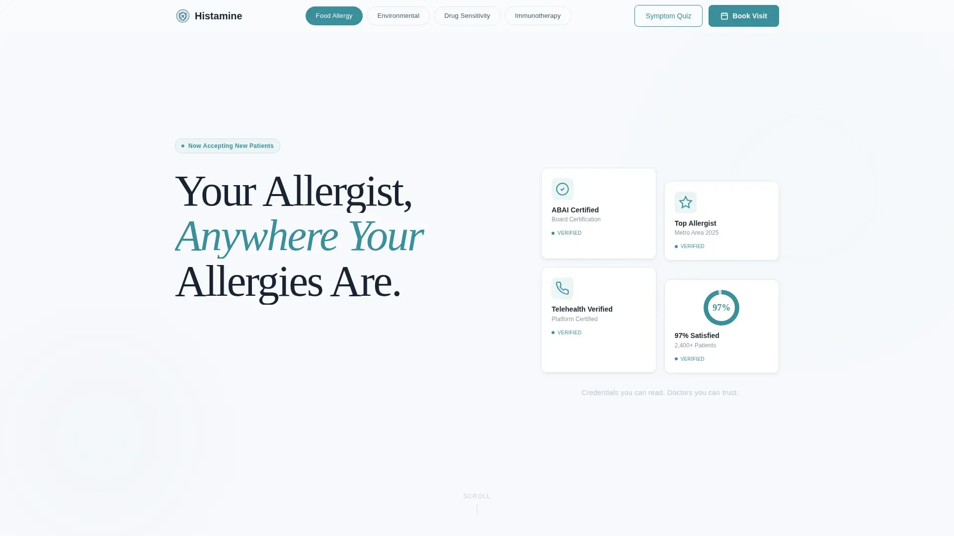
- A hero section with award badge mosaic, a bold Fraunces serif headline, and a credential side panel
- Four hub sections covering Food Allergy, Environmental Allergy, Drug Sensitivity, and Immunotherapy Management, each with its own testimonial mosaic
- A three-step progressive booking form with insurance carrier dropdown, symptom category selector, and a calendar showing allergist names and photos
Feature list
This template is built around one conversion goal: getting a qualified patient to book a virtual allergy visit. Every feature below serves that outcome directly.
Sticky Anchor Navigation with Active States
A pill-style sticky nav sits at the top of the viewport and scrolls with the visitor at all times. The four hub topics appear as nav items. The active section highlights in decisive teal, giving visitors an instant sense of where they are and where they can go next. The primary booking call to action is pinned inside this nav permanently.
Testimonial Mosaic Grid
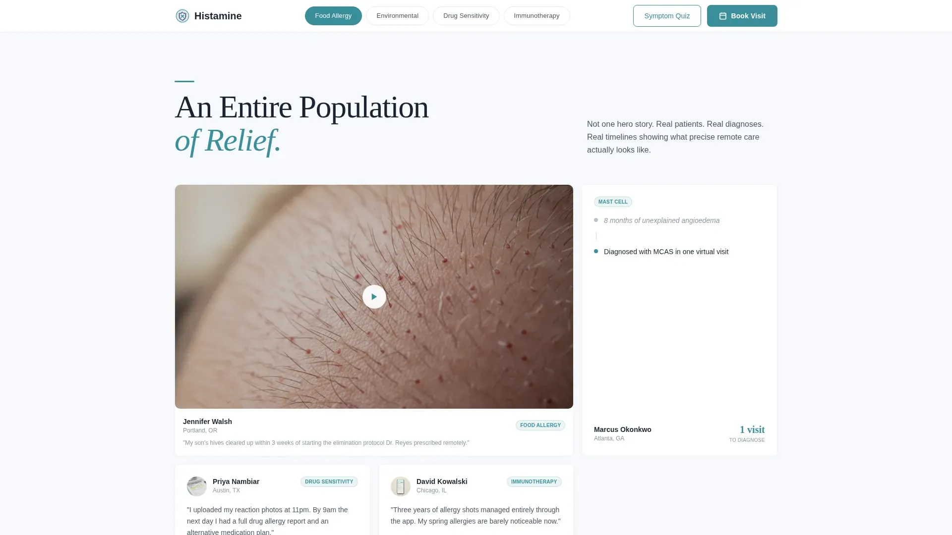
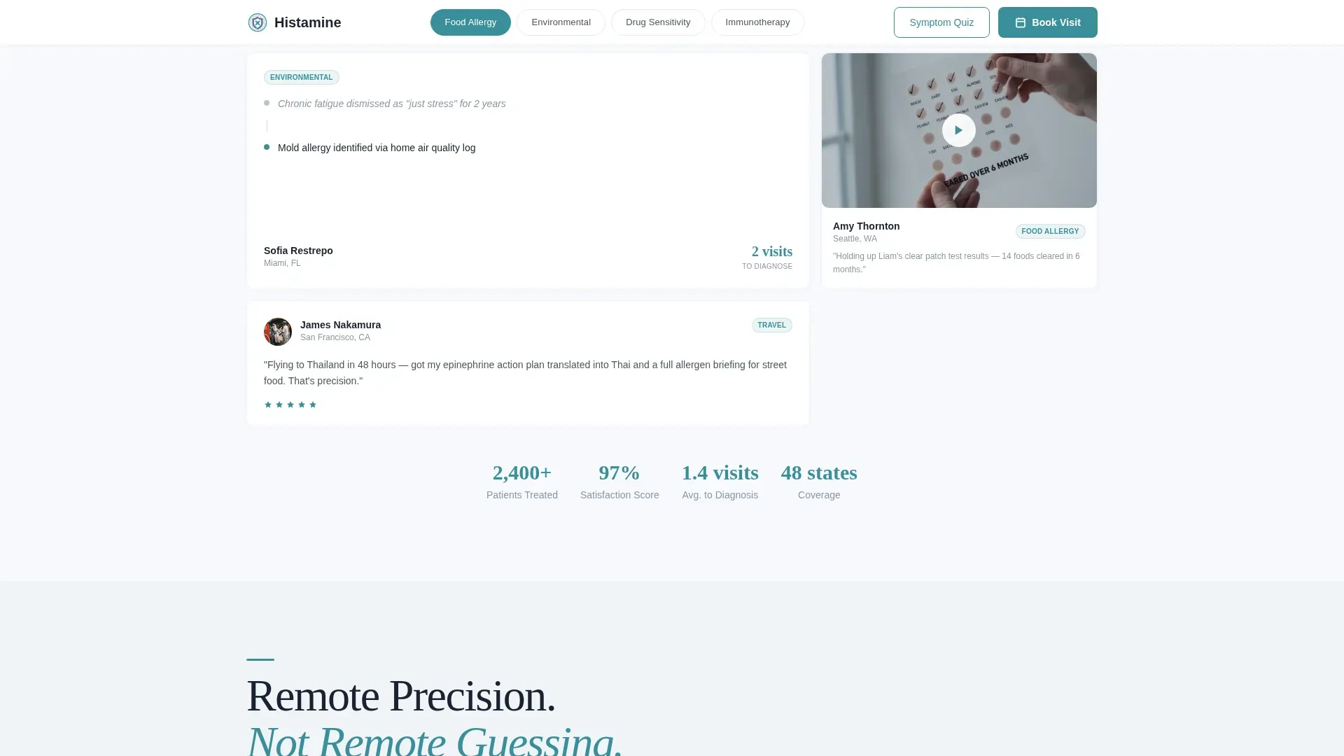
Each hub section opens with a tiled grid of patient intake-style cards. Cards include pull quotes, diagnosis-to-resolution timelines, and video thumbnails. The mosaic grows denser as the visitor scrolls, building collective proof across a visible patient population rather than relying on a single hero story.
Three-Step Progressive Booking Form
The booking section uses a three-step sequence designed to reduce anxiety at each stage. Step one is an insurance carrier dropdown. Step two is a symptom category selector that mirrors the hub topics. Step three shows a calendar with next-available slots, each paired with the allergist's name and photo.
Symptom Assessment Quiz Modal
A secondary conversion path labeled "Not Sure Yet? Take Our Symptom Assessment" opens a five-question modal quiz. The quiz ends with a personalized recommendation and a pre-filled booking form, capturing visitors who are not ready to commit on the first visit.
Award Badge Header Panel
The header displays board certification seals, metro-area recognition badges, telehealth verification marks, and a numerical patient satisfaction score. Each badge renders with a micro-shadow to give it physical weight. This section communicates credentials visually before the visitor reads a single headline.
Hub and Spoke Section Architecture
Four specialty hubs anchor the page structure. Each hub is reachable from the sticky nav and contains its own testimonial mosaic and contextual content. This architecture lets visitors self-select into the topic most relevant to their situation without scrolling through unrelated content.
Page sections overview
| Section | Purpose |
|---|---|
| Hero with Badges | Establish credentials and prompt first booking action |
| Sticky Hub Nav | Let visitors navigate to their relevant specialty topic |
| Food Allergy Hub | Address parents and pediatric food reaction cases |
| Environmental Allergy Hub | Cover seasonal, indoor, and airborne triggers |
| Drug Sensitivity Hub | Support adults with medication reaction histories |
| Immunotherapy Hub | Guide patients managing ongoing allergy protocols |
| Testimonial Mosaic | Build trust through diagnosis-to-resolution case cards |
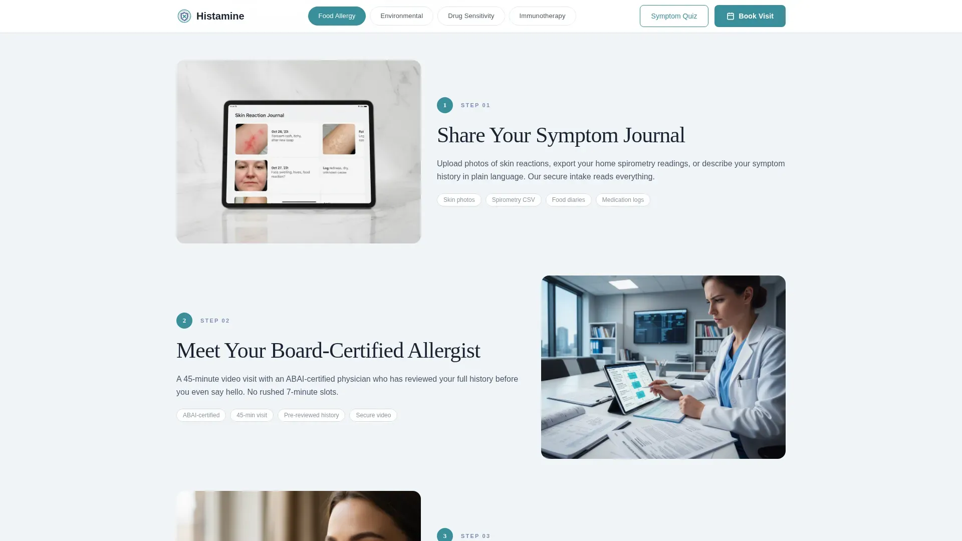
| How It Works | Explain the three-step remote consultation process |
| Booking Section | Convert visitors with the progressive appointment form |
| Linear Footer | Provide practice information in a single-row layout |
Design & branding system
The visual identity follows a Corporate Precision theme expressed through the Soft Mist color system. Every color choice reinforces the feeling of a clean, well-lit examination room where precision and calm coexist.
- Clinical white (#F7F9FC) for page backgrounds, morning fog gray (#D6DCE5) for section dividers and card surfaces, and muted periwinkle (#7B8FB2) for nav highlights and structural accents
- Decisive teal (#3A8F9B) is reserved exclusively for buttons and active nav states, ensuring every interactive element is immediately recognizable
- Fraunces serif is used for headlines to add human warmth to a clinical layout, while DM Sans handles all body text and interface labels for clean readability
Mobile & speed optimization
The template is built mobile-first, reflecting the reality that parents often search for allergy help on a phone during or right after a reaction episode. The layout stacks and reflows predictably across screen sizes.
- The sticky anchor nav collapses cleanly on small screens, keeping the booking call to action always reachable without overwhelming the viewport
- Interactive components such as the booking form and symptom quiz modal are isolated as client-side interactions, keeping the static page base lightweight to load
- Medium-intensity animations including spotlight mouse-tracking, text reveal, scroll scrub, and stagger reveals are included but structured so they do not block primary content from appearing
How this template helps you convert
The entire page is designed around a single conversion goal: a completed virtual allergy visit booking. Every structural decision supports that outcome.
- The award badge header and testimonial mosaic establish enough clinical trust within the first two scroll depths that hesitant visitors are less likely to leave before reaching the booking section
- The three-step progressive booking form reduces drop-off by surfacing the insurance question first, removing cost uncertainty before the visitor is asked to commit to a time slot
- The symptom quiz modal creates a second conversion path for undecided visitors, ending with a pre-filled booking form so the transition from curiosity to commitment requires minimal effort
Other information about this template
This template is categorized under Health & Medical, specifically the Allergist Website subcategory, and is designed around the Allergist Virtual Consultation Page niche. It is localized for the United States market, using USD pricing references and the US date format in the booking calendar. The footer follows a linear single-row pattern, keeping the page clean without a heavy multi-column footer block. Animation intensity is set to medium, with spotlight mouse-tracking, text reveal on scroll, scroll scrub effects, and stagger reveal transitions built in. Interactivity is set to high, covering the anchor nav, the three-step booking form, the symptom quiz modal, and the hub section toggle behaviors. The template is built static-first, with client-side interactions isolated to the booking and quiz components to keep the base page performant without sacrificing engagement features.
- Template style: Hub and Spoke with Anchor Navigation
- Theme: Corporate Precision
- Color system: Soft Mist
- Creative direction: Testimonial Mosaic
- Header concept: Award Badges
- Primary conversion direction: Booking and Scheduling
Theme
Corporate Precision
Creative direction
Testimonial Mosaic
Color system
Soft Mist
Style
Hub & Spoke (Anchor Nav)
Direction
Booking/Scheduling
Page Sections
Sticky Anchor Nav with Booking Call to Action
Testimonial Mosaic with Case Timelines
Three-step Progressive Booking Form
Symptom Assessment Quiz Modal
Award Badge Credential Header
Hub and Spoke Page Architecture
Related questions
Can I customize the four hub topics to match my practice's specialties?
How does the symptom quiz capture visitors who are not ready to book?
Is the booking form connected to a live scheduling system out of the box?
Does the testimonial mosaic require video content to display correctly?
Who is this landing page template best suited for?



