Wedding Consulting Professional Website Template
Clause is a single-column landing page template built for wedding technology consultants. It uses a legal-document visual language, stark typographic statements, and a stats-first scroll flow to expose real risks inside wedding platforms. The page earns trust by giving away alarming findings before guiding visitors toward a gated checklist download.
by Rocket studio
Quick summary
Clause is a single-column landing page template designed for a wedding technology consultant. It opens with a viewport-filling typographic manifesto, then walks visitors through escalating data-risk statistics before offering a downloadable audit checklist. The design feels like a legal brief made readable, using ink and paper tones to build authority without losing warmth.
Who this template is for
This template is built for consultants who sit between couples and the wedding technology industry. It speaks directly to a professional who investigates platform terms, negotiates vendor contracts, and advocates for the people who click "I Agree" without reading.
- Wedding technology consultants advising engaged couples on platform risks
- Independent advisors helping wedding planners navigate mid-season contract changes
- Professionals serving venue owners concerned about guest data harvesting by booking software
What problem this template solves
Couples, planners, and venue owners face a sprawling wedding technology market full of opaque terms and quiet data practices. A consultant in this space needs a page that builds the case for their value quickly and credibly, before a visitor bounces.
- Visitors arrive skeptical and need immediate proof that real risks exist
- Most service pages bury the offer; this template leads with alarming facts that earn the download
- The page must convert anxious, information-overloaded visitors into leads without feeling like a sales pitch
What you get with this template
You get a fully structured, single-column landing page layout built around a stats-first editorial flow. Every section is purposefully sequenced to escalate stakes and then offer relief, moving the visitor from concern to confident action.
- A viewport-filling header manifesto, three pre-gated statistics with explanatory prose, and two conversion-gated content offers
- A typographic system rooted in high-contrast serif fonts that feel authoritative without being cold
- A complete Ink and Paper color palette applied across all sections, callouts, and interactive accents
Feature list
This template ships with a set of purposeful, prompt-backed design and layout capabilities built specifically for this consulting use case.
Typographic Manifesto Header
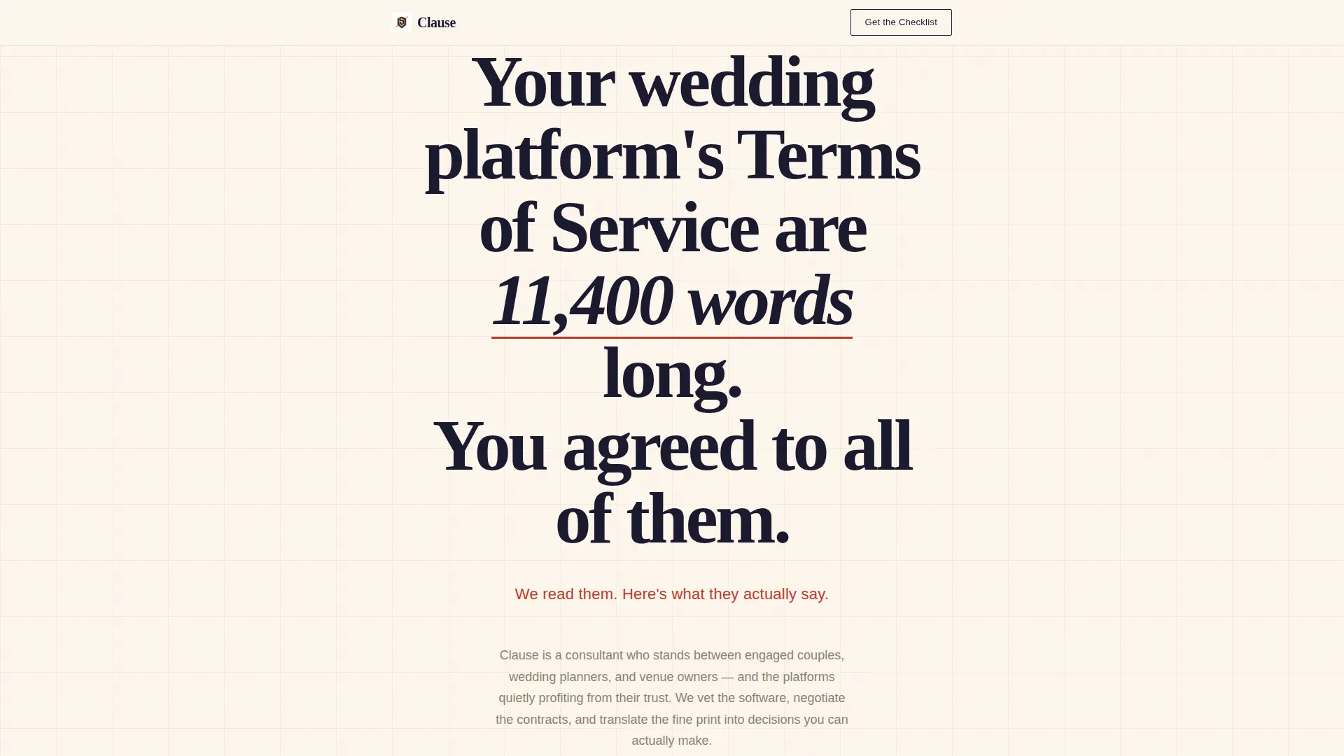
The header fills the entire viewport with a single stark statement in high-contrast serif type on notary cream. No imagery competes with the words. Below the main statement, a smaller line in redline red delivers the consultant's direct counter-claim, setting the page's tone immediately.
Stats-First Scroll Architecture
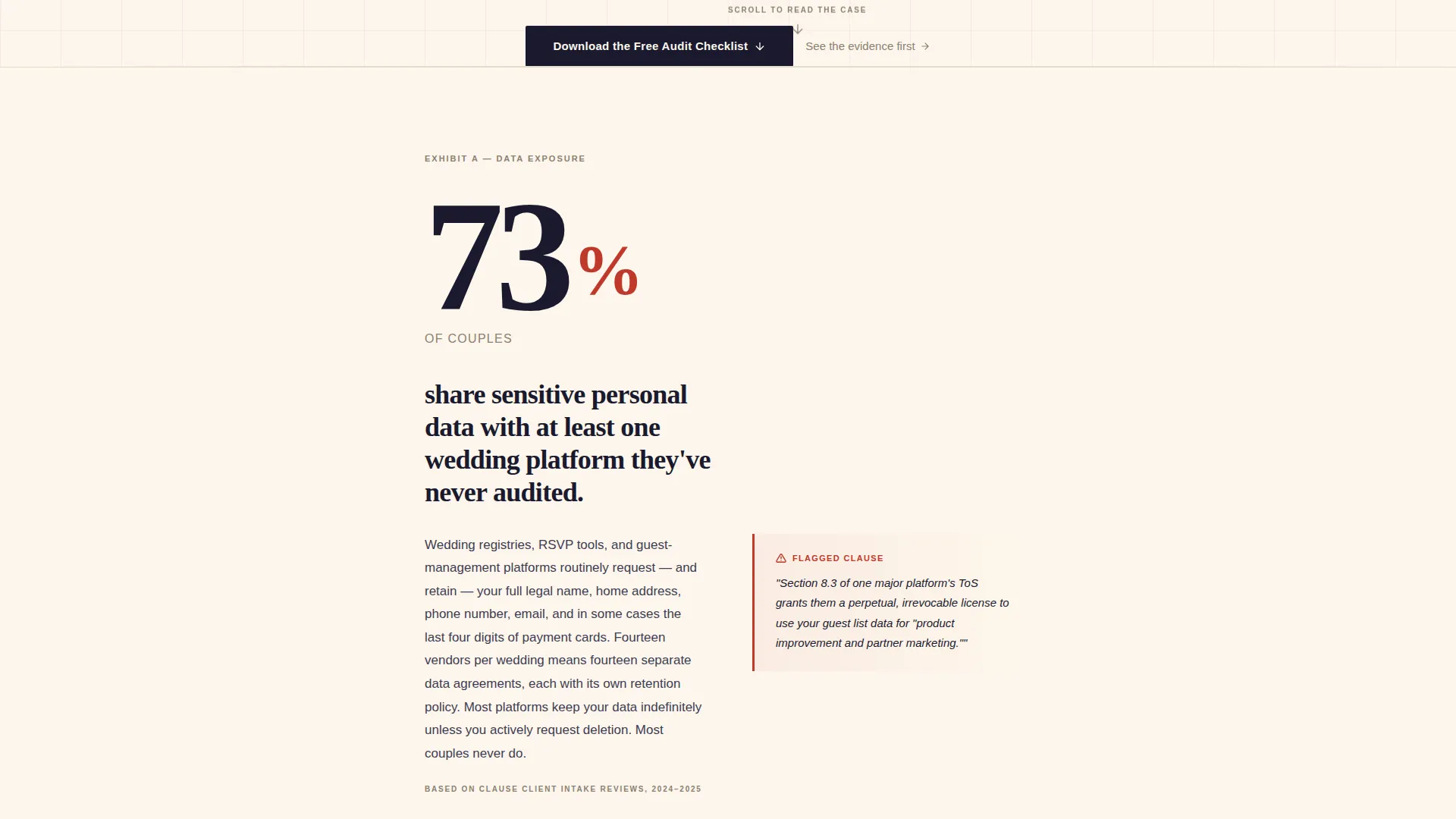
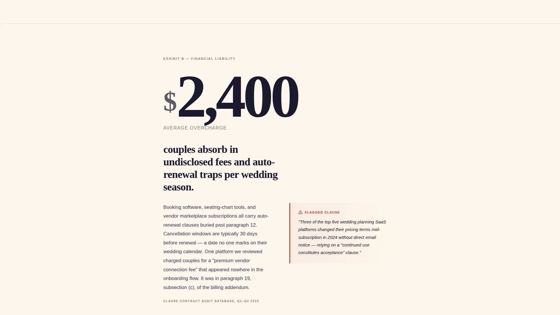
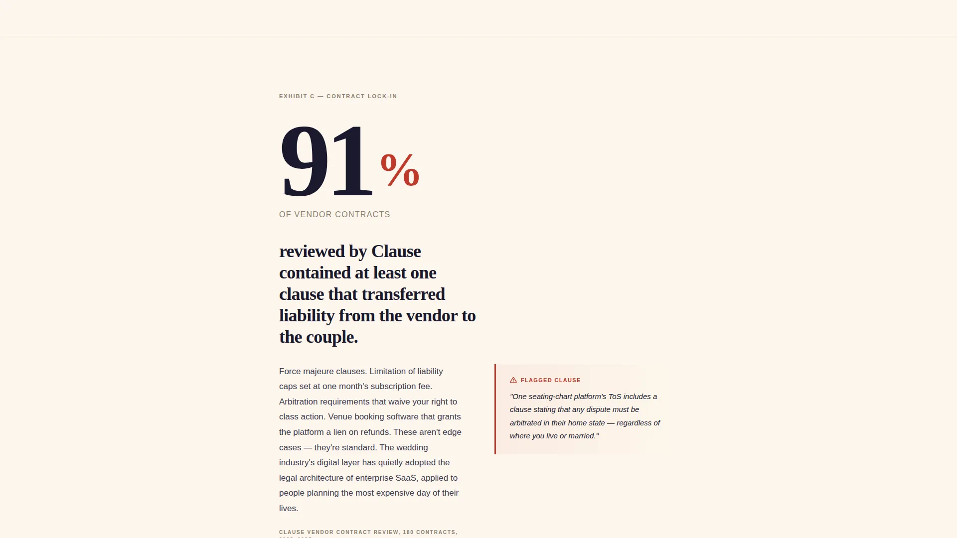
Each scroll step reveals a large-format statistic before its explanation. The number lands first at an enormous scale, then measured prose unpacks the context below it. Sections alternate between exposed risk and specific countermeasure, creating a tension-and-relief rhythm that keeps the visitor reading.
Dual Gated Offer Placement
The primary call to action, a checklist download requiring only a first name and email, appears after the third statistic when urgency peaks naturally. A secondary offer to read a full vendor comparison report sits behind the same lightweight form, giving visitors two reasons to convert at the same moment.
Legal-Document Color System
The Ink and Paper palette applies deep contract black for body text, notary cream as the dominant background, redline markup red for warnings and flagged terms, and clause-highlight gold for protective callouts and key statistics. The result reads like a freshly printed legal brief on heavy cotton stock.
Pre-Gated Free Findings
Three genuinely alarming findings are delivered in full before any form gate appears. This structure proves the checklist's value before asking for an email address, making the opt-in feel like a logical next step rather than an interruption.
Single-Column Editorial Flow
The entire page runs as one uninterrupted vertical column. There are no sidebars, no competing panels, and no distracting navigation. The layout keeps the visitor's attention locked on each successive data point and its corresponding explanation.
Page sections overview
| Section | Purpose |
|---|---|
| Manifesto Header | Opens with a stark, viewport-filling typographic statement that frames the platform-risk problem immediately |
| Red Warning Subline | Delivers the consultant's direct counter-claim in redline red directly beneath the manifesto |
| Statistic One | Reveals the first data point at large scale, then unpacks its meaning in measured prose |
| Statistic Two | Escalates stakes with a second risk finding, shifting focus to financial liability |
| Statistic Three | Peaks urgency with the third alarming finding before the primary conversion offer |
| Primary call to action Block | Presents the checklist download form, requiring only a first name and email address |
| Countermeasure Section | Describes the consultant's specific protective services as relief after the risk buildup |
| Secondary Offer Block | Gates the full vendor comparison report behind the same lightweight form |
Design & branding system
The visual identity follows a Legal Shield theme executed through an Ink and Paper color system. Typography is the primary design element throughout, with no decorative imagery competing for attention at any point.
- Color palette: deep contract black (#1A1A2E) for body text, notary cream (#FDF6EC) as the dominant background, redline markup red (#C0392B) for warnings and flagged terms, and clause-highlight gold (#D4A957) for protective callouts and statistics
- Typography: high-contrast serif typeface styled to feel like a legal document redesigned for readability, with no decorative elements anywhere on the page
Mobile & speed optimization
The single-column layout translates directly to mobile without requiring structural rearrangement. The stats-first scroll flow performs the same way on a phone screen as on a desktop, because the layout was designed as a vertical column from the start.
- Large-format statistics remain legible and impactful at smaller viewport widths
- The lightweight form requiring only a first name and email keeps the conversion path frictionless on any screen size
How this template helps you convert
The page is structured as a Content and Resource destination rather than a direct sales page. It earns conversions by delivering real value before asking for anything in return.
- Three free alarming findings are presented in sequence before any form gate appears, proving the checklist's worth and making the download feel necessary rather than optional.
- The primary call-to-action form appears precisely after the third statistic, when the visitor's urgency is at its natural peak, reducing friction at the moment of highest intent.
Other information about this template
This template was designed to serve the wedding compliance consulting niche, a professional category that sits at the intersection of consumer advocacy and the wedding technology industry. The layout style draws from editorial and magazine design principles applied through a Corporate Precision theme, making it equally suited for a consultant building a new practice or an established advisor repositioning for a higher-value clientele.
- The template style follows an Editorial and Magazine approach, giving the page a publication-grade feel that reinforces the consultant's authority
- The header concept uses a high-contrast typographic treatment rather than a dark full-bleed image, keeping the focus entirely on the written statement
- The overall theme is Corporate Precision: clean, deliberate, and structured to signal expertise without visual excess
- This template is a strong fit for the Wedding Compliance Consultant niche within the broader Professional Services and Wedding Consulting category
Theme
Corporate Precision
Creative direction
Case Study Narrative
Color system
Navy Authority
Style
Editorial/Magazine
Direction
Click-Through
Page Sections
Typographic Manifesto Header
Stats-first Scroll Architecture
Dual Gated Offer Placement
Ink and Paper Color System
Pre-gated Free Findings
Single-column Editorial Layout
Related questions
Can I use this template without a large content library?
Does the lead capture form require complex setup?
Is this template suitable for a consultant who is just starting out?
Can I adjust the color palette to match my personal branding?
What type of content works best in the statistics sections?



