Healthcare & Hospital Design Professional Website Template
Cleanroom is a pharmaceutical facility design landing page template built for firms that engineer GMP-compliant manufacturing environments. The masonry grid turns into an interactive facility explorer where each zone card expands in place. A Void and Violet color system, ultra-thin typography, and a scroll-driven consultation call to action make this template feel as controlled and precise as the facilities it represents.
by Rocket studio
Quick summary
Cleanroom is a single-page landing page template for pharmaceutical and biotech facility design firms. It uses an interactive masonry grid to let visitors explore cleanroom zones before a consultation call to action earns their click. The Void and Violet palette and ultra-thin hero typography create a precise, clinical atmosphere that matches the technical authority the firm needs to project.
Who this template is for
This template is built for B2B professional services firms operating at the intersection of architecture and pharmaceutical manufacturing. It speaks to decision-makers who evaluate vendors on proven spatial and technical expertise, not on generic portfolio slides.
- Pharmaceutical facility design firms pitching to biotech COOs and pharma VPs of Engineering
- Contract development and manufacturing organization founders building their first Good Manufacturing Practice facility
- Architecture and engineering studios that need a landing page to convert qualified prospects into consultation bookings
What problem this template solves
Pharmaceutical facility design is a high-stakes, high-complexity service. Generic architecture portfolio pages cannot communicate the precision, classification knowledge, and regulatory fluency that biotech and pharma buyers require before they commit to a consultation.
- Prospects have no way to experience the firm's spatial intelligence before a call
- Standard landing pages flatten highly technical services into bullet points that do not build trust
- The gap between "we design cleanrooms" and "we understand your pressure cascade problem" is too wide for a static page to bridge
What you get with this template
You get a fully structured landing page designed to guide a senior pharmaceutical or biotech decision-maker from first impression to consultation booking. The template delivers its proof of expertise through interaction, not text volume.
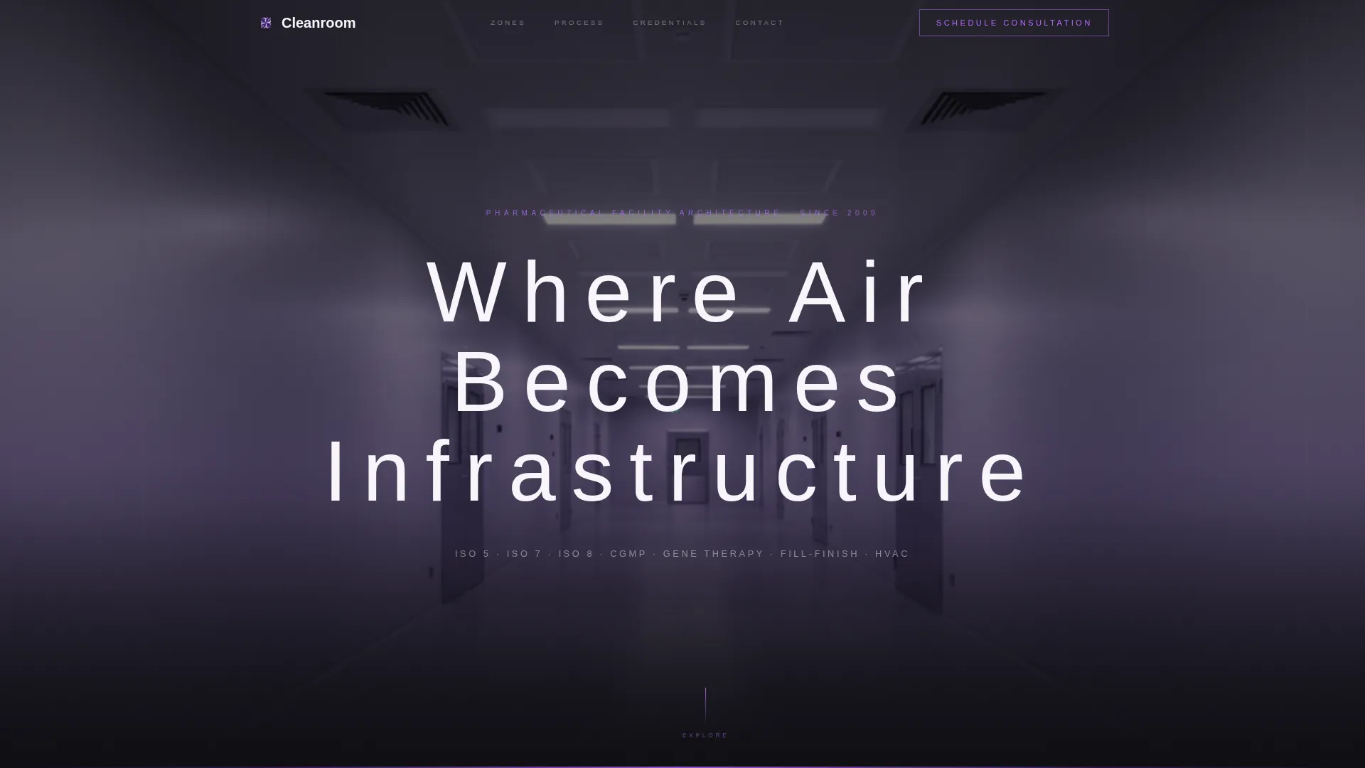
- A full-bleed hero section with a one-point-perspective cleanroom corridor photograph and a floating ultra-thin headline
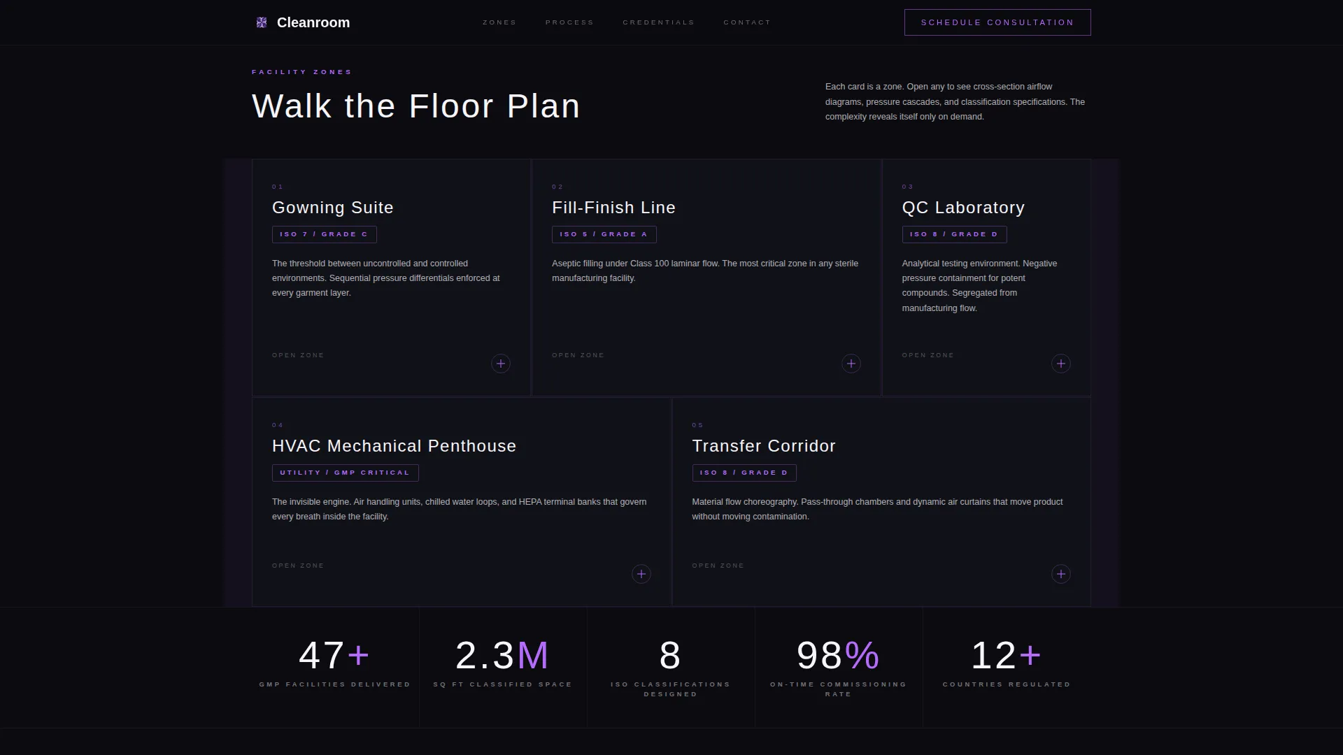
- An interactive masonry zone explorer with facility cards that expand in place to reveal cross-section diagrams, airflow animations, and classification specifications
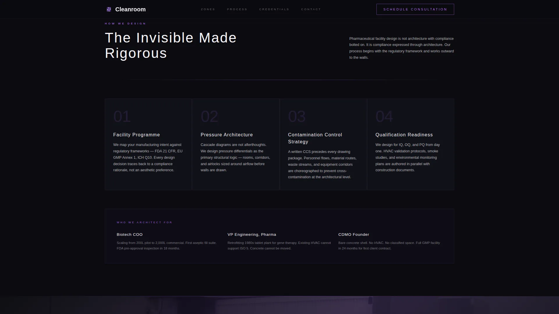
- A credentials strip, a process architecture section, a context-triggered call to action bar, and a horizontal footer
Feature list
Expanding Zone Explorer Grid
The masonry grid functions as a navigable facility tour. Each card represents a distinct cleanroom zone, including the gowning suite, fill-finish line, quality control laboratory, HVAC mechanical penthouse, and warehouse-to-cleanroom transfer corridor. Clicking a card expands it in place to show cross-section diagrams, airflow animations, and classification specs without leaving the page.
Interaction-Triggered Call to Action
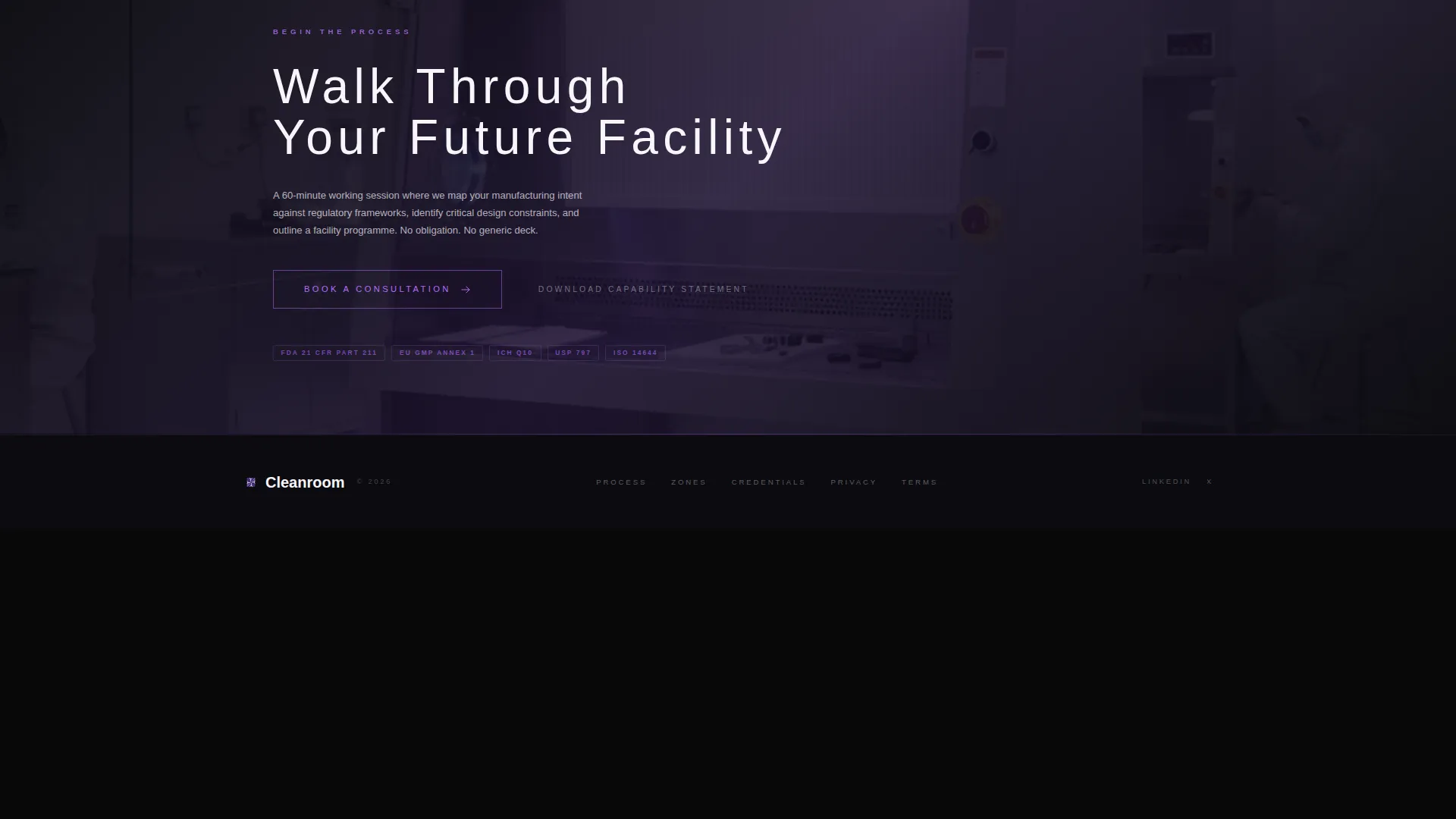
The primary call to action, labeled "Walk Through Your Future Facility," does not appear immediately. It surfaces as a ghost button in orchid violet after the visitor's third card interaction, then locks into a persistent bottom bar once two or more zones have been explored. The sequence ensures the click earns its trust before asking for it.
GSAP ScrollTrigger Animation System
Scroll-driven animations power the card transitions, grid rearrangements, and airflow SVG sequences. The grid subtly shifts card weight with each interaction to guide the visitor's eye deeper into the facility tour. Animations are scoped to client components while static sections use server rendering.
Cursor-Reactive Visual Layer
The Void and Violet palette responds to cursor position. Violet edges bleed into card borders only where the visitor's cursor travels. This keeps the surface minimal while signaling interactivity without cluttered user interface elements.
Credentials and Classification Strip
A dedicated credentials strip displays completed facility counts, ISO classification references, and project type categories. The strip gives buyers the social proof data they need to qualify the firm quickly, presented in a clean typographic band between the zone explorer and the process section.
Ultra-Thin Hero Typography
The hero headline, set in DM Sans at ultra-light weight with wide letter-spacing, floats over the full-bleed cleanroom corridor photograph. The type is white, positioned at vertical center, and reads like a pressure reading on a monitoring display. There is no subheadline and no button, keeping the opening impression clean and commanding.
Page sections overview
| Section | Purpose |
|---|---|
| Hero Full-Bleed | Establish authority with a cinematic cleanroom corridor image and floating headline |
| Zone Explorer Masonry | Let visitors interactively tour facility zones through expanding cards |
| Credentials Strip | Display completed facilities, ISO classifications, and project types |
| Process Architecture | Show how invisible infrastructure is designed from brief to build |
| Call to Action Bar | Trigger consultation intent with a ghost button that becomes a persistent bar |
| Horizontal Footer | Close the page with structured navigation and firm contact context |
Design & branding system
The Void and Violet color system is built around four precise values that mirror the atmosphere of a Class 100 cleanroom after hours. Every color decision serves a functional role in the visual hierarchy.
- Void black (#0B0B0F) dominates negative space between masonry cards, giving the layout its clinical weight
- Pharmaceutical-grade white (#F7F5FA) fills card faces to keep content legible and surface-level minimal
- Deep ultraviolet (#3D1F72) provides structural contrast for section dividers and depth layers
- Luminous orchid (#B56BFF) is reserved for hover states, active links, interactive waypoints, and the call to action ghost button
Mobile & speed optimization
The template is architected desktop-first, which matches the way biotech COOs and pharma VPs of Engineering typically review vendor materials. Tablet support is included for secondary review sessions.
- Server Components handle all static sections to keep the initial page load lightweight
- Client Components are scoped to the interactive masonry grid, card expansions, and GSAP-driven animations
- The design hierarchy and card grid are structured to remain readable on tablet viewports without compromising the desktop experience
How this template helps you convert
The template builds consultant trust through demonstrated expertise rather than stated claims. By the time a visitor reaches the call to action, they have already experienced the firm's spatial intelligence firsthand.
- The zone explorer turns passive scrolling into active facility exploration, so visitors leave the page with a felt sense of the firm's depth before any conversation begins
- The interaction-triggered call to action sequence times the booking prompt to appear only after meaningful engagement, reducing low-intent clicks and improving the quality of consultation leads
Other information about this template
This template is designed for English-language, United States-market deployment with pricing and context set in USD. The typography pairing uses DM Sans at ultra-light weight for the hero and Manrope for all body and interface copy. The masonry layout style follows a Pinterest-inspired card grid that rearranges subtly as visitors interact with zones.
- Template style: Masonry and Pinterest grid layout
- Typography: DM Sans (hero, ultra-light), Manrope (body)
- Animation library: GSAP with ScrollTrigger for scroll-driven and interaction-driven sequences
- Localization: English, United States, USD
- Device priority: Desktop-first with tablet support included
Theme
Luxe Minimal
Creative direction
Interactive Explorer
Color system
Void & Violet
Style
Masonry/Pinterest
Direction
Click-Through
Page Sections
Expanding Zone Explorer Grid
Interaction-triggered Call to Action
GSAP Scrolltrigger Animations
Cursor-reactive Violet Edges
Credentials and Classification Strip
Ultra-thin Hero Typography
Related questions
Does this template include a contact form?
How does the interactive zone explorer work?
Is this template suitable for firms designing both pharmaceutical and biotech facilities?
What level of animation does this template use?
Can the color system and typography be adapted to a different brand?



