Skincare & Derma Clinic Booking Website Template
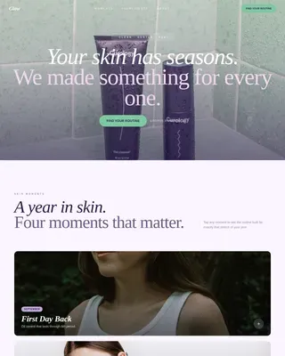
Clear is a Luxe Minimal landing page template built for acne treatment clinics. It pairs a full-viewport macro skin photo with a three-step personalized quiz, a modular card-grid treatment journey, before-and-after proof sections, and a persistent call-to-action bar. Every section is designed to move first-time visitors from skepticism to a booked consultation.
by Rocket studio
Quick summary
Clear is a single-page acne clinic template built around one core idea: give visitors a personalized treatment plan before they ever book. A macro close-up hero, a modular card grid, and a three-step visual quiz work together to guide frustrated skin-care seekers toward a confident consultation booking. The design is soft, clinical, and deliberately calm.
Who this template is for
This template is built for clinics and medical-aesthetic practices that treat acne, scarring, and hormonal skin concerns. It speaks directly to the audiences most likely to book when they feel genuinely understood.
- Acne treatment clinics offering LED therapy, medical-grade peels, and clinical extractions
- Skincare and derma clinic operators who want a quiz-led conversion flow rather than a generic booking form
- Clinic owners targeting young adults, bridal clients, and professionals with real timeline pressure
What problem this template solves
Most clinic landing pages ask visitors to book before they understand what they actually need. That gap creates hesitation. Potential clients who have already failed drugstore routines and social-media advice need to feel clinically seen before they commit.
- Visitors leave without booking because no treatment is explained in terms of their specific concern
- The consultation offer feels generic, so high-intent visitors delay or abandon entirely
- There is no visible proof that the clinic understands the difference between cystic acne, hormonal flares, and texture scarring
What you get with this template
You get a complete, ready-to-customize landing page built around a quiz-to-recommendation conversion flow. Every section is designed to reduce doubt and build trust progressively as the visitor scrolls.
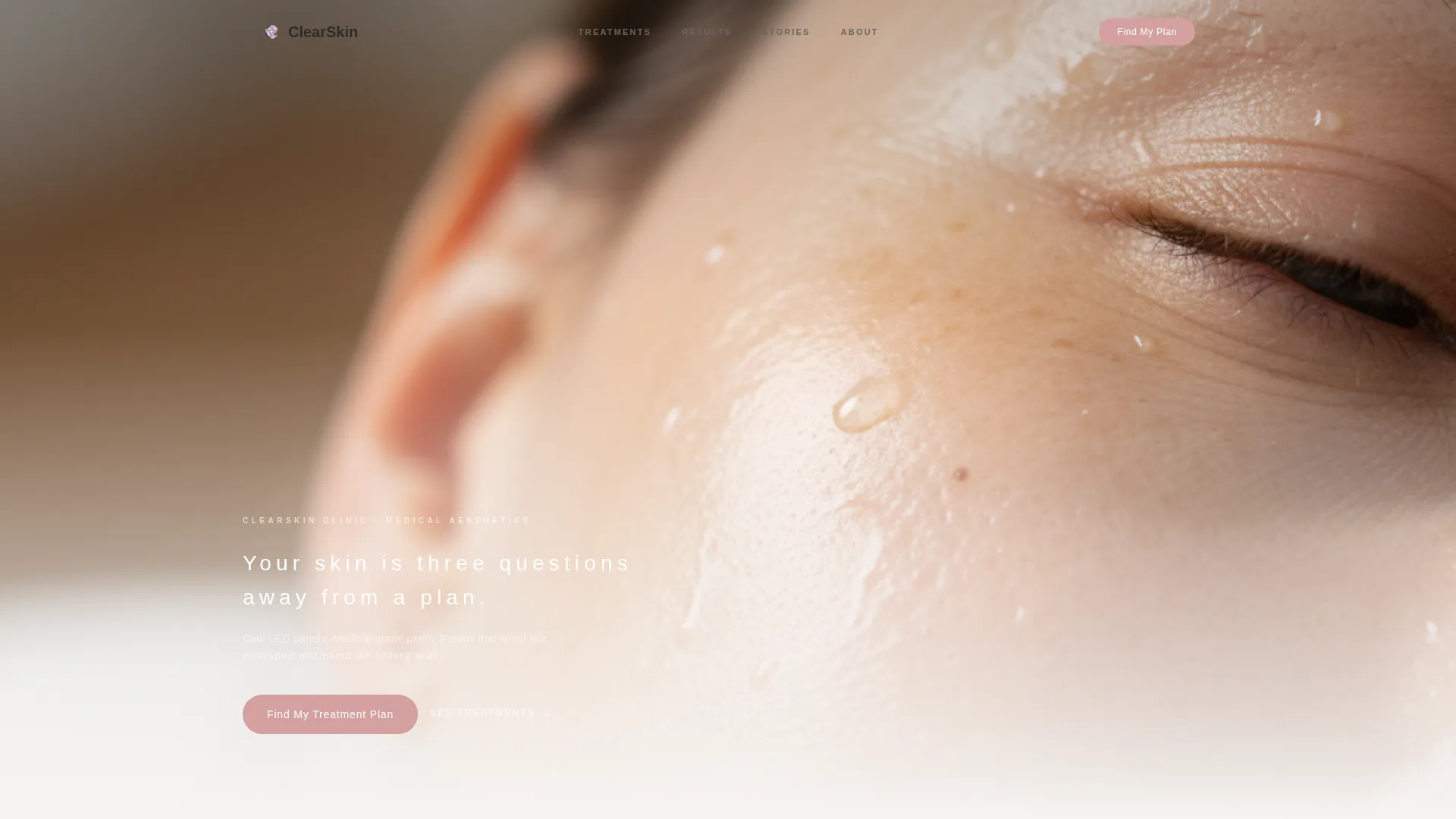
- A full-viewport macro hero with a delayed headline reveal and a clinic-rose primary call-to-action button
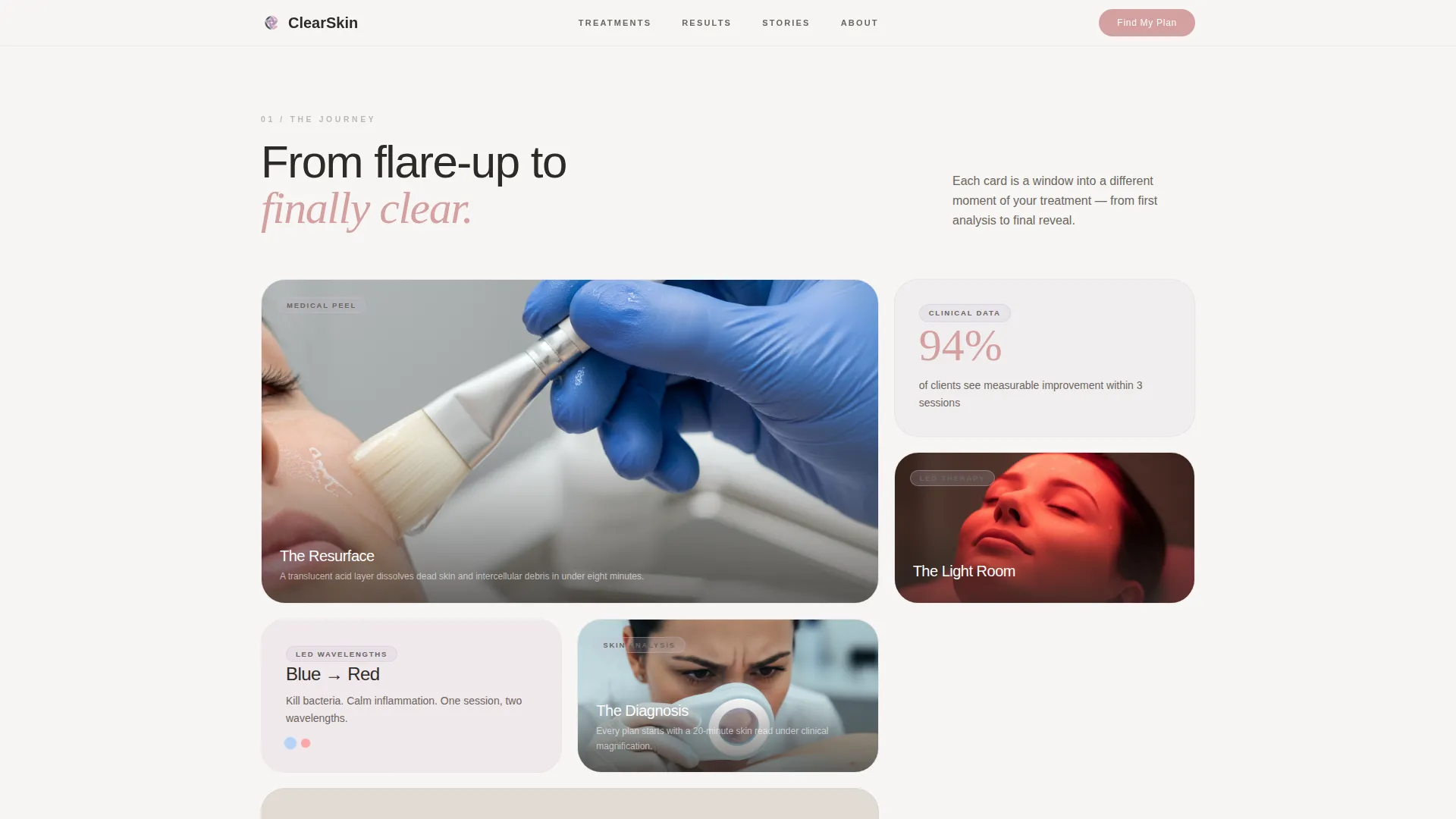
- A modular bento card grid that walks visitors through sensory treatment moments, paired before-and-after photography, and a segmented treatment menu
- A three-step visual quiz modal with horizontal slide transitions, a whisper-lilac progress bar, and an on-screen personalized recommendation on completion
Feature list
This template bundles a focused set of interactive and visual components, each serving the quiz-to-consultation conversion goal.
Full-Viewport Macro Hero
The hero fills the screen edge to edge with an extreme-detail photograph of real, healthy post-treatment skin. After a brief pause, a single tracked-out headline fades in over the image. The primary call-to-action button in clinic rose sits directly beneath it.
Three-Step Visual Quiz Modal
Clicking the primary call-to-action opens a modal quiz. Step one presents tappable image cards for skin concern type. Step two asks what the visitor has already tried. Step three captures name, email, and preferred location. Each step slides in horizontally, and a whisper-lilac progress bar marks advancement. On completion, a personalized treatment recommendation appears on-screen immediately, with a secondary "Book a Free Skin Consultation" button beneath it.
Modular Bento Card Grid
The treatment journey section uses a card-grid layout where each card frames a distinct sensory or clinical moment. Cards include close-up treatment photography, a looping LED light video, and before-and-after chin photography in paired clinical lighting. Each row fades up with a slight vertical lift as it enters the viewport, creating a lookbook-style scroll cadence.
Persistent Bottom Call-to-Action Bar
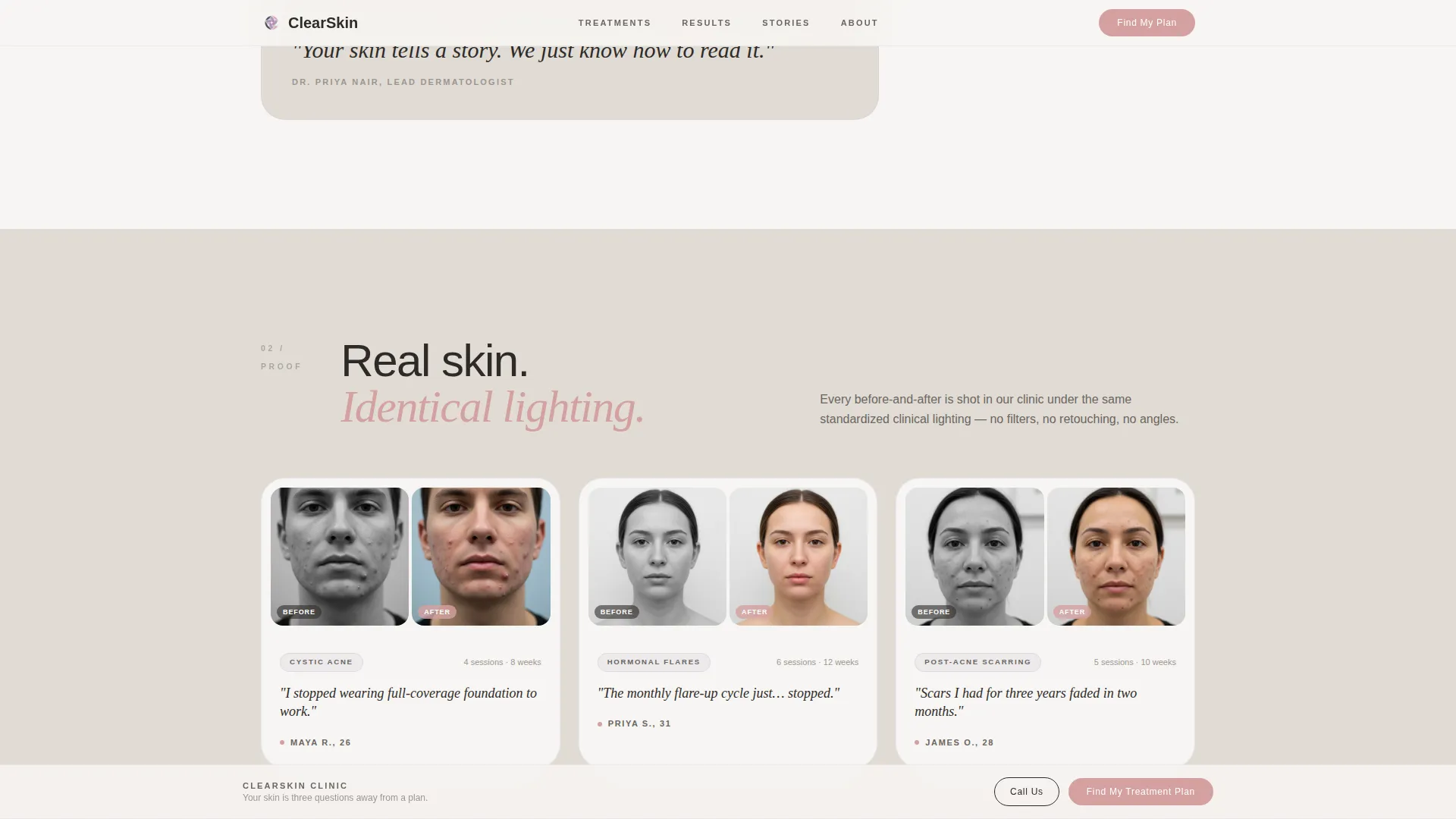
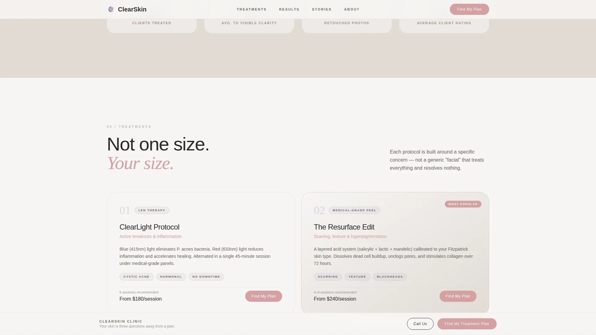
After the visitor scrolls past the second section, a fixed bottom bar appears carrying the primary call-to-action. It remains visible throughout the rest of the scroll, keeping the quiz entry point accessible at all times without interrupting the reading experience.
Before-and-After Proof Grid
A dedicated section presents clinical paired photography organized by concern type. Each pairing uses identical lighting conditions to make the comparison credible and consistent, rather than relying on dramatic filter changes.
Named Client Testimonial Section
A client stories section displays named testimonials that reference specific concerns and outcomes. Each entry is tied to a real result rather than a general endorsement, giving prospective clients a realistic sense of what the clinic delivers.
Page sections overview
| Section | Purpose |
|---|---|
| Hero with Quiz call to action | Introduce the clinic and trigger quiz entry |
| Treatment Journey Cards | Show sensory moments of the treatment process |
| Before and After Proof | Demonstrate clinical results by concern type |
| Treatment Menu Grid | Present services segmented by skin concern |
| Client Stories | Build trust with named, outcome-specific testimonials |
| Quiz Modal | Deliver a personalized plan in three guided steps |
| Footer | Provide navigation and clinic identity links |
Design & branding system
The visual identity follows a Luxe Minimal theme built around a Soft Mist color palette. Every color choice reinforces a feeling that is clinical without being cold, and soft without being vague.
- Colors: cloud-white (#F7F5F3) and morning fog (#E0DBD5) alternate as section backgrounds; whisper lilac (#C9BFD4) marks card borders and progress indicators; clinic rose (#D4A0A0) is reserved for call-to-action buttons and interactive hover states; deep graphite (#2E2B28) anchors all body text
- Typography: DM Sans carries all primary body and interface copy; Fraunces, a serif typeface, is used as an accent for the hero headline and pull-quotes throughout the page
- Animation: GSAP ScrollTrigger drives staggered card reveals and a parallax hero effect; quiz step transitions use smooth horizontal slides; no Lenis scroll library is used
Mobile & speed optimization
The template is designed mobile-first, reflecting the primary audience of young adults browsing on their phones. Desktop receives equal visual polish without sacrificing the mobile experience.
- Layout and card grid reflow gracefully across phone, tablet, and desktop breakpoints
- Native CSS smooth scroll is used for in-page navigation, keeping scroll behavior consistent without additional libraries
- Server Components handle all static sections, while Client Components are scoped to the quiz modal and animation layers
How this template helps you convert
Every design and interaction decision in this template is aimed at reducing friction between a first-time visitor and a booked consultation.
- The macro hero creates an immediate emotional response, and the delayed headline rewards attention before presenting the call-to-action, so the visitor is already engaged when they see it
- The three-step quiz replaces a generic booking form with a personalized experience, and the on-screen recommendation at the end gives visitors a reason to book because they already know what to expect
- The persistent bottom call-to-action bar keeps the quiz entry point visible throughout the entire scroll, so a visitor who reaches the testimonials or the treatment menu never has to scroll back up to act
Other information about this template
This template is categorized under Beauty and Personal Care, with a specific focus on the Skincare and Derma Clinic subcategory and the Acne Treatment Clinic niche. It is built for direct-to-consumer, appointment-led businesses operating in the United States market. Content and date formats follow English language and USD conventions.
- The footer uses an Arc Browser Split layout: clinic logo and tagline on the left, navigation links on the right
- All quiz interactions, animations, and the persistent bottom bar are built as Client Components, while the static page sections use Server Components for leaner rendering
- The template is designed for a single-page flow, making it a focused landing page rather than a multi-page website
Theme
Luxe Minimal
Creative direction
Immersive Visual
Color system
Soft Mist
Style
Card Grid (Modular)
Direction
Quiz/Assessment
Page Sections
Full-viewport Macro Hero
Three-step Visual Quiz Modal
Modular Bento Card Grid
Persistent Bottom Call to Action Bar
Clinical Before-and-after Grid
Named Client Testimonials
Related questions
Can I customize the quiz steps and answer options?
Does the quiz deliver the recommendation on-screen or by email?
Is this template suitable for a clinic that only offers one or two treatments?
What typefaces does this template use?
How does the before-and-after section handle photo uploads?