Dermatology & Skin Clinic Booking Website Template
A single-page landing page built for Mohs surgery and skin cancer clinics. It guides anxious patients from a self-assessment checklist through a clinical comparison table to a three-field consultation booking form. The design pairs deep surgical teal with warm linen and coral call-to-action buttons, creating a tone that feels both medically credible and genuinely reassuring.
by Rocket studio
Quick summary
This landing page template is designed for Mohs surgery clinics that need to turn uncertain, often worried patients into booked consultations. It opens with a portrait-centered hero, moves visitors through an interactive self-assessment and a side-by-side treatment comparison table, and closes with a focused booking form. The visual identity is clinical warmth: teal, sage, linen, and coral.
Who this template is for
This template is built for dermatology and skin cancer clinics that offer Mohs micrographic surgery as their primary procedure. It suits practices that want to educate patients before the appointment, not during it.
- Mohs surgeons and fellowship-trained dermatologic surgeons launching or refreshing a clinic page
- Practice managers who need a patient-acquisition page that addresses common pre-consultation anxieties
- Clinics serving facial and high-risk lesion cases where cure rate and tissue preservation are central selling points
What problem this template solves
Patients referred for Mohs surgery often arrive confused. They have a diagnosis but no clear picture of what the procedure involves, how it compares to other options, or whether their case is urgent. That uncertainty delays bookings and floods staff with phone calls.
- The template replaces that confusion with a structured, self-paced explanation that mirrors what a good pre-op conversation would cover
- It removes the common hesitation points: unknown cure rates, fear of scarring, and uncertainty about how many visits are required
- It gives already-diagnosed patients a direct path through the biopsy upload modal, so they are not forced through generic intake steps
What you get with this template
The template delivers a complete, single-page layout with every section already structured and connected. You do not need to source separate components or wire together a booking flow.
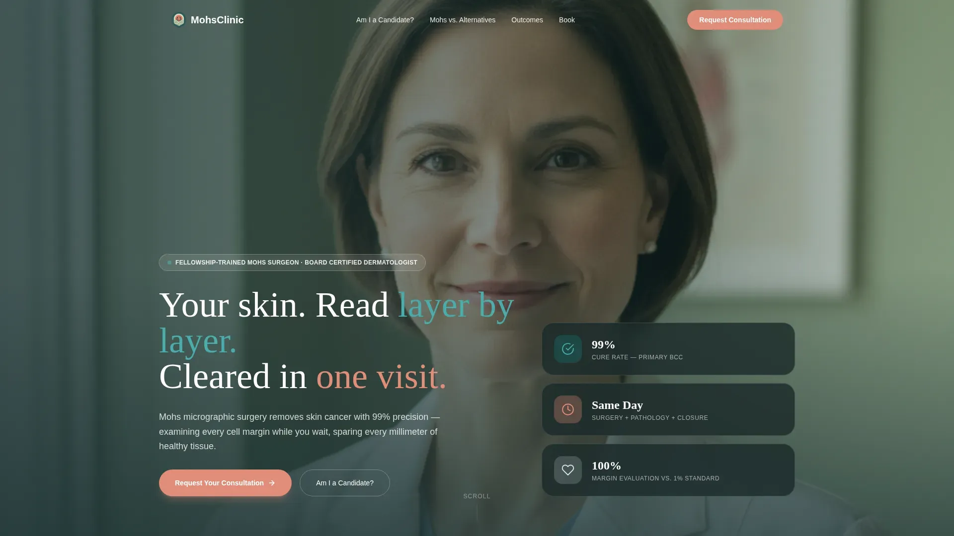
- A portrait-centered hero section with headline placement beside the surgeon image, not overlaid on it
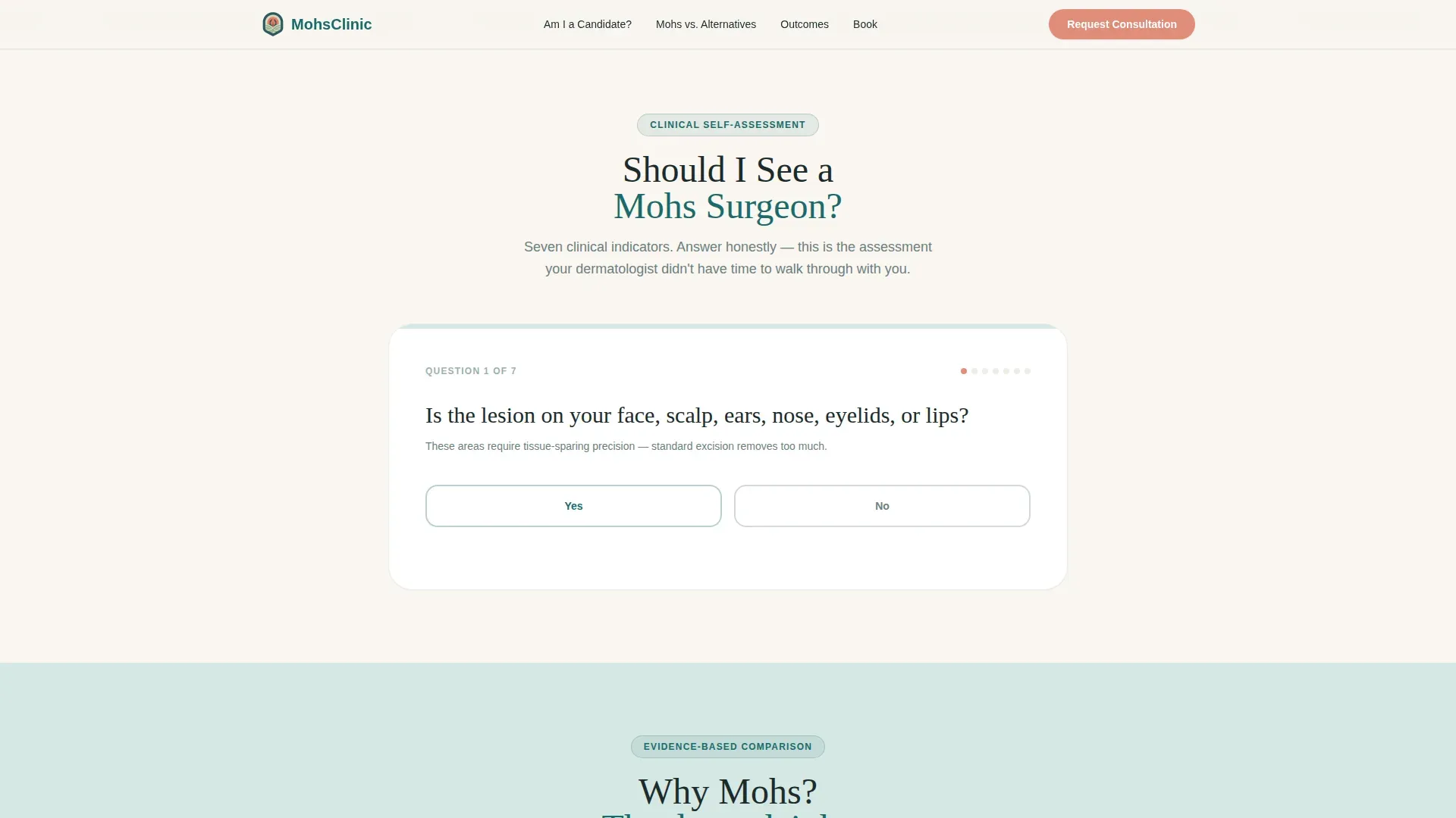
- A seven-indicator interactive self-assessment checklist that outputs a personalized urgency tier for each visitor
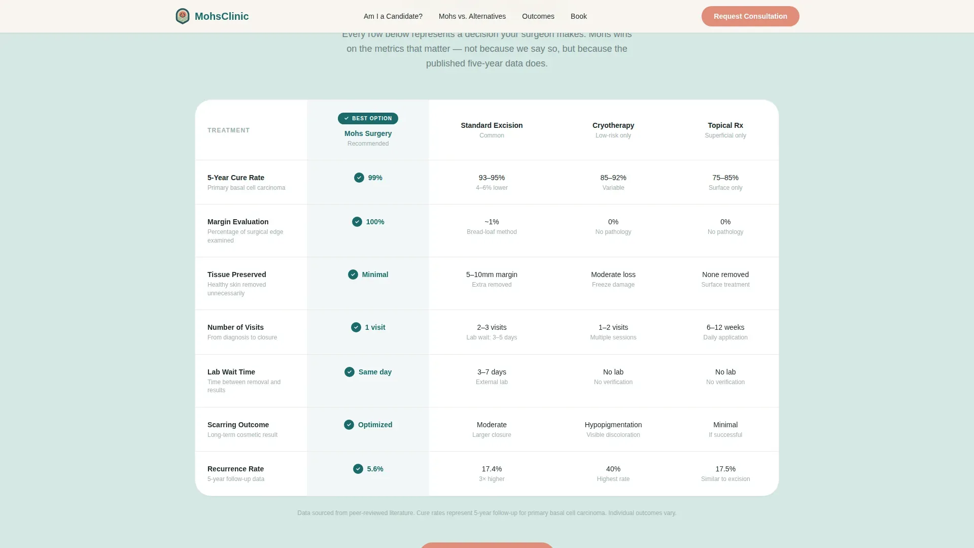
- A multi-row comparison table stacking Mohs surgery against standard excision, cryotherapy, and topical treatment across five clinical dimensions
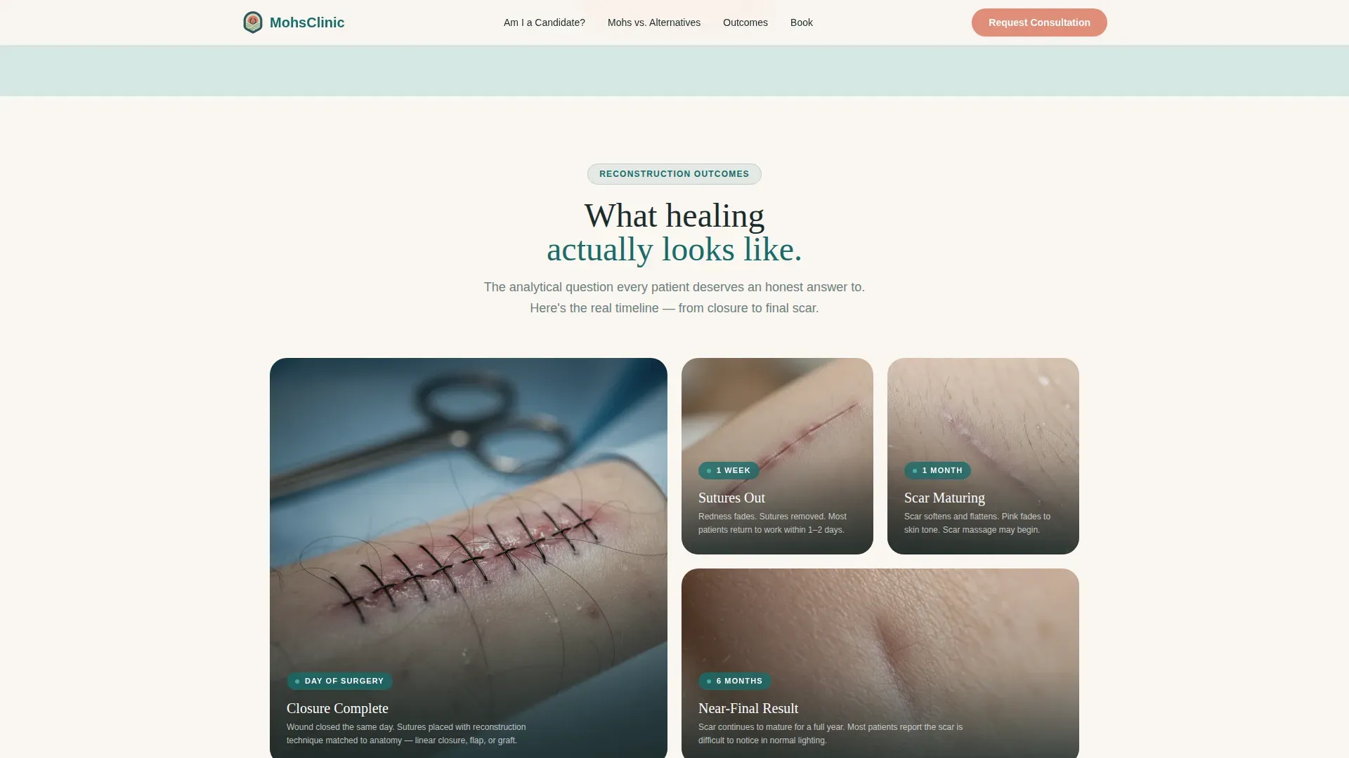
- A wound-closure reconstruction gallery organized as a healing timeline showing outcomes at one week, one month, and six months
- A three-field consultation booking form with a secondary biopsy report upload modal for pre-diagnosed patients
- A sticky mobile bottom bar that keeps the primary call-to-action visible throughout the scroll
Feature list
This section covers the core interactive and structural components included in the template.
Interactive Self-Assessment Checklist
Visitors tap yes or no across seven clinical indicators: lesion location, recurrence history, lesion size, border definition, and related factors. The checklist outputs a personalized urgency tier based on their responses, giving each patient a sense of where they stand before they ever speak to staff.
Side-by-Side Treatment Comparison Table
A structured table compares Mohs surgery against standard excision, cryotherapy, and topical treatment. Rows cover cure rate, tissue preservation, visit count, scarring, and lab wait time. Each row highlights the Mohs advantage with a teal checkmark, making the clinical case without relying on marketing language.
Reconstruction Outcome Gallery
An asymmetric bento-grid gallery displays real wound-closure outcomes across a three-stage healing timeline: one week, one month, and six months post-procedure. This gives detail-oriented patients the evidence trail they need to feel confident before booking.
Three-Field Consultation Booking Form
The booking form uses three sequential fields: a concern area dropdown covering face, scalp, neck, trunk, and extremity; a referral status selector; and a preferred contact window selector. Keeping the form short reduces friction and increases completion rates.
Biopsy Report Upload Modal
A secondary call-to-action labeled "Send Us Your Biopsy Report" opens a secure upload modal. This path fast-tracks already-diagnosed patients directly to scheduling, acknowledging that they have different needs than first-time inquirers.
Sticky Mobile Call-to-Action Bar
On mobile devices, the primary "Request Your Consultation" button anchors in a persistent bottom bar. Patients researching on their phones during waiting room visits always have one tap to initiate contact, regardless of scroll position.
Page sections overview
| Section | Purpose |
|---|---|
| Hero Portrait | Introduces the surgeon with a trust-building portrait and the page headline |
| Self-Assessment Checklist | Lets visitors gauge personal urgency across seven clinical indicators |
| Treatment Comparison Table | Stacks Mohs against three alternatives across five clinical dimensions |
| Reconstruction Gallery | Shows healing timeline outcomes to reassure evidence-seeking patients |
| Consultation Booking Form | Collects three key fields and offers a biopsy upload path for diagnosed patients |
| Footer | Single-row linear footer with practice contact and supporting links |
Design & branding system
The visual theme is Healing Space: clinical enough to establish trust, warm enough to lower a patient's anxiety level before they read the first sentence. Every color choice has a specific role in the layout.
- Deep surgical teal (#1A6B6A) anchors primary headers and trust elements, giving the page medical authority
- Soft sage (#D6E8E4) fills the resting background between sections, creating visual breathing room
- Warm linen (#FAF6F1) surfaces card backgrounds and the booking form container, keeping the interactive areas approachable
- Quiet coral (#E08D79) is reserved exclusively for calls to action and urgent-care callouts, so it always signals the next step
Mobile & speed optimization
The template is designed mobile-first, reflecting the reality that most skin cancer patients research their options on a phone, often in a waiting room between appointments. The layout prioritizes fast initial load by limiting client-side interactivity to only the components that require it.
- The sticky bottom bar keeps the consultation call-to-action accessible on small screens without requiring a scroll back to the top
- Tab interactions, checklist logic, and comparison table row reveals are handled as client components only, keeping the rest of the page lightweight
- The portrait header and gallery images are structured to load progressively, keeping the above-the-fold experience immediate
How this template helps you convert
The page is structured as a guided decision journey rather than a brochure. Each section resolves a specific barrier before asking for a commitment.
- The self-assessment checklist personalizes the visit early. By the time a visitor finishes it, they have a clearer picture of their own situation, which makes the booking request feel like a logical next step rather than a sales moment.
- The comparison table answers the most common pre-consultation question: why Mohs and not something simpler? It does this with clinical data laid out in a familiar row-by-row format, so the visitor arrives at the form already convinced rather than still skeptical.
- The biopsy upload path removes a hidden drop-off point. Pre-diagnosed patients often abandon generic forms because the intake flow does not reflect their situation. Offering a direct upload modal acknowledges where they are and keeps them moving forward.
Other information about this template
This template sits at the intersection of patient education and practice growth. It is built to serve a specific clinical niche with a high degree of specificity, not adapted from a generic healthcare layout.
- Typography uses DM Sans for body text and Fraunces for serif headlines, pairing readability with a gentle authority appropriate for a medical context
- Animation intensity is set to medium: checklist tab interactions, comparison table row reveals, and a marquee element provide motion feedback without feeling clinical or cold
- The footer follows a linear single-row pattern, keeping the page focused and avoiding footer-heavy distraction typical of multi-service clinic sites
- The template is designed for English-language, United States-based practices, with formatting consistent with United States date conventions
Theme
Healing Space
Creative direction
Checklist & Audit
Color system
Teal Catalyst
Style
Comparison Table
Direction
Booking/Scheduling
Page Sections
Interactive Urgency Self-assessment
Clinical Treatment Comparison Table
Healing Timeline Reconstruction Gallery
Focused Three-field Booking Form
Biopsy Report Upload Modal
Sticky Mobile Booking Bar
Related questions
Can I customize the self-assessment checklist questions for my clinic?
Does the comparison table support adding or removing treatment options?
Is the biopsy upload modal included in the template?
Can I update the coral call-to-action color to match my clinic's brand?
Is this template suitable for a multi-service dermatology practice?



