Highimpact Propertyservices Landing Page Template
A single-page landing page built for Paris-based professional junk removal services targeting property managers, syndics, and renovation contractors. It leads with a full-bleed dawn photograph, a logo wall of partner firms, and a three-tier comparison table that turns B2B visitors into signed partners. The sticky "Devenir Partenaire" call to action and gated rate sheet create two clear conversion paths.
by Rocket studio
Quick summary
This landing page template is designed for a Paris débarras (junk removal) service that works at professional scale. It opens with a high-impact dawn photograph, moves through an authority-building logo wall, and centers on a three-tier partnership comparison table. Two conversion paths capture both ready-to-commit clients and decision-makers who need more time.
Who this template is for
This template is built for service businesses that clear properties at volume and need to convert institutional clients, not individual households. It suits operators who already have a fleet, a client base to reference, and tiered pricing worth explaining.
- Property clearance companies serving Paris arrondissements and inner suburbs
- Débarras operators targeting property managers, syndics de copropriété, and renovation contractors
- Professional junk removal businesses ready to move from ad-hoc jobs to recurring partnership contracts
What problem this template solves
Property managers and syndics do not book junk removal the way a private individual does. They need proof of reliability, clear invoicing terms, and a direct account contact before they commit. A generic service page does not answer those needs. This template is built around exactly those concerns.
- No clear way to show fleet scale and institutional credibility to professional buyers
- Comparison tables and tiered pricing are absent from most service pages, leaving B2B visitors without the detail they need
- Two separate conversion paths are missing: one for ready partners and one for price-sensitive decision-makers still evaluating
What you get with this template
The template delivers a fully structured single-page layout that takes a professional buyer from first impression to form submission without friction. Every section is purposeful and sequenced to build confidence before asking for commitment.
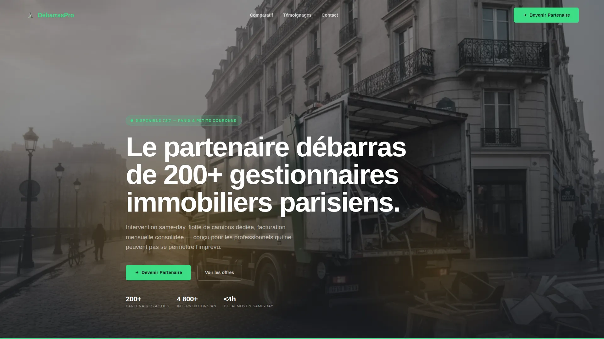
- A dark, full-bleed header with a dawn Paris street scene, headline overlay, and branded crew imagery
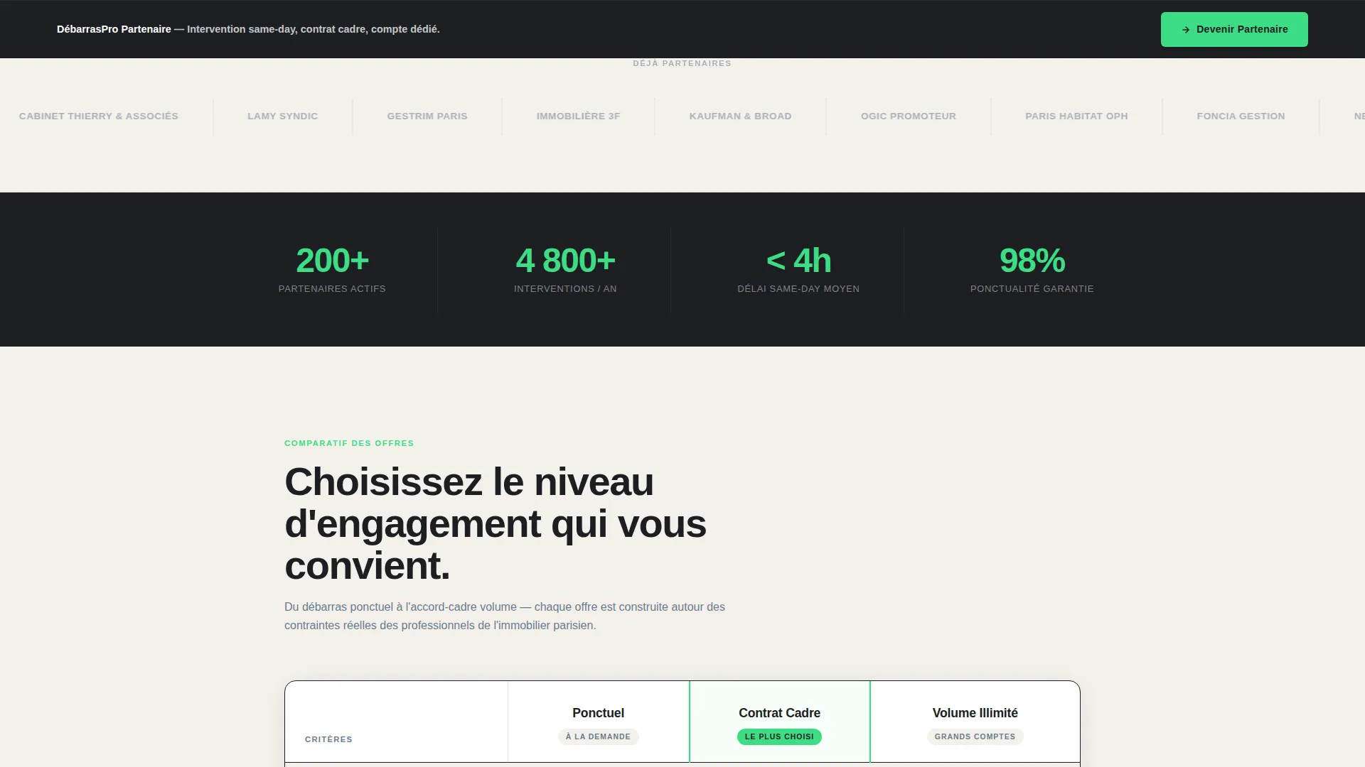
- A horizontal logo wall section showcasing existing partner firms in zinc gray on plaster white
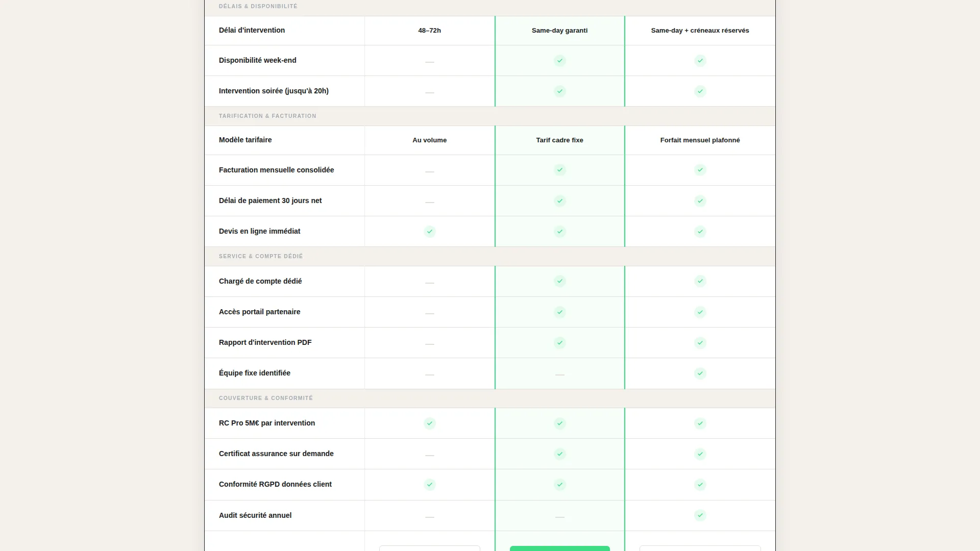
- A three-tier comparison table (Ponctuel, Contrat Cadre, Volume Illimité) with progressive green checkmarks and a sticky bottom-bar call to action
Feature list
This template includes the following built-in components and layout features.
Full-Bleed Dawn Header
A dark, desaturated Paris street photograph fills the entire header area. Amber glow from the truck interior and a single streetlamp create focal warmth. A bold sans-serif headline fades in over the dark upper third to anchor the brand promise immediately.
Logo Wall Authority Strip
A horizontal scroll of property management firms, syndic offices, and renovation companies displays their logos in zinc gray on a plaster-white background. This section appears directly below the header to establish institutional credibility before any service detail is presented.
Three-Tier Comparison Table
The table organizes three partnership tiers across rows covering response time, pricing model, account manager access, priority scheduling, invoicing terms, and insurance coverage. Progressive green checkmarks pull the reader's eye rightward toward higher commitment levels.
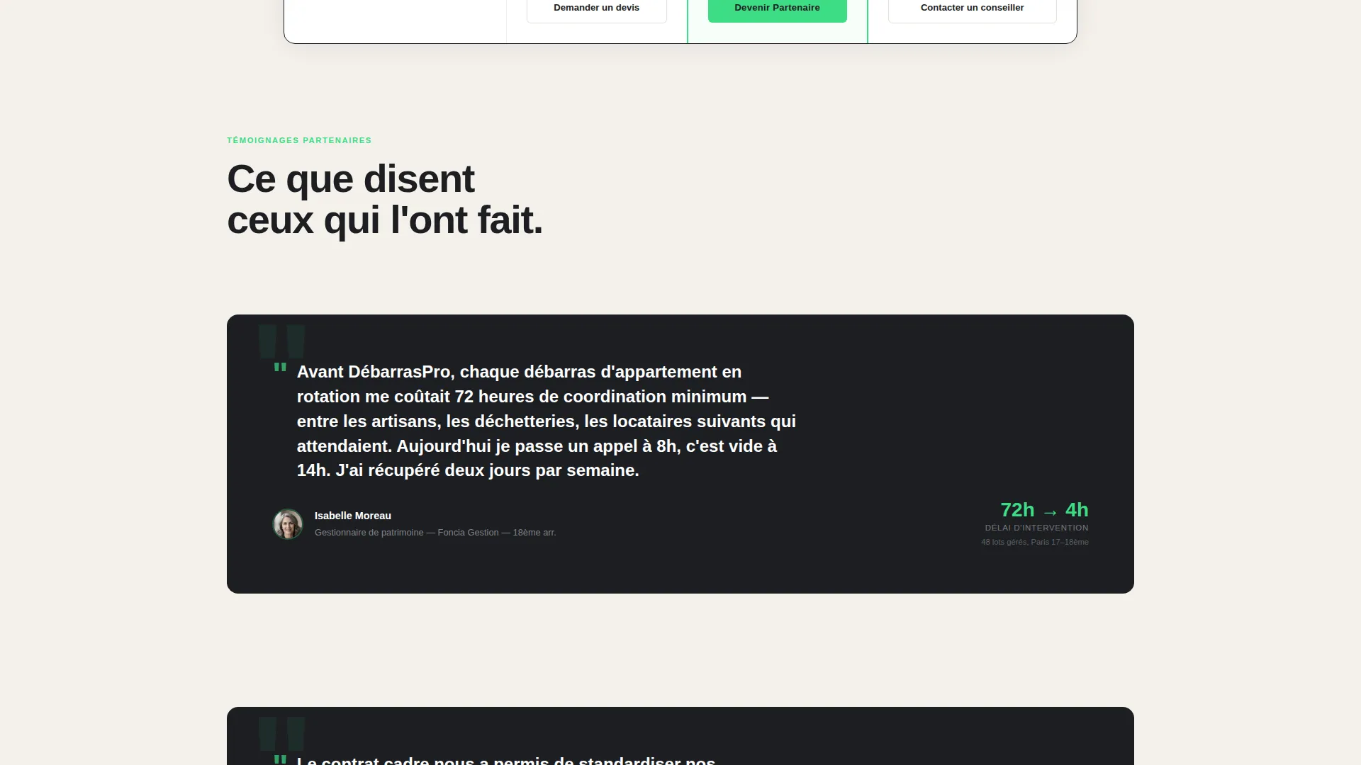
Inline Partner Case Studies
Short case study blocks break the comparison table grid at intervals. Each block features a quote from a real partner, such as a property manager describing how response time dropped from 72 hours to same-day service.
Sticky "Devenir Partenaire" Bar
A bottom bar activates after the logo wall scrolls out of view and stays fixed as the visitor continues reading. It anchors the primary call to action without interrupting the content flow above.
Gated Rate Sheet Download
A secondary conversion path offers a downloadable professional rate guide behind a simple email gate. This captures decision-makers who are still evaluating and are not yet ready to fill out the full partnership form.
Page sections overview
| Section | Purpose |
|---|---|
| Dawn Header | Opens with brand credibility and headline |
| Logo Wall | Proves institutional partner scale |
| Comparison Table | Explains the three partnership tiers |
| Partner Case Studies | Adds human proof between table sections |
| Partnership Form | Captures company name, portfolio size, arrondissement coverage, monthly volume |
| Rate Sheet Gate | Secondary path for undecided decision-makers |
| Sticky call to action Bar | Keeps the primary conversion action visible |
Design & branding system
The visual identity follows a Service Utility theme built on a Cloud Canvas color palette. The palette feels like a freshly emptied apartment on a bright afternoon: clean, neutral, and purposeful, with one high-visibility accent that guides action.
- Soft plaster white (#F4F1EC) as the dominant background, Parisian zinc gray (#6B7B8D) for body text and structural lines, and deep charcoal (#1C1E22) for headers and the comparison table frame
- Electric utility green (#3DDC84) used exclusively for calls to action, checkmarks, and active states, keeping the accent visually distinctive throughout the page
- Bold sans-serif typography for headlines, with the header image desaturated except for warm glow sources and the crew's accent-green uniform details
Mobile & speed optimization
The layout is structured for readability on smaller screens, where property managers and syndics often review supplier pages between site visits. The comparison table and sticky bar are the two components most critical to get right on mobile.
- The comparison table is designed to scroll horizontally on narrow screens, keeping tier columns intact and readable without collapsing data
- The sticky "Devenir Partenaire" bar remains anchored at the bottom of the viewport on mobile, keeping the primary action accessible without requiring the visitor to scroll back up
- The logo wall horizontal scroll adapts naturally to touch-based swiping on phones and tablets
How this template helps you convert
Every section of this page is sequenced to reduce hesitation and move a professional buyer toward action. The design does not ask for commitment before it has earned it.
- The logo wall delivers social proof from recognizable institutional names before the visitor reads a single service detail, lowering skepticism early in the scroll.
- The comparison table handles the most common B2B objection, which is not knowing what is included at each price level, by making tier differences visible and scannable at a glance.
- The two-path conversion structure means that visitors who are not ready to become partners can still enter the funnel by downloading the rate sheet, giving the business a second chance to convert them later.
Other information about this template
This template is positioned specifically for the Paris professional property services market and reflects the operational realities of that environment, including Haussmann-era staircase constraints, multi-unit portfolio management, and the syndic de copropriété relationship model.
- The partnership form fields (portfolio size, arrondissement coverage, monthly volume) are pre-configured to capture the qualification data most relevant to a Paris débarras operator
- The template is built as a single landing page, not a multi-page website, making it straightforward to publish quickly and test partner acquisition messaging
- The case study blocks between table sections are placeholder-formatted and ready to be replaced with actual partner quotes and response-time data
- This template suits operators in the Paris professional clearance market who want a focused B2B acquisition page separate from any general public-facing service site
Theme
Corporate Precision
Creative direction
Transparent Process
Color system
Plum Executive
Style
Split Screen (50/50)
Direction
Booking/Scheduling
Page Sections
Full-bleed Dawn Header Image
Logo Wall Authority Strip
Three-tier Comparison Table
Inline Partner Case Studies
Sticky Partnership Call to Action Bar
Gated Rate Sheet Download
Related questions
Who is the primary audience this landing page targets?
Can I customize the three partnership tiers and table rows?
How does the secondary conversion path work?
Does the comparison table work on mobile screens?
Can I replace the placeholder partner logos and case study quotes?



