Occupational Health Landing Page Template
Clearance is a comparison table landing page built for occupational health clinics. It guides safety directors, HR coordinators, and fleet managers through a three-step intake form, surfaces service tier differences in a scannable table, and drives scheduling appointments with a sticky call-to-action bar. The design is grounded, fast-feeling, and built to match the pace of a 12-minute clinic visit.
by Rocket studio
Quick summary
Clearance is a single-page clinic template built around speed and clarity. It opens with a purposeful multi-step form, walks visitors through a problem-led narrative, and delivers a full service comparison table before asking for a single click. Every section is designed to move a busy safety or HR professional toward booking without friction.
Who this template is for
This template is built for occupational health clinics that serve employers, not patients in the traditional sense. If your clients are companies managing workforce compliance, this page speaks their language directly.
- Safety directors managing OSHA recordables across multiple job sites
- HR coordinators onboarding large batches of warehouse or field hires under deadline
- Fleet managers who need Department of Transportation physicals without losing driver-hours
What problem this template solves
Occupational health clinics often lose potential clients at the research stage. Decision-makers cannot quickly compare service tiers, understand turnaround commitments, or justify the cost to their own leadership. This template solves that directly.
- Slow clinic experiences cost employers real money in lost labor hours and delayed onboarding
- Safety directors need to see tier differences at a glance, not read through dense service pages
- HR and fleet managers need a clear path to book without a lengthy back-and-forth
What you get with this template
You get a fully structured, section-led landing page that moves visitors from problem awareness to scheduled appointment in one scroll. Every component is defined and purposeful.
- A three-step header form with service tile selection, an employee-count range slider, and a contact step
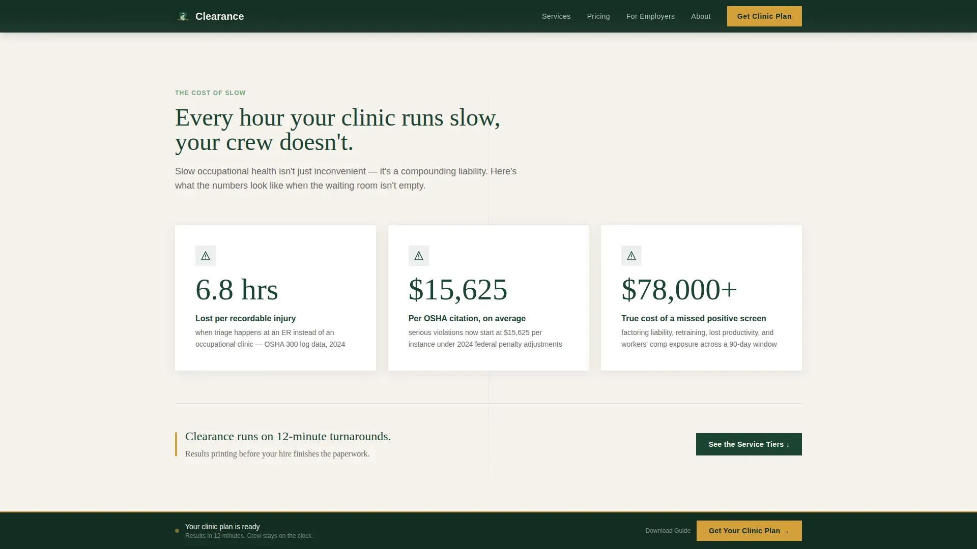
- A bold problem block with stat counters covering lost hours, OSHA fine exposure, and failed screening costs
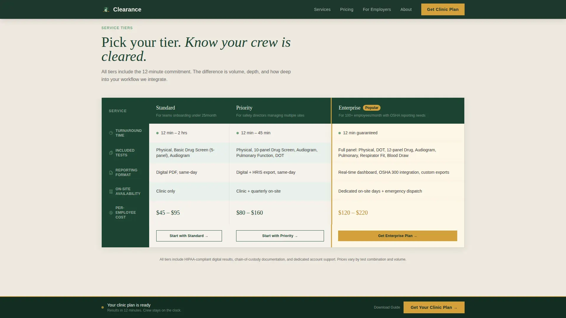
- A three-tier comparison table (Standard, Priority, Enterprise) with an amber-highlighted Enterprise row
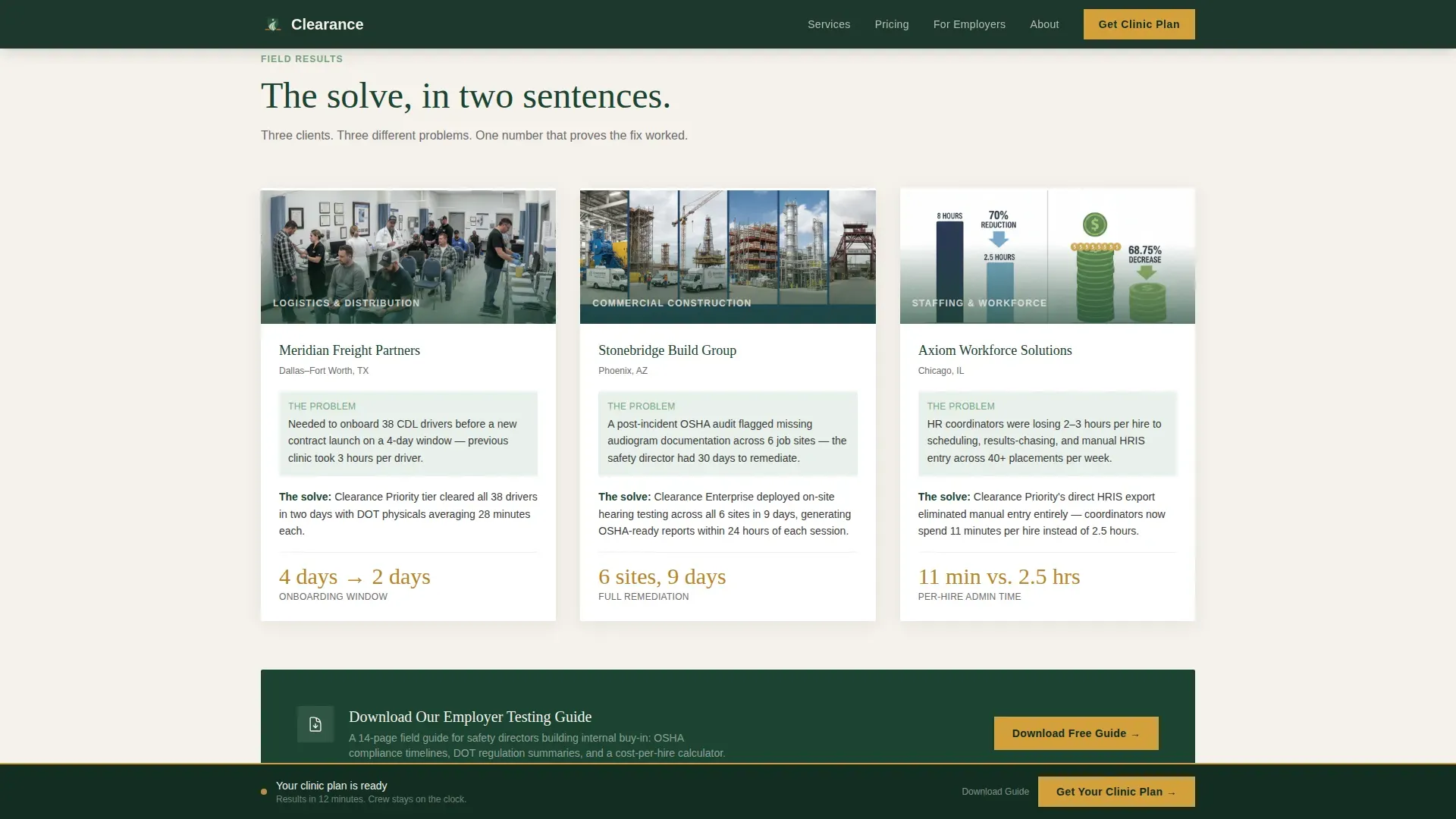
- Three short case studies covering logistics, construction, and staffing with single proof metrics
- A sticky bottom call-to-action bar that locks in after the form or table scroll
- A secondary soft-conversion block offering a downloadable employer testing guide
Feature list
This template is built with a specific set of interactive and visual components. Each one serves the core goal of reducing hesitation and accelerating the booking decision.
Three-Step Intake Form
The header opens on Step 1 of 3 with five icon-labeled service tiles: Pre-Employment Screening, Department of Transportation Physicals, Drug and Alcohol Testing, Injury Care, and Hearing and Respiratory. Selecting a tile slides to the employee-count range slider, then to a simple company name and phone collection step. An amber progress bar tracks completion across the top.
Service Tier Comparison Table
The comparison table is the spine of the page. It stacks Standard, Priority, and Enterprise tiers against five columns: turnaround time, included tests, reporting format, on-site availability, and per-employee cost range. Rows alternate between birch white and clinical sage. The Enterprise row carries a subtle amber left-border to draw the eye.
Animated Problem Stat Block
Below the form, a stat counter section surfaces the real cost of slow clinic workflows. Figures covering average hours lost per workplace injury, OSHA citation exposure, and the dollar impact of a late-discovered failed drug screen animate in on scroll to create immediate urgency.
Employer Case Study Strip
Three two-sentence case studies appear below the comparison table. Each one represents a different client type: a logistics company, a construction firm, and a staffing agency. Every case study closes with a single metric that makes the result concrete and credible.
Sticky Call-to-Action Bar
After the visitor completes the form or scrolls past the comparison table, a bottom bar locks into place carrying the primary call to action: "Get Your Clinic Plan." The bar carries the pre-selected service tier into the scheduling page so the visitor never has to repeat a choice.
Soft Conversion Download Block
A secondary call-to-action block sits beneath the case studies. It invites safety directors still building internal buy-in to download an employer testing guide. This keeps lower-intent visitors in the funnel without pressuring them toward an immediate booking.
Page sections overview
| Section | Purpose |
|---|---|
| Multi-Step Form Header | Captures service need, employee count, and contact in three fast steps |
| Problem Stat Block | Quantifies the cost of slow clinic workflows to create urgency |
| Service Comparison Table | Lets buyers compare Standard, Priority, and Enterprise tiers side by side |
| Case Study Strip | Proves the clinic's value with real-scenario two-sentence outcomes |
| Download call to action Block | Converts lower-intent visitors with a soft offer before they leave |
| Sticky Bottom Bar | Locks the primary booking call to action in view after key scroll milestones |
| Single-Row Footer | Provides minimal navigation without pulling attention from the call to action |
Design & branding system
The visual identity follows a Medical Clarity theme built on a Forest Trust color system. The result feels like a national park ranger station that happens to hold a medical license: grounded, serious, and quietly reassuring without any sterile hospital anxiety.
- Deep evergreen (#1B4332) anchors primary backgrounds and all major headers
- Clinical sage (#74A57F) fills secondary surfaces and alternating table rows, keeping the comparison section readable without visual noise
- Birch white (#F5F1EB) opens up body text containers and negative space so the page never feels dense
- Confident amber (#D4A03C) appears exclusively on call-to-action elements, the progress bar, and the Enterprise tier highlight, so every amber element carries the same action meaning
- Typography pairs Fraunces (a serif display face) for headings with DM Sans for body and interface text, balancing authority with readability
Mobile & speed optimization
The template is built desktop-first to match the primary user: a safety director reviewing options at a desk. Mobile fallback is fully considered so coordinators and managers on-site can still navigate and submit the form without friction.
- The three-step form collapses cleanly on smaller screens, with service tiles stacking vertically and the range slider remaining thumb-friendly
- The comparison table adapts for mobile viewports so tier differences stay readable without horizontal scrolling
- Static page sections use server-rendered components while the interactive form and sticky bar run as client components, keeping the heaviest interactivity isolated
How this template helps you convert
Clearance earns the booking click through a deliberate narrative arc, not through pressure tactics. Every section does specific conversion work before the call-to-action bar ever appears.
- The problem block makes the cost of inaction concrete and personal before the visitor reaches the comparison table, so they arrive already motivated rather than just curious.
- The comparison table gives decision-makers the tier-to-tier data they need to justify a choice to their own leadership, removing the most common reason for delayed decisions.
- The sticky call-to-action bar appears only after the visitor has engaged with the form or scrolled through the table, so the click arrives at the right moment rather than interrupting early consideration.
Other information about this template
This template is well-suited for clinics that operate in competitive local markets where speed of service is a primary differentiator. It is also a strong fit for multi-site clinic groups that need a single page to communicate service breadth without overwhelming a first-time visitor.
- The page uses scroll-reveal animations and stat counter animations at medium intensity, giving the experience energy without distracting from the content
- Form slide transitions between the three steps reinforce the triage metaphor built into the brief: fast, purposeful, zero wasted questions
- The sticky bar entrance is animated so it feels intentional rather than abrupt when it locks into view
- Footer follows a Linear Single-Row pattern, keeping the bottom of the page clean and focused
- The pre-selected service tier carries over from the header form into the scheduling destination page, reducing re-entry friction for the visitor
- The template supports a desktop-first layout with a solid mobile fallback, reflecting the primary audience of desk-based safety and HR professionals

Theme
Medical Clarity
Creative direction
Problem→Solution Arc
Color system
Forest Trust
Style
Comparison Table
Direction
Click-Through
Page Sections
Three-step Intake Form with Service Tiles
Service Tier Comparison Table
Animated Problem Stat Block
Two-sentence Case Study Strip
Sticky Bottom Call-to-action Bar
Soft Conversion Download Block
Related questions
Who is this landing page template designed for?
What service tiers are shown in the comparison table?
How does the three-step header form work?
Does this template support visitors who are not ready to book yet?
When does the sticky call-to-action bar appear?



