Clearance - Precision Snowremoval Landing Page Template
Clearance is a split-screen landing page template built for Dubai-based snow removal and ice management services. It pairs an editorial magazine aesthetic with a case study narrative structure, guiding industrial facility operators toward a site assessment request. The design uses a monochrome steel palette with hazard amber accents, projecting the authority and precision the niche demands.
by Rocket studio
Quick summary
Clearance is a single-page lead generation template designed for precision snow removal and ice management services operating in Dubai's engineered cold environments. It uses a 50/50 split-screen layout, an editorial magazine visual language, and a scrolling case study narrative to build credibility and drive facility operators toward booking a site assessment.
Who this template is for
This template is built for service providers operating in a niche that almost no one outside Dubai knows exists. It speaks directly to the decision-makers who manage these high-stakes cold environments and who need a vendor that feels as serious as the problem.
- Facilities directors managing indoor ski slopes and themed winter attractions
- Operations managers running sub-zero cold-chain and warehouse logistics facilities
- Event producers building temporary ice installations for large-scale seasonal events
What problem this template solves
Industrial ice management in Dubai carries reputational and structural stakes that a generic service page cannot communicate. Clients need evidence, not slogans. This template solves the trust gap between an unusual service and the cautious operations professionals who need it.
- Generic layouts fail to convey the precision and emergency-readiness that facilities directors require
- Prospective clients need project proof, measurable outcomes, and a clear path to contact
- A split-screen narrative format communicates both the problem severity and the solution quality in one scroll
What you get with this template
You get a fully structured, single-page layout that tells your service story through escalating real-world case studies. Every section is designed to move a skeptical operations manager from first impression to form submission.
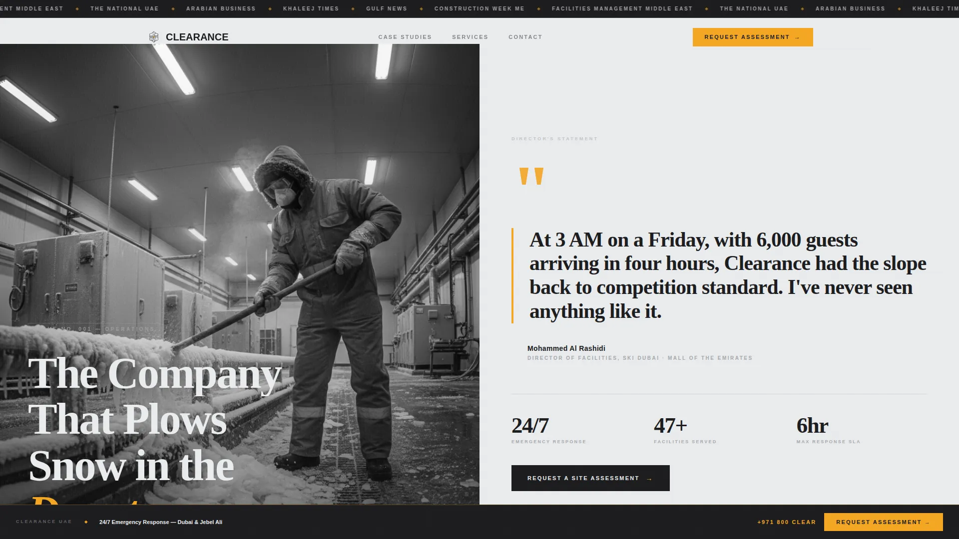
- A press mentions masthead header with publication logo ticker and a bold 120-point serif headline
- Three self-contained case study scroll sections with paired problem and solution panels, thermal imaging references, and oversized outcome metrics
- A lead capture form collecting facility type, managed area, and preferred contact window, plus a secondary PDF download path gated by email
Feature list
A paragraph introducing the feature set: Each component of this template was chosen to serve one function, earning the confidence of facility operators who make high-value, low-frequency purchasing decisions.
Split-Screen Editorial Layout
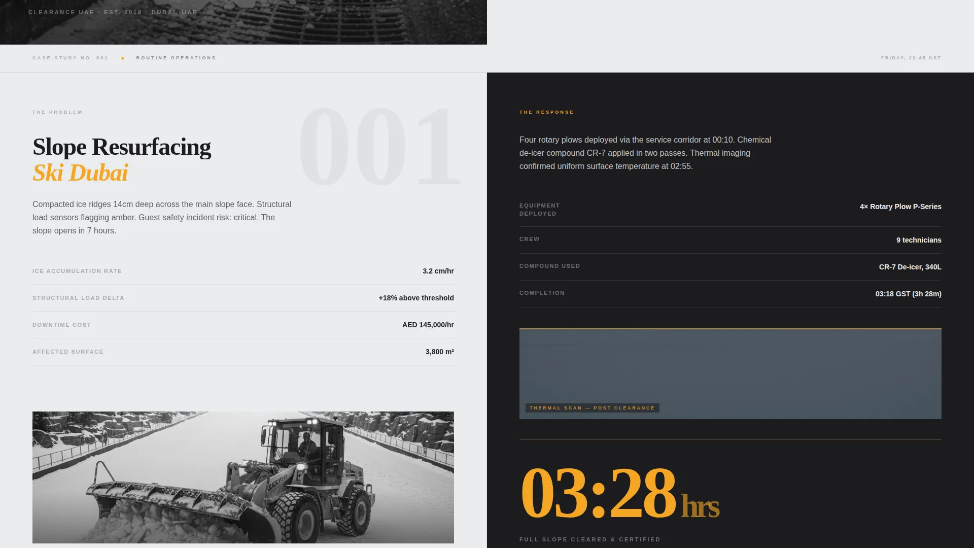
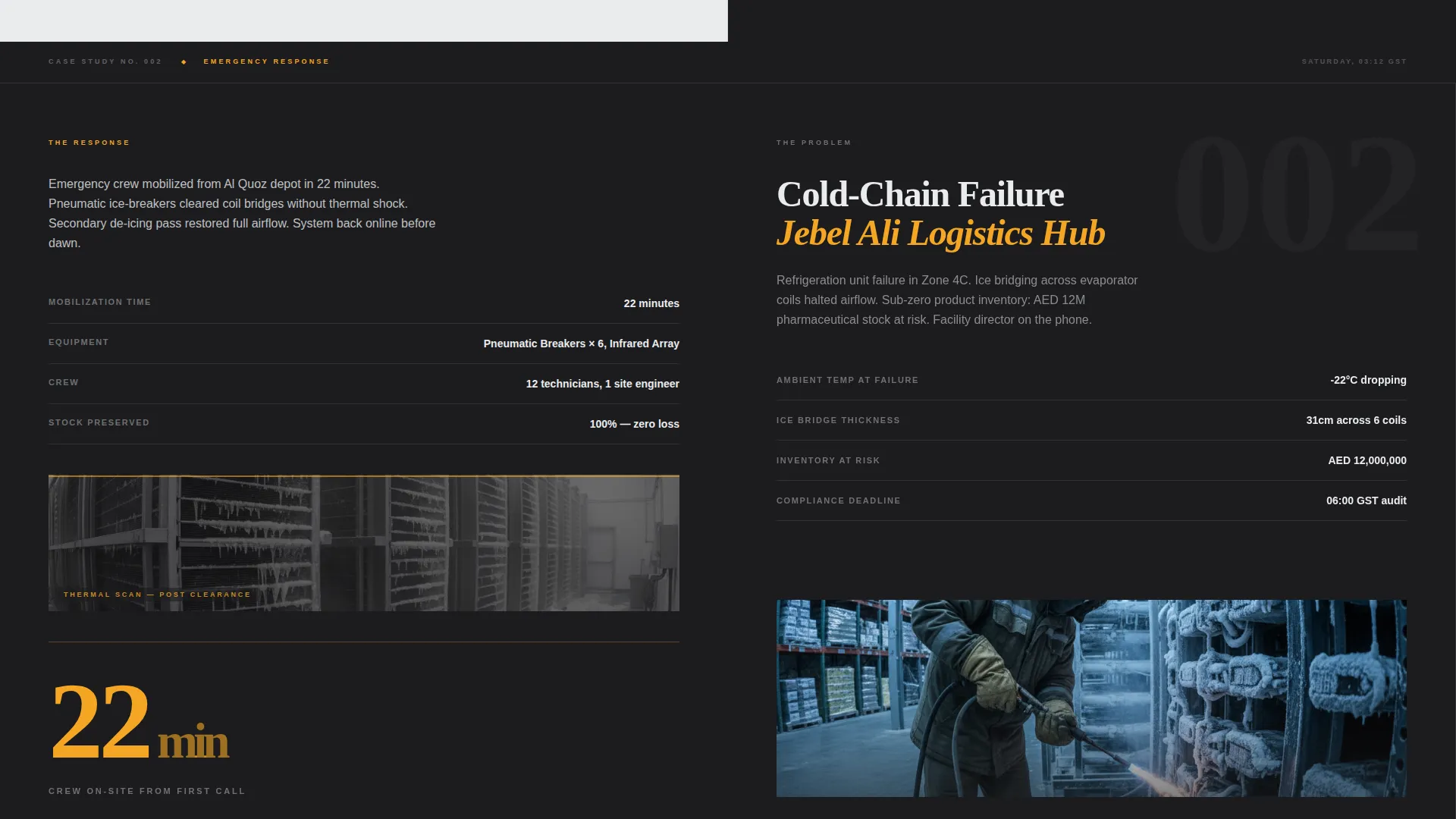
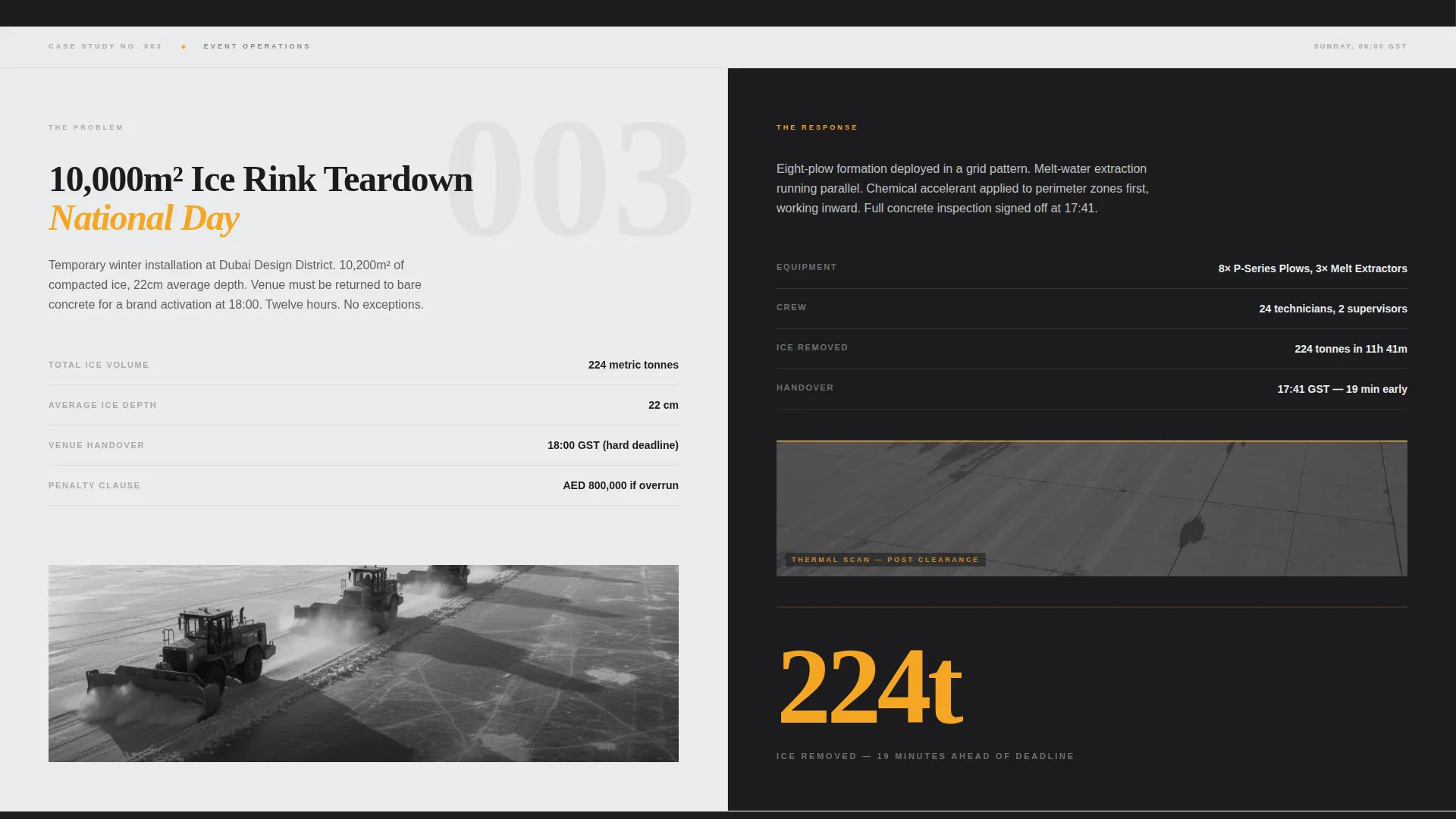
The page divides every scroll section into a precise 50/50 frame. The left panel carries the operational problem data and the right panel presents the solution details, crew size, equipment used, and the final outcome metric. This pairing lets readers process complexity without scrolling back.
Press Mentions Masthead Header
The header opens with a horizontal ticker of publication logos above a bold serif headline set at 120 points. A black-and-white editorial photograph of a technician at work anchors the left half. The right half carries a pull quote from a named facilities director, typeset with oversized amber quotation marks.
Escalating Case Study Narrative
Three project stories unfold as magazine spreads, each raising the operational stakes. The sequence moves from routine slope maintenance to a 3 AM cold-chain emergency to a 10,000-square-meter ice rink teardown under a six-hour deadline. Each case ends with a single oversized outcome metric.
Sticky Lead Capture Rail
The primary call to action, "Request a Site Assessment," appears after the second case study and then pins to the bottom of the viewport for the rest of the scroll. The form captures facility type, total managed area in square meters, and a preferred contact window.
Secondary PDF Download Path
Operations managers who are not ready to call can download the Emergency Response Service Level Agreement document by submitting an email address. This gated secondary path keeps a qualified lead in your pipeline without requiring a phone commitment.
Hazard Amber Accent System
A single accent color, hazard amber (#F5A623), is reserved exclusively for calls to action and pull-quote borders. This restraint gives every amber element the visual weight of a warning light, drawing the eye exactly where action is needed.
Page sections overview
| Section | Purpose |
|---|---|
| Publication Logo Ticker | Establishes credibility through media recognition at first glance |
| Hero Headline Block | Anchors the brand story with a bold, provocative serif statement |
| Editorial Hero Split | Pairs a technician photograph with a named facilities director quote |
| Case Study One | Documents a routine slope resurfacing project with outcome metric |
| Case Study Two | Presents a 3 AM cold-chain warehouse failure and emergency response |
| Case Study Three | Covers a 10,000 sqm ice rink teardown under a six-hour deadline |
| Site Assessment Form | Captures facility type, managed area, and contact window |
| Sticky call to action Rail | Keeps the primary call to action visible through final scroll sections |
| PDF Download Gate | Offers the Emergency Response SLA behind an email capture field |
Design & branding system
The visual identity is built on an Editorial Magazine theme using a Monochrome Steel color system. The palette is deliberately restrained, with one warm accent that carries all the urgency. The result feels like a feature spread in a serious infrastructure publication.
- Foundational charcoal (#1C1C1E), brushed aluminum (#A8A9AD), and glacier white (#EAECEE) form the neutral base
- Hazard amber (#F5A623) appears only on calls to action and pull-quote borders, functioning like a warning light on heavy machinery
- Typography uses a bold serif at 120 points for the hero headline, paired with a clean editorial body face for case study copy
Mobile & speed optimization
The template is structured for a focused single-page experience where layout decisions support readability on all screen sizes. The split-screen format adapts cleanly so that content hierarchy remains clear whether viewed on a desktop monitor or a mobile device.
- The 50/50 split-screen layout stacks vertically on smaller screens, preserving the problem-solution pairing in sequence
- The sticky bottom call to action rail remains accessible on mobile without obstructing case study content
- Oversized typographic metrics and editorial imagery are sized for impact on high-resolution displays
How this template helps you convert
Every layout decision in this template is built to move a cautious, senior operations professional from first scroll to form submission. The structure removes friction and builds credibility in a deliberate sequence.
- The press mentions masthead and named pull quote establish third-party trust before any service claim is made, lowering skepticism from the first second on the page.
- The escalating case study narrative demonstrates proven capability across three distinct scenarios, so by the time the site assessment form appears, the reader already has evidence.
- The dual conversion paths, direct form and gated PDF download, let readers self-select their level of readiness, keeping both immediate leads and longer-cycle prospects inside the funnel.
Other information about this template
This template is purpose-built for a highly specific professional services niche in the Dubai local services market. The content structure and visual system reflect the unusual intersection of industrial cold-environment operations and a desert city context.
- The template style is Split Screen (50/50), the theme is Editorial Magazine, and the creative direction follows a Case Study Narrative format
- The header concept is Press Mentions, and the landing page direction is Lead Generation
- The color system is Monochrome Steel, making it well suited for industrial, infrastructure, and facilities management service providers who need authority without visual clutter
Theme
Editorial Magazine
Creative direction
Case Study Narrative
Color system
Monochrome Steel
Style
Split Screen (50/50)
Direction
Lead Generation
Page Sections
Split-screen Editorial Layout
Press Mentions Masthead Header
Escalating Case Study Narrative
Sticky Lead Capture Rail
Gated PDF Download Path
Hazard Amber Accent System
Related questions
Who is the primary audience for this landing page template?
What conversion actions does the template support?
Can this template work for other industrial or facilities management services?
How does the sticky call-to-action rail work?
What information does the lead form collect?



