Military Credit Card Quiz Landing Page Template
Clearance is a dashboard-style military credit card landing page built for service members, veterans, and military families. A five-question quiz matches visitors to the right card variant in real time. The Arctic White and dress-blue navy design feels institutional and sharp. No personal information is collected until the visitor is ready to apply.
by Rocket studio
Quick summary
Clearance is a quiz-first landing page template for a military credit card product. Visitors answer five fast questions about their service profile and instantly see a personalized card recommendation inside a live data grid. The design borrows from secure institutional dashboards, keeping every element purposeful and uncluttered. No personally identifiable information is required to reach the results screen.
Who this template is for
This template fits financial products and military fintech brands that want to convert through personalization rather than generic benefit lists. It works best when the offer has multiple variants that suit different buyer profiles.
- Active-duty service members comparing credit cards across permanent change of station (PCS) moves, overseas postings, and deployments
- Retired non-commissioned officers and veterans who are optimizing their credit after years of "good enough" financial products
- Military families managing cost-of-living adjustments and commissary spending who need a card built around their actual habits
What problem this template solves
Military cardholders rarely see themselves in civilian rewards categories. Generic travel points and restaurant cashback ignore the real spending patterns of barracks life, commissary runs, and deployment cycles. This template solves the engagement gap by making the card-selection process personal from the very first screen.
- Visitors drop off when a page lists benefits without connecting them to the reader's specific rank, status, or spending habits
- A standard comparison table buries the most relevant card under options that do not apply to the visitor's situation
- Most landing pages ask for personal data before delivering value, which raises friction and reduces trust with a security-conscious audience
What you get with this template
You get a fully structured single-page layout built around an interactive quiz funnel and a live card-recommendation data grid. The design is desktop-first with complete mobile responsiveness and a visual identity grounded in institutional clarity.
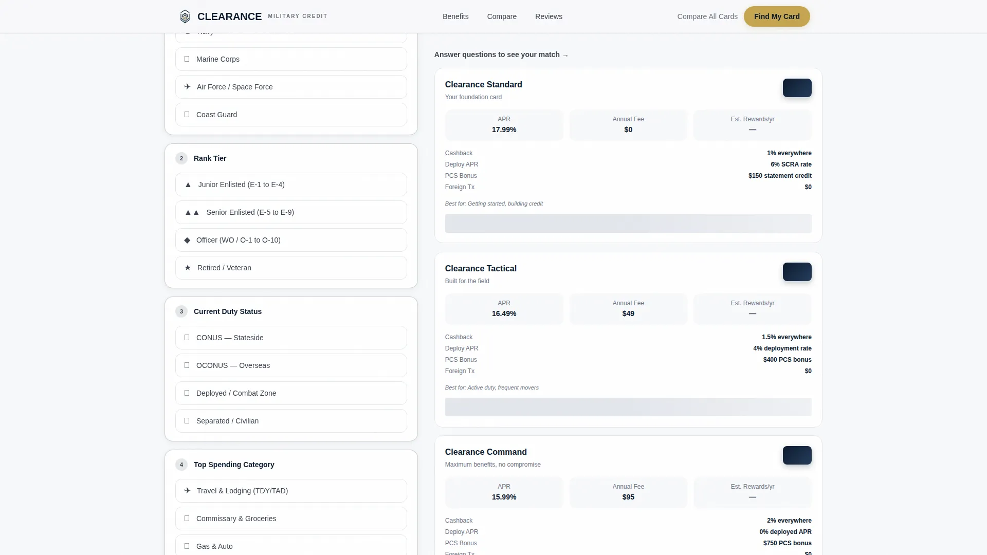
- A five-question tactical assessment with real-time card grid updates, badge unlock animations, and staggered slide-in reveal transitions
- Three card option panels showing annual percentage rate (APR), annual fee, and projected first-year rewards calculated client-side from quiz answers
- A complete page structure including a hero badge rack, quiz tool, comparison table, branch-organized testimonials, and a results-based apply call to action
Feature list
This template delivers a focused set of interactive and visual features, each grounded in the service-member experience.
Five-Question Tactical Quiz
The quiz is the page's centerpiece. Visitors choose branch of service, rank tier, duty status, top spending category, and whether they carry a balance. Answers feed a live data grid that reshuffles card recommendations in real time.
Live Card Recommendation Grid
Three card options update dynamically as each quiz answer is registered. Each card panel displays APR, annual fee, and a projected annual rewards figure calculated from the visitor's stated profile. No page reload is required.
Award Badge Rack System
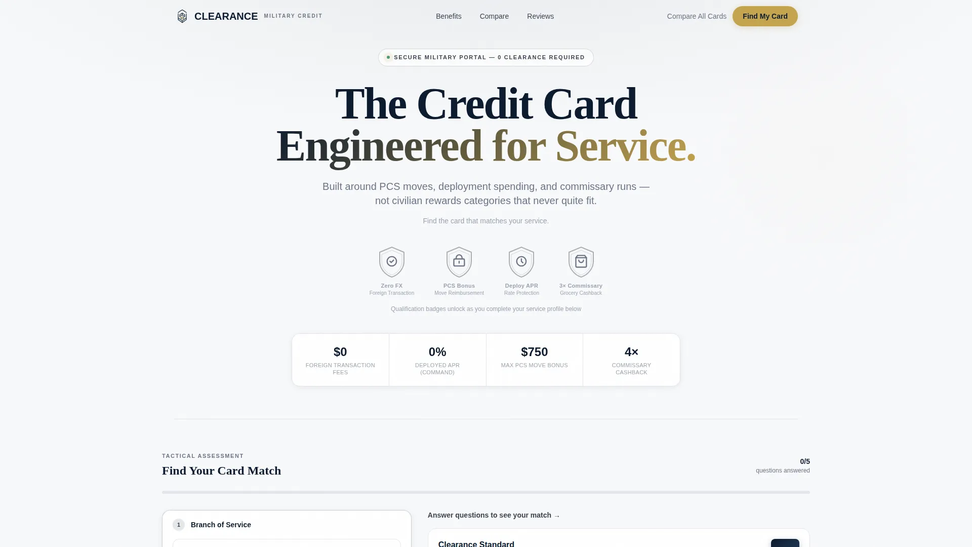
Shield-style qualification badges represent the card's core benefits: zero foreign transaction fees, PCS reimbursement bonus, deployment APR protection, and commissary cashback multiplier. Badges render in monochrome navy and unlock in service-gold as the visitor completes the quiz, rewarding engagement with a familiar military visual cue.
Rank-Native Apply Call to Action
The primary call to action reads "Apply at Your Rank" and appears only after all five questions are answered. First-year savings projections display in gold numerals alongside the application link, making the value concrete before the visitor commits.
Branch-Verified Testimonials Section
Social proof is organized by branch of service rather than shown as a generic quote carousel. This structure lets visitors find voices that match their own background, reinforcing trust at the moment of decision.
Institutional Dashboard Visual System
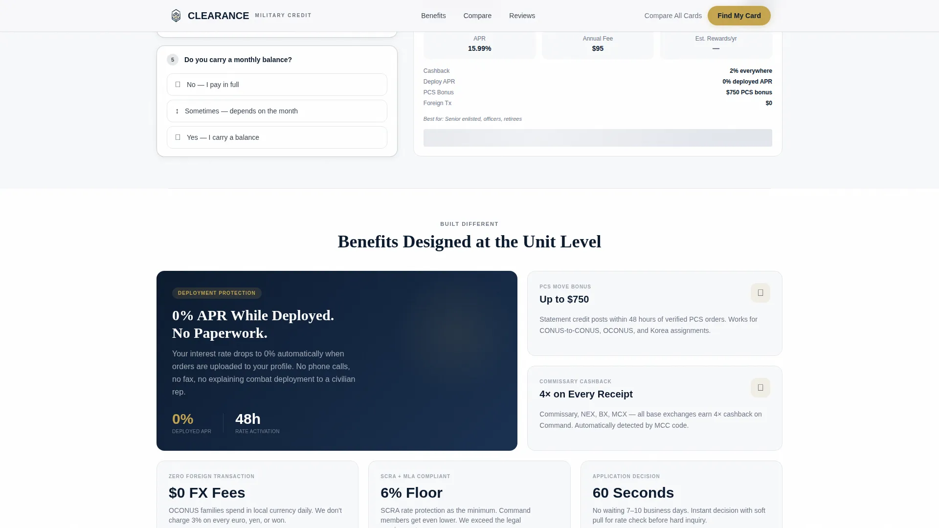
The layout uses a data-label typography system with DM Sans for interface elements and Fraunces for display headlines. The Arctic White surface, dress-blue navy headers, slate gray labels, and service-gold accents create a CAC-card-level sense of institutional credibility.
Page sections overview
| Section | Purpose |
|---|---|
| Hero Badge Rack | Displays shield qualification badges and the page tagline |
| Quiz Tool Grid | Five-question assessment with live card recommendations |
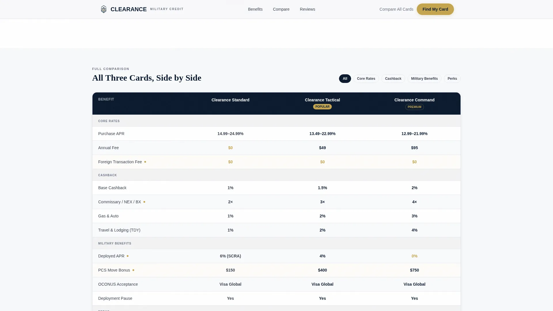
| Card Comparison Table | Side-by-side APR, fees, and rewards for all three variants |
| Branch Testimonials | Verified service member quotes organized by branch |
| Apply Call to Action | Rank-native call to action with first-year savings projection in gold |
| Footer | Linear single-row footer with supporting links |
Design & branding system
The visual identity follows a Dashboard Pro theme built on an Arctic White color system. Every design decision reinforces the institutional trust signals that a security-conscious military audience expects.
- Color palette: Arctic White (#F8F9FB) primary surface, deep dress-blue navy (#0B1A2E) for headers and card renders, slate gray (#3B4352) for data labels and secondary text, and service-gold (#C5A44E) reserved exclusively for badges, selected states, and call-to-action buttons
- Typography: DM Sans handles all data labels and interface copy; Fraunces handles display headlines, creating a clean contrast between functional and expressive type
- Animation style: medium-intensity slideInBlur staggered reveals on scroll, quiz state transitions between questions, badge unlock animations on question completion, and live grid recalculation feedback on each answer
Mobile & speed optimization
The template is designed desktop-first to support the dashboard and data-grid aesthetic, with full mobile responsiveness built in. The quiz and card grid reflow cleanly at smaller breakpoints without losing the institutional feel.
- The static hero section loads independently from the client-side quiz state, keeping the initial render fast even before interaction begins
- Badge unlock animations and grid recalculations run client-side, meaning the live recommendation experience works without server round-trips or external data requests
- The linear single-row footer keeps the mobile experience lean and focused on the primary conversion path
How this template helps you convert
Conversion is built into the structure. Every design and interaction decision reduces hesitation and builds confidence in the visitor's choice before an application link ever appears.
- The quiz collects service profile data instead of personal information, so visitors feel they are checking a result rather than submitting an application, which lowers the psychological barrier at the most sensitive stage of a financial decision.
- The "See Your Card Match" call to action appears only after all five answers are given, creating a completion-reward moment that makes clicking feel like the natural next step rather than a sales push.
- Projected first-year savings in gold numerals on the results screen give the visitor a concrete, personalized reason to act immediately, replacing generic benefit claims with a number tied directly to their own stated profile.
Other information about this template
This template is built specifically for the military credit card niche inside the broader finance and insurance category. It is matched to a military finance subcategory context and carries a high intersection match score, meaning the quiz funnel approach, dashboard layout, and quiz-first creative direction are well aligned with how service members evaluate financial products.
- Template style: Dashboard and Data Grid, using the Dashboard Pro theme
- Creative direction: Calculator and Tool First, with a Quiz and Assessment funnel as the primary landing page direction
- Header concept: Award Badges rendered as shield icons on a qualification badge rack
- Localization: English, United States dollars, MM/DD/YYYY date format, and United States military terminology throughout
- No personally identifiable information is collected during the quiz flow; the application link surfaces only at the results screen
- The footer uses Pattern 1, a linear single-row layout, keeping the page exit path simple and uncluttered
Theme
Dashboard Pro
Creative direction
Calculator/Tool First
Color system
Arctic White
Style
Dashboard/Data Grid
Direction
Quiz/Assessment
Page Sections
Five-question Tactical Quiz Engine
Live Card Recommendation Data Grid
Award Badge Rack with Unlock Animation
Rank-native Results and Apply Screen
Branch-organized Testimonials
Institutional Dashboard Visual System
Related questions
Does the quiz collect any personal information from visitors?
Can I customize the card options shown in the data grid?
How does the badge unlock animation work?
Is this template suitable for a product with only one card variant?
What does the visitor see after completing all five quiz questions?



